
The break-even point reflects the volume of production and sales of goods and services which cover all the costs of the enterprise. In the economic sense, it is an indicator of a critical situation when profits and losses are zero. This indicator is expressed in quantitative or monetary units.
The lower the break-even point of the volume of production and sales, the higher the solvency and financial stability of the firm.
Breakeven point formula in Excel
There are 2 ways to calculate the breakeven point in Excel:
- Monetary equivalent: (revenue*fixed costs) / (revenue — variable costs).
- Natural units: fixed cost / (price — average variable costs).
Attention! Variable costs are taken from the calculation per unit of output (not common).
To find break-even you need to know:
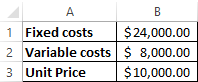
Fixed costs (independent of the production process or sale). This is lease payments, taxes, salaries for management, leasing payments, etc.
Variable costs (depend on production volumes). This is the cost of raw materials, utility bills for the use of energy resources on production facilities, wages of workers, etc.
The selling price of a unit.
We will enter the data in the Excel table:
Tasks:
- Find the volume of production in which the company will receive a net profit. Establish a relationship between these parameters.
- Calculate the volume of sales which will perform breakeven.
We compile the following table with the formulas to solve these tasks:
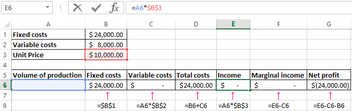
- Variable costs depend on the volume of output.
- Total costs are the sum of variables and fixed costs.
- Income is the product of the volume of production and the price of the goods.
- Marginal revenue is a gross income without variable costs.
- Net profit is income without fixed and variable production costs.
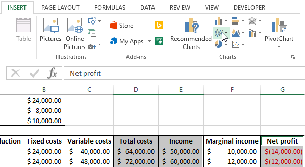
Let’s fill in the table and see what output will help the enterprise ensure cost recovery.

Since the 13th output, net profit has become positive. And in the break-even point, it is equal to zero. The volume of production is 12 units of goods. And the sales revenue is 120,000$.
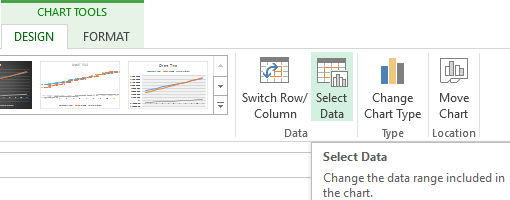
How to make the graph for break-even point in Excel?
We will draw up a graph for a clear demonstration of the economic and financial condition of the enterprise:
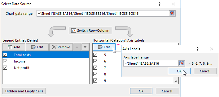
- Select range «Total costs», «Income», «Net profit» and select: «INSERT»-«Charts»-«Insert Line Chart»
- Click on chart and choose the look of the graph and click: «CHART TOOLS»-«DESIGN»-«Data»-«Select Data» on the button.
- For the demonstration, we need the columns «Total costs», «Income», «Net profit». These are the elements of the legend which called «Series». We manually enter the «Series name «. And in the «Series value» line make a reference to the corresponding column with the data.
- The range of horizontal axis titles is «Production Volume».
We obtain a graph of the next look:
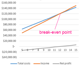
Let’s change the chart a little (Chart Styles):
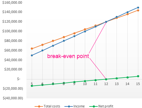
Such a demonstration allows you to see that the net profit at the breakeven point really equals «zero». And after the twelfth output cycle, we were «in the black».
Where such calculations are needed
The «breakeven point» indicator is in demand in economic practice for the solution of the following tasks:
- Calculation of the optimal price for the product.
- Calculation of the total costs at which the firm still remains competitive.
- Drawing up a plan for the sales.
- Finding the volume of output which will yield profitability.
- Analysis of the financial position and solvency of the enterprise.
- Finding the minimum amount of production.
The results of such calculations are claimed by both internal and external users. The break-even is taken into account when making management decisions and gives an idea of the financial position of the firm. The use of such a model is a way of assessing the critical level of the production volume and the sale of goods and services.
Ready-made calculations and templates for analyzing the output of the enterprise to break-even:
- Download this example calculation break-even point;
- Download an simple of calculation of the break-even point of production;
- Download the calculation of the break-even point of the store;
- Download the form for the calculation of the break-even point;
- Download examples of solving the problem of calculating the break-even point.
Done!
Break-Even Point (BEP) in Excel is the first landmark every business wants to achieve to sustain itself in the market. So, even when you work for other companies as an Analyst, they may want you to find the Excel break-even point of business.
Now, we will see what precisely the break-even point is meant for. For example, your monthly expenditure is 15,000, including all the rental, communications, food, beverages, etc. But, on the other hand, your per day salary is 1,000. So, when you earn 15,000, it becomes a break-even point for you. Anything made after the break-even point will be considered a profit.
So in business terms, if the amount of profit and expenses are equal, that is called the break-even point. So in simple terms, the break-even point is where a project’s cash inflow should equal the project’s cash outflow.
The cost could come in multiple ways, and we classify that into Fixed CostFixed Cost refers to the cost or expense that is not affected by any decrease or increase in the number of units produced or sold over a short-term horizon. It is the type of cost which is not dependent on the business activity.read more, Variable Cost, and other miscellaneous costs. Now, we will see some real-time examples of finding the break-even point in Excel analysis.
Table of contents
- Excel Break-Even Point
- How to Calculate Break-Even Point in Excel?
- Example #1
- Example #2
- Things to Remember
- Recommended Articles
- How to Calculate Break-Even Point in Excel?
How to Calculate Break-Even Points in Excel?
You can download this Break-Even Point Excel Template here – Break-Even Point Excel Template
Example #1
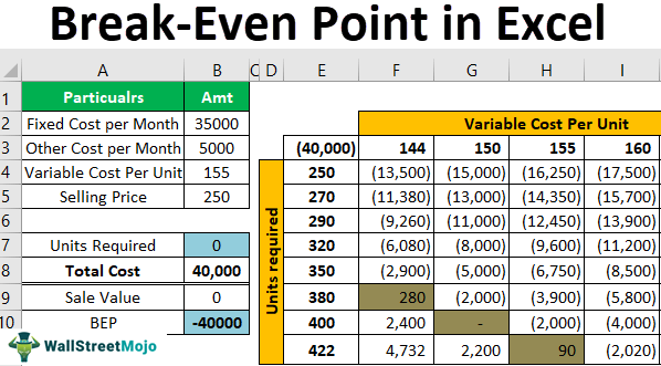
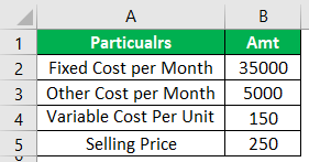
Ms. Sujit has undertaken a project of producing two-wheeler tires for two years. She has to spend ₹150 for each tire to make one tire. Her fixed cost per month is around ₹35,000, and another miscellaneous cost is ₹5,000 per month. She wants to sell each tire at ₹250 per tire.
Now, she wants to know what should be per month’s production to achieve the break-even point for her business.
We need to enter all these details given above into the worksheet area from this information. Below, we have listed the same.
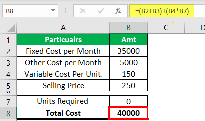
To find the break-even point, Ms. Suji must put in some formula to find the total cost.
Step 1: We should enter the formula as Total Cost = (Fixed + Other) + (Variable * Units).as Total Cost = (Fixed + Other) + (Variable * Units).
Step 2: To find the sales value, we must enter one more formula, i.e., Units * Sale Value.
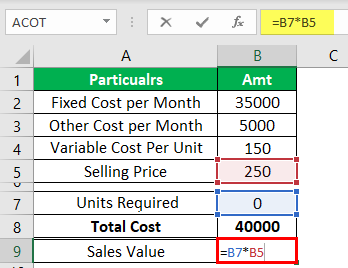
Step 3: Now, enter the formula for BEP, i.e., Sale Value – Total Cost.
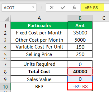
We need to find the number of tires Ms. Suji wants to produce to zero the break-even point value.
Step 4: We can find this by manually entering numbers in the “Units Required” cell. For example, now we will enter the value as 200 and see what the BEP is.
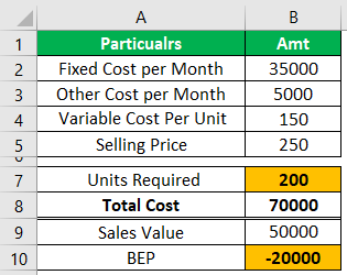
We got a break-even point of -20,000. Suppose we keep entering until we get the break-even point amount as 0. It will take a lot of time. But, we can use the “Goal Seek” tool to identify the number of units required to achieve the break-even point.
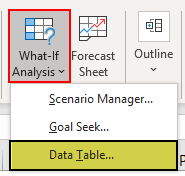
- Next, we will open the Goal Seek toolThe Goal Seek in excel is a “what-if-analysis” tool that calculates the value of the input cell (variable) with respect to the desired outcome. In other words, the tool helps answer the question, “what should be the value of the input in order to attain the given output?”
read more from the DATA tab.
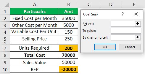
- For the first option of Goal Seek (Set cell), choose the cell BEP cell i.e., B10.
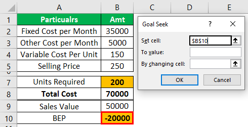
- The second option of “Goal Seek” is “To value.” We must enter zero because the “Set cell“(BEP cell) value should equal zero, which is our goal.
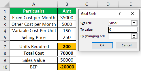
The final option is “By changing cell,”i.e., by changing the cell, we want to make the BEP cell (Set cell) value zero (To value).
- So, by finding the “Units Required” cell, we need to achieve the goal of BEP = 0, so we select cell B7.
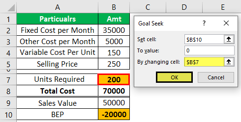
- Now, click on “OK.” As a result, “Goal Seek” will calculate to set the Excel break-even point cell to zero.
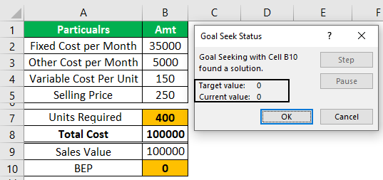
“Goal Seek” has found the “Units Required” to get the “BEP” as zero. So, Ms. Suji must produce 400 tires in a month to achieve the Break-Even PointThe break-even point (BEP) formula denotes the point at which a project becomes profitable. It is determined by dividing the total fixed costs of production by the contribution margin per unit of product manufactured. Break-Even Point in Units = Fixed Costs/Contribution Margin
read more.
Say thanks to “Goal Seek” Ms. Sujit!!!!
Example #2
Mr. Suji must know what units are needed for the different variable costs per unit. For this, we must create a table like the one below.
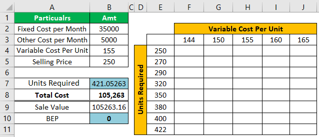
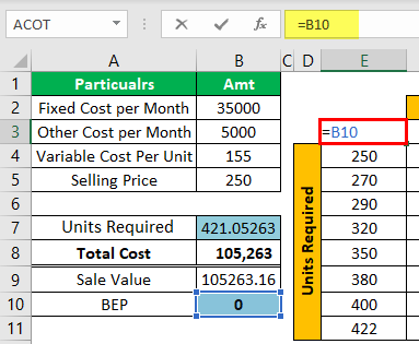
- For E3 cells, give a link to the BEP cell and B10 cell.
- Now, we must select the newly created table, as shown below.

- We will go to the “DATA” tab” What-If-Analysis in excelWhat-If Analysis in Excel is a tool for creating various models, scenarios, and data tables. It enables one to examine how a change in values influences the outcomes in the sheet. The three components of What-If analysis are Scenario Manager, Goal Seek in Excel, and Data Table in Excel.read more >>> Data Table.
- Now, we can see the below option.
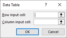
- For the “Row input cell,” we must choose the ” Variable Cost Per UnitVariable cost per unit refers to the cost of production of each unit produced, which changes when the output volume or the activity level changes. These are not committed costs as they occur only if there is production in the company.read more cell i.e., B4 cell.

We have selected the B4 cell because we have put different “Variable Cost Per Unit” row-wise in the newly created table. Accordingly, we have chosen the “Variable Cost Per Unit” as the “Row input cell.”
- For the “Column input cell,” we must choose the “Units Required” cell because unit data are shown in columns in the newly created table.

- Click on Ok; we may get the data table in ExcelA data table in excel is a type of what-if analysis tool that allows you to compare variables and see how they impact the result and overall data. It can be found under the data tab in the what-if analysis section.read more like the below one.
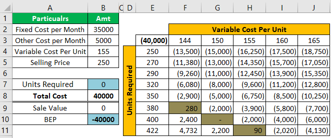
So, now we will look at the green-colored cells in the table. For example, if the variable cost per unit is 144, Ms. Suji must produce 380 tires monthly. Similarly, if the price is 150, she must make 400 tires. Finally, if the cost price is 155, then she must produce 422 tires in a month to achieve BEP.
Things to Remember
- BEP is a position of no profit and no loss.
- You need to consider all sorts of costs before calculating the break-even point in Excel.
- The moment cost and revenue are equal and are considered as BEP.
Recommended Articles
This article is a guide to Break-Even Point in Excel. Here, we discuss how to calculate break-even point in Excel, examples, and a downloadable Excel template. You may also look at these useful functions in Excel: –
- Create a Break-Even Chart
- How to do Break-Even Analysis?
- Examples of Breakeven Analysis
- Break-Even Sales
A revenue the company generates from selling the products or providing the services should cover the
fixed costs, variable costs, and leave a contribution margin. The point where the total operating
margin (the difference between the price of the product or service and the variable costs per item
or customer) covers the fixed costs is called a break-even point.
It is calculated by dividing the total fixed costs of the business by the price of the product or
service less than variable costs per item or customer. Break-even analysis through break-even chart
in Excel allows you to see the break-even point both in production units and in sales dollars and
estimate the required growth rate of sales:

The break-even point (or breakeven point, BEP) is the volume of
production and sales of products at which fixed costs will be offset by income. With the
production and sale of each subsequent unit of production, the company begins to make a marginal
profit:
![]()
where the Contribution margin for a product (or service) is the price minus the
variable costs.
For example, the first company has the following estimates in its business plan:

Using the above formulas, calculate the critical factors for the first business plan:

So, to cover all fixed costs, the first company managers should sell more than 6,667
units of the product or attract 6,667 customers to the service.
To create a graph for BEP in Excel, do the following:
- Create a chart of revenue and fixed, variable, and total costs
- Add the Break-even point
- Add the Break-even point lines
Create a chart of revenue and fixed, variable, and total costs
1. Prepare the data for the chart:
For this example, create a new data table:

where:
- the Fixed costs values are constant and equal to C3
(= $C$3), - the Variable costs values = Average variable costs * Units
(= $C$4 * A11), - the Total costs values = Fixed costs + Variable costs
(= B11 + C11), - the Revenue values = Unit sale price * Units
(= $C$5 * A11).
2. Select the costs and revenue data range (for this example,
A10:E20).
3. On the Insert tab, in the Charts group,
click on the Insert Scatter (X, Y) or Bubble Chart dropdown list:
 or Bubble Chart button in Excel 2016")
From the Insert Scatter (X, Y) or Bubble Chart dropdown list, select the
Scatter chart you prefer, for example, Scatter with Straight Line.
Excel creates the new chart for the data:

4. Make any other adjustments you desire:

Add the Break-even point
5. Add the new data:
To add the Break-even point to the chart, it is necessary to have both BEP in sales
volume and BEP in sales dollars values:
- The Break-even point in sales volume was calculated above (= C8),
- The Break-even point in sales dollars can be calculated using the following formula:

For this example:

6. Add the new data series to the chart:
6.1. Do one of the following:
- Under Chart Tools, on the Design tab, in the Data group, choose Select Data:

- Right-click in the chart area and choose Select Data… in the popup menu:


6.2. In the Select Data Source dialog box,
click the Add button.
6.3. In the Edit Series dialog box, choose the appropriate
values for the Series name and Series values fields:

7. Customize the Break-even point:
7.1. Right-click on any data series and select Format Data Series…
in the popup menu:

7.2. In the Format Data Series pane:
- If you can’t select the data series needed, click the arrow next to Series Options and
select the appropriate data series from the drop-down list. - On the Fill & Line tab, under Marker, in the Marker Options section,
select the Built-in option, the appropriate Type and Size:
Note: You can select any Fill and Border type as you wish.

8. Make any other adjustments you want:

Add the Break-even point lines
9. Select the data series for the Break-even point.
10. Under Chart Tools, on the Design tab,
in the Chart Layouts group. From the Add Chart Element dropdown list, select
Error Bars and then More Error Bars Options…:

Ensure that both Horizontal and Vertical Error Bars were added for the data series.
11. On the Format Error Bars pane for each error bar:
- On the Error Bars Options tab, in the Vertical Error Bar (or the
Horizontal Error Bar) section:- In the Direction group, select Minus,
- In the End Style group, select No Cap option,
- In the Error Amount group, select the Percentage option and then type
100%:

- On the Fill & Line tab, select the Solid line option, choose the
Color and Width, which you prefer:


Excel has many functions. Other than the normal tabulations, Excel can help you in various business calculations, among other things being Break-Even analysis.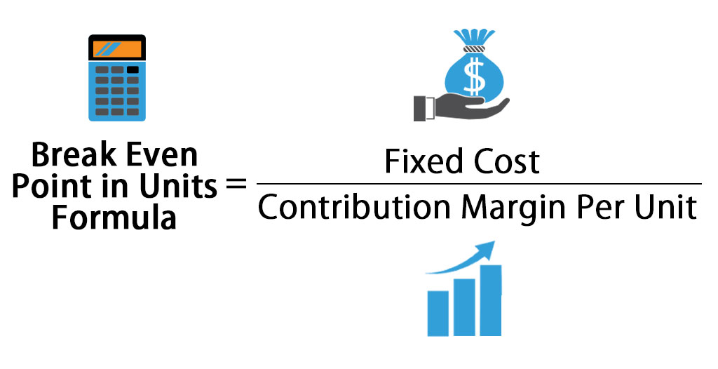
Table of Contents
- How to calculate Break-even analysis in Excel
- What is break-even analysis
- Break-Even Analysis Formula
- Contribution Margin
- Break-Even Point Formula in Excel
- Calculate break-even analysis with Goal-Seek
- Calculate Break-Even analysis in Excel with formula
- Calculate Break-Even analysis with chart
How to calculate Break-even analysis in Excel
Break-even analysis is the study of what amount of sales or units sold, a business requires to meet all its expenses without considering the profits or losses. It occurs after incorporating all fixed and variable costs of running the operations of the business.
In this post, we focus on how to use Excel to calculate Break-Even analysis.
What is break-even analysis
The break-even point of a business is where the volume of production and volume of sales of goods (or services) sales are equal. At this point, the business can cover all its costs. In the economic sense, the break-even point is the point of an indicator of a critical situation when profits and losses are zero. Usually, this indicator is expressed in quantitative or monetary units.
The lower the break-even point, the higher the financial stability and solvency of the firm.
Break-even analysis is critical in business planning and corporate finance because assumptions about costs and potential sales determine if a company (or project) is on track to profitability.
Break-even analysis helps organizations/companies determine how many units they need to sell before they can cover their variable costs and the portion of their fixed costs involved in producing that unit.
Break-Even Analysis Formula
To find the break-even, you need to know:
- Fixed costs
- Variable costs
- Selling price per unit
- Revenue
The break-even point occurs when:
Total Fixed Costs (TFC) + Total Variable Costs (TVC) = Revenue
- Total Fixed Costs are known items such as rent, salaries, utilities, interest expense, amortization, and depreciation.
- Total Variable Costs include things like direct material, commissions, billable labour, and fees, etc.
- Revenue is Unit Price * Number of units sold.
Contribution Margin
A key component of calculating the break-even analysis is understanding how much margin or profit is generated from sales after subtracting the variable costs to produce the units. This is called a contribution margin. Thus:
Contribution Marin = Selling Price — Variable Costs
Break-Even Point Formula in Excel
You can calculate the break-even point with regard to two things:
- Monetary equivalent: (revenue*fixed costs) / (revenue — variable costs).
- Natural units: fixed cost / (price — average variable costs).
Bearing this in mind, there are a number of ways to calculate the break-even point in Excel:
- Calculate break-even analysis with Goal-Seek Feature (a built-in Excel tool)
- Calculate break-even analysis with a formula
- Calculate break-even analysis with a chart
Calculate break-even analysis with Goal-Seek
Case: Supposing you want to sale a new product. You already know the per unit variable cost and the total fixed cost. You want to forecast the possible sales volumes, and use this to price the product. Here is what you need to do.
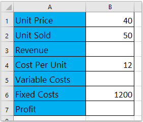
- Make an easy table, and fill in items/data.

- In Excel, enter proper formulas to calculate the revenue, the variable cost, and profit.
- Revenue = Unit Price x Unit Sold
- Variable Costs = Cost per Unit x Unit Sold
- Profit = Revenue – Variable Cost – Fixed Cost
- Use these formulas for your calculation.

- On your Excel document, Click the Data > What-If Analysis > select Goal Seek.

- When you open the Goal Seek dialogue box, do as follows:
- Specify the Set Cell as the Profit cell; in this case, it is Cell B7;
- Specify the To value as 0;
- Specify the By changing cell as the Unit Price cell, in this case; it is Cell B1.
- Click the OK button

- The Goal Seek Status dialogue box will pop up. Please click the OK to apply it.


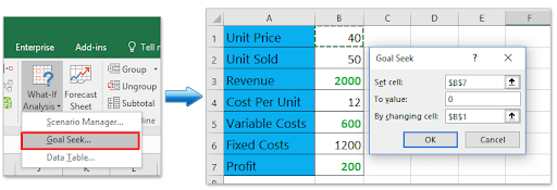

Goal Seek will change the Unit Price from 40 to 31.579, and the net profit changes to 0. Remember, at break-even point profit is 0. Therefore, if you forecast the sales volume at 50, the Unit price cannot be less than 31.579. Otherwise, you will incur a loss.
Calculate Break-Even analysis in Excel with formula
You can also calculate the break-even on point on Excel using the formula. Here’s how:
- Make an easy table, and fill items/data. In this scenario, we assume we know the units sold, cost per unit, fixed cost, and profit.

- Use the formula for calculating the missing items/data.
- Type the formula = B6/B2+B4 into Cell B1 to calculating the Unit Price,
- Type the formula = B1*B2 into Cell B3 to calculate the revenue,
- Type the formula = B2*B4 into Cell B5 to calculate variable costs.

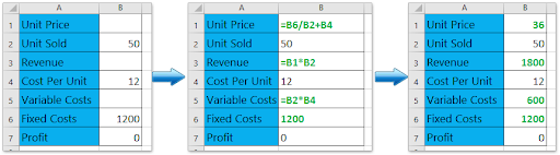
Note: if you change any value, for instance, the value of the forecasted unit sold or cost per unit or fixed costs, the value of the unit price will change automatically.
Calculate Break-Even analysis with chart
If you have already recorded your sales data, you can calculate the break-even point with a chart in Excel. Here’s how:
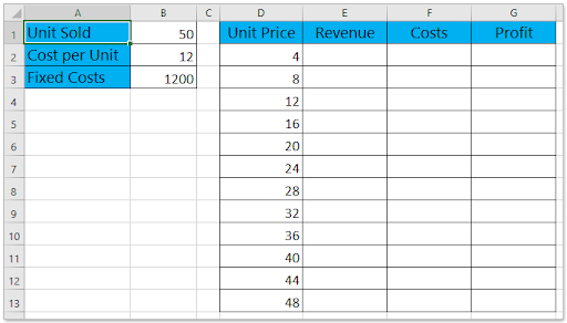
- Prepare a sales table. In this case, we assume we already know the sold units, cost per unit, and fixed costs, and we assume they’re fixed. We need to make the break-even analysis by unit price.

- Finish the calculations of the table using the formula

- In the Cell E2, type the formula =D2*$B$1 then drag its AutoFill Handle down to Range E2: E13;
- In the Cell F2, type the formula =D2*$B$1+$B$3, then drag its AutoFill Handle down to Range F2: F13;
- In the Cell G2, type the formula =E2-F2, then drag its AutoFill Handle down to the Range G2: G13.
- This calculation should give you the source data of the break-even chart.

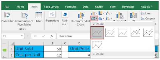
- On the Excel table, select the Revenue column, Costs column, and Profit column simultaneously, and then click Insert > Insert Line or Area Chart > Line. This will create a line chart.

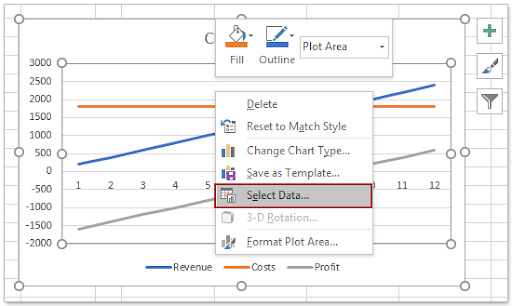
- Next, right-click the chart. From the context menu, click Select Data.

- In the Select Data Source dialogue box, do the following:
- In the Legend Entries (Series) section, select one of the series as you need. In this case, we select the Revenue series;
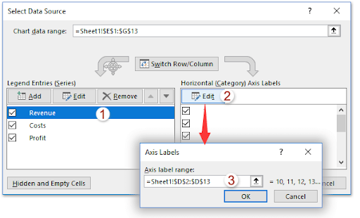
- Click the Edit button in the Horizontal (Category) Axis Labels section;
- A dialogue box will pop out with the name Axis Labels. In the box specify the Unit Price column (except the column name) as axis label range;
- Click OK > OK to save the changes.

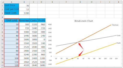
- A chat will be created, called the break-even chart. You will notice the break-even point, which occurs when the price equals to 36.

- Similarly, you can create a break-even chart to analyze the break-even point by sold units:


You’re done. Its that simple.
Wrapping up
You can tweak the appearance of your data through the data section and design tools. Excel allows you to do many other things with the data.
If you’re looking for more guides or want to read more tech-related articles, consider subscribing to our newsletter. We regularly publish tutorials, news articles, and guides to help you.
Recommended Reads
- 13 Excel Tips and Tricks to Make You Into a Pro
- Top 51 Excel Templates to Boost Your Productivity
- Microsoft Office Excel cheat sheet
- The Most Useful Excel Keyboard Shortcuts
- What Version of Excel Do I Have?
Содержание
- Точка безубыточности
- Расчет точки безубыточности
- Создание графика
- Вопросы и ответы

Одним из базовых экономических и финансовых расчетов деятельности любого предприятия является определение его точки безубыточности. Данный показатель указывает на то, при каком объеме производства деятельность организации будет рентабельной и она не потерпит убытков. Программа Excel предоставляет пользователям инструменты, которые в значительной мере позволяют облегчить определение данного показателя и отобразить полученный результат графически. Давайте выясним, как ими пользоваться при нахождении точки безубыточности на конкретном примере.
Точка безубыточности
Суть точки безубыточности состоит в том, чтобы найти величину объема производства, при котором размер прибыли (убытков) будет равен нулю. То есть, при увеличении объемов выпуска продукции предприятие начнет показывать прибыльность деятельности, а при снижении – убыточность.
При расчете точки безубыточности нужно понимать, что все затраты предприятия условно можно разделить на постоянные и переменные. Первая группа не зависит от объема производства и носит неизменный характер. Сюда можно включить объем заработной платы административному персоналу, стоимость аренды помещений, амортизацию основных средств и т.д. А вот переменные затраты прямо зависят от объема производимой продукции. Сюда, в первую очередь, следует относить расходы на приобретение сырья и энергоносителей, поэтому данный вид затрат принято указывать на единицу произведенной продукции.
Именно с соотношением постоянных и переменных затрат связано понятие точки безубыточности. До достижения определенного объема производства постоянные затраты составляют существенную величину в общей себестоимости продукции, но с увеличением объема их удельный вес падает, а значит и падает себестоимость единицы произведенного товара. На уровне точки безубыточности затраты на производство и доход от реализации товаров или услуг равны. При дальнейшем увеличении объема производства предприятие начинает получать прибыль. Вот поэтому так важно определить объемы производства, при которых достигается точка безубыточности.
Расчет точки безубыточности
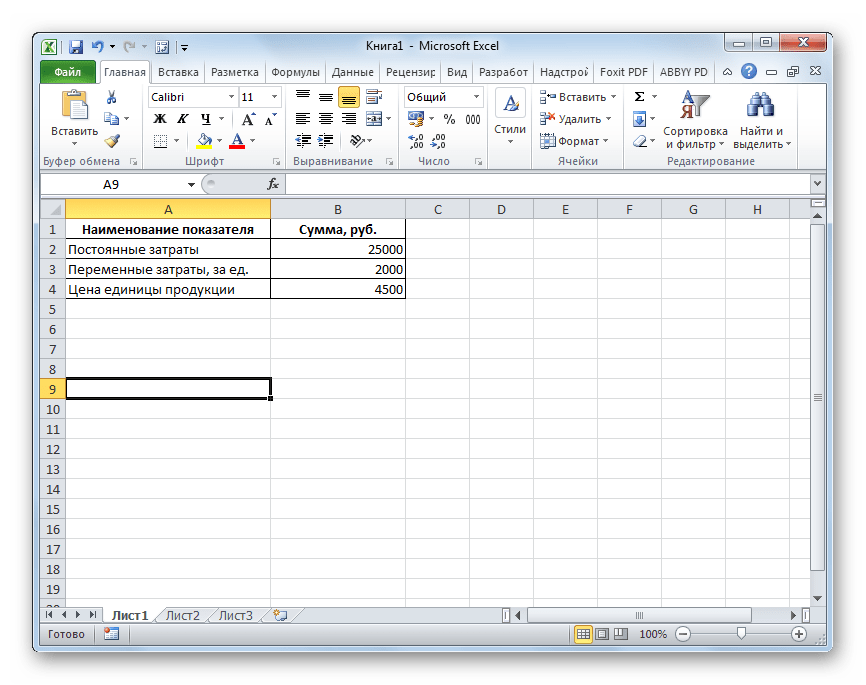
Рассчитаем этот показатель при помощи инструментов программы Excel, а также построим график, на котором отметим точку безубыточности. Для проведения расчетов будем использовать таблицу, в которой указаны такие исходные данные деятельности предприятия:
- Постоянные затраты;
- Переменные затраты на единицу продукции;
- Цена реализации единицы продукции.
Итак, произведем расчет данных, опираясь на значения, указанные в таблице на изображении ниже.
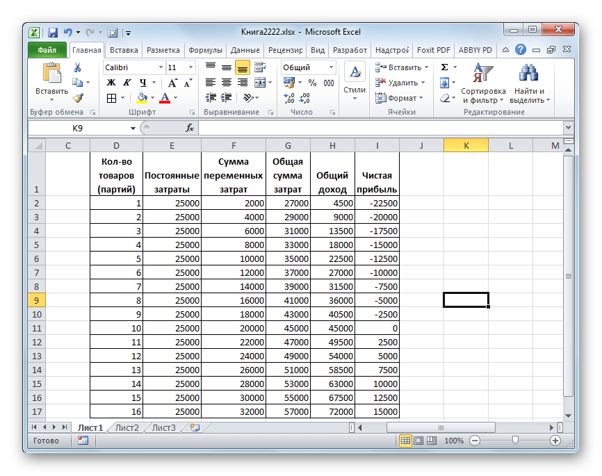
- Строим новую таблицу, основываясь на таблице-исходнике. Первая колонка новой таблицы – это количество товаров (или партий), изготовленных предприятием. То есть, номер строки будет обозначать количество изготовленных товаров. Во втором столбце находится величина постоянных затрат. Она у нас во всех строках будет равна 25000. В третьем столбце – общая сумма переменных затрат. Эта величина для каждой строки будет равна произведению количество товаров, то есть, содержимого соответствующей ячейки первого столбца, на 2000 рублей.
В четвертом столбце расположена общая сумма расходов. Она составляет сумму ячеек соответствующей строки второго и третьего столбца. В пятом столбце расположен общий доход. Он рассчитывается путем умножения цены единицы товара (4500 р.) на совокупное их количество, которое указано в соответствующей строке первого столбца. В шестом столбце размещен показатель чистой прибыли. Он вычисляется путем вычитания из общего дохода (столбец 5) суммы затрат (столбец 4).
То есть, в тех строках, у которых в соответствующих ячейках последнего столбца будет отрицательное значение, наблюдается убыток предприятия, в тех, где показатель будет равен 0 – достигнута точка безубыточности, а в тех, где он будет положительным – отмечается прибыль в деятельности организации.
Для наглядности заполняем 16 строк. В первом столбце будет число товаров (или партий) от 1 до 16. Последующие столбцы заполняются по тому алгоритму, который был указан выше.
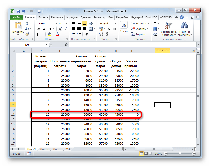
- Как видим, точка безубыточности достигается на 10 товаре. Именно тогда общий доход (45000 рублей) равен совокупным расходам, а чистая прибыль равна 0. Уже начиная с выпуска одиннадцатого товара предприятие показывает прибыльную деятельность. Итак, в нашем случае точка безубыточности в количественном показателе составляет 10 единиц, а в денежном – 45000 рублей.
Создание графика
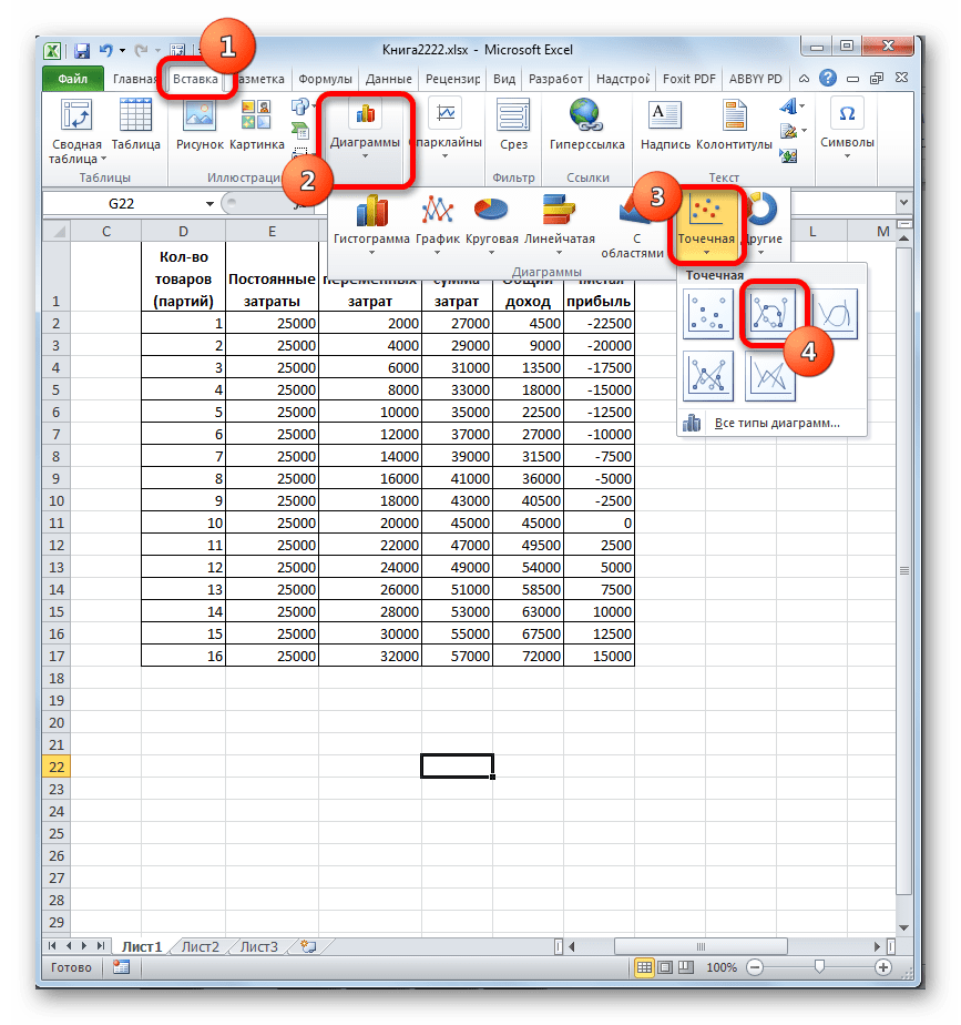
После того, как была создана таблица, в которой рассчитана точка безубыточности, можно создать график, где эта закономерность будет отображена визуально. Для этого нам придется построить диаграмму с двумя линиями, которые отражают затраты и доходы предприятия. На пересечении этих двух линий и будет находиться точка безубыточности. По оси X данной диаграммы будет располагаться количество единиц товара, а по оси Y денежные суммы.
- Переходим во вкладку «Вставка». Жмем на значок «Точечная», который размещается на ленте в блоке инструментов «Диаграммы». Перед нами открывается выбор нескольких типов графиков. Для решения нашей задачи вполне подойдет тип «Точечная с гладкими кривыми и маркерами», поэтому щелкаем по данному элементу списка. Хотя, при желании, можно использовать и некоторые другие виды диаграмм.
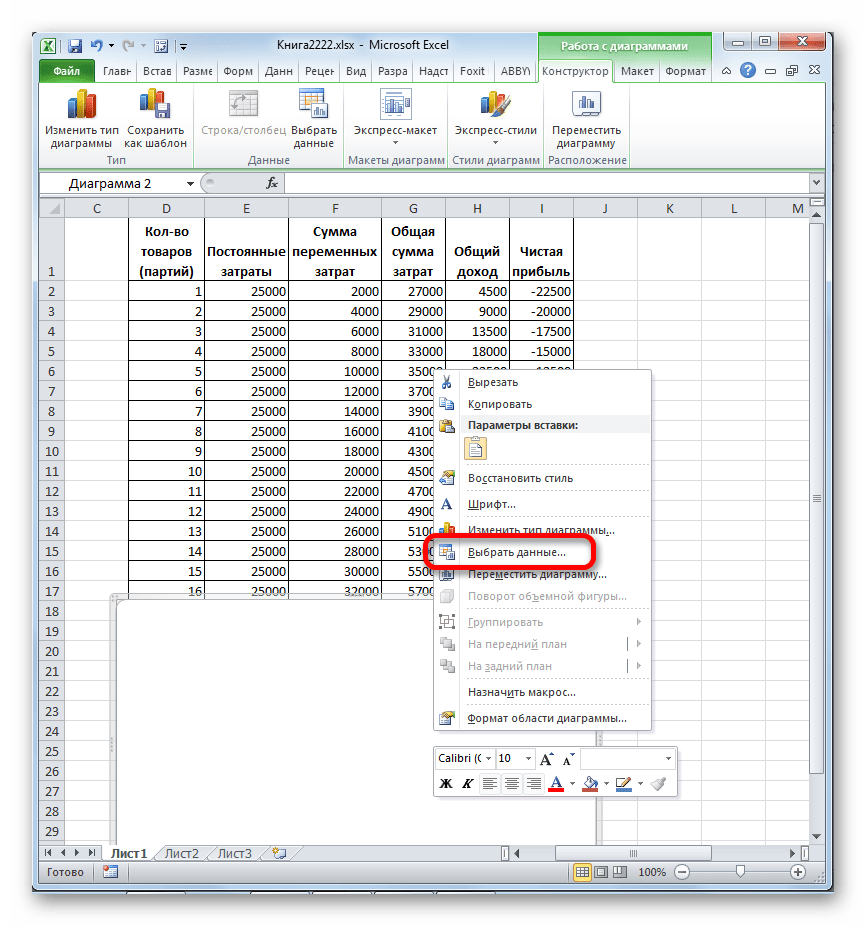
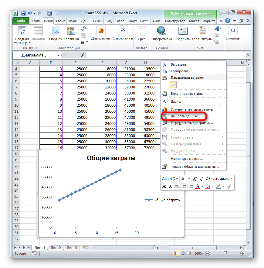
- Перед нами открывается пустая область диаграммы. Следует заполнить её данными. Для этого кликаем правой кнопкой мыши по области. В активировавшемся меню выбираем позицию «Выбрать данные…».
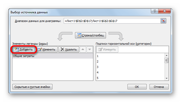
- Происходит запуск окна выбора источника данных. В его левой части есть блок «Элементы легенды (ряды)». Жмем на кнопку «Добавить», которая размещена в указанном блоке.
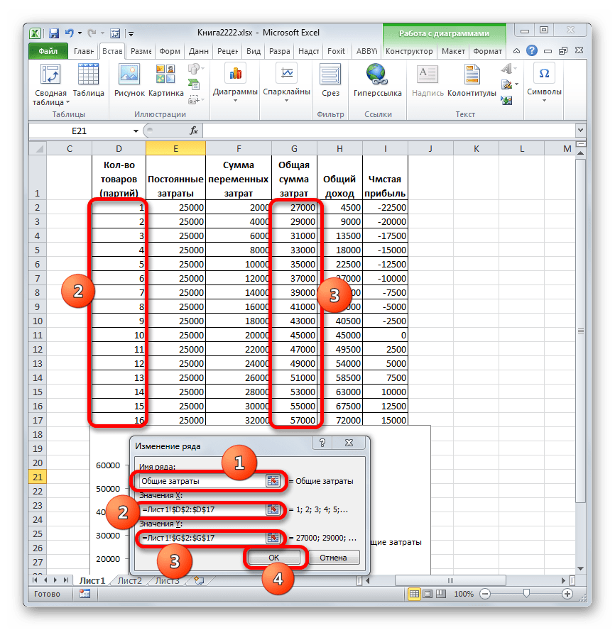
- Перед нами открывается окно под названием «Изменение ряда». В нем мы должны указать координаты размещения данных, на основе которых будет строиться один из графиков. Для начала построим график, в котором отображались бы общие затраты. Поэтому в поле «Имя ряда» вводим с клавиатуры запись «Общие затраты».
В поле «Значения X» указываем координаты данных, расположенных в столбце «Количество товаров». Для этого устанавливаем курсор в данное поле, а затем, произведя зажим левой кнопки мыши, выделяем соответствующий столбец таблицы на листе. Как видим, после указанных действий его координаты отобразятся в окне изменения ряда.
В следующем поле «Значения Y» следует отобразить адрес столбца «Общая сумма затрат», в котором расположены нужные нам данные. Действуем по вышеуказанному алгоритму: ставим курсор в поле и выделяем с зажатой левой кнопкой мыши ячейки нужного нам столбца. Данные будут отображены в поле.
После того, как указанные манипуляции были проведены, жмем на кнопку «OK», размещенную в нижней части окна.
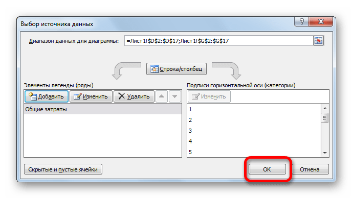
- После этого автоматически происходит возврат к окну выбора источника данных. В нем также нужно нажать на кнопку «OK».
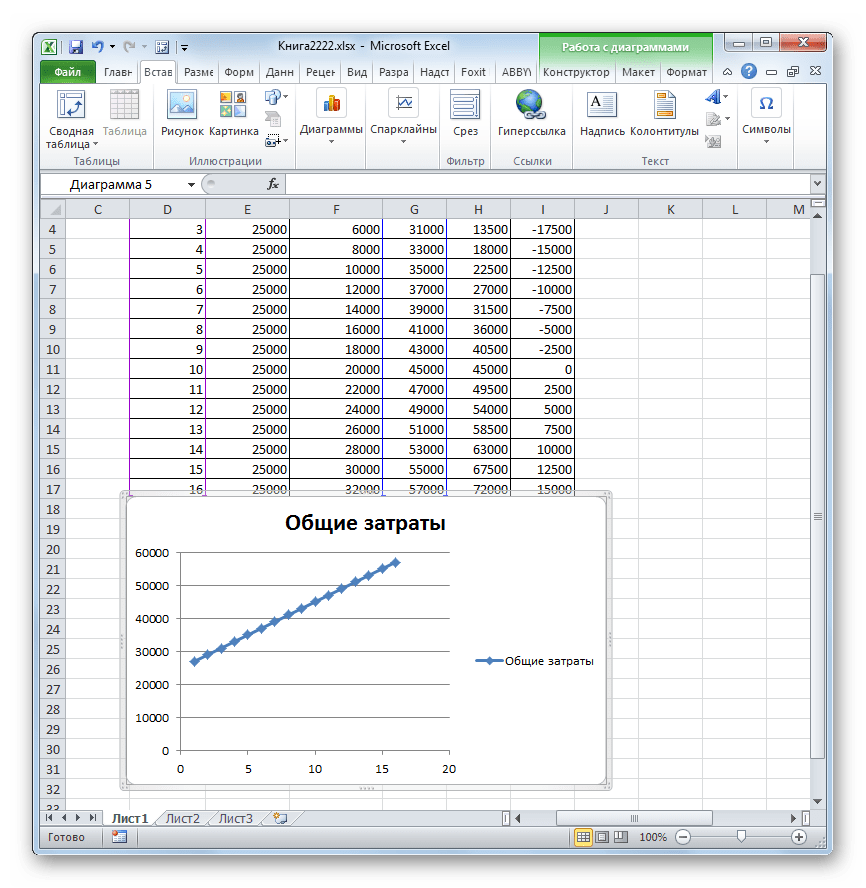
- Как видим, вслед за этим на листе отобразится график общих затрат предприятия.
- Теперь нам предстоит построить линию общего дохода предприятия. Для этих целей кликаем правой кнопкой мыши по области диаграммы, на которой уже размещена линия общих затрат организации. В контекстном меню выбираем позицию «Выбрать данные…».
- Снова запускается окно выбора источника данных, в котором опять нужно нажать на кнопку «Добавить».
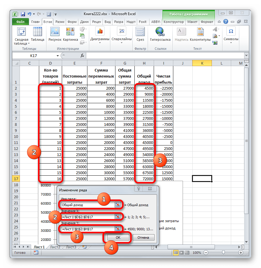
- Открывается небольшое окошко изменения ряда. В поле «Имя ряда» на этот раз пишем «Общий доход».
В поле «Значения X» следует внести координаты столбца «Количество товаров». Делаем это тем же способом, который мы рассматривали при построении линии общих затрат.
В поле «Значения Y», точно так же указываем координаты столбца «Общий доход».
После выполнения этих действий жмем на кнопку «OK».
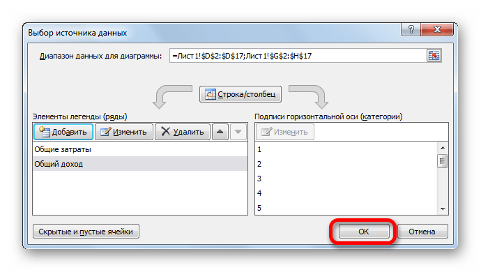
- Окно выбора источника данных закрываем, нажав на кнопку «OK».
- После этого линия общего дохода отобразится на плоскости листа. Именно точка пересечения линий общего дохода и общих затрат будет являться точкой безубыточности.


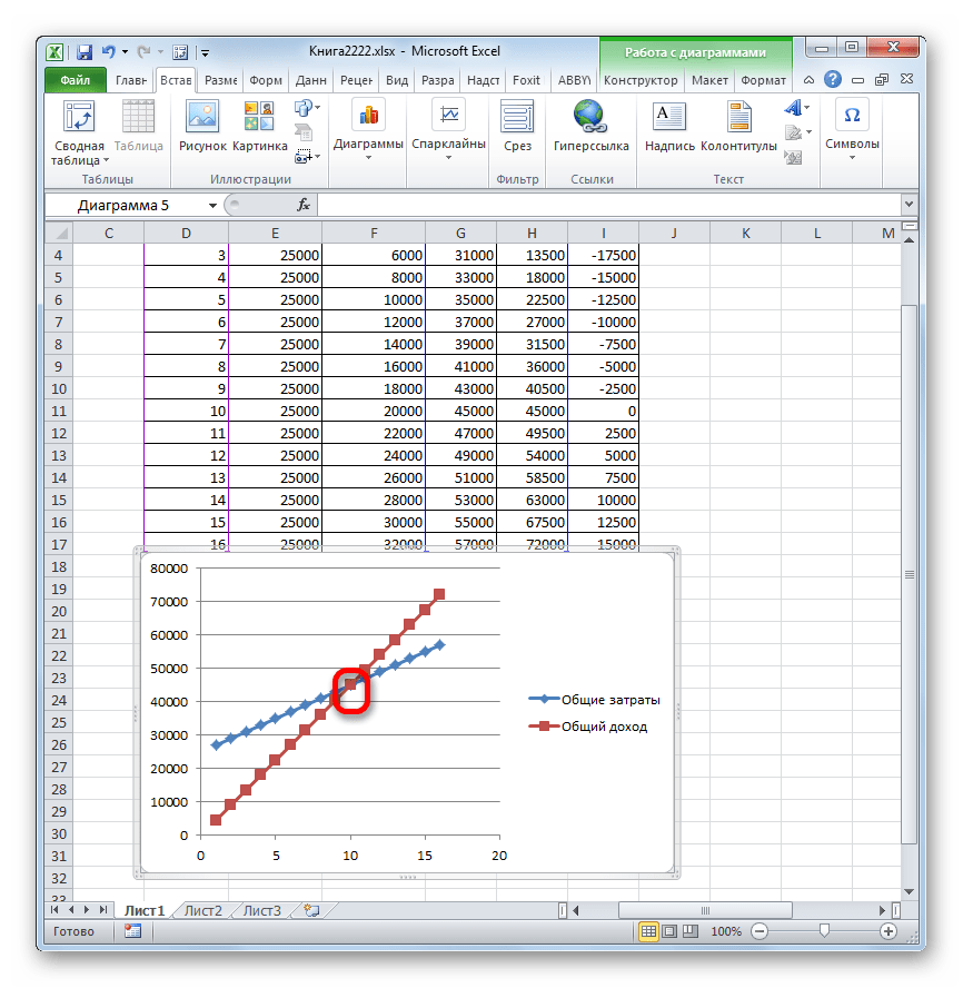
Таким образом, мы достигли целей создания данного графика.
Урок: Как сделать диаграмму в Экселе
Как видим, нахождение точки безубыточности основано на определении величины объема выпускаемой продукции, при котором общие затраты будут равны общим доходам. Графически это отражается в построении линий затрат и доходов, и в нахождении точки их пересечения, которая и будет являться точкой безубыточности. Проведение подобных расчетов является базовым при организации и планировании деятельности любого предприятия.
Еще статьи по данной теме: