
Create a box and whisker chart
-
Select your data—either a single data series, or multiple data series.
(The data shown in the following illustration is a portion of the data used to create the sample chart shown above.)

-
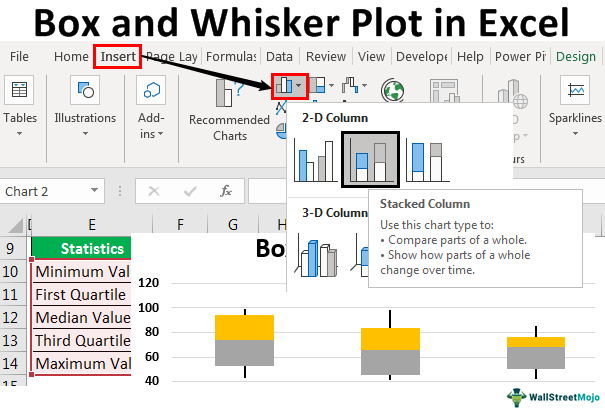
In Excel, click Insert > Insert Statistic Chart >Box and Whisker as shown in the following illustration.
Important: In Word, Outlook, and PowerPoint, this step works a little differently:
-
On the Insert tab, in the Illustrations group, click Chart.
-
In the Insert Chart dialog box, on the All Charts tab, click Box & Whisker.
-

Tips:
-
Use the Design and Format tabs to customize the look of your chart.
-
If you don’t see these tabs, click anywhere in the box and whisker chart to add the Chart Tools to the ribbon.

Change box and whisker chart options
-
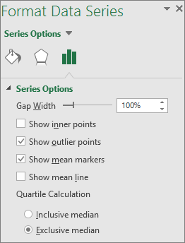
Right-click one of the boxes on the chart to select that box and then, on the shortcut menu, click Format Data Series.
-
In the Format Data Series pane, with Series Options selected, make the changes that you want.
(The information in the chart following the illustration can help you make your choices.)
Series option
Description
Gap width
Controls the gap between the categories.
Show inner points
Displays the data points that lie between the lower whisker line and the upper whisker
line.Show outlier points
Displays the outlier points that lie either below the lower whisker line or above the upper whisker
line.Show mean markers
Displays the mean marker of the selected series.
Show mean line
Displays the line connecting the means of the boxes in the selected series.
Quartile Calculation
Choose a method for median calculation:
-
Inclusive median The median is included in the calculation if N (the number of values in the data) is odd.
-
Exclusive median The median is excluded from the calculation if N (the number of values in the data) is odd.
-
Create a box and whisker chart
-
Select your data—either a single data series, or multiple data series.
(The data shown in the following illustration is a portion of the data used to create the sample chart shown above.)
-
On the ribbon, click the Insert tab, and then click
(the Statistical chart icon), and select Box and Whisker.
 (the Statistical chart icon), and select Box and Whisker.
Tips:
-
Use the Chart Design and Format tabs to customize the look of your chart.
-
If you don’t see the Chart Design and Format tabs, click anywhere in the box and whisker chart to add them to the ribbon.
Change box and whisker chart options
-
Click one of the boxes on the chart to select that box and then in the ribbon click Format.
-
Use the tools in the Format ribbon tab to make the changes that you want.
A box and whisker plot in Excel is an exploratory chart that shows statistical highlights and data set distribution. This chart is used to indicate a five-number summary of the data. These five-number summaries are “Minimum Value, First Quartile Value, Median Value, Third Quartile Value, and Maximum Value.” Using these statistics, we display the distribution of the dataset. Below is a detailed explanation of these statistics.
For example, suppose you have a data set and need to show data distribution into quartiles, highlighting the mean and outliers. In addition, we may use a box and whisker chart to compare and analyze statistically, e.g., medical results, test scores, etc.
- Minimum Value: The minimum or smallest value from the dataset.
- First Quartile Value: The value between the minimum and median values.
- Median Value: Median is the middle value of the dataset.
- Third Quartile Value: The value between the median and maximum values.
- Maximum Value: The highest value of the dataset.
One of the problems with the box and whisker plot chart is that it is not familiar to use outside the statistical world may be due to a lack of awareness among its users in the Excel community. On the other hand, it could also be the reason for the lack of knowledge on interpretation of the chart.
Table of contents
- Excel Box and Whisker Plot
- How to Create a Box and Whisker Plot in Excel?
- Recommended Articles
How to Create a Box and Whisker Plot in Excel?
You can download this Box and Whisker Plot Excel Template here – Box and Whisker Plot Excel Template
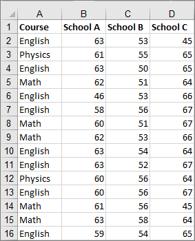
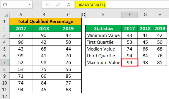
For a better explanation of the box and whisker plot chart with Excel, we are taking the sample data of the examination of the previous 3 years. Below is some data.
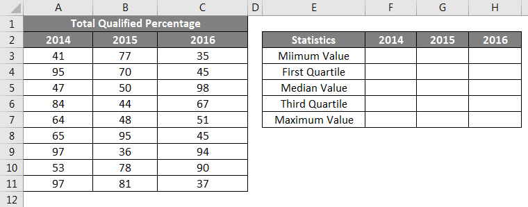
We must first calculate the five statistics numbers from the above data or each year for each year. Five numbers of statistics are “Minimum Value, First Quartile Value, Median Value, Third Quartile Value, and Maximum Value.”
For this, create a table like the one below.
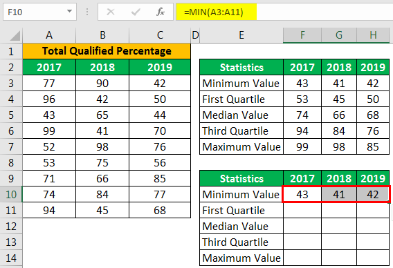
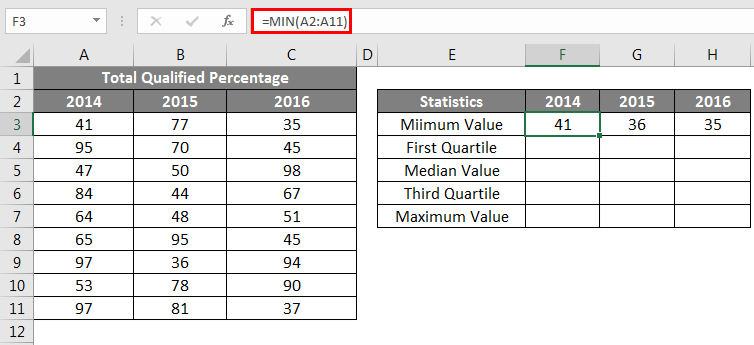
First, we must calculate the “Minimum Value” for each year.
Then, we need to calculate the “First Quartile Value.”

Then, we will calculate the “Median Value.”
Next, we should calculate the “Third Quartile” value.
Then, the final statistics are the “Maximum Value” from the loss.
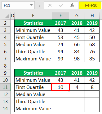
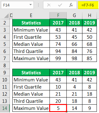
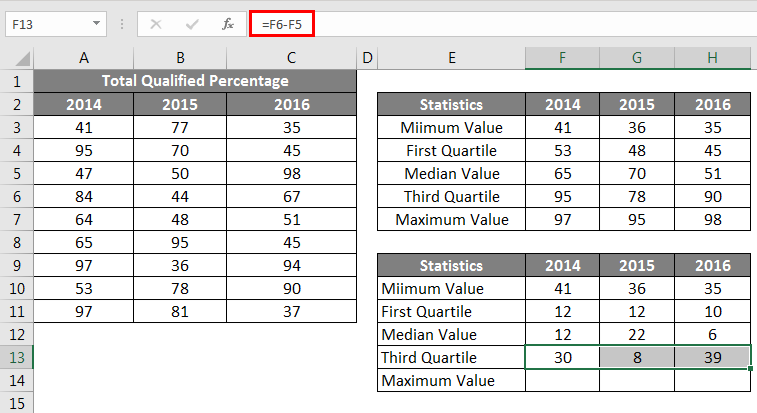
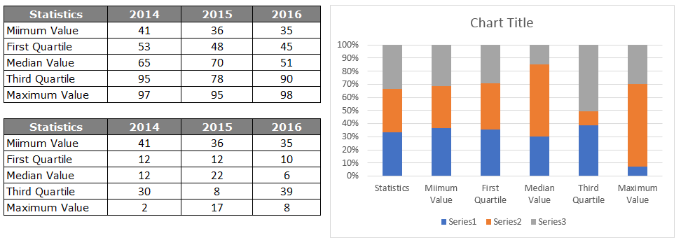
Now, we have completed performing the five number statistics. However, we need to create one more similar table to find the differences. We need to retain only the minimum value as it is.
To find the difference for “First Quartile” is First Quartile – Minimum Value.”
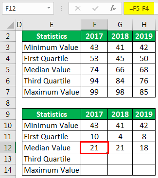
To find the difference for “Median Value” is “Median Value – First Quartile.”
To find the difference for the “Third Quartile” is “Third Quartile – Median Value.”
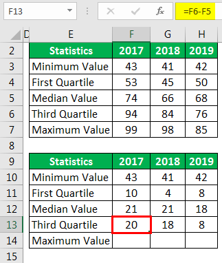
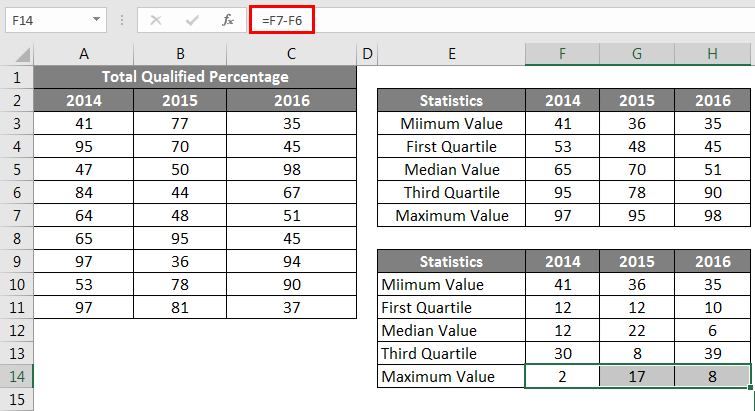
To find the difference for “Maximum Value” is the “Maximum Value – Third Quartile.”
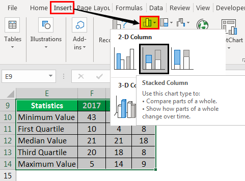
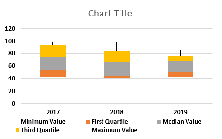
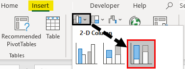
Our final table is ready to insert a chart for the data. Now select the data to Insert Stacked Column Chart in ExcelA stacked column chart in Excel is a column chart where multiple series of the data representation of various categories are stacked over each other. The stacked series are vertical.read more.
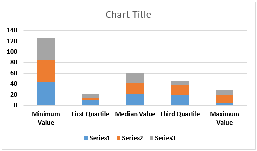
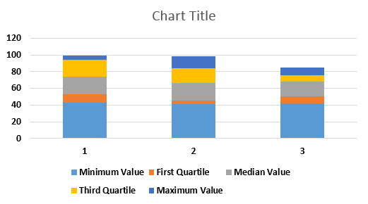
Now, we will have a chart like the one below.
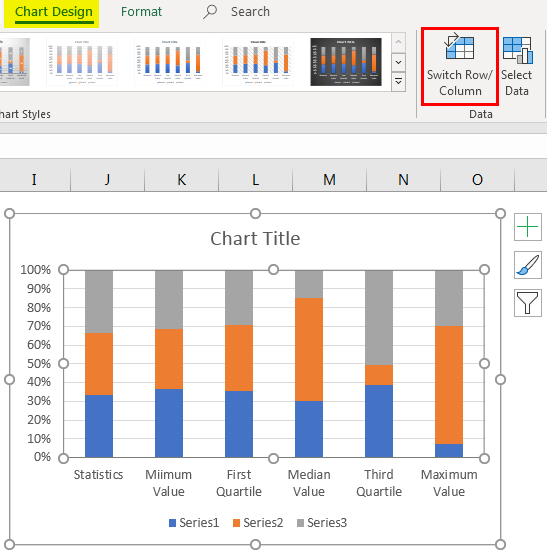
We must select the data under the “Design Ribbon” and select “Switch Row / Column.”
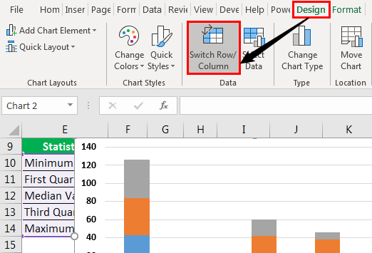
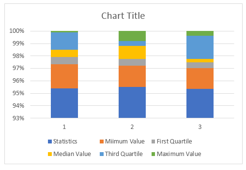
Our rows and column data in the chart are switched, so our modified chart may look as follows.
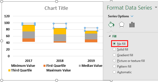
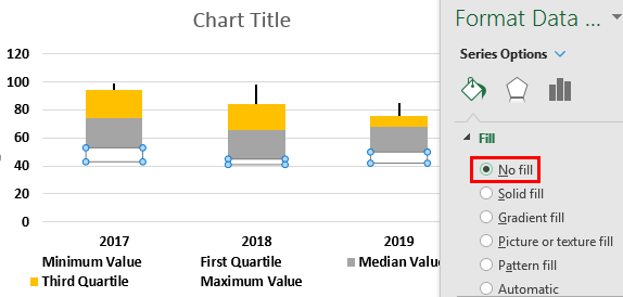
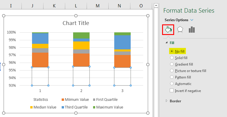
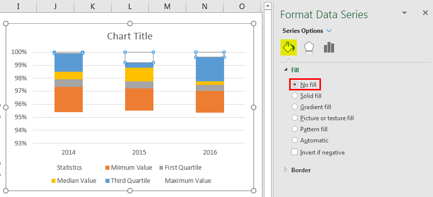
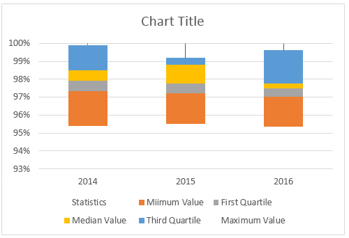
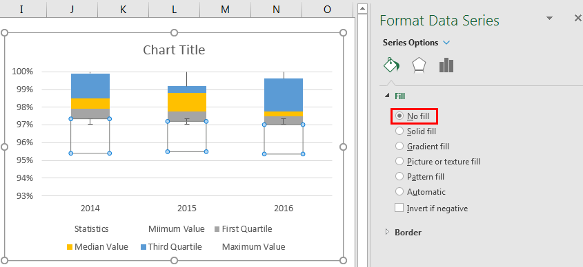
We will select the bottom-placed bar, i.e., the blue-colored bar, and make the fill “No Fill.”
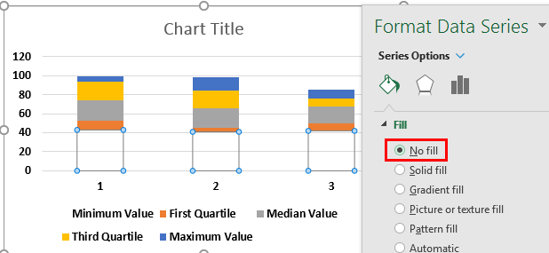
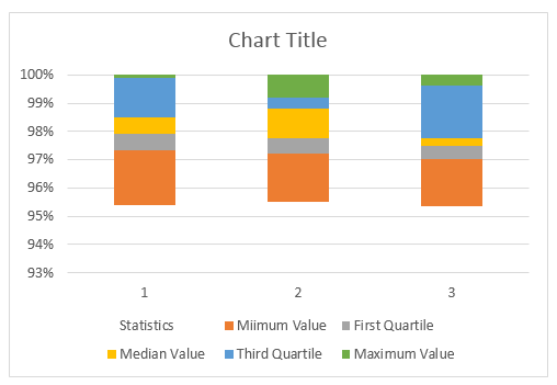
Therefore, now, the bottom bar is not visible in the chart.

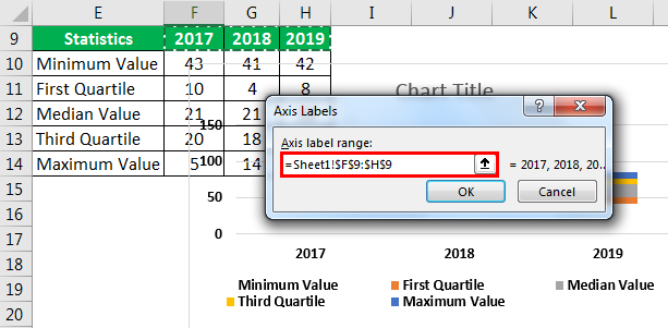
Change the horizontal axis labels to 2017, 2018, and 2019.
The box chart is ready. Next, we need to create a whisker for these boxes. Now, selecting the top bar of the chart will make no fill.
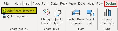
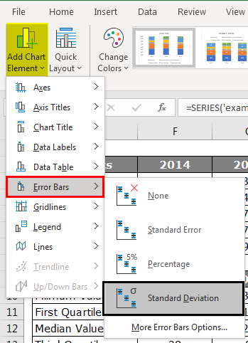
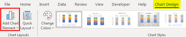
We will go to the “Design” tab and “Add Chart Elements” by selecting the same bar.
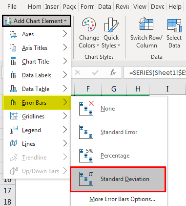
Under “Add Chart Elements,” click on “Error Bars > Standard Deviation.”
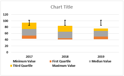
Now, we have whisker lines on top of the bars.
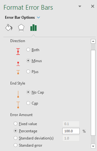
Now, select newly inserted Whisker lines and click “Ctrl + 1” to open the format data series option to the right of the chart.
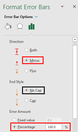
Under Format Error BarsThe error bars in Excel are the graphical representation that helps visualize the variability of data given on a two-dimensional framework. It helps indicate the estimated error or uncertainty to give a general sense of how accurate a measurement is.read more” we need to make the following changes.
>>> Direction “Minus”
>>> End Style “No Cap”.
>>> Error Amount > Percentage > 100%.
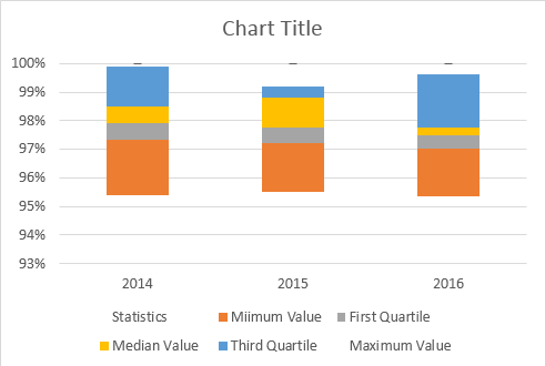
Now, the whisker lines will look as shown below:
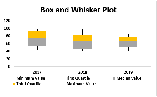
We will select the bottom-placed bar and fill in “No Fill.”
Then, we would follow the same steps as above to add the whisker line at the bottom of the box. So now our box and whisker Excel chart will look as follows.
Recommended Articles
This article is a guide to Box and Whisker Plot in Excel. We discuss how to create a box and whisker plot chart in Excel, examples, and an Excel template. You may learn more about Excel from the following articles: –
- Box Plot in Excel
- Make Scatter Plots in Excel
- Create Dot Plots in Excel
- Create 3D Scatter Plot in Excel
Simple Box and Whisker Plot | Outliers | Box Plot Calculations
This example teaches you how to create a box and whisker plot in Excel. A box and whisker plot shows the minimum value, first quartile, median, third quartile and maximum value of a data set.
Simple Box and Whisker Plot
1. For example, select the range A1:A7.

Note: you don’t have to sort the data points from smallest to largest, but it will help you understand the box and whisker plot.
2. On the Insert tab, in the Charts group, click the Statistic Chart symbol.

3. Click Box and Whisker.

Result:

Explanation: the middle line of the box represents the median or middle number (8). The x in the box represents the mean (also 8 in this example). The median divides the data set into a bottom half {2, 4, 5} and a top half {10, 12, 15}. The bottom line of the box represents the median of the bottom half or 1st quartile (4). The top line of the box represents the median of the top half or 3rd quartile (12). The whiskers (vertical lines) extend from the ends of the box to the minimum value (2) and maximum value (15).
Outliers
1. For example, select the range A1:A11.

Note: the median or middle number (8) divides the data set into two halves: {1, 2, 2, 4, 5} and {10, 12, 15, 18, 35}. The 1st quartile (Q1) is the median of the first half. Q1 = 2. The 3rd quartile (Q3) is the median of the second half. Q3 = 15.
2. On the Insert tab, in the Charts group, click the Statistic Chart symbol.
3. Click Box and Whisker.
Result:

Explanation: the interquartile range (IQR) is defined as the distance between the 1st quartile and the 3rd quartile. In this example, IQR = Q3 — Q1 = 15 — 2 = 13. A data point is considered an outlier if it exceeds a distance of 1.5 times the IQR below the 1st quartile (Q1 — 1.5 * IQR = 2 — 1.5 * 13 = -17.5) or 1.5 times the IQR above the 3rd quartile (Q3 + 1.5 * IQR = 15 + 1.5 * 13 = 34.5). Therefore, in this example, 35 is considered an outlier. As a result, the top whisker extends to the largest value (18) within this range.
4. Change the last data point to 34.

Result:

Explanation: all data points are between -17.5 and 34.5. As a result, the whiskers extend to the minimum value (2) and maximum value (34).
Box Plot Calculations
Most of the time, you can cannot easily determine the 1st quartile and 3rd quartile without performing calculations.
1. For example, select the even number of data points below.

2. On the Insert tab, in the Charts group, click the Statistic Chart symbol.
3. Click Box and Whisker.
Result:

Explanation: Excel uses the QUARTILE.EXC function to calculate the 1st quartile (Q1), 2nd quartile (Q2 or median) and 3rd quartile (Q3). This function interpolates between two values to calculate a quartile. In this example, n = 8 (number of data points).
4. Q1 = 1/4*(n+1)th value = 1/4*(8+1)th value = 2 1/4th value = 4 + 1/4 * (5-4) = 4 1/4. You can verify this number by using the QUARTILE.EXC function or looking at the box and whisker plot.

5. Q2 = 1/2*(n+1)th value = 1/2*(8+1)th value = 4 1/2th value = 8 + 1/2 * (10-8) = 9. This makes sense, the median is the average of the middle two numbers.

6. Q3 = 3/4*(n+1)th value = 3/4*(8+1)th value = 6 3/4th value = 12 + 3/4 * (15-12) = 14 1/4. Again, you can verify this number by using the QUARTILE.EXC function or looking at the box and whisker plot.

Excel 2016, как известно, обогатился новыми типами диаграмм. Одна такая, которая диаграмма Парето, уже была показана. В этот раз рассмотрим другую, чисто статистическую. Называется «ящик с усами» или «коробчатая диаграмма» (box-and-whiskers plot или boxplot).
Раньше я такие видел только в специализированных ПО, типа STATISTICA, и для того, чтобы нарисовать подобную диаграмму в Excel, нужно было изрядно потрудиться. Теперь она есть в стандартном наборе Excel.

Зачем нужна такая диаграмма? Допустим, есть выборка для анализа. А еще лучше несколько выборок, которые нужно сравнить. Для этого рассчитывают различные показатели. Однако к любому расчету всегда хочется добавить наглядности, чтобы мозг перешел в режим образного представления, а не довольствовался сухими цифрами и формулами. Поэтому основные характеристики ловко изображают на рисунке. Отличным вариантом будет как раз диаграмма «ящик с усами».

На рисунке показан формат по умолчанию. Как видно, сравниваются две выборки путем изображения двух «ящиков с усами».
Что здесь что обозначает?
Крестик посередине – это среднее арифметическое по выборке.
Линия чуть выше или ниже крестика – медиана.
Нижняя и верхняя грань прямоугольника (типа ящика) соответствует первому и третьему квартилю (значениям, отделяющим ¼ и ¾ выборки). Расстояние между 1-м и 3-м квартилем – это межквартильный размах (или расстояние).
Горизонтальные черточки на конце «усов» – максимальное и минимальное значение (без учета выбросов, см. ниже).
Отдельные точки – это выбросы, которые показываются по умолчанию. Если значение выходит за пределы 1,5 межквартильных размаха от ближайшего квартиля, то оно считается аномальным. Их можно скрыть (см. ниже настройки).
Во всей красе «ящик с усами» проявляется при сравнении выборок, в которых данные делятся на категории. Допустим, провели некоторый эксперимент среди мужчин и женщин. Есть данные до и после эксперимента по обоим полам. Для анализа потребуется вычислить различные показатели. А если к этому добавить диаграмму «ящик с усами», то результат будет весьма наглядным.

Отлично видно, что после проведения эксперимента данные по мужчинам в целом уменьшились, а данные среди женщин наоборот, увеличились. Это не значит, что выборки больше не нужно анализировать (сравнивать, проверять гипотезы и т.д.). Но наглядность сильно улучшает понимание. Перейдем к настройкам.
Настройки диаграммы «ящик с усами»
Общий вид диаграммы настраивается стандартно. Можно менять цвет, добавлять подписи и т.д. Для этого есть две контекстные вкладки на ленте (Конструктор и Формат). Но есть настройки, предназначенные специально для этой диаграммы.
Выбираем какой-либо ряд и жмем Ctrl+1. Либо два раза кликаем по какому-нибудь «ящику». Можно через правую кнопку Формат ряда данных…. Справа вылазит панель настроек.

Рассмотрим по порядку.
Боковой зазор – регулирует ширину ящиков и расстояние между ними.
Показывать внутренние точки. Если поставить галочку, то на оси, где расположены «усы», точками будут показаны все значения. Так хорошо видно распределение внутри групп.

Показывать точки выбросов – отражать экстремальные значения.

Выбросы – это точки, выходящие за пределы 1,5 межквартильных размаха.
Показать средние метки – среднее арифметическое (крестики). Стоят по умолчанию, но можно скрыть.
Показать среднюю линию – только для различных категорий. Показывает изменения по категориям.

Если добавить линии, то изменения после эксперимента станут видны еще лучше. В справке написано, что соединяются медианы, но на графике почему-то соединяются средние. Чудеса.
Инклюзивная медиана или эксклюзивная медиана. Инклюзивная медиана включает в «ящик» квартильные значения , а эксклюзивная медиана не включает. При выборе «эксклюзивной медианы» верх и низ «ящика» соответствует средней между квартильным и следующим (от центра) значением. По умолчанию стоит «эксклюзивная». Пусть стоит дальше. Причем тут медиана, вообще не понял, – речь ведь про квартиль. Думал, криво перевели, но в английской версии те же названия. В общем, здесь лучше ничего не менять.
Своевременное использование диаграммы «ящик-усы» может дать весьма ценную и наглядную информацию. Аналитику, который использует специализированные программы или трудоемкие настройки Excel, будет очень приятно иметь такую диаграмму под рукой.
Как показано в ролике ниже, все делается очень быстро и просто.
Поделиться в социальных сетях:
Box and Whisker Plot in Excel (Table of Contents)
- Introduction to Box and Whisker Plot in Excel
- How to Create Box and Whisker Plot in Excel?
Introduction to Box and Whisker Plot in Excel
By just looking at the numbers will not tell the story better, so we rely on visualizations. To create visualizations, we have sophisticated software’s in this modern world to create beautiful visualizations. However, amidst all the sophisticated software’s majority of the people still use Excel for their visualization.
When we talk about visualization, we have one of the important charts, i.e. “Box and Whisker Plot in Excel”. This is not the most popular chart in nature but the very effective chart in general. So in today’s article, we will show you about Box and Whisker Plot in Excel.
What is Meant by Box and Whisker Plot in Excel?
Box and Whisker Plot is used to show the numbers trend of the data set. Box and Whisker plot is an exploratory chart used to show the distribution of the data. This chart is used to show a statistical five-set number summary of the data.
These five statistical numbers summary are “Minimum Value, First Quartile Value, Median Value, Third Quartile Value, and Maximum Value”. These five numbers are essential to creating “Box and Whisker Plot in Excel”. Below is the explanation of each five numbers
- Minimum Value: What is the minimum or smallest value from the dataset?
- First Quartile Value: What is the number between the minimum value and Median Value?
- Median Value: What is the middle value or median of the dataset?
- Third Quartile Value: What is the value between the median value and maximum value?
- Maximum Value: What is the highest or largest value from the dataset?
How to Create Box and Whisker Plot in Excel?
Let us see the examples of creating Box and Whisker Plot in Excel.
You can download this Box And Whisker Plot in Excel here – Box And Whisker Plot in Excel
Example on Box and Whisker Plot
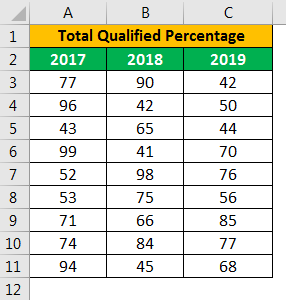
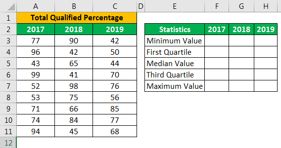
Below is the data I have prepared to show “Box and Whisker Plot ” in Excel.
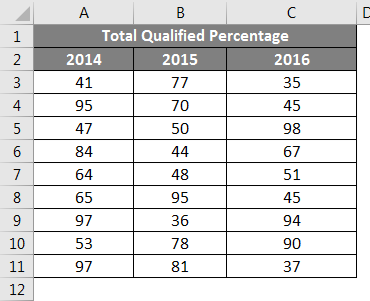
This is the data of educational examination of the past three years which says the pass percentage of students who appeared for the examination.
To create “Box and Whisker Plot in Excel”, first we need to calculate the five statistical numbers from the available data set. Five numbers of statistics are “Minimum Value, First Quartile Value, Median Value, Third Quartile Value, and Maximum Value”. For this, create a table like shown below.
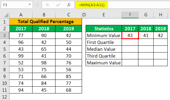
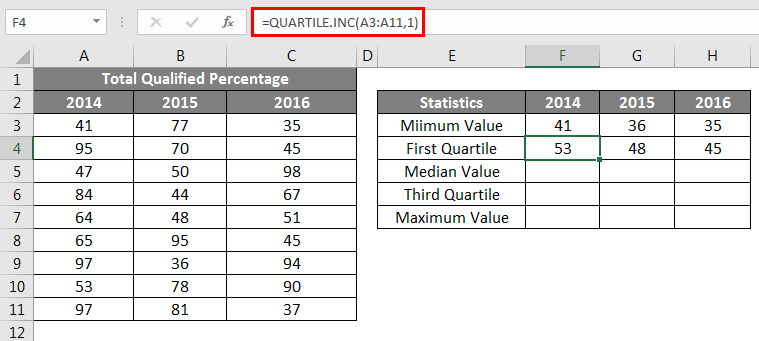
First, we need to calculate what the smallest or minimum value is for each year. So apply excel’s built-in function “MIN” function for all the years, as shown below.
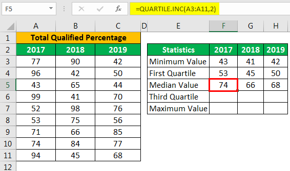
The second calculation is to calculate what the First Quartile Value is. For this, we need another built-in function, QUARTILE.INC. To find the first Quartile value, below is the formula.
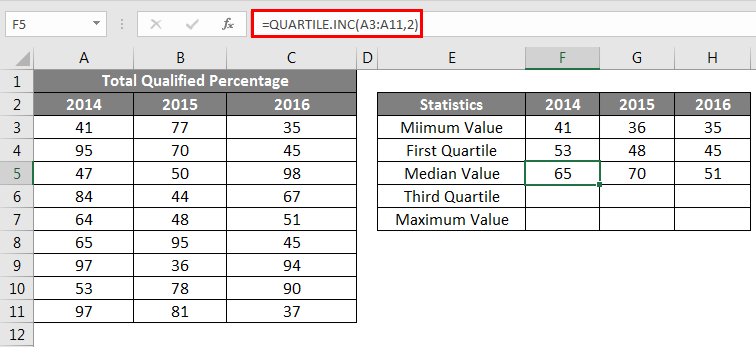
The third Statistical Calculation is Median Value; for this, below is the formula.
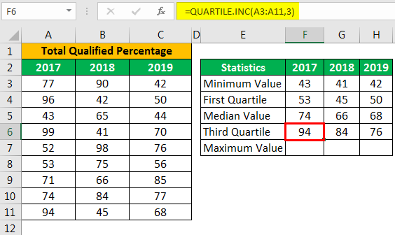
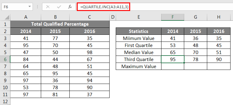
The 4th statistical calculation is the third quartile value; for this change, the last parameter of the QUARTILE.INC function to 3.
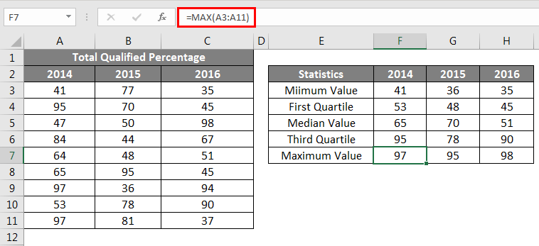
The last statistic is the calculation of the Maximum or Largest value from the available data set.
Once all the five number statistics calculation is done, create a replica of the calculation table but delete numbers.
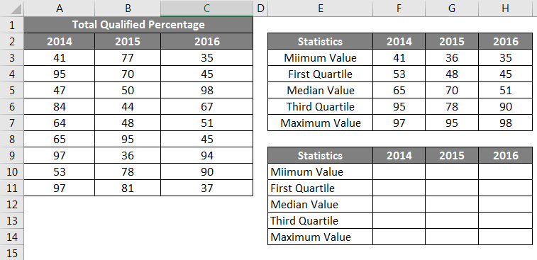
For Minimum Value cells, give a link from the above table only.
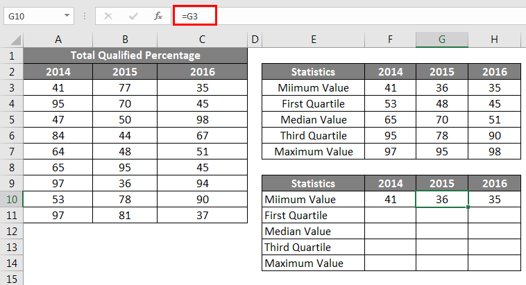
Next, we need to find the First Quartile Value, for this formula is below
First Quartile – Minimum Value.
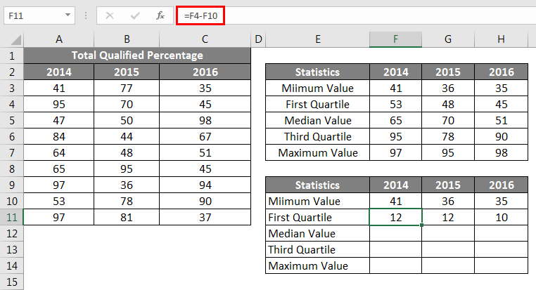
Next, we need to find the Median Value, for this formula is below
Median Value – First Quartile.
Next, we need to find the Third Quartile Value, for this formula is below
Third Quartile – Median Value.
Next, we need to find the Maximum Value, for this formula is below
Maximum Value – Third Quartile.
So, now our all the calculations are ready to insert a chart. Now select the data to insert the Stacked Column Chart.
Now our chart will look like the below.
Select the chart; now, we can see chart tools appear on the ribbon. Under the DESIGN ribbon, select “Switch Row / Column”.
This will interchange rows & column data in the chart is switched, so our new chart looks like the below one.
Now we need to format the chart; follow the below steps to format the chart.
Select the bottom-placed bar, i.e. blue-coloured bar and make the fill as No Fill.
So now the bottom bar disappears from the chart.
Right-click on the chart and choose “Select Data”.
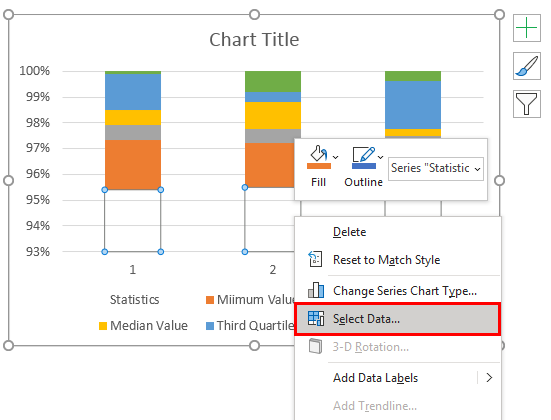
In the below window, click on the EDIT button on the right side.
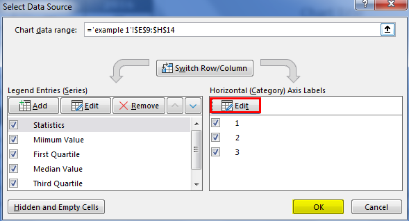
Now select Axis Label as year headers.
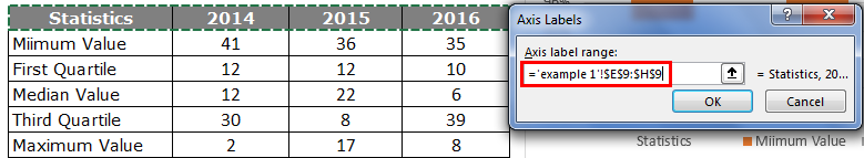
Now horizontal axis bars look like this.
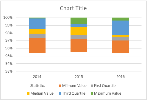
The BOX chart is ready to use in Box And Whisker Plot in Excel, but we need to insert WHISKER to the chart. To insert WHISKER, follow the below steps.
Now select the top bar of the chart makes NO FILL.
Now by selecting the same bar, go to the Design tab and Add Chart Elements.

Under Add Chart Elements, click on “Error Bars > Standard Deviation”.
Now we got Whisker lines on top of the bars.
Now select Whisker lines and press Ctrl + 1 to open the format data series option.
Under “Forma Error Bars”, do the following changes.
>>> Direction “Minus”
>>> End Style “No Cap”.
>> Error Amount > Percentage > 100%.
Under Format Error Bars, it will somewhat look like this-
Now similarly, we need to insert a whisker to the bottom as well. For this selection, the bottom-placed bar and make the FILL as NO FILL.
Also, by selecting the same bar, go to the Design tab and Add Chart Elements.
Under Add Chart Elements, click on “Error Bars > Standard Deviation”.

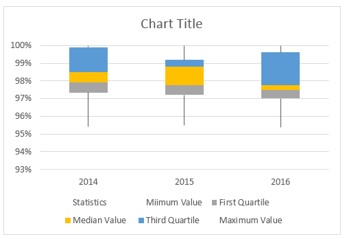
Repeat the same steps as we did for top bar whiskers, now we will have our Box and Whisker plot chart ready to use.
Things to Remember
- There is no built-in Box and Whisker plot chart in excel 2013 and earlier versions.
- We need to calculate five-number summary items like “Minimum Value”, “First Quartile Value”, “Median Value”, “Third Quartile Value”, and “Maximum Value”.
- All these calculations can be done by using excel built-in “Quartile.INC” formula.
Recommended Articles
This is a guide to Box and Whisker Plot in Excel. Here we discuss the meaning and how to create Box and Whisker plots in excel with examples. You can also go through our other suggested articles to learn more –
- Box Plot in Excel
- Plots in Excel
- 3D Scatter Plot in Excel
- Contour Plots in Excel