
Excel 2016, как известно, обогатился новыми типами диаграмм. Одна такая, которая диаграмма Парето, уже была показана. В этот раз рассмотрим другую, чисто статистическую. Называется «ящик с усами» или «коробчатая диаграмма» (box-and-whiskers plot или boxplot).
Раньше я такие видел только в специализированных ПО, типа STATISTICA, и для того, чтобы нарисовать подобную диаграмму в Excel, нужно было изрядно потрудиться. Теперь она есть в стандартном наборе Excel.

Зачем нужна такая диаграмма? Допустим, есть выборка для анализа. А еще лучше несколько выборок, которые нужно сравнить. Для этого рассчитывают различные показатели. Однако к любому расчету всегда хочется добавить наглядности, чтобы мозг перешел в режим образного представления, а не довольствовался сухими цифрами и формулами. Поэтому основные характеристики ловко изображают на рисунке. Отличным вариантом будет как раз диаграмма «ящик с усами».

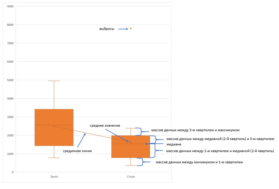
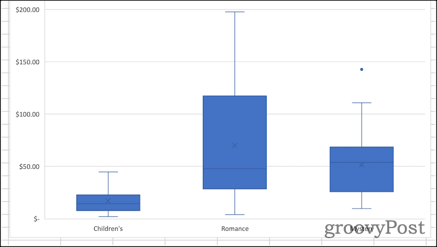
На рисунке показан формат по умолчанию. Как видно, сравниваются две выборки путем изображения двух «ящиков с усами».
Что здесь что обозначает?
Крестик посередине – это среднее арифметическое по выборке.
Линия чуть выше или ниже крестика – медиана.
Нижняя и верхняя грань прямоугольника (типа ящика) соответствует первому и третьему квартилю (значениям, отделяющим ¼ и ¾ выборки). Расстояние между 1-м и 3-м квартилем – это межквартильный размах (или расстояние).
Горизонтальные черточки на конце «усов» – максимальное и минимальное значение (без учета выбросов, см. ниже).
Отдельные точки – это выбросы, которые показываются по умолчанию. Если значение выходит за пределы 1,5 межквартильных размаха от ближайшего квартиля, то оно считается аномальным. Их можно скрыть (см. ниже настройки).
Во всей красе «ящик с усами» проявляется при сравнении выборок, в которых данные делятся на категории. Допустим, провели некоторый эксперимент среди мужчин и женщин. Есть данные до и после эксперимента по обоим полам. Для анализа потребуется вычислить различные показатели. А если к этому добавить диаграмму «ящик с усами», то результат будет весьма наглядным.

Отлично видно, что после проведения эксперимента данные по мужчинам в целом уменьшились, а данные среди женщин наоборот, увеличились. Это не значит, что выборки больше не нужно анализировать (сравнивать, проверять гипотезы и т.д.). Но наглядность сильно улучшает понимание. Перейдем к настройкам.
Настройки диаграммы «ящик с усами»
Общий вид диаграммы настраивается стандартно. Можно менять цвет, добавлять подписи и т.д. Для этого есть две контекстные вкладки на ленте (Конструктор и Формат). Но есть настройки, предназначенные специально для этой диаграммы.
Выбираем какой-либо ряд и жмем Ctrl+1. Либо два раза кликаем по какому-нибудь «ящику». Можно через правую кнопку Формат ряда данных…. Справа вылазит панель настроек.

Рассмотрим по порядку.
Боковой зазор – регулирует ширину ящиков и расстояние между ними.
Показывать внутренние точки. Если поставить галочку, то на оси, где расположены «усы», точками будут показаны все значения. Так хорошо видно распределение внутри групп.

Показывать точки выбросов – отражать экстремальные значения.

Выбросы – это точки, выходящие за пределы 1,5 межквартильных размаха.
Показать средние метки – среднее арифметическое (крестики). Стоят по умолчанию, но можно скрыть.
Показать среднюю линию – только для различных категорий. Показывает изменения по категориям.

Если добавить линии, то изменения после эксперимента станут видны еще лучше. В справке написано, что соединяются медианы, но на графике почему-то соединяются средние. Чудеса.
Инклюзивная медиана или эксклюзивная медиана. Инклюзивная медиана включает в «ящик» квартильные значения , а эксклюзивная медиана не включает. При выборе «эксклюзивной медианы» верх и низ «ящика» соответствует средней между квартильным и следующим (от центра) значением. По умолчанию стоит «эксклюзивная». Пусть стоит дальше. Причем тут медиана, вообще не понял, – речь ведь про квартиль. Думал, криво перевели, но в английской версии те же названия. В общем, здесь лучше ничего не менять.
Своевременное использование диаграммы «ящик-усы» может дать весьма ценную и наглядную информацию. Аналитику, который использует специализированные программы или трудоемкие настройки Excel, будет очень приятно иметь такую диаграмму под рукой.
Как показано в ролике ниже, все делается очень быстро и просто.
Поделиться в социальных сетях:
Создание диаграммы «ящик с усами»
-
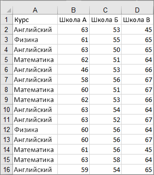
Выделите данные (один или несколько рядов).
Значения на изображении ниже являются частью набора данных, на основе которого был создан показанный выше образец диаграммы.

-
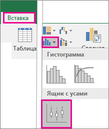
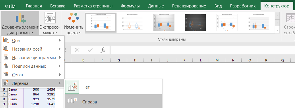
В Excel выберите команды Вставка > Вставить диаграмму статистики > Ящик с усами, как показано на рисунке ниже.
Важно: В Word, Outlook и PowerPoint порядок действий немного другой.
-
На вкладке Вставка в группе Иллюстрации нажмите кнопку Диаграмма.
-
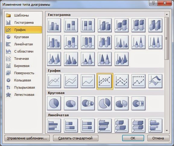
В диалоговом окне Вставка диаграммы на вкладке Все диаграммы выберите элемент Ящик с усами.
-
Советы:
-
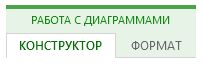
На вкладках Конструктор и Формат можно настроить внешний вид диаграммы.
-
Если они не отображаются, щелкните в любом месте диаграммы «ящик с усами», чтобы добавить на ленту область Работа с диаграммами.
Параметры диаграммы «ящик с усами»
-
Щелкните правой кнопкой мыши одно из полей на диаграмме, чтобы выбрать его, а затем в контекстном меню выберите пункт Формат ряда данных.
-
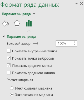
В области Формат ряда данных, выбрав Параметры ряда, внесите необходимые изменения.
(Руководствуйтесь информацией в таблице под приведенным ниже рисунком.)
Параметр ряда
Описание
Ширина зазора
Управление зазором между категориями.
Показывать внутренние точки
Отображение точек данных между верхней и нижней усами.
.Показывать точки выбросов
Отображает точки выбросов, которые находятся ниже линии верхней или нижней точки уса.
.Показывать маркеры медиан
Отображение маркеров медианы выбранного ряда.
Показывать линию медиан
Отображение линии, соединяющей медианы блоков в выбранном ряде.
Вычисление квартилей
Выберите метод вычисления медиан.
-
Инклюзивная медиана Медиана включается в вычисления, если N (число значений в данных) — нечетное число.
-
Исключающая медиана Медиана исключается из вычислений, если N (число значений в данных) — нечетное число.
-
Создание диаграммы «ящик с усами»
-
Выделите данные (один или несколько рядов).
Значения на изображении ниже являются частью набора данных, на основе которого был создан показанный выше образец диаграммы.
-
На ленте на вкладке «Вставка» щелкните
(значок статистической диаграммы) и выберите «Ящик с усами».
 (значок статистической диаграммы) и выберите «Ящик с усами».
Советы:
-
На вкладке «Конструктор диаграмм» и «Формат» можно настроить внешний вид диаграммы.
-
Если вкладки «Конструктор диаграмм» и «Формат» не вы видите, щелкните в любом месте диаграммы «ящик с усами», чтобы добавить их на ленту.
Параметры диаграммы «ящик с усами»
-
Щелкните одно из полей на диаграмме, чтобы выбрать его, а затем на ленте нажмите кнопку «Формат».
-
Внести нужные изменения можно с помощью инструментов на вкладке «Формат».
Диаграмма со смешным названием “Ящик с усами” используется в Excel, как правило, для проведения статистического анализа. Когда имеется массив данных для нескольких тестовых групп за различные периоды, и необходимо понять, как изменился разброс показателей — не обойтись без этой диаграммы.
Конечно, если вывести все эти показатели в таблицу — то какой-то результат тоже можно увидеть. Но визуализации в виде диаграмм всегда воспринимаются лучше, чем просто цифры (тем более, что не все руководители дружат с цифрами).
Еще несколько лет назад для построения диаграммы “Ящик с усами” нужно было пользоваться специализированным софтом (или как минимум Python) или очень сильно колдовать в excel. Но начиная с версии Excel- 2016, данный вид диаграммы входит в стандартный пакет.
В этой статье мы рассмотрим два варианта построения диаграммы Ящик с усами: простой — для счастливых обладателей Excel от 2016-й версии и моложе, и сложный — “танцы с бубном” для тех, кому с версией Excel повезло меньше.
Содержание статьи:
- Из чего состоит диаграмма Ящик с усами
- Диаграмма Ящик с усами встроенным инструментом Excel (для версий от 2016 и новее)
- Диаграмма Ящик с усами при помощи гистограммы с накоплением (для версий Excel до 2016 г)
Из чего состоит диаграмма
Смысл диаграммы Ящик с усами в том, чтобы показать основные характеристики статистической выборки данных: распределение данных между квартилями, среднее значение, медиану, максимальное и минимальное значения, а также выбросы данных.
Думаю, понятно, что ящик — это прямоугольник с заливкой, а усы — это черточки над и под прямоугольником.
Ящик — это межквартильный размах (или расстояние) — отделяет ¼ и ¾ выборки данных. Если ящик, условно говоря, большой — больше другого ящика — это означает, что выборка относительно однородна, и большая часть данных сконцентрирована вокруг медианы.
Черточки усов — это максимальное и минимальное значение (без учета выбросов).
Ус снизу — это разница между минимумом и 1-м квартилем.
Ус сверху — это разница между 3-м квартилем и максимумом.
Крестик посередине — среднее арифметическое значение по выборке.
Черта посередине ящика — медиана по выборке.
Выбросы — значения, сильно отклоняющиеся от основного массива выборки (выходит за пределы 1,5 межквартильных размаха от ближайшего квартиля).
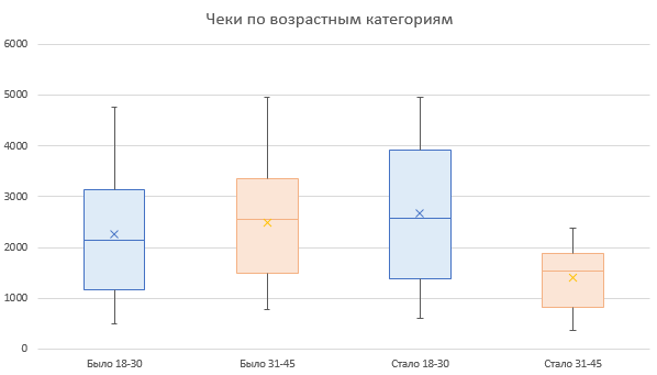
Чтобы стало еще понятнее, рассмотрим построение диаграммы Ящик с усами на примере в excel. В нашем примере есть две возрастных группы покупателей: от 18 до 30 лет и от 30 до 45 лет. По ним имеем данные о суммах в чеках, на которые они совершали покупки.
Позже была проведена маркетинговая акция, и нужно понять, что изменилось в распределении сумм покупок в каждой группе.
Диаграмма Ящик с усами встроенным инструментом Excel (для версий от 2016 и новее)
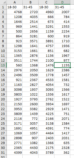
Часть выборки данных выглядит следующим образом:
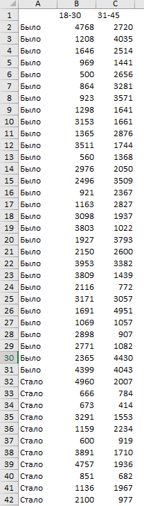
В левом столбце показатель периода (было до акции — стало после акции). Вверху названия групп (18-30, 31-45), и в ячейках суммы, на которые совершались покупки.
Внимание: таблица не должна содержать никаких итогов!
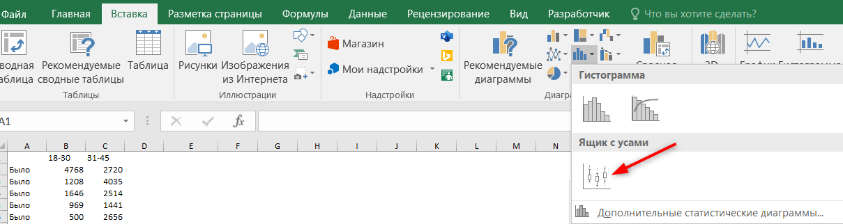
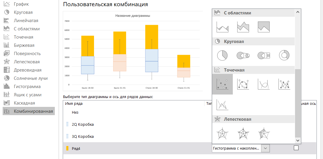
Все, что нужно сделать — это выделить массив данных вместе с названием периода и заголовками столбцов и далее: вкладка Вставка — блок Диаграммы — кнопка Гистограммы — выбрать Ящик с усами.
Переименовываем диаграмму и наслаждаемся результатом.
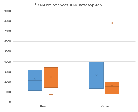
Произведем некоторые настройки.
Во-первых, выведем легенду, чтобы было понятно, где какая группа.
Во-вторых, добавим среднюю линию, показывающую тренд между периодами. Среднюю линию можно добавить, если есть не менее двух рядов данных.
Правой кнопкой мыши щелкнем на “ящике”, и выберем Формат ряда данных, установим “галку” Средняя линия.
Здесь же можно регулировать отображение точек выбросов на диаграмме.
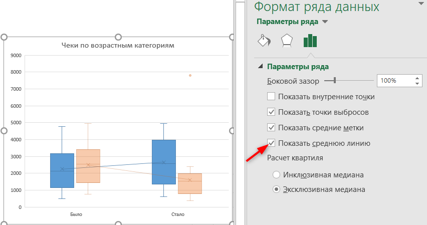
Диаграмма готова.
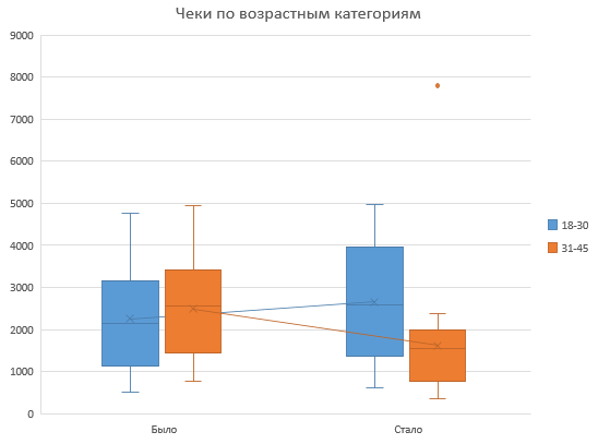
Что можно понять из диаграммы Ящик с усами, которую мы сейчас построили:
- В группе 18-30 лет средний чек немного вырос. Смотрим на крестик, который отображает среднее значение, и на среднюю линию, которая идет слегка вверх.
- В группе 31-45 лет средний чек, наоборот, прилично упал. Это говорит о том, что формат акции не попал в эту целевую аудиторию.
- Медианная сумма, на которую чаще всего совершали покупки (линия посередине ящика) также немного выросла для группы 18-30, и упала для группы 31-45, что также говорит о неудачной акции для второй группы.
- Размер ящика для группы 18-30 увеличился, также и низ, и верх ящика заняли более высокие позиции. Снова “за” успешность акции для этой категории покупателей, они стали совершать более разнообразные покупки, и в целом тратить больше денег.
- А группа 31-45, напротив, стала тратить меньше денег (низ и верх ящика снизили позиции на графике), и размер ящика также уменьшился, как и размер усов. Т.е.покупки стали более фиксированными (возможно, остались самые постоянные покупатели с фик
- Присутствует также один выброс для группы 31-45 — точка на уровне 7800. Это чек, сумма которого сильно отклоняется от основной массы покупок.
Диаграмма Ящик с усами в excel при помощи гистограммы с накоплением (для версий Excel до 2016 г)
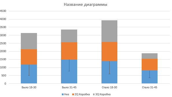
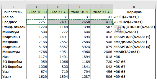
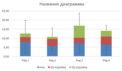
Работать будем с той же выборкой данных, только переформатируем ее так, чтобы для каждого ящика был отдельный столбец.
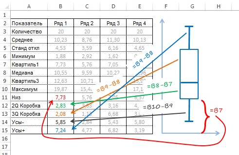
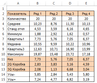
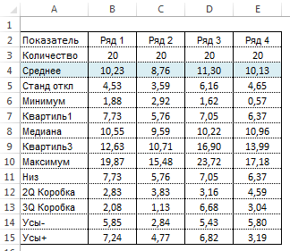
Создадим дополнительную таблицу, в которой пропишем определенные формулы. Форму таблицы и формулы смотрите на картинке:
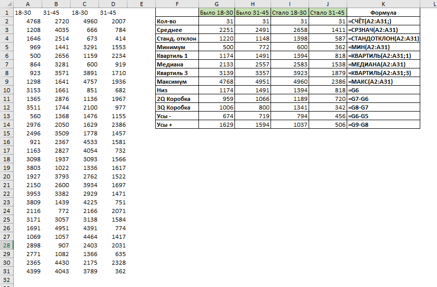
Выделим заголовки и строки Низ, 2Q Коробка и 3Q Коробка (как на картинке).
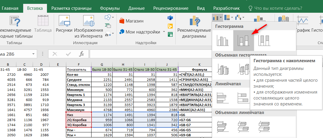
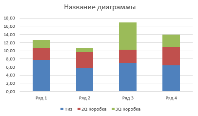
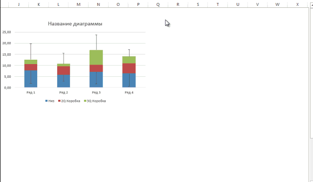
Перейдем во вкладку Вставка — Гистограмма — Гистограмма с накоплением.

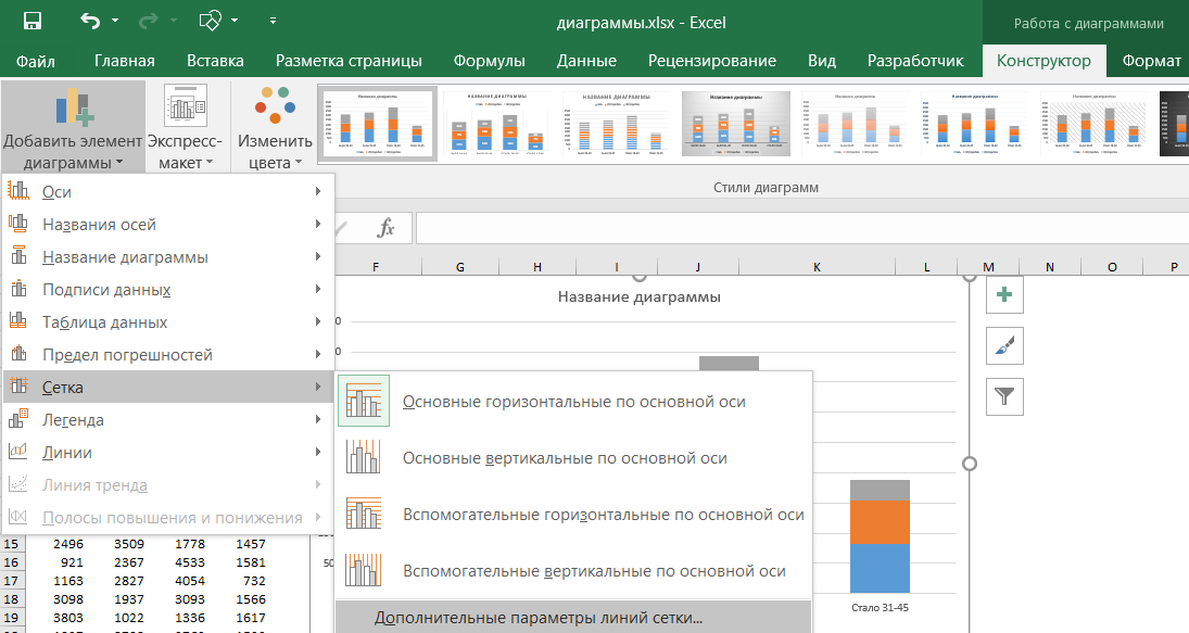
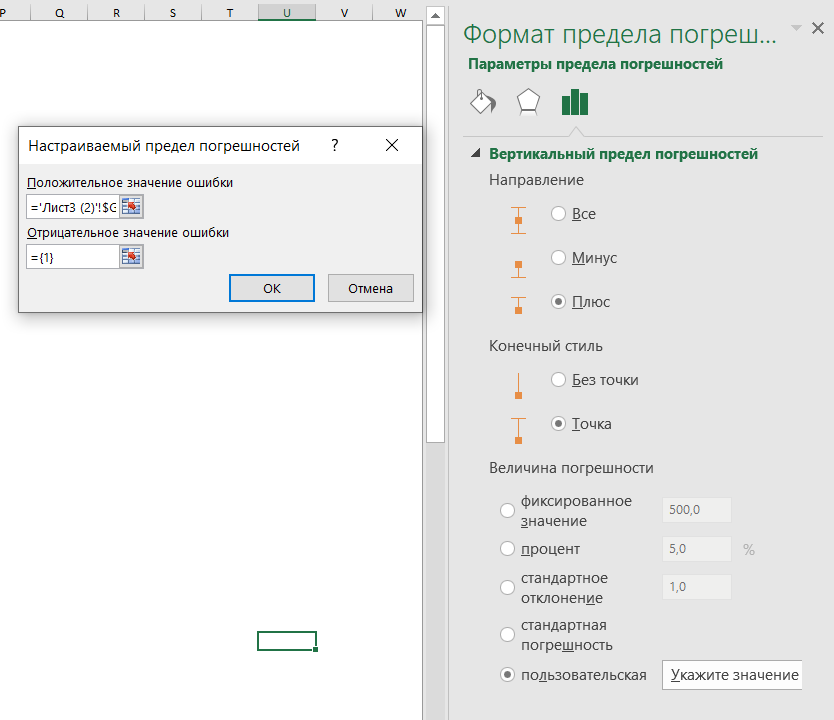
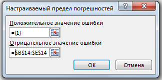
Теперь нужно нарисовать усы, начнем с нижних. Выделим на диаграмме ряд Низ, и перейдем на вкладку Конструктор — Макеты диаграмм — Добавить элементы диаграмм — Предел погрешностей — Дополнительные параметры погрешностей.
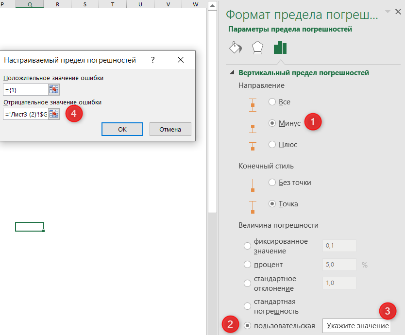
В окне Формат предела погрешностей нужно установить параметры в следующем порядке:
- Вертикальный предел погрешностей — Направление — Минус
- Величина погрешности — Пользовательская
- Нажать кнопку Укажите значение
- Поле Положительное значение ошибки оставить без изменений. Поле Отрицательное значение ошибки активировать и выделить значения из таблицы, соответствующие строке “Усы -” (только цифры).
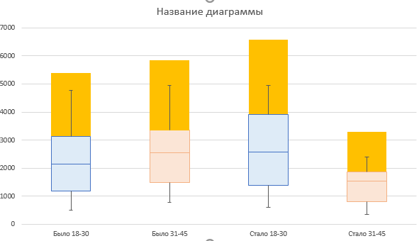
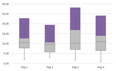
Должны появиться вот такие черточки.
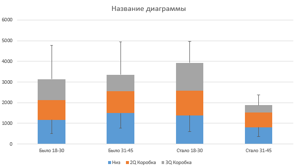
Теперь похожим образом нужно нарисовать верхние усы. Для этого выделим ряд 3Q Коробка, и снова перейдем на вкладку Конструктор — Макеты диаграмм — Добавить элементы диаграмм — Предел погрешностей — Дополнительные параметры погрешностей.
Здесь нужно указать направление вертикального предела погрешностей Плюс, величина погрешности Пользовательская, нажать кнопку Укажите значения. В поле Положительное значение установить курсор и выделить значения из строки “Усы +”. Поле Отрицательное значение ошибки оставить без изменений.
Должны появиться верхние усы.
Осталось немного доработать внешний вид диаграммы.
Уберем заливку с ряда Низ (синий в примере). Для этого выделим его, щелкнем правой кнопкой мыши — Формат ряда данных — и в блоке Заливка укажем Нет заливки.
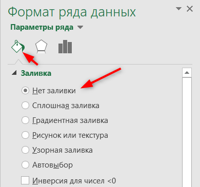
Не выходя из окна Формат ряда данных, изменим цвет для ящиков.
Осталось добавить среднее значение (крестик).
Для этого выделим строку Среднее (только числа) и нажмем Ctrl + С.
Теперь выделим диаграмму и нажмем Ctrl + V. Должно получиться что-то похожее на картинку:
Правой кнопкой мыши щелкаем на новом ряде данных и выбираем Изменить тип диаграммы для ряда.
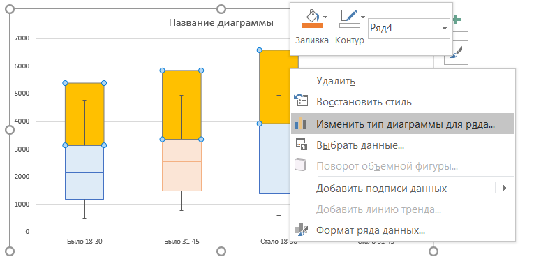
И для нового ряда выбираем тип диаграммы Точечная.
Обязательно снимите “галку” Вспомогательная ось”, если она установилась.
Осталось изменить точку на крестик (по желанию). Дважды щелкаем на любой точке, и в открывшемся окне Формат ряда данных выбираем: Маркер — Встроенный — крестик в выпадающем списке.
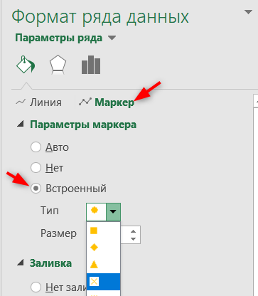
Диаграмма готова.
Конечно, у нее есть несколько недостатков по сравнению со встроенным инструментом:
- из диаграммы намеренно убраны точки выбросов, поскольку они существенно исказили бы результат. Точки выбросов можно нарисовать отдельно аналогично тому, как мы создавали крестики для среднего значения. Или не использовать их совсем.
- Нет средней линии между блоками одного ряда. При желании и сильно заморочившись, их можно нарисовать при помощи графиков. Возможно, в этой статье будет продолжение, как это сделать.
- Ряды данных не разделены визуально. Где ряд Было и Стало, видно только из названия.
Но в целом, если нет возможности установить более новую версию Excel, то это неплохой обходной путь создать диаграмму Ящик с усами в Excel.
Вам может быть интересно:

Диаграмма Ящик с усами (англ. Box and Whisker Chart, Box Plot) обычно используется для отображения статистического анализа. К сожалению, Excel не может строить такие диаграммы, но вы можете создать свою диаграмму ящик с усами с помощью гистограммы и планок погрешностей. Данная статья посвящена тому, как построить вертикальный Box Plot в Excel 2013.
Простая диаграмма ящика с усами отображает диапазон данных, находящийся между первым и третьим квартилем, а медиана делит эту коробку на две части (межквартильный диапазон). Усы отображают данные первого квартиля — от второго квартиля до минимального значения, и четвертого квартиля – от третьего до максимального значения.
Подготовка данных
Чтобы лучше понять материал и работать с одними и теми же цифрами, скачайте книгу Excel с примером Диаграмма ящик с усами.xlsx.
Данные, используемые в примере имеют нормальное распределение со средним значением равным 10 и стандартным отклонением равным 5-ти. Данные имеют четыре столбца по 20 значений.
Все значения положительные, так как при смешанном (положительные и отрицательные значения) виде, данная методика требует некоторых модификаций.
Прежде чем начать строить диаграмму, нам необходимо произвести некоторые расчеты и подготовить данные. Для этого вставьте пустые строки над массивом и заполните заголовки показателями, которые потребуются для построения диаграммы, как показано на рисунке.
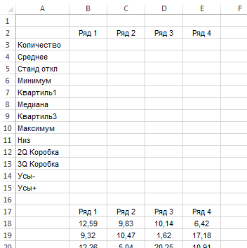
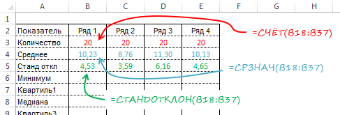
Для начала рассчитаем некоторые простые статистические меры, такие как количество значений, среднее и стандартное отклонение. Формулы, используемые для расчетов отображены на рисунке ниже.
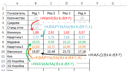
Теперь рассчитаем минимум, максимум, медиану, значение первого и третьего квартиля.
Наконец, давайте определим значения, которые станут основой построения. Наша диаграмма имеет коробку второго квартиля, которая отображает разницу между медианой и первым квартилем, значения которых мы рассчитали ранее. Также имеется коробка третьего квартиля – рассчитывается как разница между значением третьего квартиля и медианой. Нижняя часть коробки опирается на первый квартиль. Длина нижних усов равняется значению первого квартиля минус минимальное значение, длина верхних усов – максимум минус значение третьего квартиля.
Построение диаграммы ящик с усами
Выделите заголовок таблицы с расчетами, затем удерживая клавишу Ctrl, выделите три строки содержащие данные Низ, 2Q Коробка и 3Q Коробка. Этот диапазон с несколькими площадями выделен оранжевым на рисунке ниже.
Во вкладке Вставка перейдите в группу Диаграммы и выберите Вставить гистограмму –> Гистограмма с накоплением.
Чтобы добавить усы, выделите ряд данных Низ. Перейдите во вкладку Работа с диаграммами -> Конструктор в группу Макеты диаграмм. Нажмите кнопку Добавить элемент диаграммы, в выпадающем меню выберите Предел погрешностей -> Дополнительные параметры предела погрешностей. В появишейся справа панели Формат предела погрешностей в поле Направление установите маркер Минус, а в поле Величина погрешности установите маркер Пользовательская и нажмите кнопку Укажите значение. В появившемся диалоговом окне Настраиваемый предел погрешности поле Положительные значения ошибки оставьте без изменений, а для Отрицательные значения ошибки укажите диапазон B14:E14, который называется Усы-.
Нажимаем OK и получаем диаграмму, имеющую следующий вид.

Теперь необходимо добавить верхние усы. Для этого выделяем ряд данных 3Q Коробка и повторяем действия описанные выше, только теперь в поле Направление панели Формат предела погрешностей устанавливаем маркер Плюс. А в диалоговом окне Натраиваемый предел погрешностей поле Отрицательное значение ошибки оставляем неизменным, а в поле Положительное значение ошибки указываем диапазон B15:E15, который называется Усы+. Жмем ОК и получам следующую диаграмму ящика с усами.
Осталось навести антураж и отформатировать нашу таблицу. Выделяем ряд данных Низ и убираем заливку и границы ряда данных. Для ряда данных 2Q Коробка и 3Q Коробка задаем светло серую заливку и темный контур. Удаляем легенду и название диаграммы.
Добавление среднего значения
Чтобы добавить данные со средним значение к каждому ящику, выделите ряд под названием Среднее. На картинке выделено голубым.
Скопируйте выделенные данные в буфер обмена с помощью сочетания клавиш Ctrl+C. Затем выделите диаграмму и вставьте скопированные данные с помощью клавиш Ctrl+V. У вас должна получиться следующая картинка.
Щелкните по новому ряду данных правой кнопкой мыши и выберите Изменить тип диаграммы для ряда. В появившемся диалоговом окне Изменение типа диаграммы найдите рад данных Среднее, поменяйте тип диаграммы на Точечная и снимите маркер Вспомогательная ось, если он был установлен.
Наша финальная диаграмма ящик с усами готова. На ней можно увидеть распределение данных от первого до третьего квартиля, медиану и среднее значение.
Box plots (also called box and whisker charts) provide a great way to visually summarize a dataset, and gain insights into the distribution of the data.
In this tutorial, we will discuss what a box plot is, how to make a box plot in Microsoft Excel (new and old versions), and how to interpret the results.
A box plot is used in statistical analysis to visualize the distribution in a set of data.

The box plot divides numerical data into ‘quartiles’ or four parts.
The main ‘box’ of the box plot is drawn between the first and third quartiles, with an additional line drawn to represent the second quartile, or the ‘median’.
The width of the box basically marks the most concentrated area of the data distribution.
A box plot can also contain ‘whiskers’ which are simply lines that depict the minimum and maximum values that are outside the first and third quartiles.
Why Use a Box Plot?
A box plot is a great way to visually summarize your data using 5 descriptive indicators.
They can be quite helpful when you want to see how the data is distributed and the range to which the data extends.
In this way, box plots also help us find outliers and can tell if the data is symmetric or skewed.
Box plots are especially helpful when you want to compare different sample distributions, and since it provides a 5-point summary of the entire dataset, it is really useful when the datasets you are studying are very large.
How to Interpret a Box Plot
Before we see how to create a box plot (also called a box and whisker chart), let us first learn to understand and interpret a box plot.
The image below shows employee salaries of a given company:

This data can be represented with a box and whisker plot as shown below:

Let us interpret this chart by looking at its 5 indicators:
- The tip of the top whisker (line) marks the maximum value in the data. From the above chart we can see that the highest salary paid by the company is $40,000.
- The length of the top whisker represents how far the highest value is from the median of the dataset. This value can help us identify if the dataset is skewed or if there are any potential outliers.
- The top edge of the box marks the third quartile of the data.
- The bottom edge of the box marks the first quartile of the data.
- The line that runs across the middle of the box is the second quartile or the median value of the data.
- The vertical width of the box represents the spread in the data. In other words, it tells us if there is a large amount of variation in employee salaries or if they are more or concentrated around the median. In the above chart, we can see that the range of salaries is 40,000-10,000 = $30,000.
- The length of the bottom whisker represents how far the lowest value is from the median of the dataset. This also helps us see if the dataset is skewed.
- The tip of the bottom whisker marks the minimum value in the data (or the lowest salary paid by the company). From the above chart we can see that the highest salary paid by the company is $10,000.
How to Create a Box Plot Chart in Excel
Now that we understand box plots a little better, let us see how to create them in Excel.
Up until Excel 2016, there was no separate feature in Excel to create box plots.
As such, in older versions, if you need to create a box plot, you need to improvise a stacked chart and convert it into a box plot.
The box plot was included as a separate charting option only from Excel 2016 onwards.
So, in this tutorial, we will show you how to create a box plot in both older as well as newer Excel versions.
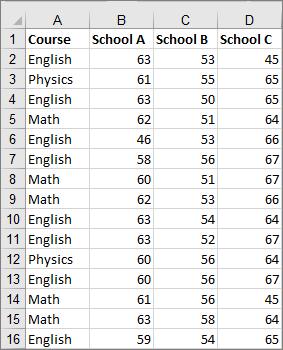
We are going to create the box plot based on the dataset shown below:

The above screenshot displays employee salaries for two different companies – Company A and Company B.
Let us see how to create a box plot from the above data in both older and newer Excel versions.
Creating a Box Plot in Newer Excel Versions (2016, 2019, & Office 365)
If you’re using newer versions of Excel-like Excel 2016 or Excel in Office 365, creating a box plot is much simpler.
This is because these versions already have a template to create a box plot.
So you can generate a chart directly from your original dataset and you don’t need to compute quartiles or differences between the quartiles, etc.
For example, on Office 365, all you need to do is:
- Select the range of cells containing your data. In our case, we can directly select the cells in the range A1:A10.
- From the Insert tab, click on the icon for Insert Statistic Chart as shown in the image below:

- This displays a dropdown menu, from where you can select the ‘Box and Whisker’ chart.

- You should now get a Box Plot of your data.

- By default, the box plot performs quartile calculation with exclusive median. To convert it into inclusive median, select the Series Options icon from your Format Data Series sidebar and check the radio button next to ‘Inclusive median’ under the ‘Quartile Calculation’ category:

As you can see, in just a few clicks, you get a box plot ready. You can now go ahead and change the Chart title.
Note: The crosses that you can see in each box indicate the mean of the dataset.
Creating a Box Plot in Older Excel Versions (2013, 2010, 2007)
Older Excel versions do not have chart templates to create a box plot, but you can create one from a stacked bar chart.
To create a box plot in Excel versions 2013 and older, you need to follow the steps shown below:
- Compute 5 summary descriptors from the data
- Compute the Quartile differences
- Create a stacked column chart from the above computed values
- Convert the stacked column chart into a box plot.
Let us see how to perform each of these steps in more detail.
Step 1: Compute the 5 Summary Descriptors from the Data
First, we need to compute the 5 summary descriptors.
For this, create a second table based on the main data, using the formulas shown below (Make sure they are in the same order as shown below too):
| Descriptor | Formula |
| Minimum Value | =MIN(range) |
| First Quartile | =QUARTILE.INC(range,1) |
| Median | =QUARTILE.INC(range,2) |
| Third Quartile | =QUARTILE.INC(range,3) |
| Maximum Value | =MAX(range) |
Here are the formulas that we used for our sample dataset:

Step 2: Compute the Quartile Differences
The next step is to find the differences between each of the above-computed values. These will help us specify the heights for every column segment of our stacked column chart.
Create a third table. In this table, specify the following values:
- In the first row: The minimum values of your data. In our example, the formulas used are =E3 and =G3.
- In the second row: The difference between the first quartile and minimum value. In our example, the formulas are =E4-E3 and =G4-G3.
- In the third row: The difference between the second and first quartiles. In our example, the formulas are =E5-E4 and =G5-G4.
- In the fourth row: The difference between the third and second quartiles. In our example, the formulas are =E6-E5 and =G6-G5.
- In the fifth row: The difference between the maximum value and the third quartile. In our example, the formulas are =E7-E6 and =G7-G6.
Here’s a screenshot of the third table, after applying to our sample dataset:

Step 3: Create a Stacked Column Chart from the Computed Values
Now that we have computed all the required differences, we can use these to specify the heights of each column segment for the column chart.
We will later modify this column chart and convert it into a box plot.
- Select the range of cells containing the third table (in our case, cell range J2:K7).

- From the Insert tab, select the Insert Column Chart button (under the Charts group).

- Select the Stacked Column (under the 2-D Column category) from the dropdown that appears.

- This creates a stacked column chart based on our selected range of cells. However, notice that this does not yet look like a box plot. This is because the chart was created by selecting data horizontally from your selection, rather than vertically.

- To reverse this, right click on the chart and click on ‘Select Data’ from the context menu that appears.

- Click on the Switch Row/Column button from the dialog box and click OK.

Your stacked column chart should now more or less resemble a box chart, with 5 segments for each column:

You can now go ahead and change the chart title and get rid of the legend if you need to.

Step 4: Convert the Stacked Column Chart into a Box Plot
We are not done yet. We still need to convert this chart into a proper box plot.
For this, follow the steps shown below:
Remove the bottom segment from all the stacked columns
- Select the lowest segment of any of one of the stacked columns. You will notice that clicking on a segment of a single column automatically selects that segment in all the columns.

- Next, select the Format tab from the Chart Tools tab and click on Format Selection from the Current Selection group.

- This opens the Format Data Series sidebar to the right of your Excel window. Under Series options, click on the icon for Fill and line.

- Under the Fill category, check the radio button next to No Fill.

- The lowest segment of all your stacked columns should now disappear.

Convert the top and second to bottom segments into whiskers for the box plot
- Select the second to bottom segment of the stacked columns.

- Select the Design tab from the Chart Tools tab and click on Add Chart Element from the Chart Layouts group.

- From the dropdown menu that appears, select Error Bars->Standard Deviation.

- This will add error bars to all the stacked columns as shown below.

- Select the error bar on any one stacked column. It will automatically select the error bars on all the stacked columns. From the Format Error Bars sidebar, click on the icon for Error Bar Options.

- Under the Direction category, check the radio button next to ‘Minus’. Under the End Style category, check the radio button next to ‘No Cap’ and under the Error Amount category, select the radio button next to Percentage. Change the percentage to 100% in the input box next to it.

- Finally remove the second to bottom segment, so that only the lower whisker is visible. For this again select the segment, and click on No Fill from the Format Data Series.

- Repeat the same steps (a. to h.) on the topmost segment of the stacked column chart, to convert it into the top whisker of the box plot.

- So far, this is how your chart should be looking:

Change the fill and outline for the middle 2 sections:
- Select the second from top section of the stacked column chart (the yellow segment in our sample chart).

- From the Format Data Series sidebar, select the icon for Fill and Line under Series Options and check the radio button next to Solid Fill.
- Select an appropriate Fill color and Transparency. For our sample chart, we used the default ‘Blue, Accent 1’ color and a transparency of 60%.

- Under the Border category, check the radio button next to Solid line and select an appropriate color and transparency for the box border. We left it at the default settings.

- Repeat the steps a. To d. for the grey segment of your stacked chart too.

Your end result should like an actual box plot, as shown in the screenshot below:

Limitations of the Box Plot
There are a few points to note about box plots:
- The box plot is good at representing bell shaped or Gaussian distributions, but can hide certain important insights in case of bimodal or other non-Gaussian distributions.
- Box plots are not very intuitive at first glance. So, people who are not really familiar with concepts like quartiles, etc. might not be able to understand or interpret a box plot correctly.
These limitations aside, if your data is more or less symmetrically distributed around the median, then the box plot can help you understand the distribution at a glance, even if you have a really large dataset.
Moreover, the box plot can be quite helpful in understanding the distribution and range of data. As such, the merits of the box plot far outnumber the demerits.
In this tutorial, we showed you how to create a box plot using both older and newer versions of Excel. We hope it was helpful for you.
Other articles you may also like:
- How to Add Gridlines in a Chart in Excel?
- How to Insert Chart Title in Excel?
- How to Create Bar of Pie Chart in Excel?
- How to Create Org Chart in Excel?
- How to Create a Waterfall Chart in Excel?
- How to Create Win/Loss Sparklines Chart in Excel?
Данный пост будет интересен тем, у кого пока нет офиса 16, в 16-м офисе в excel уже есть возможность строить боксплот.
Warning
Если у вас 2016 excel и выше, см. видео
В посте Прогноз эффективности продавцов на основе теста CPI
и многих других постах ранее я использовал диаграмму boxplot,

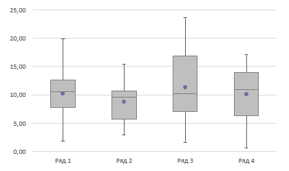
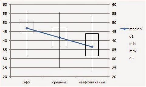
Диаграмму включает такие показатели:
- медиана — средняя линия в боксе;
- минимальное значение — нижний хвост, перевернутая Т;
- первый квартиль — «дно» бокса;
- третий квартиль — «крышка» бокса;
- максимальное значение — верхний хвост
- и выбросы, которые точками
Диаграмма информативна и показательна для решения задач:
- представления о распределении выборки (нормальное / ненормальное, в какую сторону scew)
- разнице групп
Делал я эту диаграмму в программе Rstudio. Можно делать в SPSS. Но это специализированные
программы, а если под рукой только excel? А в excel
нет возможности создать легко и просто такой тип диаграммы. Зато есть возможность
создать не очень легко и не очень просто. И я расскажу, как это делается.
Итак, строим boxplot в excel
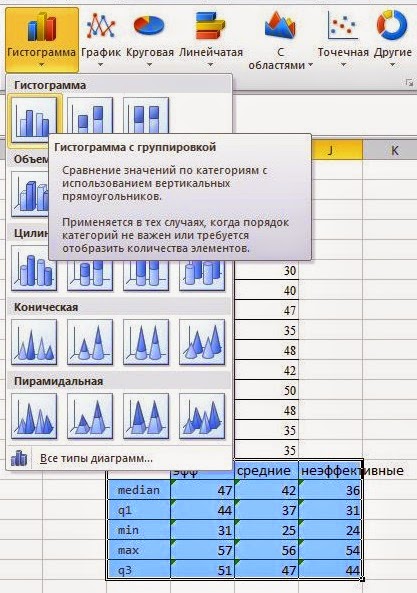
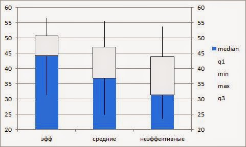
Шаг №1 Строим таблицу
показателей boxplot
|
эфф |
средние |
неэффективные |
|
|
медиана |
47 |
42 |
36 |
|
1-й квартиль |
44 |
37 |
31 |
|
min |
31 |
25 |
24 |
|
max |
57 |
56 |
54 |
|
3-й квартиль |
51 |
47 |
44 |
Используем для построения формулы в excel – Медиана,
Квартиль, Мин, Макс, Квартиль
Порядок обязательно тот, который указан в таблице.
Опускаю про то, как готовить данные для получения
показателей в таблице – это мне кажется очевидным.
Шаг №2 строим
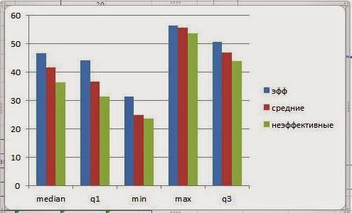
гистограмму
В excel:
Вставка / Гистограмма / Гистограмма с группировкой
Самая простая гистограмма (диаграммы можно увеличивать кликом)
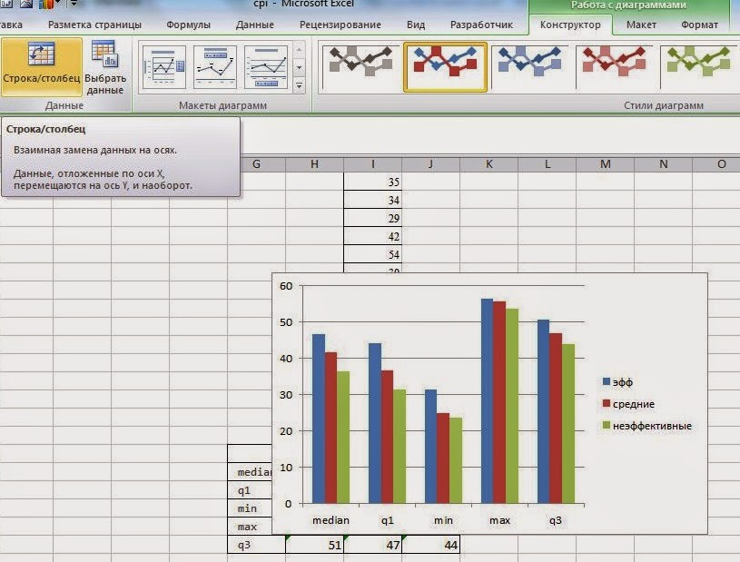
Шаг № 3 Строки в
столбцы
Далее делаем процедуру перевода строк в столбцы: на закладке
Работа с диаграммами / Конструктор находим кнопку Строка / столбец

Шаг № 4 Меняем тип диаграммы
Кликаем по полю диаграммы правой клавишей и выбираем
изменить тип
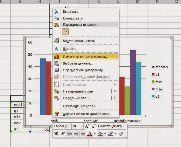
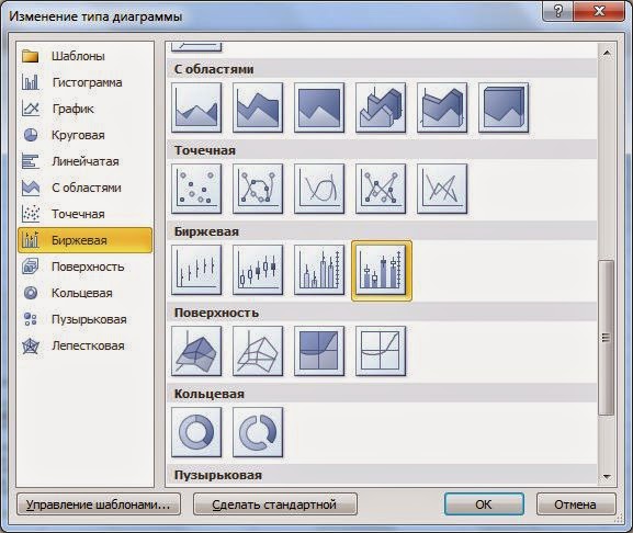
Выбираем Биржевой тип диаграммы, последний рисунок

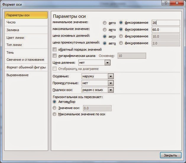
Шаг № 4 Формат оси
Приводим формат оси к единой шкале
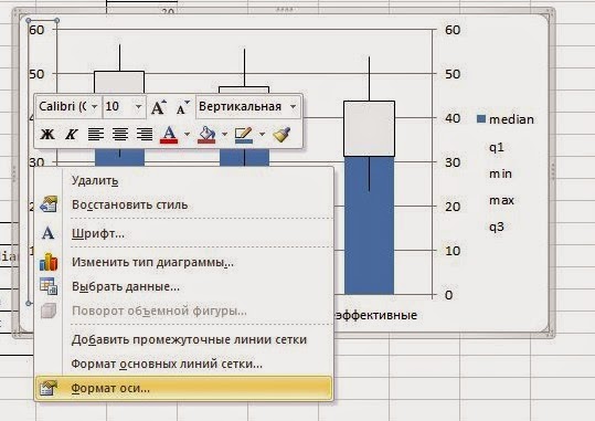
Задаем границы с двух сторон
получаем
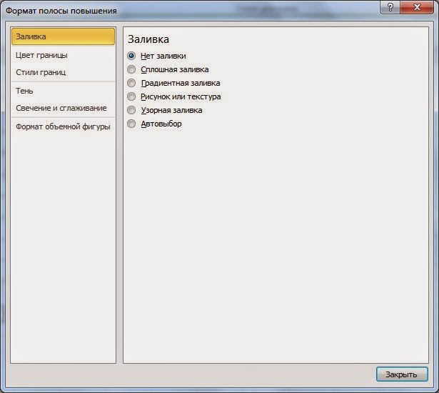
Шаг № 5 Делаем прозрачным прямоугольник
Выделяем правой клавишей прямоугольники, кликаем на Формат
полосы повышения
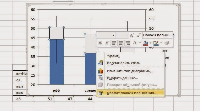
Выбираем поинт Нет заливки
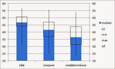
Шаг № 6 Меняем тип диаграммы для синей области
Кликаем правой клавишей по синей области, в открывшемся
списке выбираем Изменить тип диаграммы для ряда

Выбираем тип диаграммы График, четвертый рисунок
Шаг № 7 наводим красоту
Кликаем в легенде по медиане правой клавишей, выбираем
формат ряда данных

Там выбираем цвет линий / нет линий
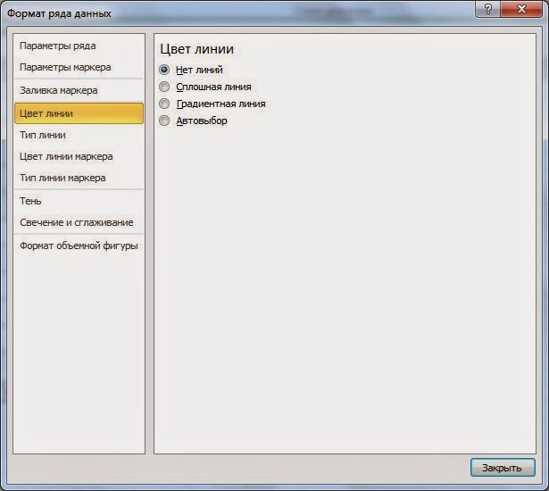

Синий кружочек это наша медиана. Все, boxplot в excel готов
Шаг № 8 на любителя
Я бы допилил до такого состояния диаграмму. В данном случае «допилка»
относится к базовым функциям работы с диаграммами, поэтому я не показываю, как
это делать.
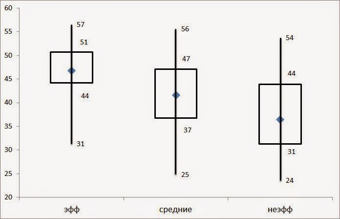
Мне вот такая картинка нравится: я вывел значения мин, макс, квартилей на диаграмме.
Содержание
- How to Make a Box Plot in Excel
- What Is a Box Plot?
- How to Make a Box Plot in Excel for Microsoft 365
- Formatting a Box Chart in Excel
- A Welcome Addition for Statistical Analysis
- Create a box and whisker chart
- Create a box and whisker chart
- Change box and whisker chart options
- Create a box and whisker chart
- Change box and whisker chart options
- Диаграмма «ящик с усами» (boxplot) в Excel 2016
- Настройки диаграммы «ящик с усами»
How to Make a Box Plot in Excel


If you’re presenting or analyzing difficult statistical data, you might need to know how to make a box plot in Excel. Here’s what you’ll need to do.
Microsoft Excel allows you to create informative and attractive charts and graphs to help present or analyze your data. You can easily create bar and pie charts from your data, but creating a box plot in Excel has always been more challenging for users to master.
The software didn’t provide a template specifically for creating box plots, but it’s much easier now. If you want to make a box plot in Excel, here’s what you’ll need to know (and do).
What Is a Box Plot?
For descriptive statistics, a box plot is one of the best ways to demonstrate how data is distributed. It shows the numbers in quartiles, highlighting the mean value as well as the outliers. Statistical analysis uses box plot charts for everything from comparing medical trial results to contrasting different teachers’ test scores.
The basis for a box plot is to display data based on a five-number summary. This means showing:
- Minimum value: the lowest data point in the data set, excluding any outliers.
- Maximum value: the highest data point in the data set, excluding outliers.
- Median: the middle value in the data set
- First, or Lower, quartile: this is the median of the lower half of the values in the data set.
- Third, or Upper, quartile: the median of the upper half of the data set’s values
Sometimes, a box plot chart will have lines extending vertically up or down, showing how the data might vary outside the upper and lower quartiles. These are called “whiskers,” and the charts themselves are sometimes referred to as box and whisker charts.
How to Make a Box Plot in Excel for Microsoft 365
In past versions of Excel, there wasn’t a chart template specific to box plots. While it was still possible to create it, it took a lot of work. Office 365 does include box plots as an option now, but it’s somewhat buried in the Insert tab.
The instructions and screenshots below assume Excel for Microsoft 365. The steps below have been created using a Mac, but we also provide instructions where the steps are different on Windows.
First, of course, you need your data. Once you’ve finished entering it, you can create and stylize your box plot.
To create a box plot in Excel:
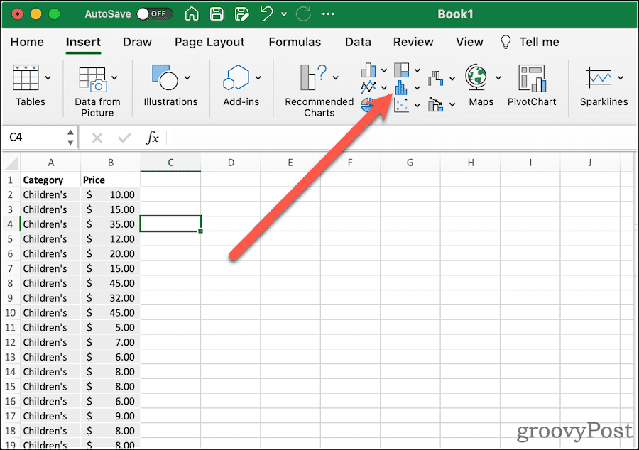
- Select your data in your Excel workbook—either a single or multiple data series.
- On the ribbon bar, click the Insert tab.
- On Windows, click Insert > Insert Statistic Chart > Box and Whisker.
- On macOS, click the Statistical Chart icon, then select Box and Whisker.
That will net you a very basic box plot, with whiskers. Next, you can modify its options to look how you want.
Formatting a Box Chart in Excel
Once you’ve created your box plot, it’s time to pretty it up. The first thing you should do is give the chart a descriptive title. To do this, click the existing title, then you can select the text and change it.
From the Design and Format tabs of the ribbon, you can modify how Excel styles your box chart. This is where you can select the theme styles used, change the fill color of the boxes, apply WordArt styles, and more. These options are universal to just about all of the charts and graphs you might create in Excel.
If you want to change options specific to the box and whisper chart, click Format Pane. Here, you can change how the chart represents your data. For example:
A Welcome Addition for Statistical Analysis
It wasn’t always so easy to figure out how to create a box plot in Excel. Creating the chart in previous versions of the spreadsheet software required manually calculating the different quartiles. You could then create a bar graph to approximate the presentation of a box plot. Microsoft’s addition of this chart type with Office 365 and Microsoft 365 is very welcome.
Of course, there are lots of other Excel tips and tricks you can learn if you’re new to Excel. Box plots might seem advanced, but once you understand the concepts (and the steps), they’re easy to create and analyze using the steps above.
Источник
Create a box and whisker chart
A box and whisker chart shows distribution of data into quartiles, highlighting the mean and outliers. The boxes may have lines extending vertically called “whiskers”. These lines indicate variability outside the upper and lower quartiles, and any point outside those lines or whiskers is considered an outlier.
Box and whisker charts are most commonly used in statistical analysis. For example, you could use a box and whisker chart to compare medical trial results or teachers’ test scores.

Create a box and whisker chart
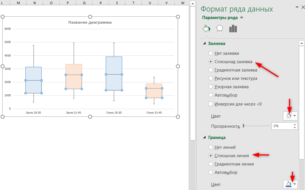
Select your data—either a single data series, or multiple data series.
(The data shown in the following illustration is a portion of the data used to create the sample chart shown above.)
In Excel, click Insert > Insert Statistic Chart > Box and Whisker as shown in the following illustration.
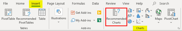
Important: In Word, Outlook, and PowerPoint, this step works a little differently:
On the Insert tab, in the Illustrations group, click Chart.
In the Insert Chart dialog box, on the All Charts tab, click Box & Whisker.

Use the Design and Format tabs to customize the look of your chart.

If you don’t see these tabs, click anywhere in the box and whisker chart to add the Chart Tools to the ribbon.
Change box and whisker chart options
Right-click one of the boxes on the chart to select that box and then, on the shortcut menu, click Format Data Series.
In the Format Data Series pane, with Series Options selected, make the changes that you want.
(The information in the chart following the illustration can help you make your choices.)
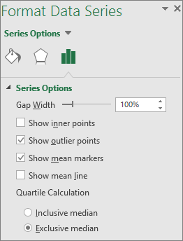
Controls the gap between the categories.
Show inner points
Displays the data points that lie between the lower whisker line and the upper whisker line.
Show outlier points
Displays the outlier points that lie either below the lower whisker line or above the upper whisker line.
Show mean markers
Displays the mean marker of the selected series.
Displays the line connecting the means of the boxes in the selected series.
Choose a method for median calculation:
Inclusive median The median is included in the calculation if N (the number of values in the data) is odd.
Exclusive median The median is excluded from the calculation if N (the number of values in the data) is odd.
Tip: To read more about the box and whisker chart and how it helps you visualize statistical data, see this blog post on the histogram, Pareto, and box and whisker chart by the Excel team. You may also be interested learning more about the other new chart types described in this blog post.
Create a box and whisker chart
Select your data—either a single data series, or multiple data series.
(The data shown in the following illustration is a portion of the data used to create the sample chart shown above.)
On the ribbon, click the Insert tab, and then click  (the Statistical chart icon), and select Box and Whisker.
Use the Chart Design and Format tabs to customize the look of your chart.
If you don’t see the Chart Design and Format tabs, click anywhere in the box and whisker chart to add them to the ribbon.
Change box and whisker chart options
Click one of the boxes on the chart to select that box and then in the ribbon click Format.
Use the tools in the Format ribbon tab to make the changes that you want.
Источник
Диаграмма «ящик с усами» (boxplot) в Excel 2016
Excel 2016, как известно, обогатился новыми типами диаграмм. Одна такая, которая диаграмма Парето, уже была показана. В этот раз рассмотрим другую, чисто статистическую. Называется «ящик с усами» или «коробчатая диаграмма» (box-and-whiskers plot или boxplot).
Раньше я такие видел только в специализированных ПО, типа STATISTICA, и для того, чтобы нарисовать подобную диаграмму в Excel, нужно было изрядно потрудиться. Теперь она есть в стандартном наборе Excel.

Зачем нужна такая диаграмма? Допустим, есть выборка для анализа. А еще лучше несколько выборок, которые нужно сравнить. Для этого рассчитывают различные показатели. Однако к любому расчету всегда хочется добавить наглядности, чтобы мозг перешел в режим образного представления, а не довольствовался сухими цифрами и формулами. Поэтому основные характеристики ловко изображают на рисунке. Отличным вариантом будет как раз диаграмма «ящик с усами».

На рисунке показан формат по умолчанию. Как видно, сравниваются две выборки путем изображения двух «ящиков с усами».
Что здесь что обозначает?
Крестик посередине – это среднее арифметическое по выборке.
Линия чуть выше или ниже крестика – медиана.
Нижняя и верхняя грань прямоугольника (типа ящика) соответствует первому и третьему квартилю (значениям, отделяющим ¼ и ¾ выборки). Расстояние между 1-м и 3-м квартилем – это межквартильный размах (или расстояние).
Горизонтальные черточки на конце «усов» – максимальное и минимальное значение (без учета выбросов, см. ниже).
Отдельные точки – это выбросы, которые показываются по умолчанию. Если значение выходит за пределы 1,5 межквартильных размаха от ближайшего квартиля, то оно считается аномальным. Их можно скрыть (см. ниже настройки).
Во всей красе «ящик с усами» проявляется при сравнении выборок, в которых данные делятся на категории. Допустим, провели некоторый эксперимент среди мужчин и женщин. Есть данные до и после эксперимента по обоим полам. Для анализа потребуется вычислить различные показатели. А если к этому добавить диаграмму «ящик с усами», то результат будет весьма наглядным.

Отлично видно, что после проведения эксперимента данные по мужчинам в целом уменьшились, а данные среди женщин наоборот, увеличились. Это не значит, что выборки больше не нужно анализировать (сравнивать, проверять гипотезы и т.д.). Но наглядность сильно улучшает понимание. Перейдем к настройкам.
Настройки диаграммы «ящик с усами»
Общий вид диаграммы настраивается стандартно. Можно менять цвет, добавлять подписи и т.д. Для этого есть две контекстные вкладки на ленте (Конструктор и Формат). Но есть настройки, предназначенные специально для этой диаграммы.
Выбираем какой-либо ряд и жмем Ctrl+1. Либо два раза кликаем по какому-нибудь «ящику». Можно через правую кнопку Формат ряда данных…. Справа вылазит панель настроек.

Рассмотрим по порядку.
Боковой зазор – регулирует ширину ящиков и расстояние между ними.
Показывать внутренние точки. Если поставить галочку, то на оси, где расположены «усы», точками будут показаны все значения. Так хорошо видно распределение внутри групп.

Показывать точки выбросов – отражать экстремальные значения.
Выбросы – это точки, выходящие за пределы 1,5 межквартильных размаха.
Показать средние метки – среднее арифметическое (крестики). Стоят по умолчанию, но можно скрыть.
Показать среднюю линию – только для различных категорий. Показывает изменения по категориям.

Если добавить линии, то изменения после эксперимента станут видны еще лучше. В справке написано, что соединяются медианы, но на графике почему-то соединяются средние. Чудеса.
Инклюзивная медиана или эксклюзивная медиана. Инклюзивная медиана включает в «ящик» квартильные значения , а эксклюзивная медиана не включает. При выборе «эксклюзивной медианы» верх и низ «ящика» соответствует средней между квартильным и следующим (от центра) значением. По умолчанию стоит «эксклюзивная». Пусть стоит дальше. Причем тут медиана, вообще не понял, – речь ведь про квартиль. Думал, криво перевели, но в английской версии те же названия. В общем, здесь лучше ничего не менять.
Своевременное использование диаграммы «ящик-усы» может дать весьма ценную и наглядную информацию. Аналитику, который использует специализированные программы или трудоемкие настройки Excel, будет очень приятно иметь такую диаграмму под рукой.
Как показано в ролике ниже, все делается очень быстро и просто.
Источник
Excel Box Plot (Table of Contents)
- What is a Box Plot?
- How to Create Box Plot in Excel?
Introduction to Box Plot in Excel
If you are a statistic geek, you often might come up with a situation where you need to represent all the 5 important descriptive statistics which can be helpful in getting an idea about the spread of the data (namely minimum value, first quartile, median, third quartile and maximum) in a single pictorial representation or in a single chart which is called as Box and Whisker Plot. For example, the first quartile, median, and third quartile will be represented under a box, and whiskers give you minimum and maximum values for the given set of data. Box and Whisker Plot is an added graph option in Excel 2016 and above. However, previous versions of Excel do not have it built-in. In this article, we are about to see how a Box-Whisker plot can be formatted under Excel 2016.
What is a Box Plot?
In statistics, a five-number summary of Minimum Value, First Quartile, Median, Last Quartile, and Maximum value is something we want to know in order to have a better idea about the spread of the data given. This five value summary is visually plotted to make the spread of data more visible to the users. The graph on which statistician plot these values is called a Box and Whisker plot. The box consists of First Quartile, Median and Third Quartile values, whereas the Whiskers are for Minimum and Maximum values on both sides of the box respectively. This Chart was invented by John Tuckey in the 1970s and has recently been included in all the Excel versions of 2016 and above.
We will see how a box plot can be configured under Excel.
How to Create Box Plot in Excel?
Box Plot in Excel is very simple and easy. Let’s understand how to create the Box Plot in Excel with some examples.
You can download this Box Plot Excel Template here – Box Plot Excel Template
Example #1 – Box Plot in Excel
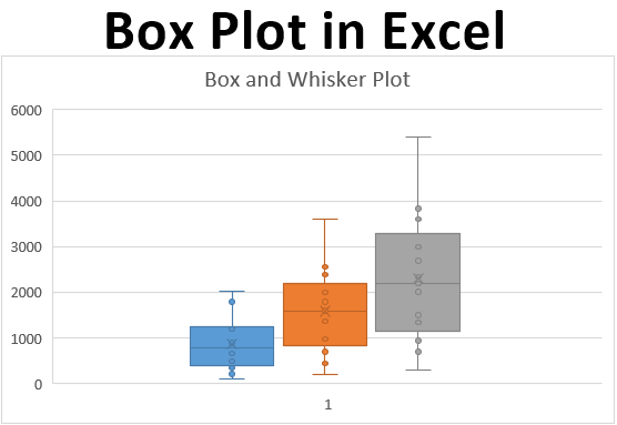
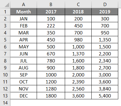
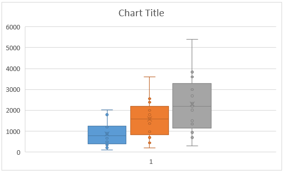
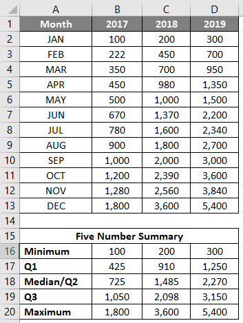
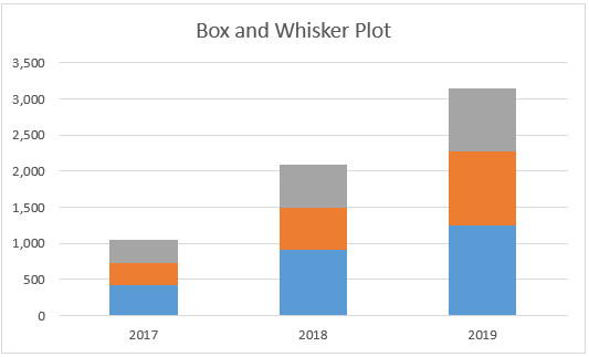
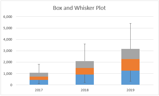
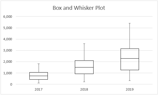
Suppose we have data as shown below, which specifies the number of units we sold of a product month-wise for years 2017, 2018 and 2019, respectively.
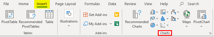
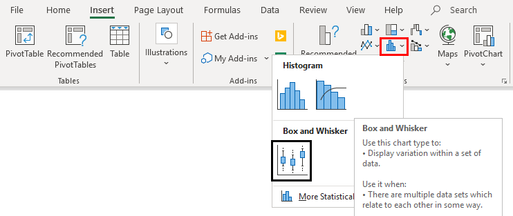
Step 1: Select the data and navigate to the Insert option in the Excel ribbon. You will have several graphical options under the Charts section.
Step 2: Select the Box and Whisker option, which specifies the Box and Whisker plot.
Right-click on the chart, select the Format Data Series option, then select the Show inner points option. You can see a Box and Whisker plot as shown below.
Example #2 – Box and Whisker Plot in Excel
In this example, we will plot the Box and Whisker plot using the five-number summary that we have discussed earlier.
Step 1: Compute the Minimum Maximum and Quarter values. MIN function allows you to give your Minimum value; MEDIAN will provide you the median Quarter.INC allows us to compute the quarter values, and MAX allows us to calculate the maximum value for the given data. See the screenshot below for five-number summary statistics.
Step 2: Now, since we are about to use the stack chart and modify it into a box and whisker plot, we need each statistic as a difference from its subsequent statistic. Therefore, we use the differences between Q1 – Minimum and Maximum – Q3 as Whiskers. Q1, Q2-Q1, Q3-Q2 (Interquartile ranges) as Box. And combine together, it will form a Box-Whisker Plot.
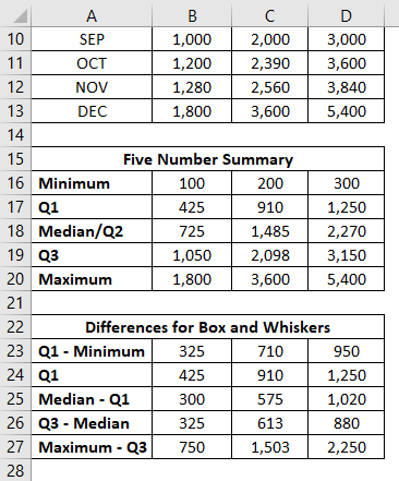
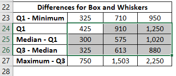
Step 3: Now, we are about to add the boxes as the first part of this plot. Select the data from B24:D26 for boxes (remember Q1 – Minimum and Maximum – Q3 are for the Whiskers?)
Step 4: Go to the Insert tab on the excel ribbon and navigate to Recommended Charts under the Charts section.
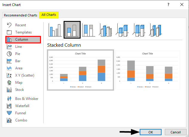
Step 5: Inside Insert Chart window > All Charts > navigate to Column Charts and select the second option, which specifies the Stack Column Chart and click OK.
This is how it looks.
Step 6: Now, we need to add whiskers. I will start with the lower whisker first. Select the stack chart portion, which represents the Q1 (Blue bar) > Click on Plus Sign > Select Error Bars > Navigate to More Options… dropdown under Error Bars.
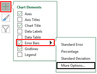
Step 7: As soon as you click on More Options… Format Error Bars menu will appear > Error Bar Options > Direction : Minus Radio Button (since we are adding the lower whisker) > End Style : Cap radio button > Error Amount : Custom > Select Specify Value.
It opens up a window within which specifies the lower whisker values (Q1 – Minimum B23:D23) under Negative Error Value and Click OK.
Step 8: Do the same for the upper Whiskers. Select the gray bar (Q3-Median bar); instead of selecting Direction as Minus, use Plus and add the values of Maximum – Q3, i.e. B27:D27, under the Positive Error Values box.
It opens up a window within which specifies the lower whisker values (Q3 – Maximum B27:D27) under Positive Error Value and Click OK.
The Graph now should look like the screenshot below:
Step 9: Remove the bars associated with Q1 – Minimum. Select the Bars > Format Data Series > Fill & Line > No Fill. This will remove the lower part as it is not useful in the Box-Whisker plot and just added initially because we want to plot the stack bar chart as a first step.
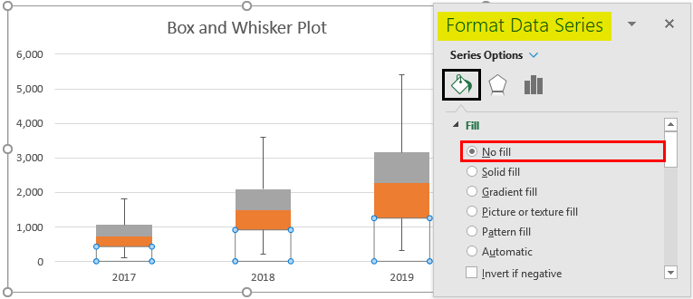
Step 10: Select the Orange bar (Median – Q1) > Format Data Series > Fill & Line > No fill under Fill section > Solid line under Border section > Color > Black. This will remove the colors from the bars and represent them just as outline boxes.
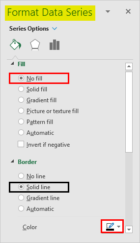
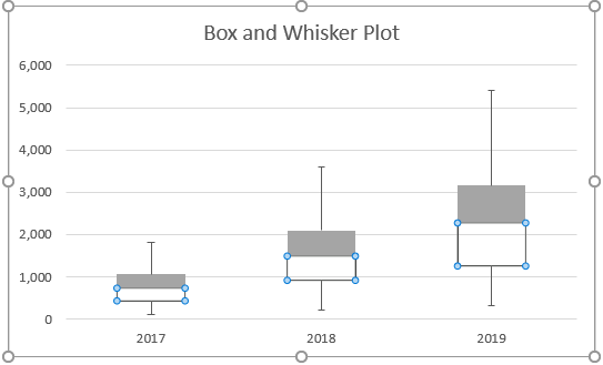
Follow the same procedure for the gray bar (Maximum – Q3) to remove the color from it and represent it as a solid line bar. The plot should look like the one in the screenshot below:
This is how we can create Box-Whisker Plot under any version of Excel. If you have Excel 2016 and above, you anyway have the direct chart option for the Box-Whisker plot. Let’s end this article with some points to be remembered.
Things to Remember
- Box plot gives an idea about the spread/distribution of the dataset with the help of a five-number statistical summary which consists of Minimum, First Quarter, Median/Second Quarter, Third Quarter, Maximum.
- Whiskers are nothing but the boundaries, which are distances of minimum and maximum from first and third quarters, respectively.
- Whiskers are useful to detect outliers. Anything point lying outside the whiskers is considered an outlier.
Recommended Articles
This is a guide to Box Plot in Excel. Here we discuss how to create a Box Plot in Excel along with practical examples and a downloadable excel template. You can also go through our other suggested articles –
- Plots in Excel
- Box and Whisker Plot in Excel
- Dot Plots in Excel
- 3D Scatter Plot in Excel
How to Make a Box and Whisker Plot in Excel
Display a five-number summary of data
Updated on September 30, 2020
In Microsoft Excel, a box plot uses graphics to display groups of numerical data through five values, called quartiles. Box plot charts can be dressed up with whiskers, which are vertical lines extending from the chart boxes. The whiskers indicate variability outside the upper and lower quartiles.
Box and whisker plots are typically used to depict information from related data sets than have independent sources, such as test scores between different schools or data from before and after changes in a process or procedure.
In recent versions of Excel, you can create a box and whisker chart using the Insert Chart tool. Although older versions of Excel don’t have a box and whisker plot maker, you can create one by converting a stacked column chart into a box plot and then adding the whiskers.
These instructions apply to Excel 2019, Excel 2016, Excel for Microsoft 365, Excel 2013, and Excel 2010.
Use Excel’s Box and Whisker Plot Maker
For Excel 2019, Excel 2016, or Excel for Microsoft 365, make a box and whisker plot chart using the Insert Chart tool.
-
Enter the data you want to use to create a box and whisker chart into columns and rows on the worksheet. This can be a single data series or multiple data series.
-
Select the data you want to use to make the chart.
-
Select the Insert tab.
-
Select Recommended Charts in the Charts group (or select the dialog box launcher in the lower-right corner of the charts group) to open the Insert Chart dialog box.
-
Select the All Charts tab in the Insert Chart dialog box.
-
Select Box and Whisker and choose OK. A basic box and whisker plot chart appears on the worksheet.
Transform a Box Plot Chart into a Box and Whisker Plot
For Excel 2013 or Excel 2010, start with a stacked column chart and transform it into a box and whisker plot chart.
Create a basic box plot chart in Excel and then add the whiskers.
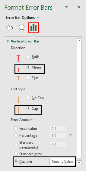
Add the Top Whisker
The whiskers on a box and whisker box plot chart indicate variability outside the upper and lower quartiles. Any data point that falls outside the top or bottom whisker line would be considered an outlier when analyzing the data.
-
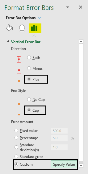
Select the top box on the chart and then select Add Chart Element on the Chart Design tab.
-
Select Error Bars and choose More Error Bar Options to open the Format Error Bars menu.
-
Select Plus under Direction in Error Bars Options.
-
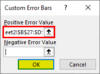
Select Custom and choose Specify Value in the Error Amount Section to open the Custom Error Bars dialog box .
Add the Bottom Whisker
Once you’ve added the top whiskers, then you can add the bottom whiskers in a similar fashion.
-
Select the bottom box on the chart and select Add Chart Element on the Chart Design tab.
-
Select Error Bars and choose More Error Bar Options to open the Format Error Bars menu.
-
Select Minus under Direction in Error Bars Options.
-
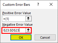
Select Custom and choose Specify Value in the Error Amount Section. The Custom Error Bars dialog box will open.
-
Delete the contents of the Positive Error Value box. Select the bottom values on the worksheet and select OK to close the Custom Error Bars window.
Format a Box and Whisker Plot Chart in Excel
Once you have created the chart, use Excel’s chart formatting tools.
-
Select Chart Title and enter the title you want to appear for the chart.
-
Right-click one of the boxes on the chart and choose Format Data Series to open the Format Data Series pane.
-
Increase or decrease the Gap Width to control the spacing of the gap between the boxes.
-
Select Show Inner Points to display the data points between the two whisker lines.
-
Also in the Format Data Series pane, select Show Outlier Points to display outliers below or above the whisker lines.
-
Select Show Mean Markers to display the mean marker of the data series.
-
Select Show Mean Line to display the line connecting the means of the boxes in the data series.
-
Select a method for Quartile Calculation:
- Inclusive Median is included in the calculation if the number of values in the data is odd.
- Exclusive median is excluded from the calculation if there are an odd number of values in the data.
-
Select the next box in your plot chart to customize it in the Format Data Series pane and repeat for any remaining boxes.
Edit or Change the Appearance of the Box and Whisper Plot
To make changes to the appearance of the box and whisker plot chart, select any area of the chart and then choose Chart Design or Design Tools on the Chart Tools tab, depending on which version of Excel you are using.
Modify factors such as the chart layout, style, or colors using the same methods described above.
Thanks for letting us know!
Get the Latest Tech News Delivered Every Day
Subscribe