
The default ‘Body Text’ style in Word needs some changes to suit your needs. Here’s some suggestions for things to alter or check to make sure they suit your, er, style.
Can’t see a Body Text style? See Make Body Text style appear in Microsoft Word
Body Text style can be different
The default Body Text style in a Blank Document / normal.dotm might be different on your computer. It depends on the version of Office, Windows or Mac, changes made previously and, perhaps, your horoscope.
Word 365/2019 for Windows
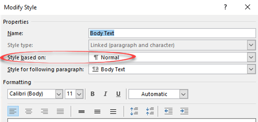
This is the current Word 2019/365 for Windows default Body Text style, at least on our test machines.
Word 365 for Mac
Word 365 for Mac has Body Text style also with the style is based on Normal, instead of (no style). There are other differences like Line Spacing is Single.

Your mileage may vary a little, but not much
Your ‘Body Text’ style may be different but the settings and options will be the same (or almost the same). This is an area which has not changed much for many versions of Office/Word.
Change ‘Style Based on’
The main reason you use ‘Body Text’ instead of ‘Normal’ for most paragraphs is to avoid any inheritance problems if you change the main paragraph settings. Microsoft knows this, but still the ‘Body Text’ style is based on Normal.

This is important and the first thing we’ll change. Switching to ‘(no style)’ reveals all the style settings as listed below. ‘(no style)’ means that the settings from ‘Normal’ are copied into ‘Body Text’ (copied not linked) to make a standalone style which inherits no settings from any other style.
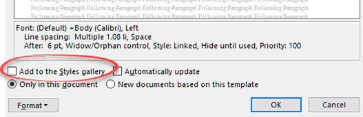
Body Text default settings
Here are the default settings as seen above for Word 365/2019/2021 for Windows. The listing in the Word dialog isn’t entirely clear with some strange wrapping (e.g. Space … After ).
Linked style – it can apply to both a paragraph and characters.
Style based on: (no style).
Style for following paragraph: pressing Enter to end a paragraph in this style, the next paragraph will be: Body Text.
- Font: (Default) +Body (Calibri)
- (Justification) Left
- Line spacing: Multiple 1.08 li,
- Space After: 6 pt
- Widow/Orphan control,
- Style: Linked
- Hide until used
- Priority 100 (order in styles list)
Add to Style Gallery: No
Changes to the document formatting do NOT change the style (‘Automatically update’ is OFF)
Any style changes only apply to the current document (not ‘New documents based on this template’ i.e. change the style settings in the template).
Body Text settings to check or change
The Body Text style settings may be different on your computer. Here’s some settings to check or change to suit you. All these settings are available from Modify Style, mostly via the ‘Format’ list.

The basic settings like Font, Justification,Line Spacing, Space before/after, Indents are on the Modify Style box with a very simple preview:

Style based on
We’ve already mention this. Change ‘Style based on ..’ to (no style) which makes Body Text standalone from any other style changes.
Font
Choose another font, suggestions for body text include Times New Roman, Garamond or Georgia.
Justification
The default is Left justification which is the standard for document drafts.
Change to Justify whenever you like, most commonly for the final stages before publication.
Line Spacing
Increase the line spacing for drafts, especially printed drafts or using digital ink markup.
Switching to, say, 1.5 or double spacing gives you more ‘scribble’ room.
For the final release, change Line Spacing to single line spacing or similar.
Language
Make sure the Language setting is correct because it effects the spell and grammar checking done by Word.
There are often language variants like English (Canada) or English (UK) to choose instead of English (US) which appears as the default all over the world.
It’s a similar story in French, Spanish and other languages.
For multi-lingual documents, you could have extra styles linked to ‘Body Text’ with only a language change e.g. ‘Body Text – Finnish’ ‘Body Text – German’ etc. That will ensure the correct spell and grammar checks are applied. Modern Word has automatic language detection, but many users find it’s more reliable to specify the language.
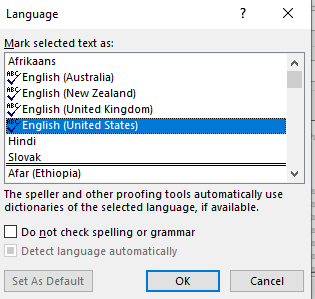
Use the ‘Do not check spelling or grammar’ choice for computer code, quotations or other text that doesn’t need spell/grammar checks. Make a linked style ‘Body Text – no proofing’.
Quick Style Gallery
Do you want the style to appear in the Styles Gallery (i.e on the ribbon)?
Add to Styles Gallery on Modify Styles will do that.
Word for Mac has the same option except it’s called a ‘Quick Style List’.
Shortcut key
The quickest way to apply a style is a shortcut key. See Add a Fast keyboard shortcut for any Word style and Shortcuts for Word heading styles.
For Body Text we use Ctrl + Alt + ` because the third keypress is immediately to the left on the of the Heading 1 shortcut (Ctrl + Alt + 1). An alternative could be Ctrl + Alt + 0 at the right side of the keyboard number row.

Another choice is Ctrl + Alt + N which will override the default shortcut for Normal style.
This document or the template?
Are these style changes for the current document only or all documents based on the current template?
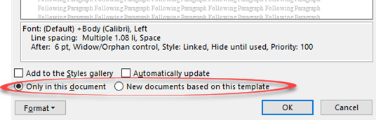
Make that choice from:
- Only in this document
- New documents based on this template
See Make Body Text style appear in Microsoft Word
Why choose Body Text vs Normal in Word
Автор статьи: Сюзанн Барнхилл (Suzanne Barnhill)
Обычный (Normal) – это стиль, являющийся основой для всех прочих стилей (если Вы сами не измените данное условие). Изменение шрифта или форматирования абзаца стиля Обычный (Normal) окажет волновой эффект на большинство других стилей документа. Поэтому при создании документа с четкой постоянной структурой (в отличие от черновой работы) лучше использовать другие стили, предназначенные для конкретных задач.
Основной текст (Body Text) как раз и является таким стилем для использования по отношению к обычному тексту документа. По умолчанию он идентичен стилю Обычный (Normal), за исключением применения интервала после абзаца 6 пт. Это означает, что при его использовании будут применяться полуторные междустрочные интервалы между абзацами, что часто и будет соответствовать Вашим пожеланиям. В иных случаях, когда Вам потребуются большие или меньшие интервалы, отступ первой строки абзаца, иной шрифт или какие-либо другие изменения, Вы сможете настроить желаемые параметры стиля Основной текст (Body Text). При этом, не будет оказано влияния на другие стили, за исключением стилей «семьи Основного текста» (таких, как Основной текст с отступом (Body Text Indent), Основной текст с отступом 2 (Body Text First Indent) и т.д.), в основе которых лежит стиль Основной текст (Body Text).
Также обратите внимание, что, по желанию, Вы можете отменить привязку какого-либо стиля к стилю Обычный (Normal); для этого выберите Формат | Стили и форматирование | Изменить (Format | Style | Modify), а в поле «Основан на стиле» (“Based on”) укажите «(нет)» (no style).
Для более подробной информации, см. раздел, посвященный стилям, статьи Создание шаблона (Часть II) (Creating a Template (Part II)), а также см. Подсказки по печати от Microsoft Publisher (Typographical Tips from Microsoft Publisher).
If you’re sick of MicroSoft word fonts Calibri and Cambria, change your default heading and body styles so you can start every new Word document with the fonts you prefer.
Put Font Frustration Behind You!
One of the most persistent frustrations legal users have with Microsoft Word fonts is the default font settings. Fortunately, you can permanently change just two Styles (+Body and +Headings) to give your documents a more businesslike typeface.
These settings are found in the Design tab (introduced into Microsoft Word with version 2013).
Over on the far right is a drop-down called Fonts. Clicking on Fonts will give you a list of preconfigured font sets. From here, you want to choose Customize Fonts.
That’s going to take you into the Create New Theme Fonts dialog box. On the left, you’ll see Heading font and Body font. This is where you set the two Styles I told you about earlier, +Body and +Headings, which in turn control basic settings for many of the other Styles in a Word document. Just use the drop-down for each to find a font more to your liking. Then you can name your preferred font set before clicking Save.
Once you reset the font style, the default text size is an easy fix, too.
Go to the Home tab and click on the small launcher arrow in the lower right-hand corner of the font section to go to the Font dialog box. Select +Body and the size text you want, then click Set as Default in the lower left-hand corner.
Word will ask whether you want to make this the default for this document only or for all future documents based on the Normal template. Choose the latter and click OK.
Save everything you’ve done by clicking Set as Default on the Design tab (next to the Colors and Fonts buttons).
Now Every New Document You Start in Word Will Use the Microsoft Office Fonts You Prefer
This doesn’t affect documents you receive from others or any existing documents you created. However, once you reset your default fonts, at least your days of adjusting the fonts every time you start a document are behind you.
Click here to read more of Deborah’s Microsoft Office tips.
Illustration ©iStockPhoto.com
Subscribe to Attorney at Work
Get really good ideas every day: Subscribe to the Daily Dispatch and Weekly Wrap (it’s free). Follow us on Twitter @attnyatwork.
This is the second in a series on formatting books for print.
Part 1 is First Steps in Formatting for Print.
______________________________
In our first article in this series, we looked at three important topics for the writer who is self-publishing print books—trim, font, and margins. Before you begin formatting the text itself, you’ll want to choose trim size (the book’s dimensions), font and font size, and margin sizes.
Once you’ve made your decisions and set up your Word doc to reflect these choices—your paper size will match the trim size and will no longer be 8 1/2 x 11 or A4, and your margins will no longer be the typical one inch on each side—you can make other changes. (A reminder that the specifics of this series relate to MS Word, although you can use other software to prepare your manuscript for publishing.)
Be sure to save your formatted document with a new name so you can go back to your working manuscript in its original form if you need to.
Justified Text
While you probably worked with text that was aligned left and jagged on the right, you’ll now want to justify the text. Justification gives you straight margins on both sides rather than jagged ones on the right and is the typical setup for print books.
One easy way to justify your text is to highlight all of it (Ctrl+A) and type Ctrl+J.
A second way is to highlight all the text and click the justified text icon in Word’s toolbar.
With both options, all text will be justified. And that means your chapter titles as well as the story text. This isn’t really a problem, however, since chapter titles will require attention for other reasons and you’ll be changing the font for those eventually. (When you set the font style for chapter titles, it’s likely that you’ll center the title, but you don’t have to. You may align the title to the left or indent to allow room for a graphic.)
Beyond highlighting all the text and then justifying it, there are other ways to justify text. You could create a font style to set up your body text to include justified text. The use of font styles makes formatting a great deal easier.
We’re going to look at font styles in some detail in this article before we go into other specifics about formatting.
Font Styles
MS Word allows you to assign styles to each type of text in your document. Using font styles makes it easy to change all instances of one style at the same time without affecting text that uses any other style.
For a novel, you’ll typically have a style for your regular body text (with indented paragraphs), a style for body text that’s not indented (first lines of chapters and/or scenes), a style for chapter numbers and/or chapter titles, styles for author names and book titles in headers (which could be separate styles), a style for page numbers in either header or footer, and styles for the front matter, including copyright, acknowledgement, and title pages.
While novels typically include author name in the left page header and novel title in the right page header, nonfiction headers are often arranged differently. Nonfiction books often include the book title in the left page header and a chapter title in the right. Nonfiction books with multiple parts may include part and chapter titles in headers and the book title in the footer. Most nonfiction doesn’t include the author name in header or footer. And you may find you need a different font style for each element in your headers and footers.
For fiction and nonfiction, you may also need a separate font style or styles for the first line of a chapter—will you use small caps for the first few words or even for the entire first line? Will you use a drop cap for the first word of a chapter? What about the first line after a scene break—indented or not?
This would be a great time to pull out several dozen books and start studying the formatting. Looking at two or three books won’t be enough—expose yourself to twenty or thirty books and layouts. See which elements appeal to you. See if you can determine why choices were made for certain books.
Does a drop cap style better fit a certain genre?
Are page numbers in the header or in the footer? Centered in the middle or flush with the margins?
Are book titles and author names in different fonts in the header? Are the fonts the same but of a different size?
Do chapters begin halfway down the page or only one third of the way? And where do chapter titles fall, halfway between the top of the page and the first line of the chapter or closer to either the top or the center of the page?
______________________________
Once you decide on the options you want to try, it’s time to set up the text.
Make sure that you’ve changed the paper sizes and the margins before you start changing the text itself.
If you’ve used font styles all along, you’ll be ahead of the game. If you haven’t, you’ll need to take time to create styles as you format. Styles make the management of text easy and nearly automatic. Once you decide on a font style for a certain type of text, you simply apply that style each time you need it. And if you need to change one or more features of the style, you change the font style itself and not the text. When you modify the style, all text based on that style is changed as well.
You can also piggyback one style on another. If you have used one style for body text that’s indented but need a style that’s exactly the same—same font, same font size, same line spacing—except you want to eliminate the indent, you can create a new font style based on the original one and simply change the indent. Just save the new font style with a different name.
This may sound confusing, but it’s actually not. This is one instance, however, when trying the steps for yourself, using sample text, will likely be helpful for making sense of the tips.
For our purposes, I’m going to walk through the process of creating a few styles and applying them to the manuscript text only, meaning only body text and chapter titles. Styling for headers and footers and front matter can be achieved the same way.
Some formatters strip all formatting from text when they’re ready to format for print, and you may want to do that as well, especially if you’ve played with a lot of different fonts and spacing. But you don’t have to. If you work with styles all along and rely on those rather than on manual tabs or extra paragraph breaks, your manuscript may only need a little tweaking before it’s ready for formatting.
Did I mention that you can add spacing to your font styles? This means that with your chapter title, you can have it begin at a certain place on a page, no more inserting dozens of paragraph breaks to move the text into place. You can also build in line spacing to be included after a paragraph containing a certain font style. So if you want your chapter’s body text to begin four line spaces after the chapter title, you can include that detail in your font style for the chapter title. You could also include spacing before a particular font style. For a nonfiction book, you may want to increase the space between multiple examples or between the final example and the resumption of the regular body text. This is easy to set up with font styles.
Anything you can apply to text can be achieved through a font style.
______________________________
When you begin a new document in Word, you’re usually using the a font style called normal. Normal may be preset to something such as Times New Roman, 12 pt., aligned left, with no indents, line spacing at 1.15, and spacing of 10 points after each paragraph. This would be common for a letter or something similar.
When you format for a manuscript that you’re submitting to an agent or publisher or are printing for yourself, you probably changed your formatting at least once—to double space the text. You may have also changed the margins to make sure they were one inch on every side.
When you format a book for print, you again need to make changes to the text’s format.
Let’s assume that you’ve got body text (the bulk of the story itself) that’s aligned left (ragged on the right) and not indented, and you’ve got chapter titles (or numbers) that you’ve centered. You now want to set up styles that will format both these types of text (plus a couple of others).
If you have only a couple of different styles of text so far, that’s great. You can format for some additional styles as you go along.
If you didn’t set up styles beforehand, the easiest way to add styles is probably to first create a body text style and change all your text to that style.
There are a couple of ways to add and modify styles, and a couple of ways to move in and out of the styles pane; I suggest that once you’re familiar with the styles pane and style dialogue boxes, you find the best options for your workflow and your experience with Word.
On the home tab, click the arrow under change styles (or type Alt+Ctrl+Shift+S). Both of these open the styles pane (or window).
You can adjust the styles pane to show only the styles you’re using for the current document, but there are other options as well. Once you get used to working with styles, you may want to play around with the options here.
Word comes with some styles already set up (such as headings and subtitles), styles that you can modify, but we’re going to set up our own styles.
To set your first style, click on the new style icon on the bottom of the styles pane. A dialogue box will open, allowing you to create a new style. Note that you can base your new style on an existing style—that’s what we’re going to do.
Give your style a name. You won’t want to use a style name that Word has reserved, so try something that means something to you and to the specific text. Let’s call our first style novel body.
Next we add a few general bits of information.
The style type will be paragraph (more on this option later), style based on normal, and style in the next paragraph will be novel body as well.
After you enter that information, you’re ready to start styling. I’m going to skip some options since we won’t need all of them, at least not to get started.
Enter font and font size. (We talked about choosing fonts for print books in part 1.)
Click on the icon that will justify the text—this is the image whose lines evenly fill out the image from left to right.
Click on the format button on the bottom of the window and go to paragraph. Here you can set up indents on the indents and spacing tab—under special, try a first line indent of .2, .25, or .3 inches. (You can always modify your choices. It’s likely that you’ll try a couple of options and combinations before settling on one that works for your book’s needs.)
Left and right indents should be set at zero. Set spacing before and after the paragraph to zero and line spacing to something like multiple 1.1. (This is a measurement you should have already worked out as you were working through margins and trim size. Yet you can always make changes.)
Save your changes.
You now have a style called novel body.
If the manuscript contains only story text and chapter titles, highlight the entire doc (Ctrl+A) and then click on novel body in the styles window. All the text will change to the format you set up for novel body. To modify the style of your chapter titles—because you won’t use the same font size and maybe not the same font—create a new style, this one for titles.
If the manuscript contains a wide variety of text that will need different styles, and if there will be a lot of text in one or more of those styles, you could still change them all first to your body style, but you don’t have to. Still, this may be the quickest way to start adding styles.
For chapter titles, you may want to center the titles and change the font and font size. You will want to start a new page with every new chapter, place the chapter title partway down the page, and include a few line spaces after the title and before the chapter’s text begins.
You can do all of that with styles.
Create a new style, just as you did the first one. Name it chapter title or something similar. After choosing the font and font size and centering the text, click on format and then paragraph.
On the indents and spacing tab, find the spacing section near the bottom of the dialogue box. This is where you’ll enter the space requirements for spacing before and after the chapter titles.
Try something like 100 points before to get started. The actual amount of space you’ll want before your title will depend on the look you want, the page dimensions, the size of your title font (and the amount of space the chapter titles take up), and the amount of space you want between the chapter title and the header and between the title and the first line of the chapter.
Play around a bit—you can always change this later.
The size of your header may also affect where your title begins, so keep that in mind. (We won’t get into headers in this article, but don’t forget that your print book will likely contain headers and/or footers.)
Next, try something like 24 points after. The is the amount of space between your title and the first line of the chapter. Again you’ll want to play around with the way this looks. Print test pages to get a more accurate sense of what a printed page would look like. Make the space between your title bigger or smaller, depending on the look you want to create. (Keep in mind that chapter titles, especially in nonfiction, may be more than one line long. Longer titles may require a smaller font or may mean you’ll need to start the chapter title higher on the page.)
What this style setting does is locate your chapter title in the same place on every page. You won’t have to adjust the title using paragraph breaks (which you’ll never want to do now that you know how to add space before and after titles).
While you’re in the paragraph dialogue box, click the line and page breaks tab. Under pagination, click page break before. With this option checked, you’ve told Word to begin a new page at every line of text that uses the chapter title style. And that means you don’t have to manually insert page breaks. Be sure to save (okay) your changes.
As an alternative to creating your own style from scratch, you can use existing styles or you can rename and/or modify existing styles.
We won’t go into all the options you have for finding the style list and for modifying styles, but one detail that you will need to know about is the style type. You’ll find this in the create new styles dialogue box. Style type is in the properties section. You have options for character, paragraph, table and a few other choices.
When you create a new style, you’ll need to decide whether the style will apply to a character or a paragraph (or one of the other options). (You’re able to modify the style type of a style that you create, but you can’t modify the style type for one of Word’s default styles.)
If the style is set to paragraph and you use the style on even a single word in a paragraph, the entire paragraph is formatted to that style.
If the style is set to character, only the highlighted characters or words will be formatted to the style. So if you want to use small caps for the first three or four words of a chapter (or maybe the first line), you wouldn’t want the entire paragraph to be formatted with small caps. In this case you’d set up the style type for character, not paragraph.
You can modify font styles by right-clicking the style name in the styles list and choosing modify and then changing font or paragraph details, or you can change text in the document first. If you change a section of text first, highlight the newly formatted text and then right click on the font style you want to change in the style list. (Once you highlight text, the font style in the styles pane should also be highlighted.) Click update [style name] to match selection. This will update all sections of text using that style.
This gives you a couple ways of modifying styles—through changing the text first and then updating the style or changing the style through a dialogue box and then applying that style to a section of text.
Keep in mind that when you modify a style, all instances of that style in the text will also change. If you need to modify a style for only some sections of text but need to keep the first font style as well, add a new style based on the other style and then apply that new style only to the text that requires that style.
Say that most of your body text will be the same but you’ve got it set to indent at the beginning of every paragraph. What do you do for paragraphs that aren’t indented, such as those at the beginning of a chapter and after a scene break? Create a new style for those. Everything will be the same between the styles except for the indent. You might call this new style no-indent first line. (The more styles you have, the more you’ll appreciate how specific you should be when you name them.)
For nonfiction, you may have dozens of styles—example text, table headings, bulleted text, image descriptions, indexes, text with extra spacing, and much more.
______________________________
You can use font styles with any kind of document, but you definitely want styles in place when you format for print. (Formatting for e-books may require a different setup.) Set your styles up when you’re writing or wait until the manuscript is finished, but be prepared to work with styles. They give consistency to the text and will make formatting for print—whether done by you or a formatter—easier and faster. Font styles also allow you to do away with extra formatting that you’ve added willy-nilly throughout a document. Use styles so that every instance of one particular type of text is formatted the same as all others.
You can even save your font styles and manuscript setup as a template that you can use for other book projects.
***
Extra tip: You know how you get all kinds of wacky formatting when you copy and paste from the Internet? Use styles to clear that odd formatting. Highlight the text and click clear all on the styles list. The apply the style(s) you want for the text.
![]()
Tags: formatting Posted in: Self-Publishing