
You can split fonts into two main styles. There are serif fonts (with lines flicking out of each letter) and sans-serif fonts (without the lines). Serif fonts tend to be easier to read, but they look more formal. This article will show you some of the best ones in Word.
The best serif fonts in Microsoft Word are Times New Roman, Garamond, and Palatino Linotype. They all work well to show a more formal look in your writing. They’re also very easy to read, making them solid choices if you’re looking to write an essay or academic paper.
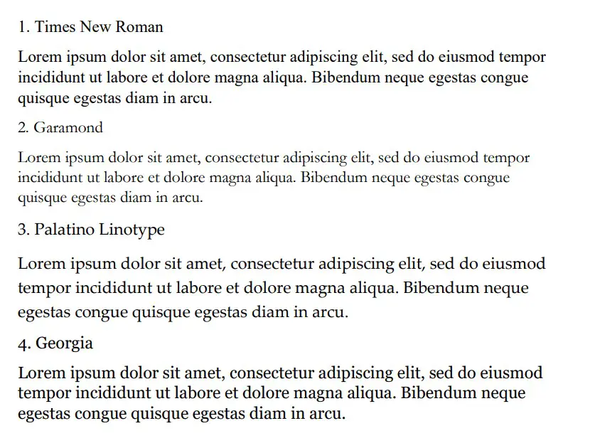
Times New Roman
Times New Roman is the default Microsoft Word font. You really can’t go wrong with it. Everyone knows what it looks like, and everyone uses it as the default serif font in Word. If you don’t actively change your font, it’s likely that you’re writing in Times New Roman.
It is a very professional font that has been proven to be one of the easiest to read on paper. It also makes your writing look more trustworthy, which works wonders when you use it for something like an academic or scientific paper.
You will find that Times New Roman is one of the most popular fonts in the world. It’s such a good choice because of how popular it is, and it can fit in just about anywhere in your writing. It works well for titles and in the main body of the text.
Garamond
Garamond is another great serif font that works really well. It comes in at a close second to Times New Roman, which is saying a lot considering how popular Times New Roman is. Garamond is fairly easy to read, and it even comes in slightly smaller in size.
Garamond is a great font that makes your writing much more concise. The smaller size of this font allows you to fit more words onto your page without feeling like you’re writing an essay full of gibberish and waffle.
If people decided to choose a different serif font in place of Times New Roman, it’s likely that Garamond would rank quite highly as their next favorite pick.
Palatino Linotype
Palatino Linotype is a great font choice that a lot of people enjoy using. It feels a bit fresher than some of the other serif fonts, and the size of the letters makes it a little more appealing when you are writing it for more informal purposes.
You will find that Palatino Linotype looks good wherever you put it. It can be both in a heading or in the main text body. As long as you like the look of the font, you’ll find a great place to put it to make sure it fits in.
The letters on Palatino Linotype feel a little more “open” than those of Times New Roman and Garamond. That’s what makes it a better choice if you’re looking for something that’s a little bit easier to read or comes across with more informal energy.
Georgia
Georgia is a very popular choice that a lot of essay writers are recommended to use. Many academics also vouch for Georgia, making it a really good choice if you’re looking to capture a more formal and trustworthy look.
People say that Georgia works really well as a heading. While this is definitely true, there is nothing wrong with using it as part of the main body of your text either. It can work in just about any situation, which makes it a great serif font choice.
While it’s not as popular as Times New Roman, it’s definitely up there in terms of how many people use it. It’s a fairly generic serif font, so there aren’t any specific style choices that stand it out from some of the rest.
Cambria
Cambria is another great serif font that is a default choice in Microsoft Word. While it isn’t automatically set as a font choice, it is automatic if you use the specific Word style that allows you to write headings and sub-headings.
Cambria is one of the best choices to introduce new ideas with headings and sub-headings. Of course, you don’t have to be limited to including it as a heading. If you want it as the text body, too, that’s fine.
You’ll find that this ranks highly in popularity compared to many of the other fonts. It looks really good on the page because of the more “square” feel that the letters have.
Bodoni MT
Bodoni MT is a classical serif font that works well. People like to use this font for novels, which shows that it must be an easy-to-read choice. The purpose of novels is to have thousands of words page after page, so having an easy-to-read font is always going to be ideal.
Bodoni MT is one of the thicker fonts on this list. It almost looks like it is written in bold, which really helps it to stand out from some of the other options. It works really well when it’s used to write multiple words at the same time.
The serif style looks very similar to some of the best fonts on this list, too. While this doesn’t allow Bodoni MT to be unique, it does allow it to have a familiar look and feel to it.
Bookman Old Style
Bookman Old Style is another great font that is common for novels. Again, if it works well in novels, you can bet that it works well in any situation when you might need someone to read through what you’re writing carefully.
Bookman Old Style is a large font. It allows the letters to appear more free and open compared to many of the other choices. This makes it a great font that’s worth trying out.
Lucida Bright
Lucida Bright is a good font choice. It’s part of the famous Lucida font family, and it works really well to show a large serif style. Lucida Bright is one of the larger fonts on this list, making it a great choice if you’re trying to make your writing really easy to read.
Some people would argue that Lucida Bright is too large for most formal documents. It does mean that you’ll take up a few extra pages because of your larger font choice, but this isn’t always a problem. Sometimes, it’s refreshing to include a larger font.
Modern No. 20
Modern No. 20 is an interesting serif font that doesn’t often get used. It’s a great choice nonetheless, and it applies to situations where some of the other serif fonts might feel a bit too pretentious or samey.
Modern No. 20 has very sharp serifs on its letters. While all of the fonts discussed so far have decent serif accents, Modern No. 20 seems to have some of the largest serifs that really help it to bring a unique style to your writing.
It’s much smaller than most of the other options too. It makes for a great choice if you’re trying to include a lot of information in one area without feeling like you have to fill up a lot of pages to get it to work.
Rockwell
Rockwell is a great option that many people like to use. It comes from the Rockwell family, which has made its name with more obvious and impactful fonts like ExtraBold and Condensed. Rockwell on its own is a great option for your serif-font needs.
It fits a similar style to most of the other serif fonts. There is nothing particularly unique that makes it stand out, which is usually a good thing. People don’t like their serif fonts to look out of place in their writing, and Rockwell will fit in no matter where you put it.
Poor Richard
Poor Richard is a great font in Microsoft Word that deserves more attention. It’s a very attractive font that comes with small lower-case letters. The capital letters tend to dwarf the lower-case ones, making it an interesting font style that the other serif fonts don’t have.
This font style is both a blessing and a curse, depending on how you look at it. It’s a blessing because it means that Poor Richard has a unique personality that allows it to stand out from the rest of the serif crowd.
It’s a curse because the uniqueness and size of the font in its style mean it doesn’t work very well formally. You’ll find that Poor Richard is a much better serif font for your informal writing.
Perpetua
Perpetua follows the same general idea as Poor Richard. It’s not all that popular, but it deserves to be. It’s a great font with an interesting style (most of which comes from the way some of the letters go below the written line, like the “p’s” and “q’s”).
Perpetua works really well in formal and informal contexts. It’s worth trying to use it yourself to see whether you can get along with it. A lot of people think it’s an attractive font, but it doesn’t often get used because it’s not a very well-known name.
You may also like:
12 Smallest Fonts In Microsoft Word
12 Best Cursive Fonts in Microsoft Word
12 Most Scary Fonts for Halooween in Microsoft Word

Martin holds a Master’s degree in Finance and International Business. He has six years of experience in professional communication with clients, executives, and colleagues. Furthermore, he has teaching experience from Aarhus University. Martin has been featured as an expert in communication and teaching on Forbes and Shopify. Read more about Martin here.


Disclosure: Some of the links below are affiliate links, meaning that at no additional cost to you, I will receive a commission if you click through and make a purchase. Read our full affiliate disclosure here.
Great graphic design is powered by great font selection. But picking great fonts is a challenge most people. Luckily, Word has made adding great fonts to your designs much easier. In this tutorial, our team of design experts will cover the best fonts in Word.
Best Fonts in Word
1. PT Serif

PT Serif™ is the second pan-Cyrillic font family developed for the project “Public Types of the Russian Federation.” The first family of the project, PT Sans, was released in 2009.
2. Sorts Mill Goudy

Sorts Mill Goudy is a revival of Frederic Goudy’s ‘Goudy Oldstyle’ with Regular and Italic styles, and extended Latin character coverage.
3. GFS Didot

GSF Didot was designed by the famous French typecutter Firmin Didot, a new Greek typeface in Paris in 1805, under the influence of the neoclassical ideals of the late 18th century. It was immediately used in the publishing program of Adamantios Korai, the prominent intellectual figure of the Greek diaspora and leading scholar of the Greek Enlightenment.
4. Courier Prime

Courier Prime is a new take on IBM’s Courier which was designed in 1956 by Howard Kettler.
5. David Libre Regular

David Libre is a Libre David Hebrew, based on David Hadash Formal, released by Monotype Corporation in 2012. David Hadash Formal is modern digitization made from original large-scale technical drawings for the typeface drawn by Ismar David.
6. Cardo

Cardo contains features that are required for high-quality typography such as ligatures, text figures (also known as old-style numerals), true small capitals, and a variety of punctuation and space characters.
7. Tahomo Font TH

Tahoma is a humanist sans-serif typeface that Matthew Carter designed for Microsoft Corporation. Microsoft first distributed it, along with Carter’s Verdana, as a standard font in the initial release of Windows 95. Tahoma is often compared with Fruiter, another humanist sans-serif typeface.
8. Glass Antigua

Glass Antiqua is a revival of the 1913 typeface “Glass Antiqua” by “Genzsch & Heyse” found in the Taschen book “Type: A Visual History of Typefaces and Graphic Styles, 1901-1938.” A magnificent and unique design with a Jugenstile fleur, combining Slab Serif and Antiqua, plus elements of cursive calligraphy.
9. Arturo

Arturo is a sans serif family designed by Francesco Canovaro as part of his research on the digital reinvention of handmade brush lettering.
10. Calistoga

Calistoga is a cheerful, space-saving display typeface. It was inspired by Oscar M. Bryn’s lettering as seen on the posters made for the Western US-based Santa Fe Railroad. Its vintage railroad flavor is found in the whole design.
Conclusion
Word is an amazing tool, and I hope you found this tutorial covering the best fonts in Word, useful! Below are several related tutorials that you might find useful.
Related Articles
Великолепная подборка бесплатных шрифтов: лучшие из лучших
Время на прочтение
10 мин
Количество просмотров 146K
В этой статье — великолепная подборка из 55 бесплатных шрифтов, которые были отобраны из тысяч предлагаемых на сегодняшний день в сети Интернет. Коллекции шрифтов, перечисленных ниже, можно скачать и использовать в различных проектах.
Для удобства шрифты поделены на 8 категорий, вы можете выбрать необходимую из списка:
- Serif fonts
- Sans-serif fonts
- Handwriting fonts
- Vintage and retro fonts
- Brush fonts
- Tattoo fonts
- Graffiti fonts
- Unusual fonts
Serif fonts
1. Droid Serif
Семейство шрифтов Droid Serif в первую очередь предназначено для удобного чтения на небольших экранах.
2. Butler
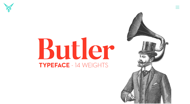
Это микс семейств шрифтов Dala Floda & Bodoni. Был создан для того, чтобы немного модернизировать шрифты с засечками. Отлично подходит для плакатов, большого размера книг. В общей сложности семейство Butler содержит 334 символов.
Ссылка для скачивания
3. Arvo
Arvo — это семейство шрифтов, которое подходит как для вывода на дисплей, так и для печати. Разработано Антоном Коовитом для чтения, Arvo в каталоге Google Font — бесплатный открытый шрифт (OFL).
4. Crimson Text
Бесплатное семейство шрифтов, созданное специально для книжного производства с нотками старинных шрифтов Garamond-esque. Crimson Text — разработан немецким дизайнером, проживающим в Торонто, Себастьяном Кош. Crimson — прекрасная альтернатива традиционному Garamond-esque, с выразительным курсивом, прекрасно сочетается с геометрическими засечками, такими как Futura или Avenir.
5. Aleo
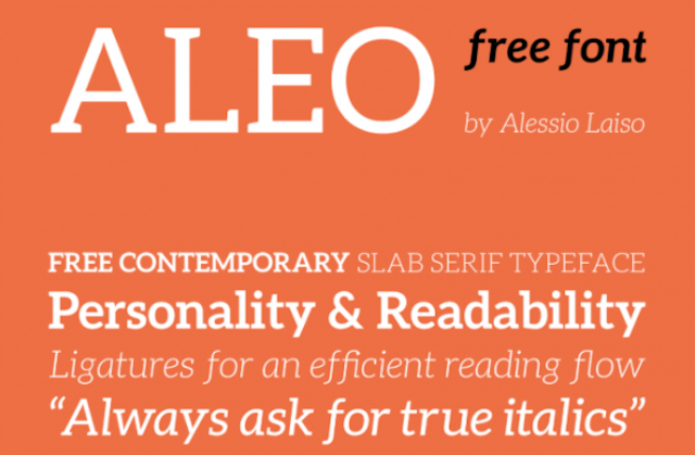
Aleo — полукруглый с гладкой структурой шрифт, придающий нотки индивидуальности, но при этом удобочитаемый. Бесплатное семейство шрифтов, которое включает в себя шесть стилей, 3 насыщенности шрифта / weight (Light, Regular и Bold) с соответствующим курсивом. Шрифт был разработан Alessio Laiso.
6. Cormorant
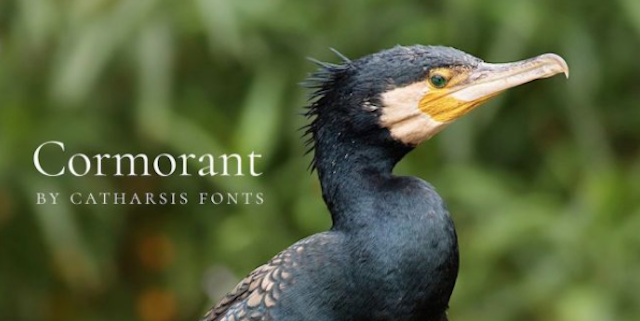
Cormorant — это экстравагантный шрифт с засечками, наследие исторических шрифтов французского пуансониста и издателя Клода Гарамона. Был нарисован вручную Кристианом Тальманом. «Острые резкие засечки, опасно гладкие кривые», такой шрифт лучше всего использовать для заголовков или в текстах больших размеров (плакаты). Читабелен как при выводе на экран, так и в печатном виде. Cormorant поддерживает кириллицу, каждый из стилей представлен в пяти насыщенностях Light, Regular, Medium, Semibold, Bold.
7. Brela
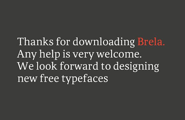
Brela — это гуманистический шрифт с засечками, предназначенный исключительно для редакционного дизайна. Шрифт был разработан испанским креативным агентством Makarska Studio, одинаково хорош при использовании в текстах с небольшим кеглем и для написания заголовков.
Скачать Brela Regular
8. Libre Baskerville
Libre Baskerville — это веб-шрифт, созданный американской фирмой ATF (American Type Founders 1941 год). Шрифт с высокой x, ему свойственна меньшая контрастность, что позволяет использовать его для чтения на экране.
9. Jura

Шрифт Jura — необычно элегантный шрифт с отличительными деталями, такими как округлые клиновидные засечки. Он хорошо выглядит при больших и маленьких размерах текста. Бесплатный шрифт был создан британским дизайнером Эдом Мерриттом.
10. Fenix
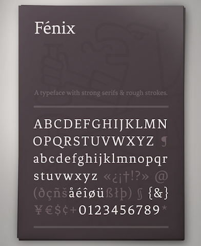
Fénix — это шрифт с засечками и грубыми штрихами, он прекрасен для чтения, для текстов с небольшим размером кегля. Шрифт под названием птицы счастья — работа Фернандо Диаса, дизайнера уругвайского литейного завода TipoType.
11. Luthier
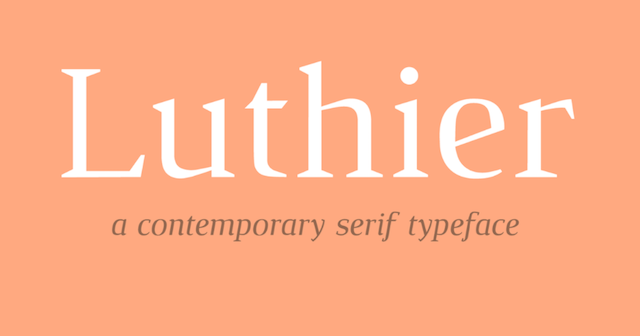
Luthier — это современный шрифт с характерными резкими засечками и высоким контрастом, наличие двух видов насыщенности + курсив. Хорошо подходит для заголовков, для основного текста, для серьезных интеллектуальных проектов. Бесплатный шрифт был создан живущим в Барселоне дизайнером Адрианом Гомесом.
Free sans-serif шрифты
12. Aganè
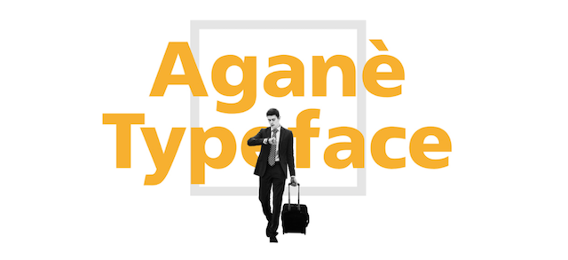
Шрифт Aganè — это чистый без засечек шрифт, разработанный швейцарским графическим дизайнером, специалистом UI Данило де Марко. Свободный для персонального и коммерческого пользования, Aganè — это результат вдохновения такими шрифтами как Noorda Font, FF Transit и Frutiger. Оптимизированный для удобочитаемости даже при небольших размерах кегля. Доступен в 4 насыщенностях: light, regular, bold и extra bold. Aganè является лауреатом премии IF Design 2017 года.
13. Titillium Web
Как для бесплатного шрифта, у Titillium очень респектабельная родословная, которая берет свое начало с дизайн-проекта итальянской академии di Belle Arti di Urbino. Каждый учебный год десятки студентов работают над проектом, развивают его, совершенствуют шрифт путем анализа предоставленных данных от дизайнеров, которые используют этот шрифт в своих работах. Он острый, современный и поставляется в широком диапазоне насыщенностей. Лучше всего он подходит для написания заголовков.
14. League Gothic
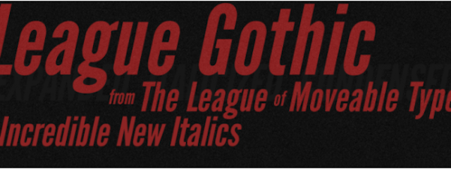
League Gothic — это сжатый без засечек, вдохновленный классическим шрифтом Alternate Gothic # 1, шрифт изначально был разработанным Моррисом Фуллером Бентоном для American Type Founders Company в 1903 году. Это возрождение старой классики, новая версия забытого старого.
15. Chivo
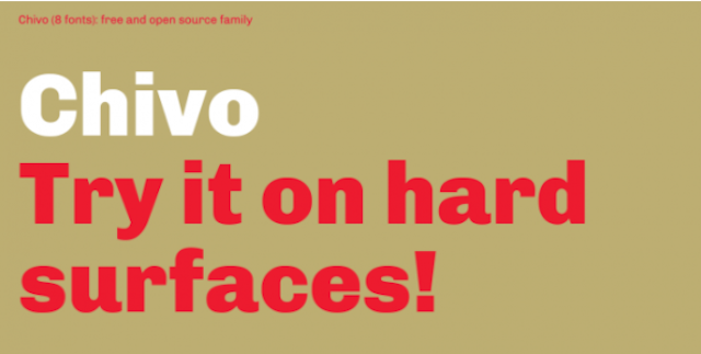
Chivo — гротескный шрифт, он идеально подходит для заголовков и других надписей, которыми вы хотите привлечь внимание. Уверенный, элегантный, он предлагается в четырех насыщенностях с использованием курсива. Этот бесплатный шрифт — работа Эктора Гатти и команды Omnibus-Type.
16. Comfortaa
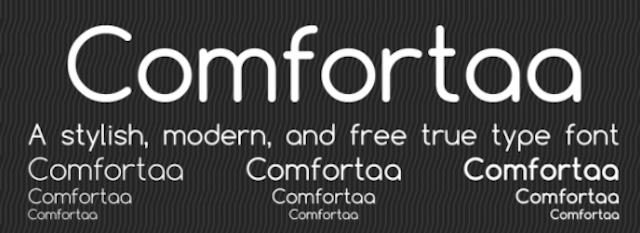
Comfortaa — это округлый геометрический шрифт без засечек, предназначенный для текстов с большим размером кегля. Создан был инженером-конструктором Технического университета в Дании Johan Aakerlund. Это простой, красивый шрифт, который включает в себя большое количество различных символов.
17. Noto Sans
Noto Sans (от «No more tofu») относится к семейству бесплатных шрифтов, которое охватывает более 800 языков и оперирует свыше 110 тыс. символами, не пропущен ни один из символов, заложенных в системе Юникод.
18. HK Grotesk Hanken
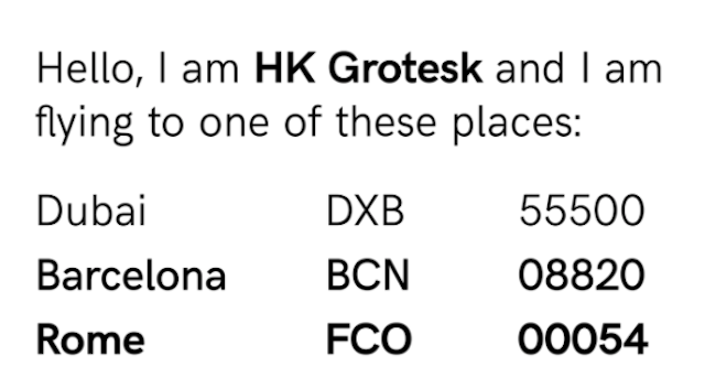
HK Grotesk — шрифт без засечек, создание которого — продукт вдохновения классическими гротескными шрифтами, такими как Akzidenz Grotesk, Univers, Trade Gothic и Gill Sans. Он был разработан Hanken Design Co с целью создания дружественного и удобочитаемого шрифта, который подходил бы для текста с небольшим кеглем. Недавно была добавлена кириллица.
19. Aileron
Aileron — это универсальный нео-гротескный шрифт без засечек, что-то между Helvetica и Univers. Был создан Sora Sagano, дизайнер компании Tipotype. Он призван обеспечить читателям высокий уровень визуального комфорта.
20. Ubuntu
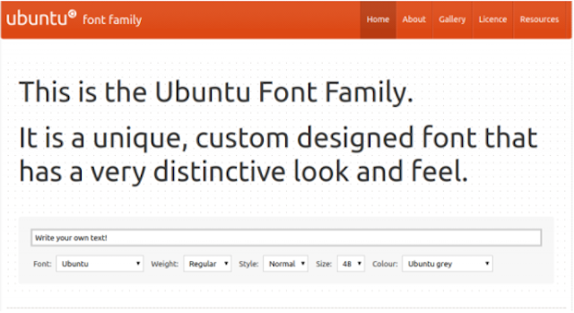
Этот бесплатный шрифт был специально создан компанией Dalton Maag по заказу Canonical в дополнение к операционной системе Linux для использования в персональных компьютерах, планшетах и смартфонах.
21. Clear Sans
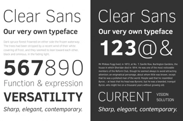
Clear Sans — это универсальный шрифт, разработанный Intel для комфортного вывода на экран. Подходит и для печати, и для использования в сети. Он универсален, в сдержанном стиле (без засечек) шрифт с поддержкой OpenType.
22. Source Sans Pro
Выпущенный в 2012 году, Source Sans Pro был первым семейством шрифтов с открытым исходным кодом для Adobe, его популярности можно позавидовать. Это классический гротескный шрифт с простым, непритязательным дизайном разработан дизайнером компании Adobe Паулом Хантом.
Handwriting fonts
23. Nickainley
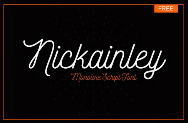
Nickainley — этот шрифт с классическими нотками и винтажным ощущением, предполагает множество возможных вариантов использования, включая логотипы, дизайны футболок, фирменные бланки и банеры. Этот бесплатный шрифт был создан индонезийским агентством Seniors Studio.
24. Pacifico
Pacifico — это удобный забавный рукописный шрифт, вдохновением послужила американская серф-культура 1950 годов. Этот шрифт с открытым исходным кодом разработан покойным дизайнером Верноном Адамсом, который скончался в прошлом году. Вернон закончил магистратуру по дизайну шрифтов в Университете Рединга и жил в Калифорнии.
25. Cute Punk
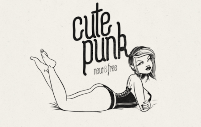
Cute Punk — это яркий, молодежный и полностью современный подход к рукописным шрифтам. Это работа Флоу, дизайнера и иллюстратора из Братиславы, Словакия.
26. Futuracha
Один из самых странных рукописных шрифтов, Futuracha может хорошо сработать при правильном применении в дизайне. Своеобразный, идиосинкразический подход применен в этом рукописном шрифте, Futuracha был создан под вдохновением от классических шрифтов Джона Баскервиля и Futura Book. Это бесплатное семейство шрифтов включает в себя численные символы — греческие и латинские. Futuracha можно использовать в креативных заголовках, логотипах или типографских иллюстрациях.
27. Yellowtail
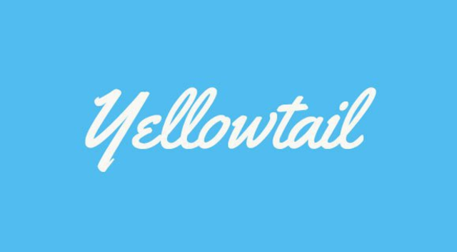
Yellowtail — классический рукописный шрифт, старая школа 1930 годов, таких как Gillies Gothic и Kaufmann. Разработан был типографическим институтом Astigmatic, смесь связующих и несвязанных буквенных форм придает ему уникальный внешний вид и в то же время обеспечивает удобочитаемость.
Винтажные и ретро шрифты (vintage and retro fonts)
28. Cheque
Cheque — изначально был студийным проектом Мирела Белова, в нем нотки геометрических фигур и классический, винтажный образ. Он используется в заголовках версии Regular и Black бесплатны как для личного, так и для коммерческого пользования.
29. Bauru
Bauru- душевный ретро шрифт, надпись вызывает ностальгирующие чувства, суммирует ушедшее время жизни. Один из лучших бесплатных ретро-шрифтов, хорошо работает для создания плакатов, рекламы, логотипа. Bauru был разработан бразильским арт-директором и иллюстратором Пьером Паоло.
30. LOT
LOT — один из самых толстых, крутых, ретро-бесплатных шрифтов. Стилизованные надписи в блогах и рекламе, на плакатах и в журналах в стиле 1970, 1980 годов. LOT — гладкий новый винтажный стиль с коллекцией толстых геометрических букв. Располагает 78 символами, бесплатный шрифт LOT хорош для разработки логотипов, для заголовков.
31. Streetwear
Окунутся в ретро атмосферу? Запросто! Шрифт Streetwear — крутой, смелый шрифт в стиле ретро-моды и -спорта 1960, 1970 годов. Универсальный и веселый одновременно. Подходит для логотипов, плакатов, упаковки и дизайна футболок.
32. Paralines Font
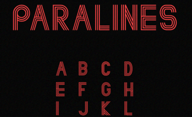
Paralines Font — шрифт в ретро-футуристическом стиле. Здесь своеобразно использованы параллельные линии, такая техника вдохновляет дизайнеров, шрифт подходит для любого проекта, передает настроение 1970 начала 1980 годов.
33. Hamurz
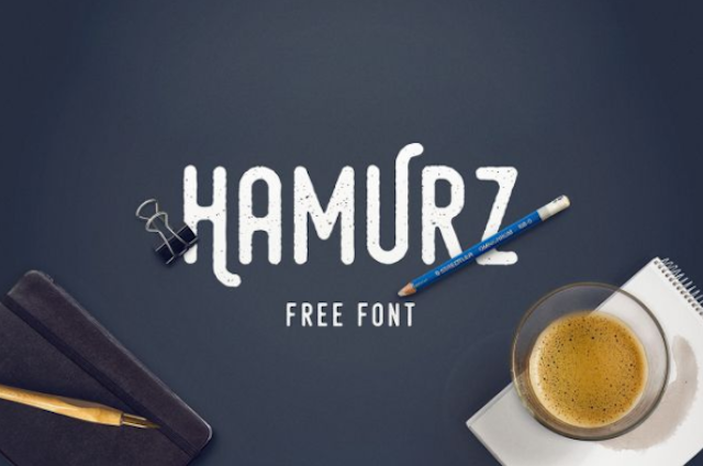
Бесплатный шрифт Hamurz — хипстерский ретро стиль с грубыми краями и округлыми формами. Созданный Bagus Budiyanto, он может применяться для создания логотипов, заголовков, рисунков на футболках, значках или на печатных изданиях.
Brush fonts
34. Leafy
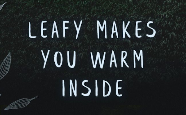
Leafy — бесплатный ручной работы шрифт. Содержит более 90 символов, нарисован Крисиджанисом Мезулисом. Идеально подходит для любого дизайна.
35. Playlist

Playlist отлично подходит для иллюстраций на товарах (плакаты, футболки), рисованный шрифт в стиле сухой кисти, который состоит из трех вариантов: скрипт, шапки и орнамент.
36. Sophia
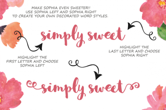
Бесплатный шрифт Sophie для декоративного оформления, легкий, дружелюбный и безмолвно-веселый. Рукописный шрифт со сладким декоративным бонусом)
37. Reckless
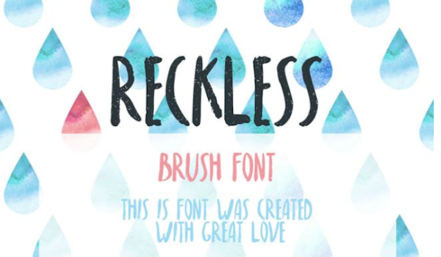
Reckless — шрифт для поднятия настроения, включает прописные латинские символы. Хорош для создания эффекта акварельных красок для печати и для веб проектов. Был создан российским дизайнером Надей Спасибенко.
38. Kust
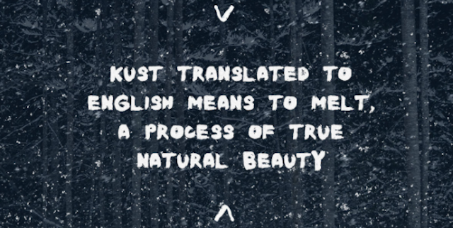
Kust — это рукописный шрифт, слегка искаженными штрихами. Он был представлен в нарисованном виде — на твердой бумаге черными чернилами толстой кистью дизайнером Leva Mezule.
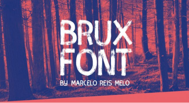
39. Brux
Шрифт Brux с оригинальным подходом к рукописным шрифтам, он довольно жесткий, с чертами формальности, вызывает ощущение шрифта, нарисованного под трафарет.
Шрифты в стиле тату (tattoo fonts)
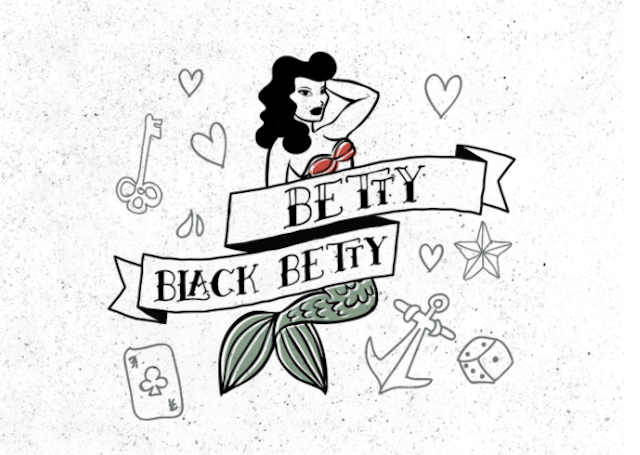
40. Betty
Betty — один из тех бесплатных шрифтов, которые возвращают в прошлое, когда у каждого «настоящего мужчины» был якорь моряка и «дама сердца», наколотая на бицепсе.
41. Angilla
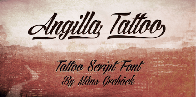
Angilla — чрезвычано свежий и стильный tattoo шрифт, работа шведского дизайнера Måns Grebäck.
42. Serval
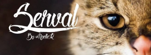
Бесплатный шрифт Serval — это жилистый, колючий зверь со своеобразным дизайном.
43. MOM
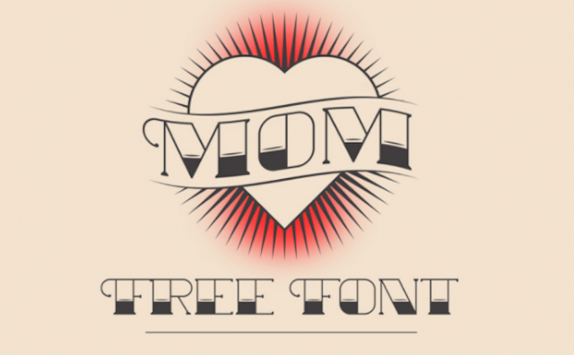
MOM — это шрифт, в стиле американской старой школьной татуировкой, дань уважения великим художникам-татуировщикам прошлого.
44. Original Gangsta
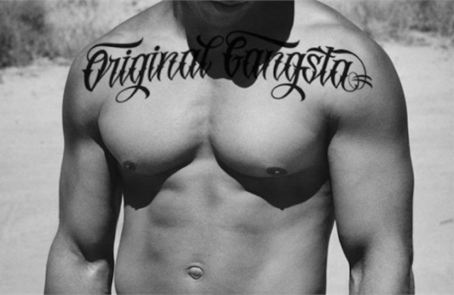
Бескомпромиссный стиль в каждом символе шрифта Original Gangsta. Нет милосердию, Gangsta — это жесткий шрифт для брутальных надписей.
Шрифты в стиле графити (graffiti fonts)
45. Ruthless Dripping One
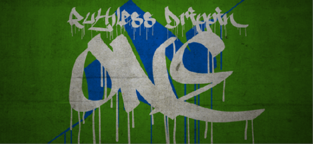
Ruthless Dripping One — один из немногих бесплатных шрифтов в стиле граффити, который выглядит реалистично. Большинство бесплатных шрифтов-граффити — в действительности стилизованные шрифты без чувства искусства, стиля и игривости, которые так важны для городской уличной арт-сцены.
46. Urban Jungle
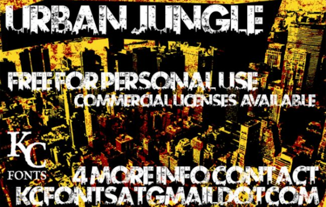
Трафареты — это фокус современного уличного искусства. В Urban Jungle смешаны традиционные трафареты с добавлением текстуры, что мгновенно окунает в атмосферу улицы, яростной улицы.
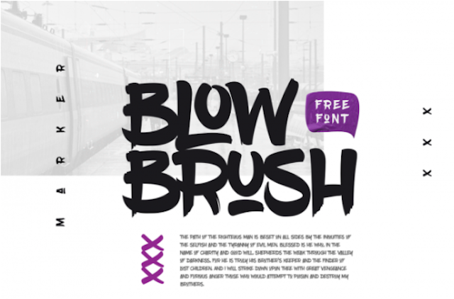
47. Blow Brush
Blow Brush вдохновлен хип-хопом и городской культурой, от него исходит энергия и смелость. Причудливый, но при этом разборчивой и функциональный шриф.
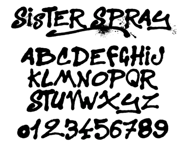
48. Sister Spray
Бесплатный шрифт Sister Spray по красивому грязный шрифт с распылителя: буквы, цифры и кучу брызг, пятен и штрихов.
49. Tag Type

Tag Type вдохновлен граффити-тегами, содержит буквы верхнего и нижнего регистра, цифры и знаки препинания. Шрифт создан украинским дизайнером Энди Панченко.
Необычные шрифты (unusual fonts)
50. Gilbert
Шрифт назван в честь дизайнера-создателя радужного флага Гилберта Бейкера, который умер в 2017 году, он был активистом LGBTQ и художником, известен тем, что создал знаковый флаг радуги. Gilbert доступен в стандартном векторном формате, цветном формате OpenType-SVG и анимированной версии.
51. Jaapokki
Jaapokki — красивый шрифт без засечек с чистыми линиями, большим набором символов и необычными элементами, отлично подходит для заголовков, плакатов, логотипов. Он имеет множество вариантов, со шрифтом можно смело экспериментировать.
52. Carioca Bebas
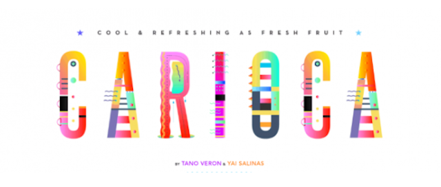
Свежий, фруктовый, красочный шрифт. Carioca — это новое, веселое создание. Этот восхитительный бесплатный шрифт был разработан в рамках трехмесячного экспериментального проекта аргентинских графических дизайнеров Тано Верона и Яи Салинаса.
53. Le Super Serif
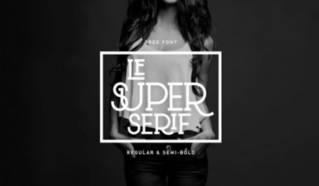
Шрифт Le Super Serif — это редкая вещь: типографский эксперимент голландского дизайнера Тийса Янссена. Модный заглавный шрифт на современный западный лад. Шрифт имеет 88 лигатур и несколько «специальных» альтернативных символов.
54. Pelmeshka
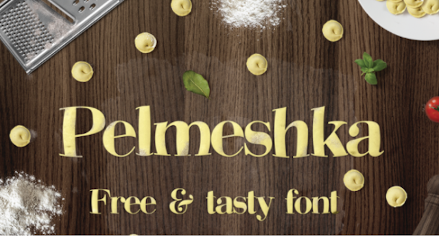
Бесплатный шрифт Pelmeshka — новый поворот, уникальная вариация шрифтов для тем о еде. Идеально подходит для любого дизайна. Смешной, дружелюбный и оригинальный стиль этого шрифта — работа русского дизайнера Кирилла Михайлова.
55. Tiny Hands
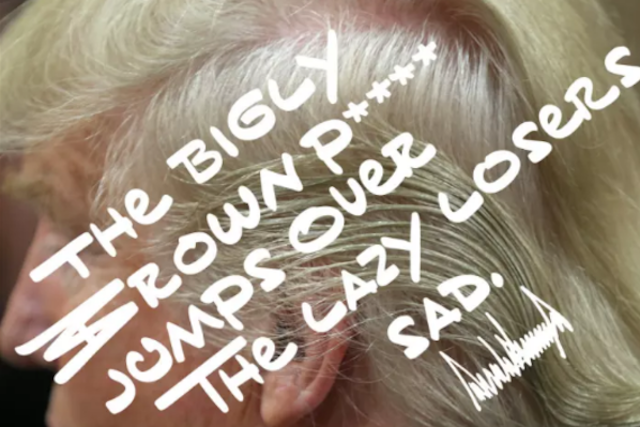
Этот бесплатный шрифт посвящен эксцентричному почерку, принадлежащему Дональду Трампу. Он был создан типографом Марком Дэвисом, как забавная сатиры, но в то же время его спкойно можно использовать для мультфильма или комикса.
Какой бы дизайн и шрифт для своего сайта, проекта вы не выбрали, необходимо заранее подумать о его надежном размещении и хранении. Наши специалисты помогут вам подобрать оптимальный вариант, согласно потребностям и возможностям, будь то хостинг за 0,99 $ или дорогостоящая инфраструктура корпоративного класса. Будьте уверены в том, что ваша информация размещена в надежном дата-центре премиум класса, а ценовая политика предоставления услуг — волшебна. Акции — еще одни шаг навстречу нашим пользователям.
На правах рекламы.Акция! Только сейчас получите до 4-х месяцев бесплатного пользования VPS (KVM) c выделенными накопителями в Нидерландах и США (конфигурации от VPS (KVM) — E5-2650v4 (6 Cores) / 10GB DDR4 / 240GB SSD или 4TB HDD / 1Gbps 10TB — $29 / месяц и выше, доступны варианты с RAID1 и RAID10), полноценным аналогом выделенных серверов, при заказе на срок 1-12 месяцев, условия акции здесь, cуществующие абоненты могут получить 2 месяца бонусом!
Как построить инфраструктуру корп. класса c применением серверов Dell R730xd Е5-2650 v4 стоимостью 9000 евро за копейки?
Free Fonts for Every Project
Style matters.
As a creative designer, you understand exactly how important it is to use the right font for every project. The style of the words on the page influences the overall tone of the content, draws the eye to particular points, and affects readability.
But with so many free downloadable fonts available on the web, it’s getting more and more difficult to find the fonts that can actually elevate your work.
And that’s why we’ve put together our collection of the best free fonts available. You can download each one of these fonts free to use in your projects. There are even free fonts for commercial use. And to help you find exactly what you’re looking for, we’ve broken it down into a few categories.
Free Sans Serif Fonts
Sans Serif fonts are fonts that don’t have serifs (the small lines often seen at the ends of most letters.) They’re popular for their modern, simple, and minimalist style. Because of this styling, you’ll often see sans serif fonts used in short blocks of text. They’re also usually the default font style in many apps and websites.
Need a san serif font? Check out Story Choice Sans Serif and Sans Serif Plus 7
Free Serif Fonts
Serif fonts include a small stroke (known as a serif) at the end of the lines in most letters. Serif fonts have a classic look to them, and the serifs are also known to aid in the readability of text. Because of this, serif fonts are popular fonts for long blocks of text like books, newspapers, and magazine articles.
If you’re searching for free serif fonts, check out popular fonts like NIGHTMARE PILLS and Playfair Display.
Free Brush Fonts
Brush fonts include artistic details meant to make them appear hand-painted. You can typically see lines that make each individual letter look as though someone took the time to handcraft the words rather than type them. These artistic details make brush fonts a popular choice for greeting cards, posters, and rustic themed websites.
Check out Calligraphy and Angel Tears if you’re looking for great brush fonts to include in your next project.
Free Handwriting Fonts
Handwritten notes are indisputably more intimate than typed letters, and that’s exactly the feeling that free handwriting fonts bring to a project. Handwriting fonts imitate real handwriting, making them appear authentic, intimate, and classic. These fonts are available in many different styles, from whimsical to elegant and everything in-between.
Looking to download free fonts in the handwriting style? Take a look at Hello Ketta and Great Day! Or browse our selection of cursive font styles.
Free Retro and Vintage Fonts
Conjuring the essence of years gone by isn’t always easy, but using the right retro and vintage fonts can help you achieve the feel you’re striving for. Perfect for posters, cards, and website headings, these fonts are pure nostalgia from a simpler time.
Whether you’re looking for a font that reminds you of the bravado of the New Wave era or makes you want to go to a hop from 1958, we have the vintage fonts you need. Check out Retro New Version or Bratsy Script for some inspiration.
Free Graffiti Fonts
Looking to add an urban edge to your next project? Graffiti fonts can help you capture a rebellious, streetwise feel. Plus, they’re artistic and can be incorporated into just about any project you might be working on. From posters to greeting cards and website headings, these fonts will give you the stand-out style you’re looking for.
Explore fonts like Ghang and Fat Wandals to capture the edgy, artistic vibe of graffiti in your next project.
Free Tattoo Fonts
Whether you’re searching for the perfect font to use in your next tattoo or you’re just looking to bring the style of a classic tattoo to your next project, there are hundreds of free tattoo fonts for you to choose from. These free fonts range in style from bold and rebellious to elegant and artistic, so there’s always one to match the project you’re working on.
Check out Easy November and S&S GreyHood Seven for some inspiration.
Free Unusual Fonts
Some free fonts are so unique that they need a category all their own! These original and unique designs are the definition of imagination. You’ll find unusual fonts to compliment any project you can think of—greeting cards, posters, party invitations, and more.
Take a look at Poland Canned into Space and Bogeyman Eroded to take a look at a few of our favorite unusual free fonts.
No matter what kind of project you’re working on, you’re sure to find free font downloads that fit your needs right here at Fontspace. Our library of over 66,000 fonts has everything from classic serif fonts to creative and cool fonts, and everything else in-between.
Have more questions? Contact us today or use our font generator. Our team is always happy to help!
Cursive writing in Microsoft Word is not that popular but it is good to mix things up if you are using it for some sort of art project. I’ve prepared a list of some of the best cursive fonts in Word. Some are already available in Microsoft word and some you can download for free.
This guide also has step-by-step instructions to download them for free and how to add fonts to Word if you are not familiar with that process either.
For someone wondering what font is cursive in Microsoft word, this article will help guide you in the right direction. If you are preparing a very long article, learning how to remove section breaks in word is a trick you should learn as well.
There are a handful of fonts to choose from and it again comes down to personal preference and the use case the font serves. I’ve taken some time to find some of the best cursive handwriting fonts in MS Word among hundreds of pretty script fonts in word which should save you a lot of time.
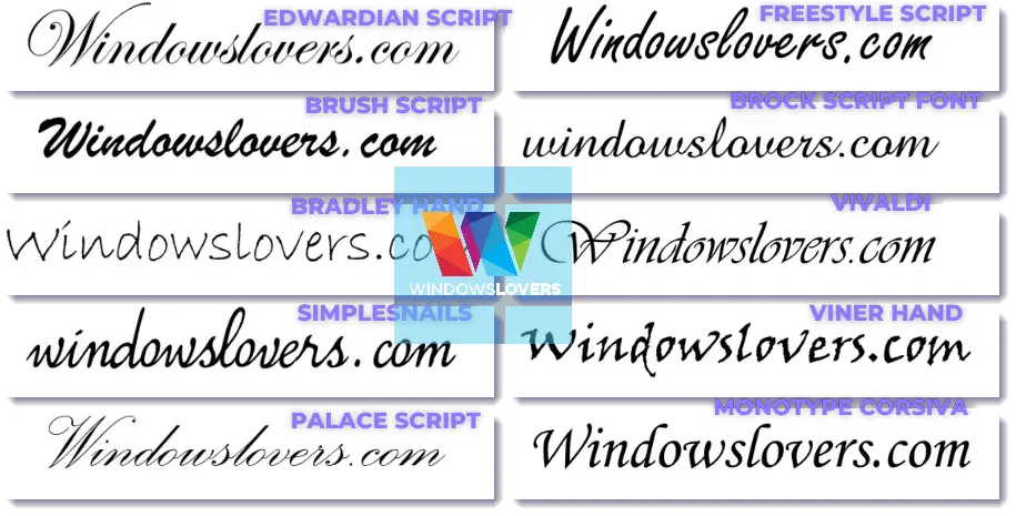
Some of the best cursive fonts in word are:
- Brock Script Font
- Simplesnails
- Edwardian Script
- Bradley Hand
- Brush Script
- Palace Script
- Freestyle Script
- Monotype Corsiva
- Viner Hand
- Vivaldi
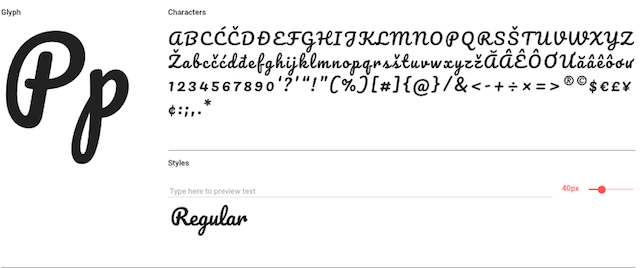
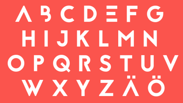
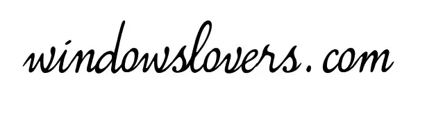
The below image shows all of these cursive fonts at a glance.
If you would like to see what these cursive fonts look like when you use them in a Microsoft word document, please look at the individual images down below.
I use these fonts to insert signatures in a word document digitally that I need to sign if that’s something you are looking for.
1. Brock Script Font
This font can be downloaded for free from 1001fonts.
2. Simplesnails
Simplesnails is available for free on dafont.com.
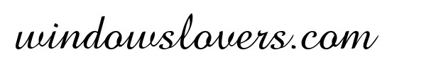
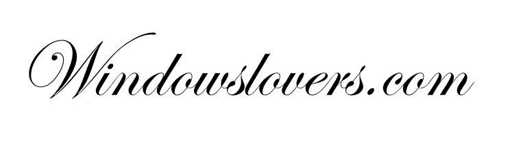
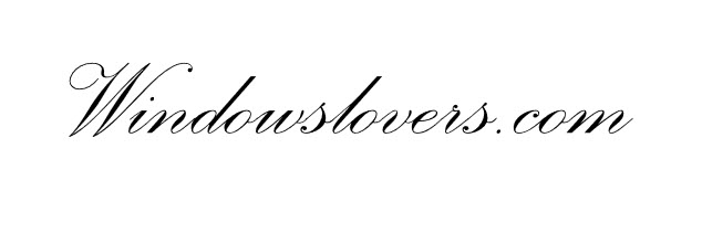
3. Edwardian Script
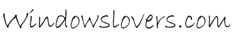
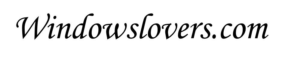
4. Bradley Hand
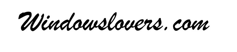
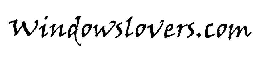
5. Brush Script
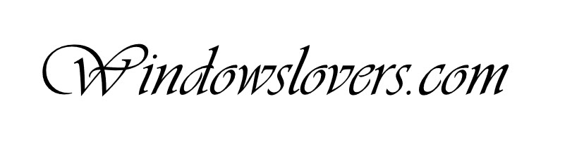
6. Palace Script
7. Freestyle Script

8. Monotype Corsiva
9. Viner Hand
10. Vivaldi
If none of these fit your taste or the project you are working on, you can download and install more free cursive fonts from the internet.
This is a list curated by me personally and going through online portals and forums. This will vary according to your taste and preference.
If you know other cool pretty cursive fonts that should be in the list, please let me know in the comments.
Download Free Cursive Handwriting Fonts From Dafont.com
Dafont is one of my favorite websites to go to whenever I am looking for a new font to use. It has more options to choose from as compared to Google fonts but you do have to make sure that you are not infringing anyone’s copyright while using their fonts.
There are beautiful cursive fonts you can download and use from Dafont. You can enter the word that you will be using the cursive font for to quickly preview how the text will look like and download them on basis of that.
Go to Dafont.com and choose the category of font you are looking for. You probably won’t find a specific section for cursive fonts but you can search for cursive in the search bar if you prefer.
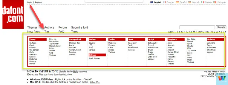
I usually choose the Calligraphy section which has lots of cool cursive fonts.
Once a type is selected, enter a word to get a feel of how the font will look like once installed and used in your project in the “Preview” holder and click “Submit”.
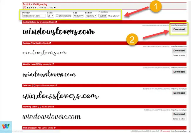
Go through the list and look for the font that you would like to download.
Please make sure you look at the license of usage on these fonts before downloading and using them.
READ: Sign A Word File Electronically For Free
To learn how to add fonts to word, please go to the installation section of this guide down below.
Google Fonts – Cursive Tattoo Fonts
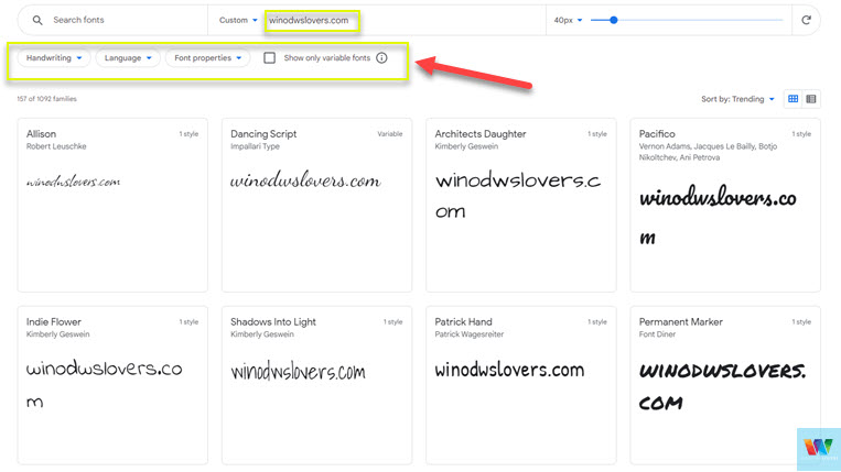
Google Fonts is another go-to place to download free cursive fonts for word or any other apps.
Go to Fonts.google.com and select “handwriting” as this font type has the most cursive fonts available. You can also play around with other options available if you wish.
Enter the text you would like to see how the font will look and after that find that font you would like to download.
Click on the font that you are happy with and hit the “Download family” button on the top-right corner of the screen.
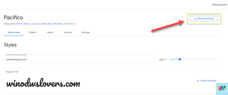
Save the font download file on a location that you can remember for ease while installing it later on.
How To Add Fonts To Word in Windows or macOS
Once you have downloaded the font, unzip the files to a folder. If you are on macOS you can extract them using Winrar for Mac OS if you would like.
How To Install Fonts Word on Windows 10/11
There are multiple ways to install or add fonts to Word in the Windows system. Using “RUN” is the quickest and easiest way to do it.
To install new cursive handwriting fonts to Microsoft Word, do the following:
Installing Cursive Font On macOS
- Go to the fond you’ve just downloaded and double-click on the font.
- Click on “Install Font” on the bottom-right corner of the screen.
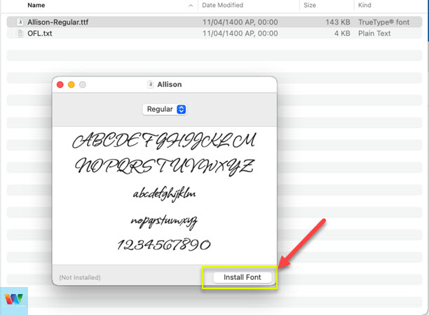
You can use that font in your projects moving forward.
Frequently Asked Questions
Some of the most asked questions and issues that users normally face have been listed below. If you have other issues, please reach out to me or leave them in the comments section below.
I update this section regularly too.
What is the best font for cursive writing?
Personally, Brock script is one of the best fonts for cursive writing in Microsoft Word when it comes to good free cursive or handwriting fonts.
What Microsoft font looks like cursive?
Some of the Microsoft fonts that look like cursive are Segoe Script, Edwardian Script, Palace Script, and Vladimir Script among others.
Does Microsoft Word have a cursive Font?
Yes, there are multiple choices one can choose from. Please look at the image above which will help you choose quickly.
What font is most like cursive?
Edwardian Script looks most like cursive if you are not looking to add other fonts to ms word. If you want other choices, download a free font and install it in your system and use it in your word document.
How do you type in cursive on Microsoft Word?
To type in cursive, first, decide which font you would like to use from the available cursive handwriting fonts in Microsoft word. Then go to “Home > Select” the font and start typing in cursive.
Please let me know what are your favorite best cursive fonts in Word except for the ones I’ve mentioned and should make the list. If you face any issues or have any queries regarding this, please reach out in the comments section below.