
![]()
Download Article
![]()
Download Article
This wikiHow teaches you how to create a line of best fit in your Microsoft Excel chart. A line of best fit, also known as a best fit line or trendline, is a straight line used to indicate a trending pattern on a scatter chart. If you were to create this type of line by hand, you’d need to use a complicated formula. Fortunately, Excel makes it easy to find an accurate trend line by doing the calculations for you.
-

1
Highlight the data you want to analyze. The data you select will be used to create your scatter chart. A scatter chart is one that uses dots to represent values for two different numeric values (X and Y).
-
2
Click the Insert tab. It’s at the top of Excel.
Advertisement
-
3
Click the Scatter icon on the Charts panel. It’s in the toolbar at the top of the screen. The icon looks like several small blue and yellow squares—when you hover the mouse cursor over this icon, you should see «Insert Scatter (X, Y)» or Bubble Chart (the exact wording varies by version).[1]
A list of different chart types will appear. -
4
Click the first Scatter chart option. It’s the chart icon at the top-left corner of the menu. This creates a chart based on the selected data.
-
5
Right-click one of the data points on your chart. This can be any of the blue dots on the chart. This selects all of the data points at once and expands a menu.
- If you are using a Mac and don’t have a right mouse button, hold down the Ctrl button as you click a dot instead.
-
6
Click Add Trendline on the menu. Now you’ll see the Format Trendline panel on the right side of Excel.
-
7
Select Linear from the Trendline Options. It’s the second option in the Format Trendline panel. You should now see a linear straight line that reflects the trend of your data.
-
8
Check the box next to «Display equation on chart.» It’s toward the bottom of the Format Trendline panel. This displays the math calculations used to create the best fit line. This step is optional, but can be useful for anyone viewing your chart who wants to understand how the best fit line was calculated.
- Click the X at the top-right corner of the Format Trendline panel to close it.


Advertisement
Ask a Question
200 characters left
Include your email address to get a message when this question is answered.
Submit
Advertisement
Video
-
While your chart is selected, you can customize its colors and other features by experimenting with the options on the Design tab. Click Change Colors in the toolbar to choose a color scheme, and then scroll through the «Chart styles» options to find one that looks good for your data.
Thanks for submitting a tip for review!
Advertisement
References
About This Article
Article SummaryX
1. Highlight the data for your chart.
2. Click the Insert tab.
3. Click the Scatter icon.
4. Click the first Scatter chart.
5. Right-click one of the data points on the chart.
6. Click Add Trendline.
7. Select «Linear.»
8. Check the box next to «Display equation on chart.»
Did this summary help you?
Thanks to all authors for creating a page that has been read 47,153 times.
Is this article up to date?
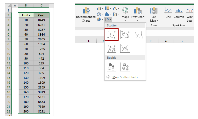
For example, you have been researching in the relationship between product units and total cost, and after many experiments you get some data. Therefore, the problem at present is to get the best fit curve for the data, and figure out its equation. Actually, we can add the best fit line/curve and formula in Excel easily.
- Add best fit line/curve and formula in Excel 2013 or later versions
- Add best fit line/curve and formula in Excel 2007 and 2010
- Add best fit line/curve and formula for multiple sets of data
Add best fit line/curve and formula in Excel 2013 or later versions
Supposing you have recorded the experiments data as left screenshot shown, and to add best fit line or curve and figure out its equation (formula) for a series of experiment data in Excel 2013, you can do as follows:
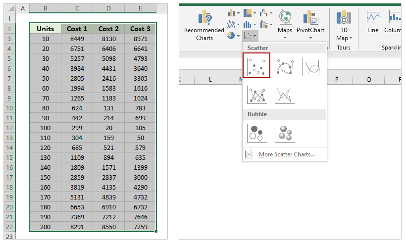
1. Select the experiment data in Excel. In our case, please select the Range A1:B19, and click the Insert Scatter (X, Y) or Bubble Chart > Scatter on the Insert tab. See screen shot:
2. Select the scatter chart, and then click the Add Chart Element > Trendline > More Trendline Options on the Design tab.
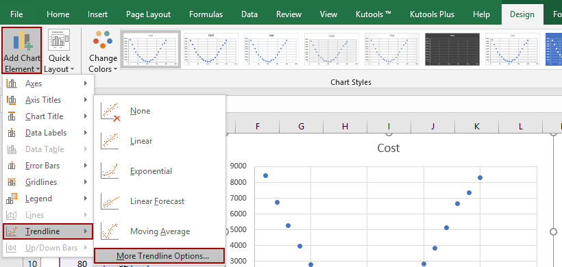
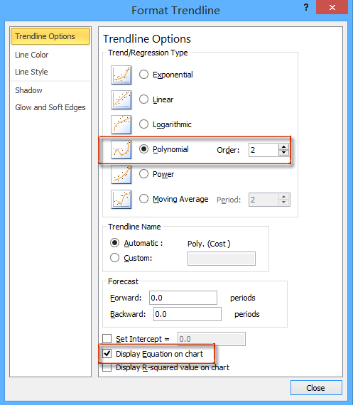
3. In the opening Format Trendline pane, check the Polynomial option, and adjust the order number in the Trendline Options section, and then check the Display Equation on Chart option. See below screen shot:
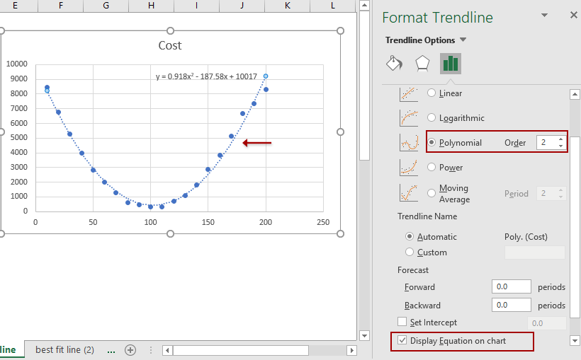
Then you will get the best fit line or curve as well as its equation in the scatter chart as above screen shot shown.
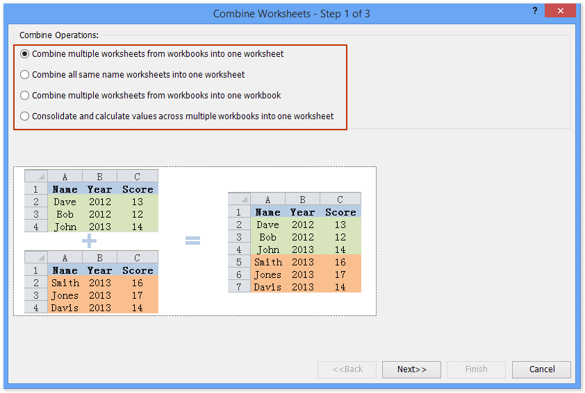
Easily combine multiple worksheets/workbooks/CSV files into one worksheet/workbook
It may be tedious to combine dozens of sheets from different workbooks into one sheet. But with Kutools for Excel’s Combine (worksheets and workbooks) utility, you can get it done with just several clicks!
Add best fit line/curve and formula in Excel 2007 and 2010
There are a few differences to add best fit line or curve and equation between Excel 2007/2010 and 2013.
1. Select the original experiment data in Excel, and then click the Scatter > Scatter on the Insert tab.

2. Select the new added scatter chart, and then click the Trendline > More Trendline Options on the Layout tab. See above screen shot:

3. In the coming Format Trendline dialog box, check the Polynomial option, specify an order number based on your experiment data, and check the Display Equation on chart option. See screenshot:
4. Click the Close button to close this dialog box.
Add best fit line/curve and formula for multiple sets of data
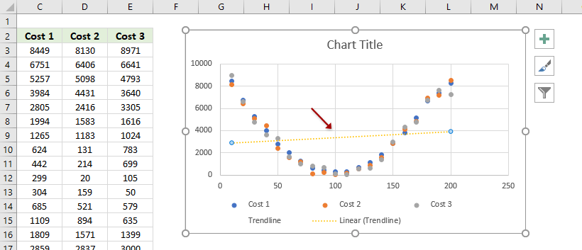
In most cases, you may get multiple sets of experiment data. You can show these sets of data in a scatter chart simultaneously, and then use an amazing chart tool – Add Trend Lines to Multiple Series provided by Kutools for Excel – to add the best fit line/curve and formula in Excel.
Kutools for Excel — Includes more than 300 handy tools for Excel. Full feature free trial 30-day, no credit card required! Free Trial Now!
1. Select the sets of experiment data, and click Insert > Scatter > Scatter to create a scatter chart.
2. Now the scatter chart is created. Keep the scatter chart, and click Kutools > Charts > Chart Tools > Add Trend Lines to Multiple Series. See screenshot:

Now the trendline is added to the scatter chart. If the trendline does not match with the scatter plots, you can go ahead to adjust the trendline.
3. In the scatter chart, double click the trendline to enable the Format Trendline pane.
4. In the Format Trendline pane, tick the trendline types one by one to check which kind of trendlines is the best fit. In my case, the Polynomial trendline fits best. And tick the Display Equation on chart as well.

Demo: Add best fit line/curve and formula in Excel 2013 or later versions
Kutools for Excel includes more than 300 handy tools for Excel, free to try without limitation in 30 days. Download and Free Trial Now!
Related articles:
The Best Office Productivity Tools
Kutools for Excel Solves Most of Your Problems, and Increases Your Productivity by 80%
- Reuse: Quickly insert complex formulas, charts and anything that you have used before; Encrypt Cells with password; Create Mailing List and send emails…
- Super Formula Bar (easily edit multiple lines of text and formula); Reading Layout (easily read and edit large numbers of cells); Paste to Filtered Range…
- Merge Cells/Rows/Columns without losing Data; Split Cells Content; Combine Duplicate Rows/Columns… Prevent Duplicate Cells; Compare Ranges…
- Select Duplicate or Unique Rows; Select Blank Rows (all cells are empty); Super Find and Fuzzy Find in Many Workbooks; Random Select…
- Exact Copy Multiple Cells without changing formula reference; Auto Create References to Multiple Sheets; Insert Bullets, Check Boxes and more…
- Extract Text, Add Text, Remove by Position, Remove Space; Create and Print Paging Subtotals; Convert Between Cells Content and Comments…
- Super Filter (save and apply filter schemes to other sheets); Advanced Sort by month/week/day, frequency and more; Special Filter by bold, italic…
- Combine Workbooks and WorkSheets; Merge Tables based on key columns; Split Data into Multiple Sheets; Batch Convert xls, xlsx and PDF…
- More than 300 powerful features. Supports Office / Excel 2007-2021 and 365. Supports all languages. Easy deploying in your enterprise or organization. Full features 30-day free trial. 60-day money back guarantee.
")
Office Tab Brings Tabbed interface to Office, and Make Your Work Much Easier
- Enable tabbed editing and reading in Word, Excel, PowerPoint, Publisher, Access, Visio and Project.
- Open and create multiple documents in new tabs of the same window, rather than in new windows.
- Increases your productivity by 50%, and reduces hundreds of mouse clicks for you every day!
")
Comments (8)
No ratings yet. Be the first to rate!
In statistics, a line of best fit is the line that best “fits” or describes the relationship between a predictor variable and a response variable.
The following step-by-step example shows how to create a line of best fit in Excel.
Step 1: Enter the Data
First, let’s enter the following dataset that shows the number of hours spent practicing and the total points scored by eight different basketball players:

Step 2: Create a Scatter Plot
Next, let’s create a scatter plot to visualize the relationship between the two variables.
To do so, highlight the cells in the range A2:B9, then click the Insert tab along the top ribbon, then click the option titled Scatter in the Charts group:

The following scatter plot will automatically be created:

Step 3: Add the Line of Best Fit
To add a line of best fit to the scatter plot, click anywhere on the chart, then click the green plus (+) sign that appears in the top right corner of the chart.
Then click the arrow next to Trendline, then click More Options:

In the Format Trendline panel that appears, click the button next to Linear as the trendline option, then check the box next to Display Equation on chart:

The line of best fit along with the equation for the line will appear on the chart:

Step 4: Interpret the Line of Best Fit
From the chart we can see that the line of best fit has the following equation:
y = 2.3095x – 0.8929
Here is how to interpret this equation:
- For each additional hour spent practicing, average points scored increases by 2.3095.
- For a player who practices zero hours, average points scored is expected to be -0.8929.
Note that it doesn’t always make sense to interpret the intercept value in a regression equation.
For example, it’s not possible for a player to score negative points.
In this particular example, we’re mostly interested in the value for the slope of the regression line which is 2.3095.
Additional Resources
The following tutorials explain how to perform other common tasks in Excel:
How to Perform Simple Linear Regression in Excel
How to Perform Multiple Linear Regression in Excel
How to Calculate R-Squared in Excel
Right Click on any one of the data points and a dialog box will appear. Click “Add Trendline”; this is what Excel calls a “best fit line”: 16.
Contents
- 1 How do you find the equation of the line of best fit on Excel?
- 2 How do you make a best fit column in Excel?
- 3 How do I find the line of best fit?
- 4 What is best fit curve?
- 5 How do you use the Logest function?
- 6 How do I make Excel cells fit text?
- 7 How do you do a trend in Excel?
- 8 How do you make a best fit column?
- 9 How do you resize a column to best fit?
- 10 How do I make my Excel spreadsheet fit on one page?
- 11 Does line of best fit have to start at 0?
- 12 Is the line of best fit the same as the regression line?
- 13 What does Logest formula in Excel?
- 14 What is Logest Excel?
- 15 What is the formula of growth in Excel?
- 16 How do you put borders on Excel?
- 17 How do I resize a column in Excel?
- 18 How do you forecast trends?
- 19 How do you go upward and downward trends in Excel?
- 20 How do you perform a trend analysis?
How do you find the equation of the line of best fit on Excel?
To show the equation, click on “Trendline” and select “More Trendline Options…” Then check the “Display Equation on chart” box.
How do you make a best fit column in Excel?
Select the column or columns that you want to change. On the Home tab, in the Cells group, click Format. Under Cell Size, click AutoFit Column Width. Note: To quickly autofit all columns on the worksheet, click the Select All button, and then double-click any boundary between two column headings.
How do I find the line of best fit?
A line of best fit can be roughly determined using an eyeball method by drawing a straight line on a scatter plot so that the number of points above the line and below the line is about equal (and the line passes through as many points as possible).
What is best fit curve?
Curve of Best Fit: a curve the best approximates the trend on a scatter plot. If the data appears to be quadratic, we perform a quadratic regression to get the equation for the curve of best fit. If it appears to be cubic, then we perform a cubic regression.
How do you use the Logest function?
Here are the steps for this function:
- With the data entered, select a five-row-by-two-column array of cells for LOGEST ‘s results.
- From the Statistical Functions menu, select LOGEST to open the Function Arguments dialog box for LOGEST .
- In the Function Arguments dialog box, type the appropriate values for the arguments.
How do I make Excel cells fit text?
Select the cells to which you want to apply ‘Shrink to Fit’ Hold the Control key and press the 1 key (this will open the Format Cells dialog box) Click the ‘Alignment’ tab. In the ‘Text Control’ options, check the ‘Shrink to Fit’ option.
How do you do a trend in Excel?
Add a trendline
- Select a chart.
- Select the + to the top right of the chart.
- Select Trendline. Note: Excel displays the Trendline option only if you select a chart that has more than one data series without selecting a data series.
- In the Add Trendline dialog box, select any data series options you want, and click OK.
How do you make a best fit column?
Automatically adjust your table or columns to fit the size of your content by using the AutoFit button.
- Select your table.
- On the Layout tab, in the Cell Size group, click AutoFit.
- Do one of the following. To adjust column width automatically, click AutoFit Contents.
How do you resize a column to best fit?
Using the “Best Fit” feature in Access, though, you can adjust the width of columns dynamically.
- Click the Microsoft Office ribbon at the top-left corner of the screen. Video of the Day.
- Click the “Records” section.
- Click “More” from the drop-down menu.
- Choose “Column Width.”
- Click “Best Fit.”
How do I make my Excel spreadsheet fit on one page?
Shrink a worksheet to fit on one page
Select the Page tab in the Page Setup dialog box. Select Fit to under Scaling. To fit your document to print on one page, choose 1 page(s) wide by 1 tall in the Fit to boxes. Note: Excel will shrink your data to fit on the number of pages specified.
Does line of best fit have to start at 0?
The line of best fit does not have to go through the origin. The line of best fit shows the trend, but it is only approximate and any readings taken from it will be estimations.
Is the line of best fit the same as the regression line?
The regression line is sometimes called the “line of best fit” because it is the line that fits best when drawn through the points. It is a line that minimizes the distance of the actual scores from the predicted scores.
What does Logest formula in Excel?
In regression analysis, the LOGEST function calculates an exponential curve that fits your data and returns an array of values that describes the curve. Because this function returns an array of values, it must be entered as an array formula.Excel inserts curly brackets at the beginning and end of the formula for you.
What is Logest Excel?
The LOGEST function in Excel is a function used to fit an exponential curve to exponential data. LOGEST is an array formula. Note that while using Microsoft 365, LOGEST is compatible with dynamic arrays and does not require the use of Ctrl + Shift + Enter (CSE).We can use LOGEST to fit a curve to the data.
What is the formula of growth in Excel?
For GROWTH Formula in Excel, y =b* m^x represents an exponential curve where the value of y depends upon the value x, m is the base with exponent x, and b is a constant value.
How do you put borders on Excel?
Here’s how:
- Select a cell or a range of cells to which you want to add borders.
- On the Home tab, in the Font group, click the down arrow next to the Borders button, and you will see a list of the most popular border types.
- Click the border you want to apply, and it will be immediately added to the selected cells.
How do I resize a column in Excel?
Resize columns
- Select a column or a range of columns.
- On the Home tab, in the Cells group, select Format > Column Width.
- Type the column width and select OK.
How do you forecast trends?
7 Tips for Trend Forecasting in Today’s Market
- FIND OUT WHERE YOUR CONSUMER IS GETTING INSPIRED.
- LEARN EVERYTHING YOU CAN ABOUT YOUR CONSUMERS’ PSYCHOGRAPHICS.
- BE REACTIVE.
- FOCUS ON THE CONVERSION.
- UNDERSTAND VISUAL CONSUMPTION.
- UTILIZE THE LATEST TECHNOLOGY.
- HEAR THE COLLECTIVE VOICE.
How do you go upward and downward trends in Excel?
Select the target range of cells and select Manage Rules under the Conditional Formatting button on the Home tab of the Ribbon. In the dialog box that opens, click the Edit Rule button. Adjust the properties, as shown here. You can adjust the thresholds that define what up, down, and flat mean.
How do you perform a trend analysis?
- 1 – Choose Which Pattern You Want to Identify. The first and most obvious step in trend analysis is to identify which data trend you want to target.
- 2 – Choose Time Period.
- 3 – Choose Types of Data Needed.
- 4 – Gather Data.
- 5 – Use Charting Tools to Visualize Data.
- 6 – Identify Trends.
This article describes the formula syntax and usage of the LINEST function in Microsoft Excel. Find links to more information about charting and performing a regression analysis in the See Also section.
Description
The LINEST function calculates the statistics for a line by using the «least squares» method to calculate a straight line that best fits your data, and then returns an array that describes the line. You can also combine LINEST with other functions to calculate the statistics for other types of models that are linear in the unknown parameters, including polynomial, logarithmic, exponential, and power series. Because this function returns an array of values, it must be entered as an array formula. Instructions follow the examples in this article.
The equation for the line is:
y = mx + b
–or–
y = m1x1 + m2x2 + … + b
if there are multiple ranges of x-values, where the dependent y-values are a function of the independent x-values. The m-values are coefficients corresponding to each x-value, and b is a constant value. Note that y, x, and m can be vectors. The array that the LINEST function returns is {mn,mn-1,…,m1,b}. LINEST can also return additional regression statistics.
Syntax
LINEST(known_y’s, [known_x’s], [const], [stats])
The LINEST function syntax has the following arguments:
Syntax
-
known_y’s Required. The set of y-values that you already know in the relationship y = mx + b.
-
If the range of known_y’s is in a single column, each column of known_x’s is interpreted as a separate variable.
-
If the range of known_y’s is contained in a single row, each row of known_x’s is interpreted as a separate variable.
-
-
known_x’s Optional. A set of x-values that you may already know in the relationship y = mx + b.
-
The range of known_x’s can include one or more sets of variables. If only one variable is used, known_y’s and known_x’s can be ranges of any shape, as long as they have equal dimensions. If more than one variable is used, known_y’s must be a vector (that is, a range with a height of one row or a width of one column).
-
If known_x’s is omitted, it is assumed to be the array {1,2,3,…} that is the same size as known_y’s.
-
-
const Optional. A logical value specifying whether to force the constant b to equal 0.
-
If const is TRUE or omitted, b is calculated normally.
-
If const is FALSE, b is set equal to 0 and the m-values are adjusted to fit y = mx.
-
-
stats Optional. A logical value specifying whether to return additional regression statistics.
-
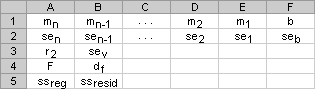
If stats is TRUE, LINEST returns the additional regression statistics; as a result, the returned array is {mn,mn-1,…,m1,b;sen,sen-1,…,se1,seb;r2,sey;F,df;ssreg,ssresid}.
-
If stats is FALSE or omitted, LINEST returns only the m-coefficients and the constant b.
The additional regression statistics are as follows.
-
|
Statistic |
Description |
|---|---|
|
se1,se2,…,sen |
The standard error values for the coefficients m1,m2,…,mn. |
|
seb |
The standard error value for the constant b (seb = #N/A when const is FALSE). |
|
r2 |
The coefficient of determination. Compares estimated and actual y-values, and ranges in value from 0 to 1. If it is 1, there is a perfect correlation in the sample — there is no difference between the estimated y-value and the actual y-value. At the other extreme, if the coefficient of determination is 0, the regression equation is not helpful in predicting a y-value. For information about how r2 is calculated, see «Remarks,» later in this topic. |
|
sey |
The standard error for the y estimate. |
|
F |
The F statistic, or the F-observed value. Use the F statistic to determine whether the observed relationship between the dependent and independent variables occurs by chance. |
|
df |
The degrees of freedom. Use the degrees of freedom to help you find F-critical values in a statistical table. Compare the values you find in the table to the F statistic returned by LINEST to determine a confidence level for the model. For information about how df is calculated, see «Remarks,» later in this topic. Example 4 shows use of F and df. |
|
ssreg |
The regression sum of squares. |
|
ssresid |
The residual sum of squares. For information about how ssreg and ssresid are calculated, see «Remarks,» later in this topic. |
The following illustration shows the order in which the additional regression statistics are returned.
Remarks
-
You can describe any straight line with the slope and the y-intercept:
Slope (m):
To find the slope of a line, often written as m, take two points on the line, (x1,y1) and (x2,y2); the slope is equal to (y2 — y1)/(x2 — x1).Y-intercept (b):
The y-intercept of a line, often written as b, is the value of y at the point where the line crosses the y-axis.The equation of a straight line is y = mx + b. Once you know the values of m and b, you can calculate any point on the line by plugging the y- or x-value into that equation. You can also use the TREND function.
-
When you have only one independent x-variable, you can obtain the slope and y-intercept values directly by using the following formulas:
Slope:
=INDEX(LINEST(known_y’s,known_x’s),1)Y-intercept:
=INDEX(LINEST(known_y’s,known_x’s),2) -
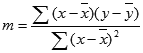
The accuracy of the line calculated by the LINEST function depends on the degree of scatter in your data. The more linear the data, the more accurate the LINEST model. LINEST uses the method of least squares for determining the best fit for the data. When you have only one independent x-variable, the calculations for m and b are based on the following formulas:
where x and y are sample means; that is, x = AVERAGE(known x’s) and y = AVERAGE(known_y’s).
-
The line- and curve-fitting functions LINEST and LOGEST can calculate the best straight line or exponential curve that fits your data. However, you have to decide which of the two results best fits your data. You can calculate TREND(known_y’s,known_x’s) for a straight line, or GROWTH(known_y’s, known_x’s) for an exponential curve. These functions, without the new_x’s argument, return an array of y-values predicted along that line or curve at your actual data points. You can then compare the predicted values with the actual values. You may want to chart them both for a visual comparison.
-
In regression analysis, Excel calculates for each point the squared difference between the y-value estimated for that point and its actual y-value. The sum of these squared differences is called the residual sum of squares, ssresid. Excel then calculates the total sum of squares, sstotal. When the const argument = TRUE or is omitted, the total sum of squares is the sum of the squared differences between the actual y-values and the average of the y-values. When the const argument = FALSE, the total sum of squares is the sum of the squares of the actual y-values (without subtracting the average y-value from each individual y-value). Then regression sum of squares, ssreg, can be found from: ssreg = sstotal — ssresid. The smaller the residual sum of squares is, compared with the total sum of squares, the larger the value of the coefficient of determination, r2, which is an indicator of how well the equation resulting from the regression analysis explains the relationship among the variables. The value of r2 equals ssreg/sstotal.
-
In some cases, one or more of the X columns (assume that Y’s and X’s are in columns) may have no additional predictive value in the presence of the other X columns. In other words, eliminating one or more X columns might lead to predicted Y values that are equally accurate. In that case these redundant X columns should be omitted from the regression model. This phenomenon is called “collinearity” because any redundant X column can be expressed as a sum of multiples of the non-redundant X columns. The LINEST function checks for collinearity and removes any redundant X columns from the regression model when it identifies them. Removed X columns can be recognized in LINEST output as having 0 coefficients in addition to 0 se values. If one or more columns are removed as redundant, df is affected because df depends on the number of X columns actually used for predictive purposes. For details on the computation of df, see Example 4. If df is changed because redundant X columns are removed, values of sey and F are also affected. Collinearity should be relatively rare in practice. However, one case where it is more likely to arise is when some X columns contain only 0 and 1 values as indicators of whether a subject in an experiment is or is not a member of a particular group. If const = TRUE or is omitted, the LINEST function effectively inserts an additional X column of all 1 values to model the intercept. If you have a column with a 1 for each subject if male, or 0 if not, and you also have a column with a 1 for each subject if female, or 0 if not, this latter column is redundant because entries in it can be obtained from subtracting the entry in the “male indicator” column from the entry in the additional column of all 1 values added by the LINEST function.
-
The value of df is calculated as follows, when no X columns are removed from the model due to collinearity: if there are k columns of known_x’s and const = TRUE or is omitted, df = n – k – 1. If const = FALSE, df = n — k. In both cases, each X column that was removed due to collinearity increases the value of df by 1.
-
When entering an array constant (such as known_x’s) as an argument, use commas to separate values that are contained in the same row and semicolons to separate rows. Separator characters may be different depending on your regional settings.
-
Note that the y-values predicted by the regression equation may not be valid if they are outside the range of the y-values you used to determine the equation.
-
The underlying algorithm used in the LINEST function is different than the underlying algorithm used in the SLOPE and INTERCEPT functions. The difference between these algorithms can lead to different results when data is undetermined and collinear. For example, if the data points of the known_y’s argument are 0 and the data points of the known_x’s argument are 1:
-
LINEST returns a value of 0. The algorithm of the LINEST function is designed to return reasonable results for collinear data and, in this case, at least one answer can be found.
-
SLOPE and INTERCEPT return a #DIV/0! error. The algorithm of the SLOPE and INTERCEPT functions is designed to look for only one answer, and in this case there can be more than one answer.
-
-
In addition to using LOGEST to calculate statistics for other regression types, you can use LINEST to calculate a range of other regression types by entering functions of the x and y variables as the x and y series for LINEST. For example, the following formula:
=LINEST(yvalues, xvalues^COLUMN($A:$C))
works when you have a single column of y-values and a single column of x-values to calculate the cubic (polynomial of order 3) approximation of the form:
y = m1*x + m2*x^2 + m3*x^3 + b
You can adjust this formula to calculate other types of regression, but in some cases it requires the adjustment of the output values and other statistics.
-
The F-test value that is returned by the LINEST function differs from the F-test value that is returned by the FTEST function. LINEST returns the F statistic, whereas FTEST returns the probability.

Examples
Example 1 — Slope and Y-Intercept
Copy the example data in the following table, and paste it in cell A1 of a new Excel worksheet. For formulas to show results, select them, press F2, and then press Enter. If you need to, you can adjust the column widths to see all the data.
|
Known y |
Known x |
|---|---|
|
1 |
0 |
|
9 |
4 |
|
5 |
2 |
|
7 |
3 |
|
Result (slope) |
Result (y-intercept) |
|
2 |
1 |
|
Formula (array formula in cells A7:B7) |
|
|
=LINEST(A2:A5,B2:B5,,FALSE) |
Example 2 — Simple Linear Regression
Copy the example data in the following table, and paste it in cell A1 of a new Excel worksheet. For formulas to show results, select them, press F2, and then press Enter. If you need to, you can adjust the column widths to see all the data.
|
Month |
Sales |
|---|---|
|
1 |
$3,100 |
|
2 |
$4,500 |
|
3 |
$4,400 |
|
4 |
$5,400 |
|
5 |
$7,500 |
|
6 |
$8,100 |
|
Formula |
Result |
|
=SUM(LINEST(B1:B6, A1:A6)*{9,1}) |
$11,000 |
|
Calculates the estimate of the sales in the ninth month, based on sales in months 1 through 6. |
Example 3 — Multiple Linear Regression
Copy the example data in the following table, and paste it in cell A1 of a new Excel worksheet. For formulas to show results, select them, press F2, and then press Enter. If you need to, you can adjust the column widths to see all the data.
|
Floor space (x1) |
Offices (x2) |
Entrances (x3) |
Age (x4) |
Assessed value (y) |
|---|---|---|---|---|
|
2310 |
2 |
2 |
20 |
$142,000 |
|
2333 |
2 |
2 |
12 |
$144,000 |
|
2356 |
3 |
1.5 |
33 |
$151,000 |
|
2379 |
3 |
2 |
43 |
$150,000 |
|
2402 |
2 |
3 |
53 |
$139,000 |
|
2425 |
4 |
2 |
23 |
$169,000 |
|
2448 |
2 |
1.5 |
99 |
$126,000 |
|
2471 |
2 |
2 |
34 |
$142,900 |
|
2494 |
3 |
3 |
23 |
$163,000 |
|
2517 |
4 |
4 |
55 |
$169,000 |
|
2540 |
2 |
3 |
22 |
$149,000 |
|
-234.2371645 |
||||
|
13.26801148 |
||||
|
0.996747993 |
||||
|
459.7536742 |
||||
|
1732393319 |
||||
|
Formula (dynamic array formula entered in A19) |
||||
|
=LINEST(E2:E12,A2:D12,TRUE,TRUE) |
Example 4 — Using the F and r2 Statistics
In the preceding example, the coefficient of determination, or r2, is 0.99675 (see cell A17 in the output for LINEST), which would indicate a strong relationship between the independent variables and the sale price. You can use the F statistic to determine whether these results, with such a high r2 value, occurred by chance.
Assume for the moment that in fact there is no relationship among the variables, but that you have drawn a rare sample of 11 office buildings that causes the statistical analysis to demonstrate a strong relationship. The term «Alpha» is used for the probability of erroneously concluding that there is a relationship.
The F and df values in output from the LINEST function can be used to assess the likelihood of a higher F value occurring by chance. F can be compared with critical values in published F-distribution tables or the FDIST function in Excel can be used to calculate the probability of a larger F value occurring by chance. The appropriate F distribution has v1 and v2 degrees of freedom. If n is the number of data points and const = TRUE or omitted, then v1 = n – df – 1 and v2 = df. (If const = FALSE, then v1 = n – df and v2 = df.) The FDIST function — with the syntax FDIST(F,v1,v2) — will return the probability of a higher F value occurring by chance. In this example, df = 6 (cell B18) and F = 459.753674 (cell A18).
Assuming an Alpha value of 0.05, v1 = 11 – 6 – 1 = 4 and v2 = 6, the critical level of F is 4.53. Since F = 459.753674 is much higher than 4.53, it is extremely unlikely that an F value this high occurred by chance. (With Alpha = 0.05, the hypothesis that there is no relationship between known_y’s and known_x’s is to be rejected when F exceeds the critical level, 4.53.) You can use the FDIST function in Excel to obtain the probability that an F value this high occurred by chance. For example, FDIST(459.753674, 4, 6) = 1.37E-7, an extremely small probability. You can conclude, either by finding the critical level of F in a table or by using the FDIST function, that the regression equation is useful in predicting the assessed value of office buildings in this area. Remember that it is critical to use the correct values of v1 and v2 that were computed in the preceding paragraph.
Example 5 — Calculating the t-Statistics
Another hypothesis test will determine whether each slope coefficient is useful in estimating the assessed value of an office building in Example 3. For example, to test the age coefficient for statistical significance, divide -234.24 (age slope coefficient) by 13.268 (the estimated standard error of age coefficients in cell A15). The following is the t-observed value:
t = m4 ÷ se4 = -234.24 ÷ 13.268 = -17.7
If the absolute value of t is sufficiently high, it can be concluded that the slope coefficient is useful in estimating the assessed value of an office building in Example 3. The following table shows the absolute values of the 4 t-observed values.
If you consult a table in a statistics manual, you will find that t-critical, two tailed, with 6 degrees of freedom and Alpha = 0.05 is 2.447. This critical value can also be found by using the TINV function in Excel. TINV(0.05,6) = 2.447. Because the absolute value of t (17.7) is greater than 2.447, age is an important variable when estimating the assessed value of an office building. Each of the other independent variables can be tested for statistical significance in a similar manner. The following are the t-observed values for each of the independent variables.
|
Variable |
t-observed value |
|---|---|
|
Floor space |
5.1 |
|
Number of offices |
31.3 |
|
Number of entrances |
4.8 |
|
Age |
17.7 |
These values all have an absolute value greater than 2.447; therefore, all the variables used in the regression equation are useful in predicting the assessed value of office buildings in this area.