
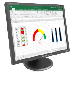
Excel is the most powerful tool to manage and analyze various types of Data. This Microsoft Excel tutorial for beginners covers in-depth lessons for Excel learning and how to use various Excel formulas, tables and charts for managing small to large scale business process. This Excel for beginners course will help you learn Excel basics.
What should I know?
Nothing! This Free Excel training course assumes you are a beginner to Excel.
Microsoft Excel Syllabus
Introduction
| 👉 Lesson 1 | Introduction to Microsoft Excel 101 — Notes About MS Excel |
| 👉 Lesson 2 | Excel Basic Formulas — Add, Subtract, Multiply & Divide in Excel |
| 👉 Lesson 3 | Excel Data Validation — Filters & Grouping in Excel |
| 👉 Lesson 4 | Excel Formulas & Functions — Learn with Basic Examples |
| 👉 Lesson 5 | Logical Functions in Excel — IF, AND, OR, Nested IF & NOT |
| 👉 Lesson 6 | How to Create Charts in Excel — Types & Examples |
| 👉 Lesson 7 | How to make Budget in Excel — Personal Finance Tutorial |
Advance Stuff
| 👉 Lesson 1 | How to Import XML Data into Excel — Learn with Example |
| 👉 Lesson 2 | How to Import CSV Data into Excel — Learn with Example |
| 👉 Lesson 3 | How to Import SQL Database Data into Excel — Learn with Example |
| 👉 Lesson 4 | How to Create Pivot Table in Excel — Beginners Tutorial |
| 👉 Lesson 5 | Advanced Excel Charts & Graphs — Learn with Template |
| 👉 Lesson 6 | Microsoft Office 365 Cloud — Benefits of MS Excel Cloud |
| 👉 Lesson 7 | CSV vs Excel — What is the Difference? |
| 👉 Lesson 8 | Excel VLOOKUP Tutorial for Beginners — Learn with Examples |
| 👉 Lesson 9 | Excel ISBLANK Function — Learn with Example |
| 👉 Lesson 10 | Sparklines in Excel — What is, How to Use, Types & Examples |
| 👉 Lesson 11 | SUMIF function in Excel — Learn with EXAMPLE |
| 👉 Lesson 12 | Microsoft Excel Interview Questions — Top 40 MS Excel Interview Q & A |
| 👉 Lesson 13 | Top Excel Formulas — Top 10 Excel Formulas Asked in an Interview |
| 👉 Lesson 14 | Best Excel Course — 15 Best Excel Course & Classes Online |
| 👉 Lesson 15 | BEST Excel Alternatives — 20 BEST Free Excel Alternatives Software |
| 👉 Lesson 16 | BEST Excel Books — 15 BEST Excel Books |
| 👉 Lesson 17 | Best Microsoft Courses — 13 Best Free Microsoft Courses & Certification |
| 👉 Lesson 18 | BEST Online Data Entry Courses — 6 BEST Online Data Entry Courses & Training Certificates |
| 👉 Lesson 19 | Excel Tutorial PDF — Download Excel Tutorial for Beginners PDF |
Macros & VBA in Excel
| 👉 Lesson 1 | Macro Tutorial — How to Write Macros in Excel |
| 👉 Lesson 2 | VBA in Excel — What is Visual Basic for Applications, How to Use |
| 👉 Lesson 3 | VBA Variables — Data Types & Constants in VBA |
| 👉 Lesson 4 | Excel VBA Arrays — What is, How to Use & Types of Arrays |
| 👉 Lesson 5 | VBA Controls — VBA Form Control & ActiveX Controls in Excel |
| 👉 Lesson 6 | VBA Arithmetic Operators — Multiplication, Division & Addition |
| 👉 Lesson 7 | VBA String Operators — VBA String Manipulation Functions |
| 👉 Lesson 8 | VBA Comparison Operators — Not equal, Less than or Equal to |
| 👉 Lesson 9 | VBA Logical Operators — AND, OR, NOT, IF NOT in Excel |
| 👉 Lesson 10 | Excel VBA Subroutine — How to Call Sub in VBA with Example |
| 👉 Lesson 11 | Excel VBA Function Tutorial — Return, Call, Examples |
| 👉 Lesson 12 | Excel VBA Range Object — Range Property in VBA |
Skip to main content
Support
Support
Sign in
Sign in with Microsoft
Sign in or create an account.
Hello,
Select a different account.
You have multiple accounts
Choose the account you want to sign in with.
Quick start
Intro to Excel
Rows & columns
Cells
Formatting
Formulas & functions
Tables
Charts
PivotTables
Share & co-author
Linked data types
Get to know Power Query
 Take a tour
Download template >
 Formula tutorial
Download template >
 Make your first PivotTable
Download template >
 Get more out of PivotTables
Download template >
More resources

Other versions
Excel 2013 training
Other training
LinkedIn Learning Excel training
Templates
Excel templates
Office templates


Need more help?
Want more options?
Discover
Community
Contact Us
Explore subscription benefits, browse training courses, learn how to secure your device, and more.

Microsoft 365 subscription benefits

Microsoft 365 training

Microsoft security

Accessibility center
Communities help you ask and answer questions, give feedback, and hear from experts with rich knowledge.

Ask the Microsoft Community

Microsoft Tech Community

Windows Insiders
Microsoft 365 Insiders
Find solutions to common problems or get help from a support agent.

Online support
Was this information helpful?
(The more you tell us the more we can help.)
(The more you tell us the more we can help.)
What affected your experience?
Resolved my issue
Clear instructions
Easy to follow
No jargon
Pictures helped
Other
Didn’t match my screen
Incorrect instructions
Too technical
Not enough information
Not enough pictures
Other
Any additional feedback? (Optional)
Thank you for your feedback!
×
#статьи
- 2 ноя 2022
-

0
Собрали в одном месте 15 статей и видео об инструментах Excel, которые ускорят и упростят работу с электронными таблицами.
Иллюстрация: Meery Mary для Skillbox Media

Рассказывает просто о сложных вещах из мира бизнеса и управления. До редактуры — пять лет в банке и три — в оценке имущества. Разбирается в Excel, финансах и корпоративной жизни.
Excel — универсальный софт для работы с электронными таблицами. Он одинаково хорош как для составления примитивных отчётов или графиков, так и для глубокого анализа больших объёмов информации.
Функции Excel позволяют делать всё, что может понадобиться в работе с таблицами: объединять ячейки, переносить данные с одного листа на другой, закреплять строки и столбцы, делать выпадающие списки и так далее. Они значительно упрощают работу с данными, поэтому применять их должны уметь все.
В Skillbox Media есть серия инструкций по работе с Excel. В этом материале — подборка главных возможностей программы и ссылки на подробные руководства с примерами и скриншотами.
- Как ввести и оформить данные
- Как работать с формулами и функциями
- Как объединить ячейки и данные в них
- Как округлить числа
- Как закрепить строки и столбцы
- Как создать и настроить диаграммы
- Как посчитать проценты
- Как установить обычный и расширенный фильтр
- Как сделать сортировку
- Как сделать выпадающий список
- Как пользоваться массивами
- Как использовать функцию ЕСЛИ
- Как использовать поисковые функции
- Как делать сводные таблицы
- Как делать макросы
- Как узнать больше о работе в Excel
С этого видеоурока стоит начать знакомство с Excel. В нём сертифицированный тренер по Microsoft Office Ренат Шагабутдинов показывает:
- какие есть способы и инструменты для ввода данных в Excel;
- как копировать, переносить и удалять данные;
- как настраивать форматы и стили таблиц;
- как создавать пользовательские форматы, чтобы таблицы становились нагляднее.
Формулы в Excel — выражения, с помощью которых проводят расчёты со значениями на листе. Пользователи вводят их в ячейки таблицы вручную. Чаще всего их используют для простых вычислений.
Функции в Excel — заранее созданные формулы, которые проводят вычисления по заданным значениям и в указанном порядке. Они позволяют выполнять как простые, так и сложные расчёты.
На тему работы с формулами и таблицами тоже есть видеоурок. В нём Ренат Шагабутдинов показывает:
- как проводить расчёты с помощью стандартных формул и функций;
- как создавать формулы с абсолютными и относительными ссылками;
- как находить ошибки в формулах.
Функция объединения позволяет из нескольких ячеек сделать одну. Она пригодится в двух случаях:
- когда нужно отформатировать таблицу — например, оформить шапку или убрать лишние пустые ячейки;
- когда нужно объединить данные таблицы — например, сделать одну ячейку из нескольких и при этом сохранить всю информацию в них.
В статье подробно рассказали о четырёх способах объединения ячеек в Excel:
- Кнопка «Объединить» — когда нужно сделать шапку в таблице.
- Функция СЦЕПИТЬ — когда нужно собрать данные из нескольких ячеек в одну.
- Функция СЦЕП — когда нужно собрать данные из большого диапазона.
- Функция ОБЪЕДИНИТЬ — когда нужно собрать данные из большого диапазона и автоматически разделить их пробелами.

Округление необходимо, когда точность чисел не важна, а в округлённом виде они воспринимаются проще.
В Excel округлить числа можно четырьмя способами:
- Округление через изменение формата ячейки — когда нужно округлить число только визуально.
- Функция ОКРУГЛ — когда нужно округлить число по правилам математики.
- Функции ОКРУГЛВВЕРХ и ОКРУГЛВНИЗ — когда нужно самостоятельно выбрать, в какую сторону округлить число.
- Функция ОКРУГЛТ — когда нужно округлить число с заданной точностью.
В статье показали, как применять эти способы округления.
Закрепление областей таблицы полезно, когда все данные не помещаются на экране, а при прокрутке теряются названия столбцов и строк. После закрепления необходимые области всегда остаются на виду.
Опция «замораживает» первую строку таблицы, первый столбец или несколько столбцов и строк одновременно. В этой статье Skillbox Media мы подробно разбирали, как это сделать.
Диаграммы используют для графического отображения данных таблиц. Также с помощью них показывают зависимости между этими данными. Сложная информация, представленная в виде диаграмм, воспринимается проще: можно расставлять нужные акценты и дополнительно детализировать данные.
В статье «Как создать и настроить диаграммы в Excel» рассказали:
- для чего подойдёт круговая диаграмма и как её построить;
- как показать данные круговой диаграммы в процентах;
- для чего подойдут линейчатая диаграмма и гистограмма, как их построить и как поменять в них акценты;
- как форматировать готовую диаграмму — добавить оси, название, дополнительные элементы;
- как изменить данные диаграммы.
В этой статье Skillbox Media подробно рассказывали о четырёх популярных способах расчёта процентов в Excel:
- как рассчитать процент от числа — когда нужно найти процент одного значения в общей сумме;
- как отнять процент от числа или прибавить процент к числу — когда нужно рассчитать, как изменятся числа после уменьшения или увеличения на заданный процент;
- как рассчитать разницу между числами в процентах — когда нужно понять, на сколько процентов увеличилось или уменьшилось число;
- как рассчитать число по проценту и значению — когда нужно определить, какое значение будет у процента от заданного числа.
Фильтры в таблицах используют, чтобы из большого количества строк отобразить только нужные. В отфильтрованной таблице показаны данные, которые соответствуют критериям, заданным пользователем. Ненужная информация скрыта.
В этой статье Skillbox Media на примерах показали:
- как установить фильтр по одному критерию;
- как установить несколько фильтров одновременно и отфильтровать таблицу по заданному условию;
- для чего нужен расширенный фильтр и как им пользоваться;
- как очистить фильтры таблицы.
Сортировку в Excel настраивают, когда информацию нужно отобразить в определённом порядке. Например, по возрастанию или убыванию чисел, по алфавиту или по любым пользовательским критериям.
В статье о сортировке в Excel разобрали:
- как сделать сортировку данных по одному критерию;
- как сделать сортировку по нескольким критериям;
- как настроить пользовательскую сортировку.
Выпадающий список в Excel позволяет выбирать значение ячейки таблицы из перечня, подготовленного заранее. Эта функция пригодится, когда нужно много раз вводить повторяющиеся параметры — например, фамилии сотрудников или наименования товаров.
В статье дали пошаговую инструкцию по созданию выпадающих списков — на примере каталога авто.
Массивы в Excel — данные из двух и более смежных ячеек таблицы, которые используют в расчётах как единую группу, одновременно. Это делает работу с большими диапазонами значений более удобной и быстрой.
С помощью массивов можно проводить расчёты не поочерёдно с каждой ячейкой диапазона, а со всем диапазоном одновременно. Или создать формулу, которая одним действием выполнит сразу несколько расчётов с любым количеством ячеек.
В статье показали, как выполнить базовые операции с помощью формул массивов и операторов Excel:
- построчно перемножить значения двух столбцов;
- умножить одно значение сразу на весь столбец;
- выполнить сразу два действия одной формулой;
- поменять местами столбцы и строки таблицы.
ЕСЛИ — логическая функция Excel. С помощью неё проверяют, выполняются ли заданные условия в выбранном диапазоне таблицы.
Это может быть удобно, например, при работе с каталогами. Пользователь указывает критерий, который нужно проверить, — функция сравнивает этот критерий с данными в ячейках таблицы и выдаёт результат.
В статье Skillbox Media подробнее рассказали о том, как работает и для чего нужна функция ЕСЛИ в Excel. На примерах показали, как запустить функцию ЕСЛИ с одним или несколькими условиями.
Поисковые функции в Excel нужны, чтобы ускорить работу с большими объёмами данных. С их помощью значения находят в одной таблице и переносят в другую. Не нужно, например, самостоятельно сопоставлять и переносить сотни наименований, функция делает это автоматически.
В этой статье Skillbox Media разобрали, для чего нужна функция ВПР и когда её используют. Также показали на примере, как её применять пошагово.
В видеоуроке ниже Ренат Шагабутдинов показывает, как работают другие поисковые функции Excel — ПОИСКПОЗ и ПРОСМОТРX. А также учит пользоваться функциями для расчётов с условиями — СЧЁТ, СУММ, СРЗНАЧ, ИНДЕКС.
Сводные таблицы — инструмент для анализа данных в Excel. Сводные таблицы собирают информацию из обычных таблиц, обрабатывают её, группируют в блоки, проводят необходимые вычисления и показывают итог в виде наглядного отчёта.
С помощью сводных таблиц можно систематизировать тысячи строк и преобразовать их в отчёт за несколько минут. Все параметры этого отчёта пользователь настраивает под себя и свои потребности.
В статье дали пошаговую инструкцию по созданию сводных таблиц с примером и скриншотами. Также на эту тему есть бесплатный видеоурок.
Макрос в Excel — алгоритм действий, записанный в одну команду. С помощью макросов можно выполнить несколько шагов в Excel, нажав на одну кнопку в меню или на сочетание клавиш.
Макросы используют для автоматизации рутинных задач. Вместо того чтобы совершать несколько повторяющихся действий, пользователь записывает ход их выполнения в одну команду — и запускает её, когда нужно выполнить все эти действия снова.
В статье дали инструкцию по работе с макросами для новичков. В ней подробно рассказали, для чего нужны макросы и как они работают. А также показали, как записать и запустить макрос.
- В Skillbox есть курс «Excel + Google Таблицы с нуля до PRO». Он подойдёт как новичкам, которые хотят научиться работать в Excel с нуля, так и уверенным пользователям, которые хотят улучшить свои навыки. На курсе учат быстро делать сложные расчёты, визуализировать данные, строить прогнозы, работать с внешними источниками данных, создавать макросы и скрипты.
- Кроме того, Skillbox даёт бесплатный доступ к записи онлайн-интенсива «Экспресс-курс по Excel: осваиваем таблицы с нуля за 3 дня». Он подходит для начинающих пользователей. На нём можно научиться создавать и оформлять листы, вводить данные, использовать формулы и функции для базовых вычислений, настраивать пользовательские форматы и создавать формулы с абсолютными и относительными ссылками.
- Здесь собраны все бесплатные видеоуроки по Excel и «Google Таблицам», о которых мы говорили выше.

Научитесь: Excel + Google Таблицы с нуля до PRO
Узнать больше
Examples in Each Chapter
We use practical examples to give the user a better understanding of the concepts.
Copy Values Tool
Example values can be copied from the tutorial and into your spreadsheet, making it easy for you to tag along
step-by-step:
Case Based Learning
We have created active learning activities, so you can test and build your knowledge. Making the learning experience more fun and engaging.
Solve Case »
Why Study Excel?
Excel is the world’s most used spreadsheet program.
Example use areas:
- Data analytics
- Project management
- Finance and accounting
Test Yourself With Exercises
My Learning
Track your progress with the free «My Learning» program here at W3Schools.
Log in to your account, and start earning points!
This is an optional feature. You can study W3Schools without using My Learning.

Перейти к содержанию
Самоучитель по Microsoft Excel для чайников
На чтение 6 мин Опубликовано 10.05.2020
Самоучитель по работе в Excel для чайников позволит Вам легко понять и усвоить базовые навыки работы в Excel, чтобы затем уверенно перейти к более сложным темам. Самоучитель научит Вас пользоваться интерфейсом Excel, применять формулы и функции для решения самых различных задач, строить графики и диаграммы, работать со сводными таблицами и многое другое.
Самоучитель был создан специально для начинающих пользователей Excel, точнее для «полных чайников». Информация дается поэтапно, начиная с самых азов. От раздела к разделу самоучителя предлагаются все более интересные и захватывающие вещи. Пройдя весь курс, Вы будете уверенно применять свои знания на практике и научитесь работать с инструментами Excel, которые позволят решить 80% всех Ваших задач. А самое главное:
- Вы навсегда забудете вопрос: «Как работать в Excel?»
- Теперь никто и никогда не посмеет назвать Вас «чайником».
- Не нужно покупать никчемные самоучители для начинающих, которые затем будут годами пылиться на полке. Покупайте только стоящую и полезную литературу!
- На нашем сайте Вы найдете еще множество самых различных курсов, уроков и пособий по работе в Microsoft Excel и не только. И все это в одном месте!
Содержание
- Раздел 1: Основы Excel
- Раздел 2: Формулы и функции
- Раздел 3: Работа с данными
- Раздел 4: Расширенные возможности Excel
- Раздел 5: Продвинутая работа с формулами в Excel
- Раздел 6: Дополнительно
- Знакомство с Excel
- Интерфейс Microsoft Excel
- Лента в Microsoft Excel
- Представление Backstage в Excel
- Панель быстрого доступа и режимы просмотра книги
- Создание и открытие рабочих книг
- Создание и открытие рабочих книг Excel
- Режим совместимости в Excel
- Сохранение книг и общий доступ
- Сохранение и автовосстановление книг в Excel
- Экспорт книг Excel
- Общий доступ к книгам Excel
- Основы работы с ячейками
- Ячейка в Excel — базовые понятия
- Содержимое ячеек в Excel
- Копирование, перемещение и удаление ячеек в Excel
- Автозаполнение ячеек в Excel
- Поиск и замена в Excel
- Изменение столбцов, строк и ячеек
- Изменение ширины столбцов и высоты строк в Excel
- Вставка и удаление строк и столбцов в Excel
- Перемещение и скрытие строк и столбцов в Excel
- Перенос текста и объединение ячеек в Excel
- Форматирование ячеек
- Настройка шрифта в Excel
- Выравнивание текста в ячейках Excel
- Границы, заливка и стили ячеек в Excel
- Числовое форматирование в Excel
- Основные сведения о листе Excel
- Переименование, вставка и удаление листа в Excel
- Копирование, перемещение и изменение цвета листа в Excel
- Группировка листов в Excel
- Разметка страницы
- Форматирование полей и ориентация страницы в Excel
- Вставка разрывов страниц, печать заголовков и колонтитулов в Excel
- Печать книг
- Панель Печать в Microsoft Excel
- Задаем область печати в Excel
- Настройка полей и масштаба при печати в Excel
Раздел 2: Формулы и функции
- Простые формулы
- Математические операторы и ссылки на ячейки в формулах Excel
- Создание простых формул в Microsoft Excel
- Редактирование формул в Excel
- Сложные формулы
- Знакомство со сложными формулами в Excel
- Создание сложных формул в Microsoft Excel
- Относительные и абсолютные ссылки
- Относительные ссылки в Excel
- Абсолютные ссылки в Excel
- Ссылки на другие листы в Excel
- Формулы и функции
- Знакомство с функциями в Excel
- Вставляем функцию в Excel
- Библиотека функций в Excel
- Мастер функций в Excel
Раздел 3: Работа с данными
- Управление внешним видом рабочего листа
- Закрепление областей в Microsoft Excel
- Разделение листов и просмотр книги Excel в разных окнах
- Сортировка данных в Excel
- Сортировка в Excel – основные сведения
- Пользовательская сортировка в Excel
- Уровни сортировки в Excel
- Фильтрация данных в Excel
- Фильтр в Excel — основные сведения
- Расширенный фильтр в Excel
- Работа с группами и подведение итогов
- Группы и промежуточные итоги в Excel
- Таблицы в Excel
- Создание, изменение и удаление таблиц в Excel
- Диаграммы и спарклайны
- Диаграммы в Excel – основные сведения
- Макет, стиль и прочие параметры диаграмм
- Как работать со спарклайнами в Excel
Раздел 4: Расширенные возможности Excel
- Работа с примечаниями и отслеживание исправлений
- Отслеживание исправлений в Excel
- Рецензирование исправлений в Excel
- Примечания к ячейкам в Excel
- Завершение и защита рабочих книг
- Завершение работы и защита рабочих книг в Excel
- Условное форматирование
- Условное форматирование в Excel
- Сводные таблицы и анализ данных
- Общие сведение о сводных таблицах в Excel
- Сведение данных, фильтры, срезы и сводные диаграммы
- Анализ «что если” в Excel
Раздел 5: Продвинутая работа с формулами в Excel
- Решаем задачи с помощью логических функций
- Как задать простое логическое условие в Excel
- Используем логические функции Excel для задания сложных условий
- Функция ЕСЛИ в Excel на простом примере
- Подсчет и суммирование в Excel
- Подсчет ячеек в Excel, используя функции СЧЕТ и СЧЕТЕСЛИ
- Суммирование в Excel, используя функции СУММ и СУММЕСЛИ
- Как посчитать накопительную сумму в Excel
- Вычисляем средневзвешенные значения при помощи СУММПРОИЗВ
- Работа с датами и временем в Excel
- Дата и время в Excel – основные понятия
- Ввод и форматирование дат и времени в Excel
- Функции для извлечения различных параметров из дат и времени в Excel
- Функции для создания и отображения дат и времени в Excel
- Функции Excel для вычисления дат и времени
- Поиск данных
- Функция ВПР в Excel на простых примерах
- Функция ПРОСМОТР в Excel на простом примере
- Функции ИНДЕКС и ПОИСКПОЗ в Excel на простых примерах
- Полезно знать
- Статистические функции Excel, которые необходимо знать
- Математические функции Excel, которые необходимо знать
- Текстовые функции Excel в примерах
- Обзор ошибок, возникающих в формулах Excel
- Работа с именами в Excel
- Знакомство с именами ячеек и диапазонов в Excel
- Как присвоить имя ячейке или диапазону в Excel
- 5 полезных правил и рекомендаций по созданию имен ячеек и диапазонов в Excel
- Диспетчер имен в Excel – инструменты и возможности
- Как присваивать имена константам в Excel?
- Работа с массивами в Excel
- Знакомство с формулами массива в Excel
- Многоячеечные формулы массива в Excel
- Одноячеечные формулы массива в Excel
- Массивы констант в Excel
- Редактирование формул массива в Excel
- Применение формул массива в Excel
- Подходы к редактированию формул массива в Excel
Раздел 6: Дополнительно
- Настройка интерфейса
- Как настроить Ленту в Excel 2013
- Режим сенсорного управления Лентой в Excel 2013
- Стили ссылок в Microsoft Excel
Хотите узнать об Excel еще больше? Специально для Вас мы припасли целых два простых и полезных самоучителя: 300 примеров по Excel и 30 функций Excel за 30 дней.
Оцените качество статьи. Нам важно ваше мнение:
![]()
Download Article
![]()
Download Article
Are you new to Microsoft Excel and need to work on a spreadsheet? Excel is so overrun with useful and complicated features that it might seem impossible for a beginner to learn. But don’t worry—once you learn a few basic tricks, you’ll be entering, manipulating, calculating, and graphing data in no time! This wikiHow tutorial will introduce you to the most important features and functions you’ll need to know when starting out with Excel, from entering and sorting basic data to writing your first formulas.
Things You Should Know
- Use Quick Analysis in Excel to perform quick calculations and create helpful graphs without any prior Excel knowledge.
- Adding your data to a table makes it easy to sort and filter data by your preferred criteria.
- Even if you’re not a math person, you can use basic Excel math functions to add, subtract, find averages and more in seconds.
-
1
Create or open a workbook. When people refer to «Excel files,» they are referring to workbooks, which are files that contain one or more sheets of data on individual tabs. Each tab is called a worksheet or spreadsheet, both of which are used interchangeably. When you open Excel, you’ll be prompted to open or create a workbook.
- To start from scratch, click Blank workbook. Otherwise, you can open an existing workbook or create a new one from one of Excel’s helpful templates, such as those designed for budgeting.
-
2
Explore the worksheet. When you create a new blank workbook, you’ll have a single worksheet called Sheet1 (you’ll see that on the tab at the bottom) that contains a grid for your data. Worksheets are made of individual cells that are organized into columns and rows.
- Columns are vertical and labeled with letters, which appear above each column.
- Rows are horizontal and are labeled by numbers, which you’ll see running along the left side of the worksheet.
- Every cell has an address which contains its column letter and row number. For example, the top-left cell in your worksheet’s address is A1 because it’s in column A, row 1.
- A workbook can have multiple worksheets, all containing different sets of data. Each worksheet in your workbook has a name—you can rename a worksheet by right-clicking its tab and selecting Rename.
- To add another worksheet, just click the + next to the worksheet tab(s).
Advertisement
-
3
Save your workbook. Once you save your workbook once, Excel will automatically save any changes you make by default.[1]
This prevents you from accidentally losing data.- Click the File menu and select Save As.
- Choose a location to save the file, such as on your computer or in OneDrive.
- Type a name for your workbook. All workbooks will automatically inherit the the .XLSX file extension.
- Click Save.


Advertisement
-
1
Click a cell to select it. When you click a cell, it will highlight to indicate that it’s selected.
- When you type something into a cell, the input text is called a value. Entering data into Excel is as simple as typing values into each cell.
- When entering data, the first row of your worksheet (e.g., A1, B1, C1) is typically used as headers for each column. This is helpful when creating graphs or tables which require labels.
- For example, if you’re adding a list of dates in column A, you might click cell A1 and type Date into the cell as the column header.
-
2
Type a word or number into the cell. As you’re typing, you’ll see the letters and/or numbers appear in the cell, as well as in the formula bar at the top of the worksheet.
- When you start practicing more advanced Excel features like creating formulas, this bar will come in handy.
- You can also copy and paste text from other applications into your worksheet, tables from PDFs and the web.
-
3
Press ↵ Enter or ⏎ Return. This enters the data into the cell and moves to the next cell in the column.
-
4
Automatically fill columns based on existing data. Let’s say you want to make a list of consecutive dates or numbers. Or what if you want to fill a column with many of the same values that follow a pattern? As long as Excel can recognize some sort of pattern in your data, such as a particular order, you can use Autofill to automatically populate data into the rest of your column. Here’s a trick to see it in action.
- In a blank column, type 1 into the first cell, 2 into the second cell, and then 3 into the third cell.
- Hover your mouse cursor over the bottom-right corner of the last cell in your series—it will turn to a crosshair.
- Click and drag the crosshair down the column, then release the mouse button once you’ve gone down as far as you like. By default, this will fill the remaining cells with the value of the selected cell—at this point, you’ll probably have something like 1, 2, 3, 3, 3, 3, 3, 3.
- Click the small icon at the bottom-right corner of the filled data to open AutoFill options, and select Fill Series to automatically detect the series or pattern. Now you’ll have a list of consecutive numbers. Try this cool feature out with different patterns!
- Once you get the hang of AutoFill, you’ll have to try flash fill, which you can use to join two columns of data into a single merged column.
-
5
Adjust the column sizes so you can see all of the values. Sometimes typing long values into a cell hides the value and displays hash symbols ### instead of what you’ve typed. If you want to be able to see everything, you can snap the cell contents to the width of the widest cell. For example, let’s say we have some long values in column B:
- To expand the contents of column B, hover the cursor over the dividing line between the B and C at the top of the worksheet—once your cursor is right on the line, it will turn to two arrows pointing in either direction.[2]
- Click and drag the separator until the column is wide enough to accommodate your data, or just double-click the separator to instantly snap the column to the size of the widest value.
- To expand the contents of column B, hover the cursor over the dividing line between the B and C at the top of the worksheet—once your cursor is right on the line, it will turn to two arrows pointing in either direction.[2]
-
6
Wrap text in a cell. If your longer values are now awkwardly long, you can enable text wrapping in one or more cells. Just click a cell (or drag the mouse to select multiple cells), click the Home tab, and then click Wrap Text on the toolbar.
-
7
Edit a cell value. If you need to make a change to a cell, you can double-click the cell to activate the cursor, and then make any changes you need. When you’re finished, just press Enter or Return again.
- To delete the contents of a cell, click the cell once and press delete on your keyboard.
-
8
Apply styles to your data. Whether you want to highlight certain values with color so they stand out or just want to make your data look pretty, changing the colors of cells and their containing values is easy—especially if you’re used to Microsoft Word:
- Select a cell, column, row, or multiple cells at once.
- On the Home tab, click Cell Styles if you’d like to quickly apply quick color styles.
- If you’d rather use more custom options, right-click the selected cell(s) and select Format Cells. Then, use the colors on the Fill tab to customize the cell’s background, or the colors on the Font tab for value colors.
-
9
Apply number formatting to cells containing numbers. If you have data that contains numbers such as prices, measurements, dates, or times, you can apply number formatting to the data so it will display consistently.[3]
By default, the number format is General, which means numbers display exactly as you type them.- Select the cell you want to format. If you’re working with an entire column or row, you can just click the column letter or row number to select the whole thing.
- On the Home tab, click the drop-down menu at the top-center—it’ll say General by default, unless you selected cells that Excel recognizes as a different type of number like Currency or Time.
- Choose one of the formatting options in the list, such as Short Date or Percentage, or click More Number Formats at the bottom to expand all options (we recommend this!).
- If you selected More Number Formats, the Format Cells dialog will expand to the Number tab, where you’ll see several categories for number types.
- Select a category, such as Currency if working with money, or Date if working with dates. Then, choose your preferences, such as a currency symbol and/or decimal places.
- Click OK to apply your formatting.


Advertisement
-
1
Select all of the data you’ve entered so far. Adding your data to a table is the easiest way to work with and analyze data.[4]
Start by highlighting the values you’ve entered so far, including your column headers. Tables also make it easy to sort and filter your data based on values.- Tables traditionally apply different or alternating colors to every other row for easy viewing. Many table options also add borders between cells and/or columns and rows.
-
2
Click Format as Table. You’ll see this at the top-center part of the Home tab.[5]
-
3
Select a table style. Choose any of Excel’s default table styles to get started. You’ll see a small window titled «Create Table» once selected.
- Once you get the hang of tables, you can return here to customize your table further by selecting New Table Style.
-
4
Make sure «My table has headers» is selected and click OK. This tells Excel to turn your column headers into drop-down menus that you can easily sort and filter. Once you click OK, you’ll see that your data now has a color scheme and drop-down menus.
-
5
Click the drop-down menu at the top of a column. Now you’ll see options for sorting that column, as well as several options for filtering all of your data based on its values.
-
6
Choose which data to display based on values in this column. The simplest way to do this is to uncheck the values you don’t want to display—if you uncheck a particular date, for example, you’ll prevent rows that contain the selected date in from appearing in your data. You can also use Text Filters or Number Filters, depending on the type of data in the column:
- If you chose a numerical column, select Number Filters, then choose an option like Greater Than… or Does Not Equal to be extra specific about which values to hide.
- For text columns, you can choose Text Filters, where you can specify things like Begins with or Contains.
- You can also filter by cell color.
-
7
Click OK. Your data is now filtered based on your selections. You’ll also see a small funnel icon in the drop-down menu, which indicates that the data is filtering out certain values.
- To unfilter your data, click the funnel icon, click Clear filter from (column name), and then click OK.
- You can also filter columns that aren’t in tables. Just select a column and click Filter on the Data tab to add a drop-down to that column.
-
8
Sort your data in ascending or descending order. Click the drop-down arrow at the top of a column to view sorting options—these allow you to sort all of your data in order based on the current column.
- If you’re working with numbers, click Smallest to Largest to sort in ascending order, or Largest to Smallest for descending order.[6]
- If you’re working with text values, Sort A to Z will sort in ascending order, while Sort Z to A will sort in reverse.
- When it comes to sorting dates and times, Sort Oldest to Newest will sort with the earliest date at the top and the oldest date at the bottom, and Newest to Oldest displays the dates in descending order.
- When you sort a column, all other columns in the table adjust based on the sort.
- If you’re working with numbers, click Smallest to Largest to sort in ascending order, or Largest to Smallest for descending order.[6]


Advertisement
-
1
Select the data in your worksheet. Excel’s Quick Analysis feature is the easiest way to perform basic calculations (including totals, averages, and counts) and create meaningful tables or graphs without the need for advanced Excel knowledge.[7]
Use your mouse to select your data (including your column headers) to get started. -
2
Click the Quick Analysis icon. This is the small icon that pops up at the bottom-right corner of your selection. It looks like a window with some colored lines.
-
3
Select an analysis type. You’ll see several tabs running along the top of the window, each of which gives you different option for visualizing your data:
- For math calculations, click the Totals tab, where you can select Sum, Average, Count, %Total, or Running Total. You’ll be able to choose whether to display the results at the bottom of each column or to the right.
- To create a chart, click the Charts tab, then select a chart to visualize your data. Before you settle on a chart, just hover the cursor over each option to see a preview.
- To add quick chart data to individual cells, click the Sparklines tab and choose a format. Again, you can hover the cursor over each option to see a preview.
- To instantly apply conditional formatting (which is usually a little more complex in Excel) based on your data, use the Formatting tab. Here you can choose an option like Color or Data Bars, which apply colors to your data based on trends.


Advertisement
-
1
Quickly add data with AutoSum. AutoSum is a built-in Excel function that makes it easy to find the total of one or more columns in a few clicks. Functions or formulas that perform calculations and other tasks based on the values of cells. When you use a function to get something done, you’re creating a formula, which is like a math equation. If you have a column or row of numbers you want to add:
- Click the cell below the numbers you want to add (if a column) or to the right (if a row).[8]
- On the Home tab, click AutoSum toward the upper-right corner of the app. A formula beginning with =SUM(cell+cell) will appear in the field, and a dotted line will surround the numbers you’re adding.
- Press Enter or Return. You should now see the total of the numbers in the selected field. This is here because you created your first formula—which you didn’t have to write by hand!
- If you change any numbers in your data after using AutoSum, the AutoSum value will update automatically.
- Click the cell below the numbers you want to add (if a column) or to the right (if a row).[8]
-
2
Write a simple math formula. AutoSum is just the beginning—Excel is famous for its ability to do all sorts of simple and complex math calculations on data. Fortunately, you don’t have to be a math whiz to create simple formulas to create everyday math formulas, like adding, subtracting, and multiplying. Here’s some basic formulas to get you started:
-
Add: — Type =SUM(cell+cell) (e.g.,
=SUM(A3+B3)) to add two cells’ values together, or type =SUM(cell,cell,cell) (e.g.,=SUM(A2,B2,C2)) to add a series of cell values together.- If you want to add all of the numbers in a whole column (or in a section of a column), type =SUM(cell:cell) (e.g.,
=SUM(A1:A12)) into the cell you want to use to display the result.
- If you want to add all of the numbers in a whole column (or in a section of a column), type =SUM(cell:cell) (e.g.,
-
Subtract: Type =SUM(cell-cell) (e.g.,
=SUM(A3-B3)) to subtract one cell value from another cell’s value. -
Divide: Type =SUM(cell/cell) (e.g.,
=SUM(A6/C5)) to divide one cell’s value by another cell’s value. -
Multiply: Type =SUM(cell*cell) (e.g.,
=SUM(A2*A7)) to multiply two cell values together.
-
Add: — Type =SUM(cell+cell) (e.g.,


Advertisement
-
1
Select a cell for an advanced formula. What if you need to do something more complicated than just adding numbers? Even if you don’t know how to write formulas by hand, you can still create useful formulas that work with your data in various ways. Start by clicking the cell in which you want to display your formula.
-
2
Click the Formulas tab. It’s a tab at the top of the Excel window.
-
3
Explore the Function Library. Several function categories appear in the toolbar, such as Financial, Text, and Math & Trig. Click the options to check out the types of functions available, though they might not make a whole lot of sense just yet.
-
4
Click Insert Function. This option is in the far-left side of the Formulas toolbar. This opens the Insert Function window, which gives you a more detailed breakdown of each function.
-
5
Click a function to learn about it. You can type what you want to do (such as round), or choose a category to filter the list of functions. Then, click any function to read a description of how it works and view its syntax.
- For example, to select the formula for finding the tangent of an angle, you would scroll down and click the TAN option.
-
6
Select a function and click OK. This creates a formula based on the selected function.
-
7
Fill out the function’s formula. When prompted, type in the number or select a cell for which you want to use the formula.
- For example, if you select the TAN function, you’ll type in the number for which you want to find the tangent, or select the cell that contains that number.
- Depending on your selected function, you may need to click through a couple of on-screen prompts.
-
8
Press ↵ Enter or ⏎ Return to run the formula. Doing so applies your function and displays it in your selected cell.


Advertisement
-
1
Set up the chart’s data. If you’re creating a line graph or a bar graph, for example, you’ll want to use one column of cells for the horizontal axis and one column of cells for the vertical axis. The best way to do this is to place your data in a table.
- Typically speaking, the left column is used for the horizontal axis and the column immediately to the right of it represents the vertical axis.
-
2
Select the data in your table. Click and drag your mouse from the top-left cell of the data down to the bottom-right cell of the data.
-
3
Click the Insert tab. It’s a tab at the top of the Excel window.
-
4
Click Recommended Charts. You’ll find this option in the «Charts» section of the Insert toolbar. A window with different chart templates will appear.
-
5
Select a chart template. Click the chart template you want to use based on the type of data you’re working with. If you don’t see a chart type you like, click the All Charts tab to explore by category, such as Pie, Bar, and X Y Scatter.
-
6
Click OK. It’s at the bottom of the window. This creates your chart.
-
7
Use the Chart Design tab to customize your chart. Any time you click your chart, the Chart Design tab will appear at the top of Excel. You can adjust the chart style here, change colors, and add additional elements.
-
8
Double-click a chart element to manage it in the Format panel. When you double-click something on your chart, such as a value, line, or bar, you’ll see options you can edit in the panel on the right side of excel. Here you can change the axis labels, alignment, and legend data.


Advertisement
Add New Question
-
Question
How do you add a check mark or an X mark to a cell?

You can go into Insert, then Symbol, and choose the symbol you want. After that, you can just copy and paste the symbol from one cell to another.
-
Question
Can I add work sheets on Excel?
Yes. At the bottom left of the Excel you will see the list of sheets. To the left of those sheets you will find a «+» sign. Click on it.
-
Question
How do I move cell contents to another cell?
Highlight the cell, right-click, and click Copy. Click destination cell, right-click and Paste.
See more answers
Ask a Question
200 characters left
Include your email address to get a message when this question is answered.
Submit
Advertisement
Video
Thanks for submitting a tip for review!
References
About This Article
Article SummaryX
1. Purchase and install Microsoft Office.
2. Enter data into individual cells.
3. Format cells based on certain criteria.
4. Organize data into rows and columns.
5. Perform math operations using formulas.
6. Use the Formulas tab to find additional formulas.
7. Use data to create charts.
8. Import data from other sources.
Did this summary help you?
Thanks to all authors for creating a page that has been read 646,263 times.
Reader Success Stories
-

«I am applying for a job that requires comprehensive knowledge of Excel. Well, I don’t have it, but this article…» more
Is this article up to date?

The following Excel tutorial videos were created specifically for students who want to learn how to use a spreadsheet for a report, science project, or presentation. If you have never used a spreadsheet before, start with the introduction. Watching all of the videos will take about 25 minutes. See the Google Sheets Tutorials page if you want to use Google Sheets instead of Excel.
1. Introduction to Spreadsheets (3:20)
View Transcript
A spreadsheet lets you organize data and calculations.
My friend Sarah has been practicing her typing speed, and she’s given me some data on her timed typing tests: how many words she typed, and how many minutes she had to type them in.
In a spreadsheet, you always put each piece of data in its own cell, so I’ll put the labels in different cells in the top row.
In Row 2, I’ll pick one of her typing tests and record the number of words she typed, in cell A2, and how long it took, in cell B2. I’ll put the data from each of her tests in a new row, until they’re all in the spreadsheet.
My goal will be to calculate her typing speed in words per minute for each test.
Before I do the calculations, I’d like to style my data. I’ll add a cell border so it’s easier to see where my data is.
I can style the headers myself by making them bold or changing a font, or I can use a preset setting.
Either way, it’s nice to draw attention to what I measured.
You can see some of my labels are too long for the cell, so I can resize them by hovering between two columns until I get a double-sided arrow, then I can click and drag to change the column’s width.
You can see that words are aligned on the left side of the cell, and numbers are all pushed to the right.
If I want, I can put them all on either side or in the middle.
Now I’m ready to calculate the words per minute for each typing test.
I can start any calculation in a spreadsheet by typing the equals sign, then I just click on the cells I want to use; so the first words per minute calculation will be «= A2/B2».
I can copy this formula and paste it into all the other cells in the table.
Then, if I click one of those cells, I can see which numbers it is using in its calculation.
Some of my results have decimals and some don’t. I think it looks cleaner for all of them to have the same number of decimal places.
I can select the values and specify that they are numbers. Then I can decrease to only show 1 decimal place.
Now that I have the words per minute for each of Sarah’s tests, I’d also like to find her average words per minute.
I could calculate this by adding up each of her words per minute results and dividing by the total number of tests she took.
If I do that, I’ll want to be sure to include parentheses because the order of operations always applies.
To make things simpler, I can use a function, by typing = Average() , and selecting the cells I want to average out.
I can use functions to find Sarah’s minimum and maximum typing rates as well.
So that’s an intro on some of the functionality you can use with spreadsheets. They give you a lot of great options.
Check out our videos for tips and tricks to go a little deeper.
2. Choosing a Chart Type (1:54)
Transcript
So you’ve made a hypothesis and finished an experiment? Exciting! So now how do you share your results?
Scientists love graphs. But which kind of graph is best for your experiment? …
… view rest of transcript
There’s some cool graph options out there. Let’s see which one’s best for you.
First, think about what kind of information you have. What are your inputs and your outputs?
There’s 3 kinds of input. It could be time, like if you measured the temperature of water every 5 minutes.
There’s numerical, like if you measured the height of a catapult projectile at different distances away from the catapult.
And there’s categories, like if you measure the pH of different kinds of liquids.
Once you know which kind of input you have, there’s just one more question to ask yourself.
Is your output—what you actually measured—a number, like the temperature of water or the pH of a liquid?
Or is it more like a tally of responses, like how many people preferred one scenario over another?
Take a minute to think about your data from your experiment, then pick the chart type that matches it.
If your input is time, a line graph is a great choice.
If your input is numerical, check out an XY scatter plot.
If your input is different categories, try using a bar graph, column chart, or pictograph.
And if you have survey results or you want to show the percent of a whole, look at using a Pie chart.
Finally, if you want to show how survey results or the percent of a whole changed over time, check out a time-based area chart.
Once you know which chart type would showcase your results well, check out the video that walks you through how to create that chart yourself.
3. Create a Line Chart (4:32)
Download Line Chart Example (LineChart.xlsx)
Transcript
A line chart shows a trend of how values change over time.
It takes 3 steps to create a line chart.
- Organize the data
- Create a chart
- Add labels and style it
Before we make the chart, we’ll put our data into Excel. So how do we organize it so it can turn into a chart? …
… view rest of transcript
We start with the title. We want to be as descriptive as possible.
Imagine someone is going to find your chart, without any explanation of what it’s about. Help them figure out what they’re looking at.
Then we’ll organize our data into columns.
The first column holds the Date or Time values, which will be listed across the X axis of your chart.
Then, you’ll put each set of data you recorded in its own column to the right of the X values.
For example, I recorded the daily high and low temperature, and I’d like one line to show the high, and one line to show the low.
It’s very important to label your data with the units you measured in. For mine, are these degrees Fahrenheit or Celsius?
If you measured a distance, was it in inches, centimeters, or thousands of miles?
Just showing numbers by themselves isn’t as easy to understand as if you include their units.
Now that our columns are labeled, we just fill in all the data. The times should match up with the data we recorded at those times.
Once our data is in the spreadsheet, we’re ready to make the line graph!
This is easy. We select our data.
Click Insert > Line Graph > Line with Markers.
Voila! We have a line chart.
It even gave us a legend with our labels.
Now, we add a chart title and axis titles.
We can link the chart title to the one we already wrote.
Select the box the title is in.
In the formula bar type «=A1»
Now we’ll add a label for the X axis, and link it to the label we wrote.
In the formula bar, type «=A2»
For the Y axis, if we have more than one line we need a generic label to show what the numbers on the side mean.
For mine, I can say Temperature (F).
Yours might be Plant Height (cm).
Our last step is to make the chart look nice.
For some charts, you don’t need the Y axis to start at 0.
Like for temperature, we can zoom in on the data I measured, instead of squishing it all to the top.
If that works for your data, we’ll select the axis and change the minimum.
At this point, our chart is looking really good.
We can easily add more lines.
Just insert a new column and add the data.
Excel automatically adds a line with those values to the chart.
Now for my favorite part.
We can style our chart with different colors and designs by selecting the chart > Design, pick settings that we like.
For more specific changes to the lines on your chart, you can go to the paint bucket, officially the «Fill and Line» menu.
Here, you can change the color, size, and other details for each line individually.
Now we have a great-looking line graph.
It shows what we measured, the units we recorded them in, and how the values changed over time.
If you want a head start on creating your own line graph, you can download the Excel file I used for this video.
4. Create a Column or Bar Chart (4:44)
Download Column Chart Example (ColumnChart.xlsx)
Transcript
A column chart compares one measurement for different things or categories.
For example, you could compare the average lifespan of different kinds of animals, the pH of different liquids, or the GDP of different countries.
Excel makes it easy to create a column chart …
… view rest of transcript
You’ll label 2 columns: the first is the kind of categories you have, and the second is what you measured for those categories.
It’s very important to label your data with the units you measured in. For mine, the rainfall is measured in inches, but I have to label it or someone could think it was centimeters.
Next, you’ll type your categories in the first column, and put their values in the second column.
Once your data is in the spreadsheet, you are ready to make the column chart!
This is easy. We select our data.
Then all we have to do is go to the Insert tab, find the Column Chart option, and choose Clustered Column.
If you want to do a bar chart instead, you can select that here—the only difference is that your bars go side-to-side instead of up and down.
You will automatically get a title, but you can change it if you’d like.
The only thing you have to add is labels for the axes. You already wrote the label of the X axis, so you can link to it by going to the formula bar and typing equals, then selecting the cell with the name of your categories.
For the Y axis, you can either link to the value you wrote before, or you can type a different description of your measurement.
Either way, be sure to include the units.
You can display more than one value for each category.
If you’ve already created a chart, the easiest way to add data is to type the category title and all of the values in the next column.
Then, you can select the chart; that will highlight the data it’s using.
Find the lower-right corner of the highlighted area, and drag it to include your new data.
Then you’ll want to check that your Chart Title and Axis Title are still correct.
If you have more than one column for each category, you should add a legend to you chart, to make it clear what each column represents.
You can change your chart type at any time, if you decide a bar chart would be better than a column chart for your data.
Select the chart, then go to Design, Change chart Type. Then you’ll find Bar on the side menu.
Now our chart has all the information it needs—everything else I’ll show you is styling.
You can adjust how many decimal places the Y axis shows by selecting the axis and going to Axis Options > Number. Select Number from the dropdown list, and type the number of decimal places you’d like to display.
You can also specify the maximum value of your Y axis—just be sure that it’s high enough to show all your data.
You can style the chart with different colors and designs by selecting the chart, go to Design, and pick from a good selection of pre-set styles.
One especially cool feature of column charts is that you can use a picture instead of a solid color.
Select one of your column series, then go to the bucket fill and line menu. Choose Picture or Texture fill.
Find a picture you’d like to use, and then change it from Stretch to Stack. You can add different pictures for each of the column series.
Technically, this kind of chart is called a pictograph, and you can make it from either a column chart or a bar chart.
So that’s how you make a column chart!
If you want a head start on creating your own column chart, you can download the Excel file I used for this video.
5. Create an XY Scatter Plot (6:06)
Download XY Scatter Plot Example (XYScatterPlot.xlsx)
Transcript
A scatter graph or scatter plot can help you visualize how two numerical values are related. One dot represents both measurements for a single instance.
For example, you could graph the size of different trees in a forest. Each dot on this graph represents one tree, and shows its circumference and its height …
… view rest of transcript
Looking at it, I can see that the trees that are bigger around than other trees are also taller than other trees.
Scatter graphs can compare any 2 numbers—you could look at people’s height vs weight, city size vs population, or the amount of time students studied vs their grade on a test.
Whatever you want to show on the scatter graph, you start with putting your data in Excel.
You’ll label 2 columns: the first will be your X axis, and the second will be your Y axis.
If you had any control over one of the variables, you’ll want to put that one first.
For example, if you gave different amounts of water to each tree, that’s an «independent» variable you controlled, and should go across the bottom of your graph, and in the first column of your data.
If you didn’t have anything to do with either measurement, you can pick either one for this first column.
It’s very important to label your data with the units you measured in.
For mine, the circumference and height were both measured in meters, but I have to label it or someone might assume I measured in feet.
Once your data is in the spreadsheet, you are ready to make the scatter chart!
This is easy. First, you will select your data.
Then go to the Insert tab, find the XY Scatter Chart option, and choose Scatter.
The first thing to do is add a title. You want to describe both of your measurements, usually in the format of «Y Measurement» vs «X Measurement», with units at the end.
Next, you’ll add labels for the axes.
If you want to use the same wording you used when you labeled your data, you can link to that text by going to the formula bar and typing equals, then selecting the cell that has your data label.
If you would like to change the wording, you can select the Axis Title and type a different description of your measurement; be sure to include the units here as well.
At this point, you have a nice looking graph that has the data and the labels. Let’s take a look at how you would display more than one set of data on your chart.
There’s 2 different ways you could add data to your chart, and it depends on whether the new data uses the same X values you already recorded, or if it has different X values.
Let’s first look at adding data with the same X values.
Suppose that for each Circumference of my trees, I knew the average height of Douglas Firs in the area, and wanted to include those values on my chart.
I’d record these values in a new column to the right of my data, so for the 0.30 meter circumference tree, the average height is 8.40 meters, and so on.
Now I can select the graph and find where my data is highlighted.
I’ll find the lower right corner of the highlighting, then drag it to include my new data.
You can see it gets added as a new dataset with its own color.
I would want to add a legend to my chart to make it clear which dataset was which, and I might need to update my Title and Axis labels.
Now, let’s look at how we would add data if the X values are not the same.
Suppose I went to a different forest and measured the circumference and height of trees there.
I’d record the data in a different area of my sheet, including both the X and the Y values.
I need to be sure that the headers of my first dataset apply to my new dataset—so for mine, I’d record circumference in the first column and height in the second column, and since the units for my first dataset were measured in meters. I’d need to record the new data in meters as well.
Once you have your second dataset in the workbook, you select the chart, and on the Design tab go to «select data.»
You will add a series and name it—whatever you want to appear in the legend.
Then you’ll select the X values and the Y values of your dataset.
When you’re done, you may also want to update the name of your original series.
Again, you’d want to add a legend to your chart. You may need to update your Title and Axis labels.
You can show a trendline of each dataset.
If you select a series, right click, and choose Add Trendline, it will add a straight line that shows the general trend of your data.
If your data looks more like a curve than a straight line, some of the other options might be a better match.
When you’ve found the trendline type you want to use, you can check the box to display the trendline’s equation on your chart—this may be especially helpful for future analysis of your data.
You can style the chart with different colors and designs by selecting the chart, go to Design, and pick from a selection of pre-set styles.
If you want a head start on creating your own scatter graph, you are welcome to download the Excel file I used for this video, and then add your own data to it.
6. Create a Pie Chart (4:28)
Download Pie Chart Example (PieChart.xlsx)
Transcript
A pie chart shows how different categories make up a whole.
For example, you could survey students about their favorite animal, and make a pie graph of the results …
… view rest of transcript
Out of the students in this survey, you can see that more than half prefer horses, and about a third prefer dolphins.
The remaining students had a lot of different favorite animals.
Pie charts are best when you’d like to emphasize one especially big value or one especially small value.
This chart would be great for showing that a lot of students like horses, or for calling out that my hypothesis was wrong, if I thought that most students would prefer dogs.
It’s important to know that pie charts are not always the right answer for making comparisons.
If your numbers are closer together, like 25%, 30%, and 40%, it’s hard to tell from a pie chart which values are bigger.
A column chart is usually a better option, since it’s easier to compare similar values, and it’s easier to read when you have lots of categories.
If you do want to make a pie chart, you’ll label 2 columns: the first is the kind of categories you have, and the second is what you measured in those categories.
Next, you’ll fill in the categories in the first column, and their values in the second column.
Once your data is in the spreadsheet, you are ready to make the pie chart!
This is easy. You select your data. Then all you have to do is go to the Insert tab, find the pie chart option, and choose pie.
Now you’re going to update your title.
You want it to be descriptive enough that if someone found your chart without any explanation, they’d know what they were looking at.
If you’ve already created a chart and you want to add another slice to your pie, the easiest way to do that is to type the missing category and number at the bottom of your dataset.
Remember that if you’re using percentages, they need to add up to 100%, so be sure your data is still accurate after you add a new value.
Then, you can select the chart; that will highlight the data it’s using.
Find the lower-right corner of the highlighted area, and drag it to include your new data.
You can change your chart type at any time, if you decide a column chart would be better than a pie chart for your data, especially as you start adding more categories.
Select the chart, then go to Design, Change Chart Type. Then you’ll find Column on the side menu.
You can preview other chart options to experiment with as well.
Now your chart has all the information it needs—everything else I’ll show you is styling.
You can style the chart with different colors and designs by selecting the chart, go to Design, and pick from a good selection of pre-set styles.
Now you can do more customization on top of the styling.
You can add labels by right-clicking the chart and choosing add data callouts.
On the label options section, you can change the separator to a space so it doesn’t take up as much vertical room.
You may want to emphasize one slice of the pie chart more than the others.
If so, you can select the slice, and the side bar will say «Format Data Point».
Then under series options, you can increase the point explosion to pull it out from the rest of the pie.
On the fill and line bucket menu, you can change the colors of the whole pie, and you can change one slice at a time.
So that’s how to create a pie chart!
If you want a head start on creating your own chart, you can look in the description for a link to download this file.
7. Printing a Chart in Excel (1:57)
This video shows various ways to print a chart in Excel, including how to copy a chart from Excel into a report in Word.
Transcript
After you have made a chart and you are ready to print it, you have a few different options to customize what you print and how big it is. …
… view rest of transcript
There’s the basic print, which will print everything exactly as you see it in Excel—except of course without the gridlines that separate each cell.
This is the default if you have a cell selected when you print.
If you select a chart before you print, Excel will only print the chart—and it will automatically fit the chart onto one page.
If you want to print a specific part of your worksheet, then you can select the cells you want to print.
And then make sure that under the print settings you are printing the selection.
If you want Excel to remember where your print selection was so you can re-print the same selection later, you can save it as a print area.
You will go to Page Layout > Print Area > set print area.
If you are printing for a poster, you may want everything to print larger than it shows on your screen.
In that case, you can use custom scaling to increase the size of everything you print.
One note is you can’t do that if you select a chart first, so you’ll have to either print a selection or a range in order to change the custom scaling.
If you’re not going to print straight from Excel, and instead you’re going to copy your chart into a Word report or a Power Point presentation, I would recommend pasting it as a picture.
This will keep all the formatting and numbers the same, even if you update your Excel file later on.
So that’s how to print a chart!
Basic Spreadsheet Terminology
Though versions of Excel look different, there are some common features and common words used to describe those features. You need to know some of these words to understand some of the instructions given in various Excel tutorials.
The picture below shows an Excel 2010 workbook file named My_Workbook.xls. A spreadsheet file is called a workbook. A workbook may contain one or more worksheets, shown as tabs at the bottom of the Excel window. Each worksheet is made up of cells in a rectangular grid. The rows are numbered. The columns are labeled with letters. A group of cells is called a range.
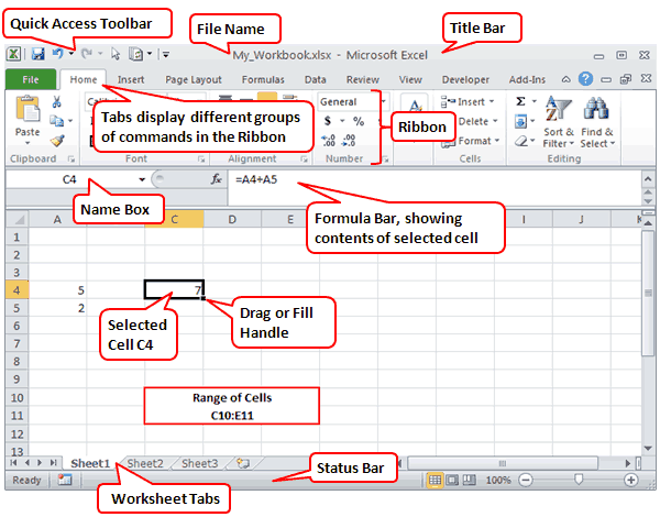
In the image above, cell C4 is currently selected. The Formula Bar is showing that cell C4 contains a formula, which you can identify because it starts with an equal sign (=). The formula is adding the values found in cells A4 and A5.
Almost everything else you need to know about Excel is explained in Microsoft’s own getting started guide found online or in Excel’s Help system.
- 1 Min 24 Sec — How to Freeze Panes in Excel (lock the upper rows or left column from scrolling)
- 2 Min 46 Sec — How to Use AutoFill in Excel (to quickly create lists of numbers, month names, etc.)
- 6 Min 10 Sec — How to Use FlashFill in Excel (to quickly reformat lists)
These Excel tutorials for beginners include screenshots and examples with detailed step-by-step instructions. Follow the links below to learn everything you need to get up and running with Microsoft’s popular spreadsheet software.
This article applies to Excel 2019, Excel 2016, Excel 2013, Excel 2010, Excel for Mac, and Excel for Android.
Understand the Excel Screen Elements
Understand the Basic Excel Screen Elements covers the main elements of an Excel worksheet. These elements include:
- Cells and active cells
- Add sheet icon
- Column letters
- Row numbers
- Status bar
- Formula bar
- Name box
- Ribbon and ribbon tabs
- File tab
Explore a Basic Excel Spreadsheet
Excel Step by Step Basic Tutorial covers the basics of creating and formatting a basic spreadsheet in Excel. You’ll learn how to:
- Enter data
- Create simple formulas
- Define a named range
- Copy formulas with the fill handle
- Apply number formatting
- Add cell formatting
Create Formulas With Excel Math
To learn how to add, subtract, multiply, and divide in Excel, see How to Use Basic Math Formulas Like Addition and Subtraction in Excel. This tutorial also covers exponents and changing the order of operations in formulas. Each topic includes a step-by-step example of how to create a formula that carries out one or more of the four basic math operations in Excel.
Add Numbers With the SUM Function
Adding rows and columns of numbers is one of the most common operations in Excel. To make this job easier, use the SUM function. Quickly Sum Columns or Rows of Numbers in Excel shows you how to:
- Understand the SUM function syntax and arguments
- Enter the SUM function
- Add numbers quickly with AutoSUM
- Use the SUM function dialog box
Move or Copy Data
When you want to duplicate or move data to a new location, see Shortcut Keys to Cut, Copy, and Paste Data in Excel. It shows you how to:
- Copy data
- Paste data with the clipboard
- Copy and paste using shortcut keys
- Copy data using the context menu
- Copy data using menu options on the Home tab
- Move data with shortcut keys
- Move data with the context menu and using the Home tab
Add and Remove Columns and Rows
Need to adjust the layout of your data? How to Add and Delete Rows and Columns in Excel explains how to expand or shrink the work area as needed. You’ll learn the best ways to add or remove singular or multiple columns and rows using a keyboard shortcut or the context menu.
Hide and Unhide Columns and Rows
How to Hide and Unhide Columns, Rows, and Cells in Excel teaches you how to hide sections of the worksheet to make it easier to focus on important data. It’s easy to bring them back when you need to see the hidden data again.
Enter the Date
To learn how to use a simple keyboard shortcut to set the date and time, see Use Shortcut Keys to Add the Current Date/Time in Excel. If you prefer to have the date automatically update every time the worksheet is opened, see Use Today’s Date within Worksheet Calculations in Excel.
Enter Data in Excel
Dos and Dont’s of Entering Data in Excel covers best practices for data entry and shows you how to:
- Plan the worksheet
- Lay out the data
- Enter headings and data units
- Protect worksheet formulas
- Use cell references in formulas
- Sort data
Build a Column Chart
How to Use Charts and Graphs in Excel explains how to use bar graphs to show comparisons between items of data. Each column in the chart represents a different data value from the worksheet.
Create a Line Graph
How to Make and Format a Line Graph in Excel in 5 Steps shows you how to track trends over time. Each line in the graph shows the changes in the value for one data value from the worksheet.
Visualize Data With a Pie Chart
Understanding Excel Chart Data Series, Data Points, and Data Labels covers how to use pie charts to visualize percentages. A single data series is plotted and each slice of the pie represents a single data value from the worksheet.
Thanks for letting us know!
Get the Latest Tech News Delivered Every Day
Subscribe