
Home > Microsoft Excel > Bar Graph in Excel — All 4 Types Explained Easily (Excel Sheet Included)
Note: This guide on how to make a bar graph in Excel is suitable for all Excel versions.
Bar graphs are one of the most simple yet powerful visual tools in Excel. Bar graphs are very similar to column charts, except that the bars are aligned horizontally.
Related:
How To Find Duplicates In Excel? The Best Guide
Excel Goal Seek—the Easiest Guide (3 Examples)
Create A Pivot Table In Excel—the Easiest Guide
They are very useful when you want to compare categorical data across variables. Use it especially when the category names are long or to display any sort of duration value.
In this guide, I’ll teach you how to make a bar graph in Excel the easy way, with plenty of illustrations. By the end of this article, you should be able to create and format bar graphs in Excel with ease.
Please find the sample Excel Sheet used in this guide below. You can use it to follow along with me.

In this guide, I’ll cover,
- Bar Graph in Excel – An Overview
- How to Make a Bar Graph in Excel?
- How to Format a Bar Chart in Excel?
- Let’s Wrap Up
Bar Graph in Excel – An Overview
An Excel bar graph or bar chart plots horizontal bars of data across different categories in a simple way. The X-axis indicates the values of the secondary variable and the Y-axis represents the various categories.
This is just a simple bar graph example. Bar charts in Excel can be tweaked to include multiple variables, display percentages, stack bars of data etc.
I’ll explain all these with examples.
Also Read:
How To Use Excel Countifs: The Best Guide
Excel Conditional Formatting -the Best Guide (Bonus Video)
The Best Excel Project Management Template In 2021
How to Make a Bar Graph in Excel?
To make any bar graph, you should prepare your data beforehand. It should have one categorical variable and one or more secondary variables. Now let me show you how to create various types of Excel bar graphs.
How to create a Simple Bar Graph?
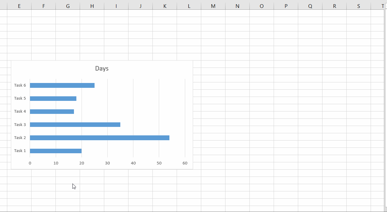
To create a simple bar graph, follow these steps:
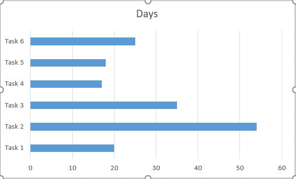
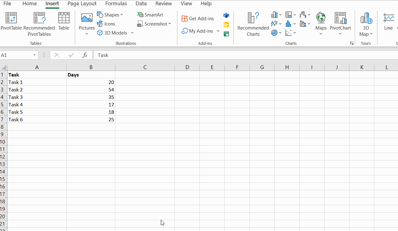
- Get your Data ready. Make sure it has one categorical variable and one quantitative secondary variable. In my example from Sheet1, I have the time duration of 6 tasks.
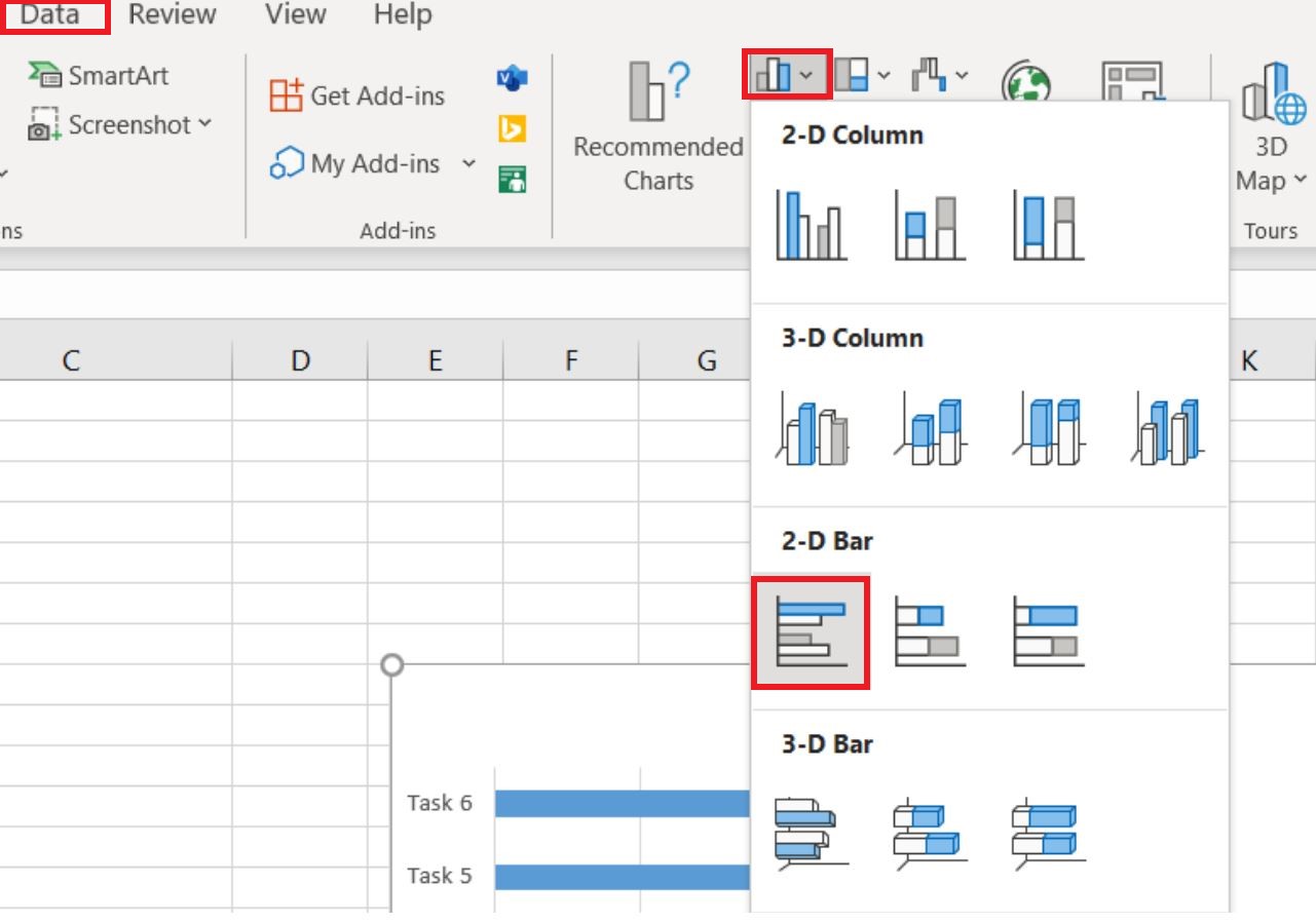
- Select your Data with headers.
- Locate and click on the 2-D Clustered Bars option under the Charts group in the Insert Tab.
- Your bar graph will now appear in the same sheet. You can edit its formatting if needed.

How to Make a Bar Graph with Multiple Variables?
To create a bar graph with multiple variables, follow these steps. Refer to Sheet2 from the sample Excel file to follow along with me.
- Make sure your data has one categorical variable and multiple quantitative secondary variables.
- Select your Data with headers
- Locate and click on the 2-D Clustered Bars option under the Charts group in the Insert Tab.
- Your bar graph will now appear in the same sheet. You can edit its formatting if needed and change its title.


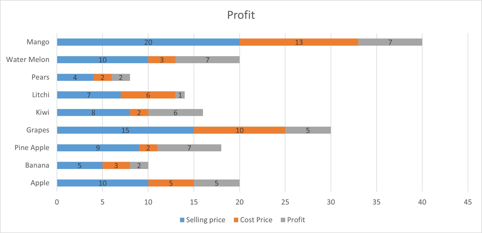
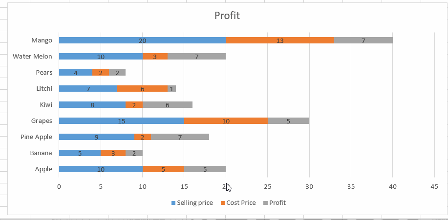
How to create a Stacked Bar Graph in Excel?
Use a stacked bar graph when you need to compare parts of a whole across categories.
To create a stacked bar graph with multiple variables, follow these steps. Refer to Sheet3 from the sample Excel file to follow along with me.
- Select your data with the headers.
- Locate and click on the 2-D Stacked Bars option under the Charts group in the Insert Tab.
- Your stacked bar graph will now appear in the same sheet. Edit its formatting if needed and change its title.
Add data labels by clicking on the “Plus” symbol next to the chart and selecting the Data Labels option.
How to Make a Percentage Bar Graph in Excel?
Use a percentage bar graph when you need to see how much percentage each variable contributes to the total across categories.
To create a percentage bar graph, follow these steps.
Refer to Sheet4 from the sample Excel file to follow along with me.
- Select your data with the headers. It must contain variables that add up to a total or make a part of the total.
- Locate and click on the 100% Stacked Bars option under the Charts group in the Insert Tab.
- Your percentage bar graph will now appear in the same sheet. Edit its formatting if needed and change its title.

Add data labels by clicking on the “Plus” symbol next to the chart and selecting the Data Labels option.

How to Format a Bar Chart in Excel?
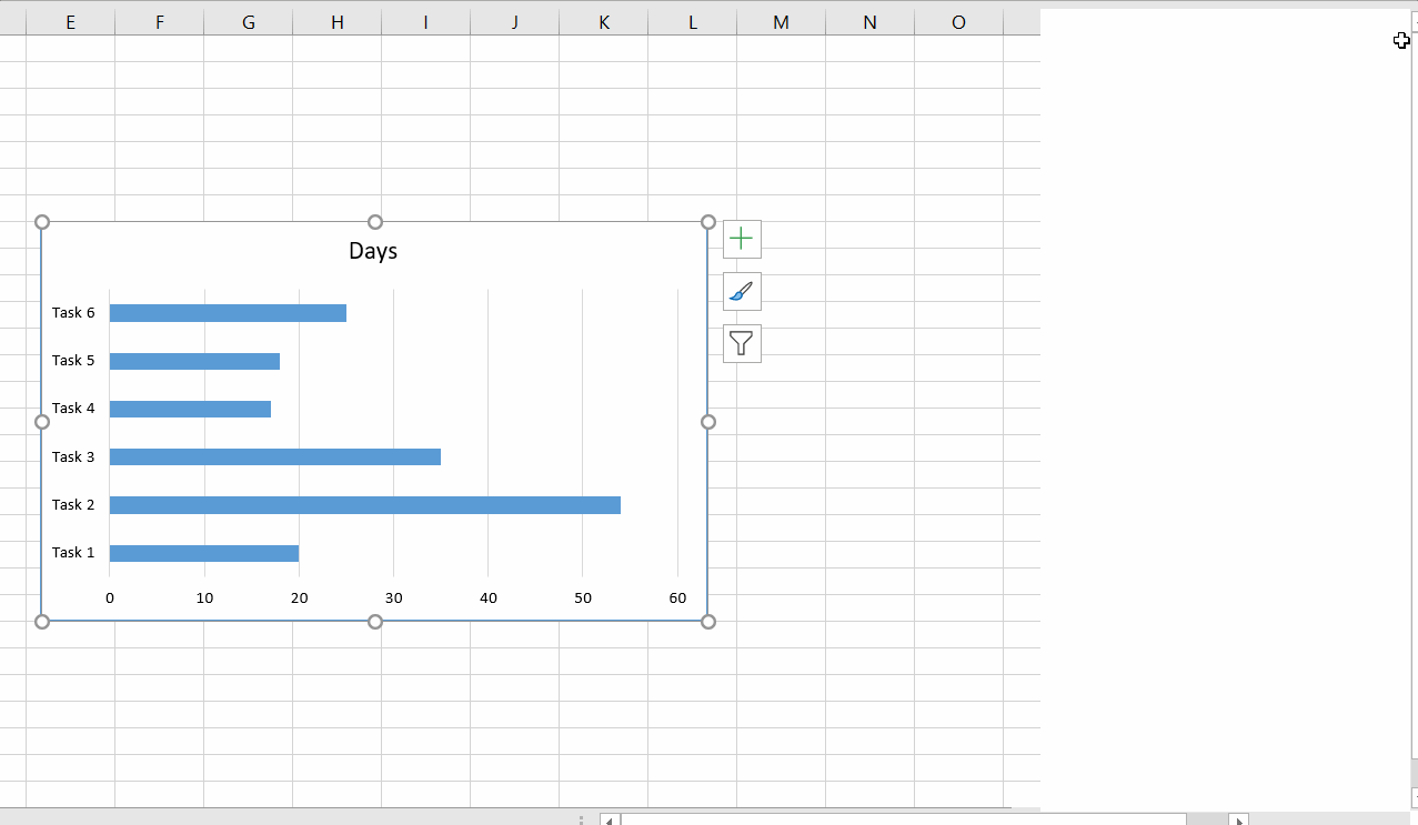
To illustrate how to format a bar chart, I am using the bar chart from Sheet1. But this guide is applicable to all types of bar charts. Follow these steps:
- You can change the Chart title by double-clicking on it and typing in the new title.
- You can add Chart Elements by clicking on the “Plus” symbol next to the chart and choosing the required element.
Select or deslect the chart elements you want to include in the bar chart. For example you can remove the gridlines from the background by unchecking the gridline box.
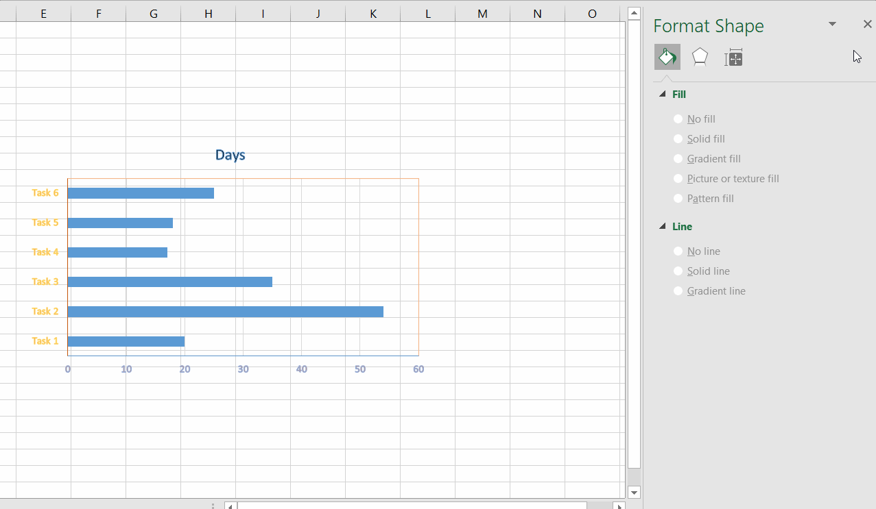
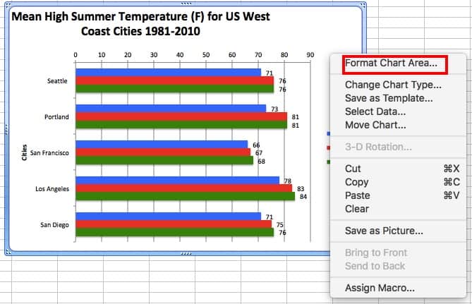
- To format the bar graph right click on the chart area and select the Format Chart Area option.
You can change the Fill type, border colour, thickness etc. Experiment with all of these options or just change things you need.
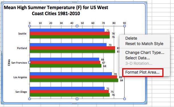
- Similarly, click on the plot area or the axes to edit their formatting in the “Format Plot Area” or “Format Axis” panes respectively. Here, the axis colour, thickness, data label appearance etc can be edited.
Suggested Reads:
Create An Excel Dashboard In 5 Minutes – The Best Guide
Dynamic Dropdown Lists In Excel – Top Data Validation Guide
Predict Future Values Using Excel Forecast Sheet – The Best Guide
FAQs
What is a subdivided bar graph?
A subdivided bar graph is nothing but a stacked bar graph, which shows how different variables add up to a total. It is used to easily find the contribution of each variable.
What are the types of bar graphs?
There are actually 4 types of bar graphs available in Excel.
Simple bar graph which shows bars of data for one variable.
Grouped bar graph which shows bars of data for multiple variables.
Stacked bar graph which shows the contribution of each variable to the total.
Percentage bar graph which shows the percentage of contribution to the total.
Latest Posts:
Let’s Wrap Up
We are at the end of this guide on bar graphs in Excel. This article explained how to create various types of bar graphs in Excel. I have also shown you how to edit the formatting of any type of bar graph with illustrations.
If you have any questions regarding bar graphs in Excel or any other Excel feature, please let us know in the comments section below. We at Simon Sez It are always happy to help.
If you need more high-quality Excel guides, please check out our free Excel resources centre.
Simon Sez IT has been teaching Excel for over ten years. For a low, monthly fee you can get access to 100+ IT training courses. Click here for advance Excel courses with in-depth training modules
Adam Lacey

Adam Lacey is an Excel enthusiast and online learning expert. He combines these two passions at Simon Sez IT where he wears a number of different hats.When Adam isn’t fretting about site traffic or Pivot Tables, you’ll find him on the tennis court or in the kitchen cooking up a storm.
Once created, you can customize charts in many ways. Themes are preset color and shape combinations available in Excel. Changing the theme affects other options, as well as any other charts created in the future. If you only want to change the current chart, use the Chart Styles option.
To change the theme, click the Home tab, then click Themes, and make your choice.
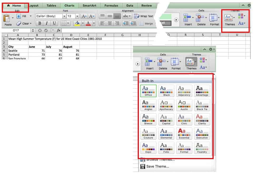
Other versions of Excel: Click the Page Layout tab, click Themes, and then make your choice.
To change the style, click Charts, and scroll through the options under Chart Styles on the same ribbon.
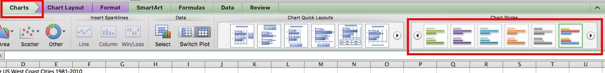
Other versions of Excel: Click Chart Tools or Chart Design tab, and click Layout to scroll through the options under Chart Styles. If you have a Chart Design tab, the different layouts will appear in the ribbon, similar to the image above.
Adding Titles
If the data presented in the chart isn’t quite clear, a title can help. Titles aren’t needed for charts with a single dependent variable.
Click on Chart Layout, click Chart Title, and click your option. Using the overlap/overlay option may cover part of the chart, so be sure the title doesn’t cover key information.
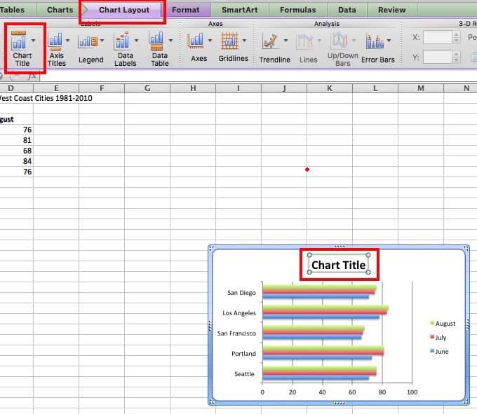
Other versions of Excel: Click Chart Tools tab, then click Layout, click Chart Title, and click your option.
If the categories in the horizontal or vertical axis need a title, follow the steps above. However, select Axis Titles instead, and then choose the horizontal axis or vertical axis.
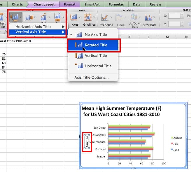
To change the font and appearance of titles, click Chart Title and then click More Title Options. Additionally, in some versions of Excel, you can click on the title in the chart and a side menu will appear with options to customize the text.
To reword a title, just click on it in the chart and retype.
Adjusting Axes
To adjust the horizontal or vertical axis, you can resize by clicking on a square in the corner and dragging an edge.

For finer adjustments, right click the axis and choose Format Axis…
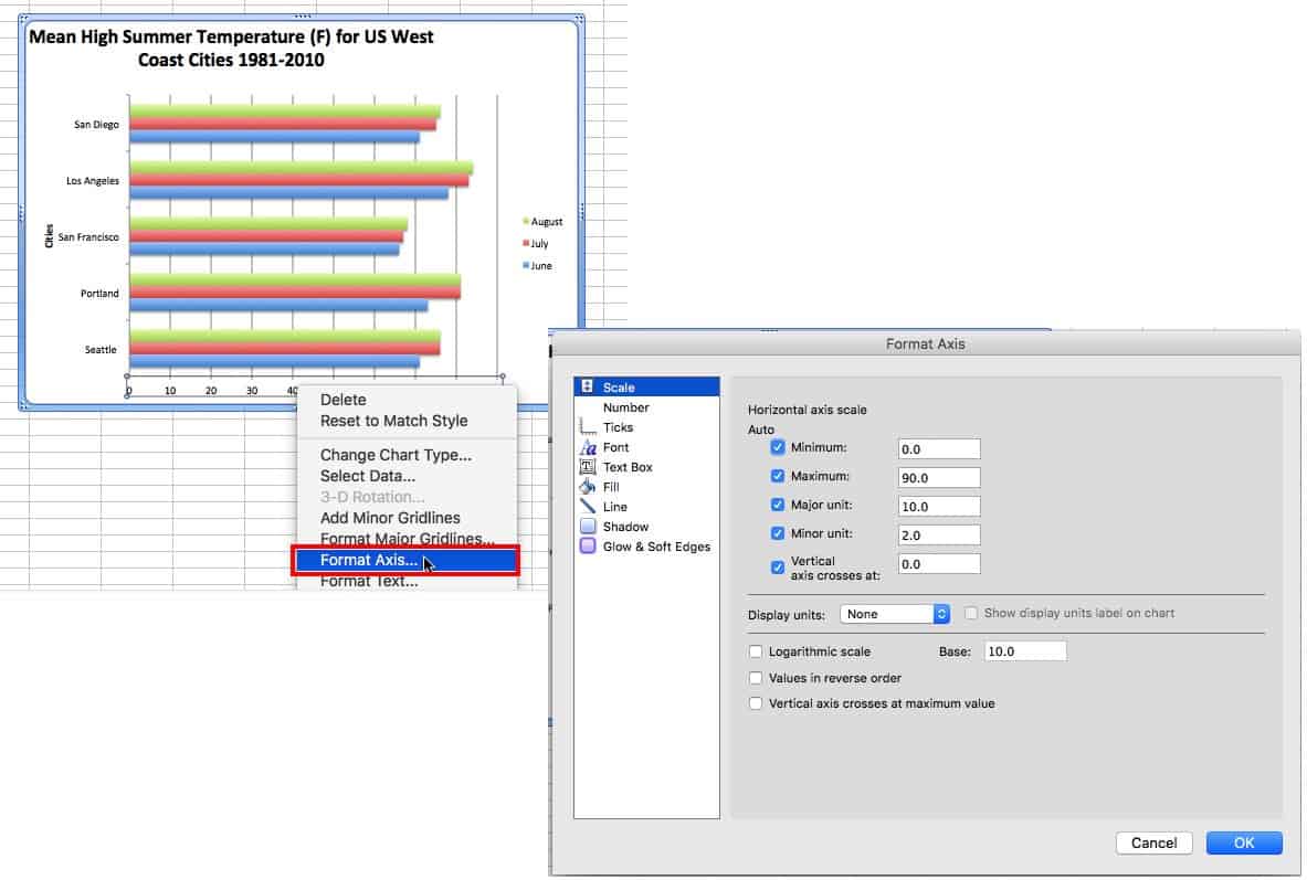
For a numeric axis, you can change the the start and end points, as well as the units displayed. Simply change the numbers in the boxes to make the starting and ending point the minimum and maximum, respectively.
Formatting Text
To format the copy, right-click any text in the chart and click Format Text (or Format Title or Format Legend, etc. — depending on your version of Excel and the area of the chart you wish to change). From this menu, you can change the font style and color, and add shadows or other effects.
Adding Data Labels
Data labels show the value associated with the bars in the chart. This information can be useful if the values are close in range. To add data values, right-click on one of the bars in the chart, and click Add Data Labels. This will create a label for each bar in that series. For clustered charts, one of each color will have to be labeled.

Moving the Legend
Click and drag the legend to a new location on the chart, or click on it and press the delete button on your keyboard to remove it completely.
Data Order
The items will appear in reverse order from the spreadsheet. Rather than changing the order there, it’s easier to right-click the axis, click Format Axis…, and then click the box next to Categories in Reverse Order. This change will also affect the order of the data clusters, if that was the chart format chosen.

In some versions of Excel, you can also change the data order by selecting one of the bars and editing the formula bar.
Adjusting Axis Text
If the text on an axis is long, pivot it on an angle to occupy less space. Right-click the axis, click Format Axis, click Text Box, and enter an angle.
You can also opt to only show some of the axis labels. Right-click the axis, click Format Axis, then click Scale, and enter a value in the Interval between labels box. A value of 2 will show every other label; 3 will show every third.

If you want to create a cleaner, less cluttered chart, hiding some labels is a good option. But the context of the hidden text is still obvious.
Changing Chart Values
Update the spreadsheet and the values in the chart will update, too. But remember, if the chart has been copied to a non-Microsoft Office document, it won’t update — in this case, copy the updated version and replace it in the document.
Changing the Look of the Bars
Right-click a bar, then click Format Data Series… and make adjustments. In addition to changing the color, you can also add a gradient or pattern, as well as many other effects.
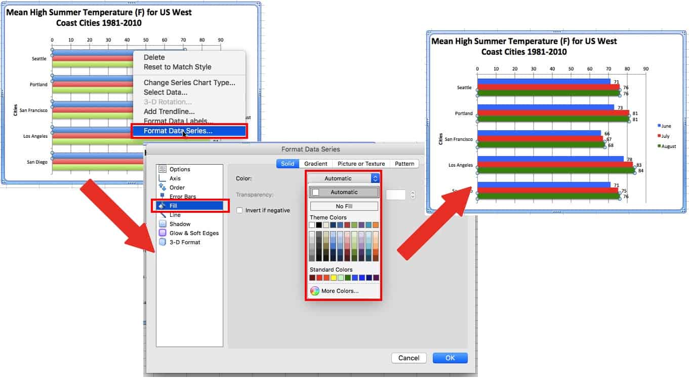
For clustered bar charts, any changes will only affect the bars associated with the same dependant variable of the selected bar. Repeat to update all the bars in the chart.
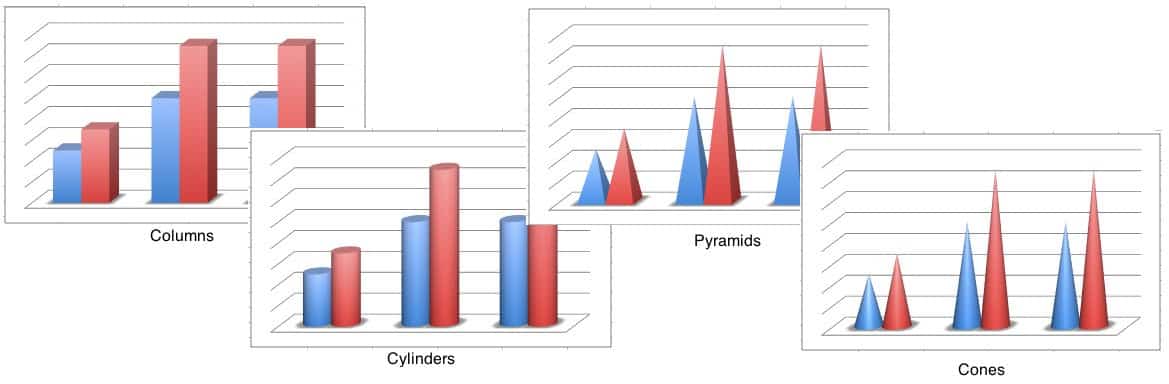
If bars don’t look right, select the chart, right-click the chart and click Change Chart Type…. In addition to the 2D bars demonstrated in this tutorial, there are options for 3D bars/columns, cylinders, cones, and pyramids.
Changing the Background of the Chart and Plot Area
To change the background, right-click in a blank area of the chart and click Format Chart Area… or right-click the plot area and click Format Plot Area…. Like the bars, you can change the color, add a gradient or pattern, adjust the color and size of lines, as well as other effects.
Adding a Data Table
A data table displays the spreadsheet data that was used to create the chart beneath the bar chart. This shows the same data as data labels, so use one or the other.
To add a data table, click the Chart Layout tab, click Data Table, and choose your option. If the legend key option is chosen, you can remove the legend as demonstrated in the image below.
Changing Chart Orientation
To swap the vertical and horizontal axes, right-click on the chart and click Change Chart Type. If you chose a column chart, chose bar chart instead, and vice versa. There are other ways to do this, but this is the simplest.
Effective Methods on How to Create A Bar Graph in Excel and Using Online Tool
A bar graph is one of the popularly used graphs in Excel. It is because creating a bar graph is simple and easy to understand. This bar can help you make comparisons of numeric values. It can be percentages, temperatures, frequencies, categorical data, and more. In that case, we will give you the most straightforward method to make a bar chart in Excel. Moreover, besides using Excel, the article will introduce another tool. With this, you will get an option on what to use when creating a bar graph. If you want to know the method of creating a graph along with the best alternative, read this article.

- Part 1. How to Make A Bar Graph in Excel
- Part 2. Alternative Way of Creating A Bar Graph in Excel
- Part 3. FAQs about How to Make A Bar Graph in Excel
If you want to visualize your data using a bar graph, you can rely on Excel. Many people are not aware of the full capabilities of this offline program. In that case, you need to read this post. One of the excellent features you can find in Excel is the capability to create various chart types, including bar charts. You can operate this offline program to compare data using a bar graph. Microsoft Excel can provide various shapes, lines, text, and more for creating a bar graph. It has an easy-to-understand interface, making it suitable for non-professional users. Moreover, if you don’t want to use the shapes for creating a bar graph, Excel can offer another way. One of the best things you can experience in this program is it can offer free bar graph templates. All you need is to insert the data in Excel, then insert the bar graph templates. Aside from that, you can customize the color of the bars, change labels, and more.
However, Microsoft Excel has some disadvantages. First, you need to insert all your data in the cells, or else the free template won’t appear. Also, Excel can’t offer you all its features when using the free version. So, if you want the full feature of this program, buy a subscription plan. In addition, the program’s installation process is confusing, especially for new users. You need the assistance of professionals when installing Excel on your computer. To make a bar chart in Excel, follow the guide below.
1
Download and install Microsoft Excel on your Windows or Mac operating system. After the installation process, launch the offline program on your computer. Then, open a blank document.
2
Then, put all the data on the cells. You can insert letters and numbers to complete the data you need for your bar graph.
3
Afterward, when you insert all the data, click the Insert option on the upper interface. Then, click the Insert Column Chart option. You will see various templates you can use. Choose your desired template and click it.
4
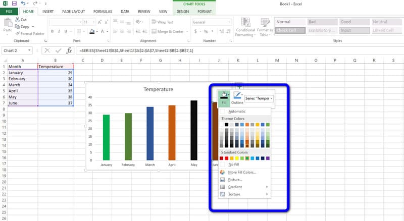
After that, the bar graph will appear on the screen. You can also see that the data is already on the template. If you want to change the bar color, double-right-click the bar and click the Fill Color option. Then, select your chosen color.
5
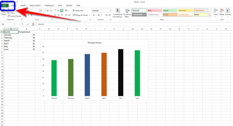
When you are done, you can already save your final bar graph. Navigate to the File menu on the top-left corner of the interface. Then, select the Save as option and save your graph on your computer.
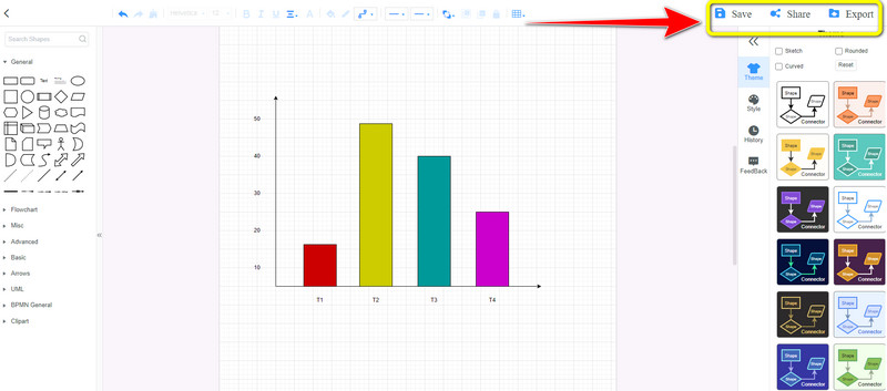
Part 2. Alternative Way of Creating A Bar Graph in Excel
Since Microsoft Excel can’t offer its full features on the free version, users can operate the offline program with limitations. In that case, we will give you an exceptional alternative to Excel. If you want to enjoy the full feature of a bar graph maker without purchasing a plan, use MindOnMap. This online tool lets you enjoy its full capabilities without paying a penny. You can encounter many features, and we will discuss them as we move forward. You need rectangular bars, lines, numbers, data, and other elements to create a bar graph. Thankfully, MindOnMap can provide all the said elements. You can create a bar graph in just a few steps. The good thing about this online tool is that the interface won’t give trouble to all users. Each option from the interface is understandable, making it a perfect layout for users.
Additionally, the themes are available on this software. It means that you can give flavor to your bar graph background. This way, you can get a colorful and attractive chart while comparing certain concepts. One of the features you can find when using this tool is the easy sharing feature. If you want to brainstorm with your teammates or with other users, it is possible. The easy sharing features let you send your chart with others for idea collision. This way, you don’t need to talk to other users in person. All you need is to send your work and acquire new thoughts from them. MindOnMap is simple to access. No matter what device you use, as long as it has a browser, you can access MindOnMap. Lastly, you can export your bar graph in various formats for further preservation. You can ensure that your output won’t get deleted or disappear quickly. You can follow the most straightforward tutorials below to create a bar graph.
1
For the first step, visit the official website of MindOnMap. Then create your MindOnMap account. To access MindOnMap easily, you can connect your Gmail account. After that, on the center part of the web page, click the Create Your Mind Map option. Expect that another web page will appear on the screen.

2
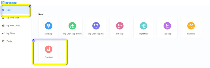
Select the New menu on the left part of the web page. Then, click the Flowchart option to start with the bar graphing procedure.
3
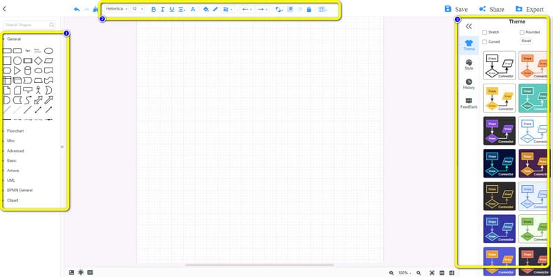
In this section, you can create your bar graph. You can go to the left interface to use rectangular shapes and add text, lines, and more. Also, go to the upper interface to change the font styles, add color, and resize the text. You can also use the free themes on the right interface for five more bar graph impacts.
4
If you are finished, save your final output. Click the Save option to save the bar graph on your MindOnMap account. If you want to download the bar graph on your computer, click Export. Also, to share your work with other users, click the Share option. You can also let others edit your bar graph after sharing.
Part 3. FAQs about How to Make A Bar Graph in Excel
1. How to make a stacked bar chart in Excel?
Making a stacked bar chart in Excel is simple. After launching the Excel, input all the data for your chart. Then, navigate to the Insert tab and click the Insert Column Chart icon. Various templates will appear, and select the stacked bar chart template.
2. Why are bar charts plotted in a common baseline?
One of the reasons is to allow readers to easily understand the comparison of data. With this type of chart, people can easily interpret data.
3. What happens if the length of a bar graph is more?
It means that the bar has the highest value on the given data. The taller the bar is, the higher the value it has.
Conclusion
If you desire to learn how to make a bar graph in Excel, this post is perfect for you. You will learn all the details of bar graphing. However, its free version has a limitation. That’s why the article introduced the best alternative for Excel. So, if you want a bar graph creator without limitations and for free, use MindOnMap. This online tool can offer you all the things you need to create a bar graph.
![]()
Download Article
![]()
Download Article
It’s easy to spruce up data in Excel and make it easier to interpret by converting it to a bar graph. A bar graph is not only quick to see and understand, but it’s also more engaging than a list of numbers. This wikiHow article will teach you how to make a bar graph of your data in Microsoft Excel.
-

1
Open Microsoft Excel. It resembles a white «X» on a green background.
- A blank spreadsheet should open automatically, but you can go to File > New > Blank if you need to.
- If you want to create a graph from pre-existing data, instead double-click the Excel document that contains the data to open it and proceed to the next section.
-
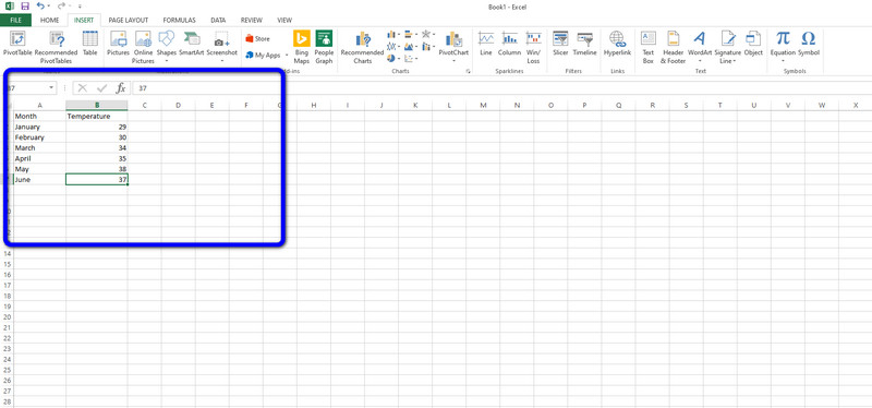
2
Add labels for the graph’s X- and Y-axes. To do so, click the A1 cell (X-axis) and type in a label, then do the same for the B1 cell (Y-axis).
- For example, a graph measuring the temperature over a week’s worth of days might have «Days» in A1 and «Temperature» in B1.
Advertisement
-
3
Enter data for the graph’s X- and Y-axes. To do this, you’ll type a number or word into the A or B column to apply it to the X- or Y- axis, respectively.
- For example, typing «Monday» into the A2 cell and «70» into the B2 field might show that it was 70 degrees on Monday.
-
4
Finish entering your data. Once your data entry is complete, you’re ready to use the data to create a bar graph.


Advertisement
-
1
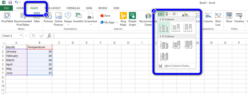
Select all of your data. To do so, click the A1 cell, hold down ⇧ Shift, and then click the bottom value in the B column. This will select all of your data.
- If your graph uses different column letters, numbers, and so on, simply remember to click the top-left cell in your data group and then click the bottom-right while holding ⇧ Shift.
-
2
Click the Insert tab. It’s in the editing ribbon, just right of the Home tab.
-
3
Click the «Bar chart» icon. This icon is in the «Charts» group below and to the right of the Insert tab; it resembles a series of three vertical bars.
-
4
Click a bar graph option. The templates available to you will vary depending on your operating system and whether or not you’ve purchased Excel, but some popular options include the following:
- 2-D Column — Represents your data with simple, vertical bars.
- 3-D Column — Presents three-dimensional, vertical bars.
- 2-D Bar — Presents a simple graph with horizontal bars instead of vertical ones.
- 3-D Bar — Presents three-dimensional, horizontal bars.
-
5
Customize your graph’s appearance. Once you decide on a graph format, you can use the «Design» section near the top of the Excel window to select a different template, change the colors used, or change the graph type entirely.
- The «Design» window only appears when your graph is selected. To select your graph, click it.
- You can also click the graph’s title to select it and then type in a new title. The title is typically at the top of the graph’s window.[1]


Advertisement
Sample Bar Graphs
Add New Question
-
Question
How can I change the graph from horizontal to vertical?

‘Bar Graph’ is horizontal. ‘Column Chart’ is the same but vertical, so use that instead.
-
Question
How do I move an Excel bar graph to a Word document?
You can copy and paste the graph. Do this the same way you’d copy and paste regular text.
-
Question
How do I adjust the bar graph width in Excel?
Click on the element you want to adjust. For example, if you want to adjust the width of the bars, you would click on the bars. If that doesn’t bring up options, try right clicking. Decreasing the gap width will make the bars appear to widen. If you have more than one set of data (i.e. the cost of two or more items over a given time span), you can also adjust the series overlap. If you’re not satisfied with the automatic layout of the axes, you can adjust these at your own peril.
See more answers
Ask a Question
200 characters left
Include your email address to get a message when this question is answered.
Submit
Advertisement
-
Graphs can be copied and then pasted into other Microsoft Office programs like Word or PowerPoint.
-
If your graph switched the x and y axes from your table, go to the «Design» tab and select «Switch Row/Column» to fix it.
Thanks for submitting a tip for review!
Advertisement
About This Article
Thanks to all authors for creating a page that has been read 1,266,169 times.
Is this article up to date?

A bar chart (or a bar graph) is one of the easiest ways to present your data in Excel, where horizontal bars are used to compare data values. Here’s how to make and format bar charts in Microsoft Excel.
Inserting Bar Charts in Microsoft Excel
While you can potentially turn any set of Excel data into a bar chart, It makes more sense to do this with data when straight comparisons are possible, such as comparing the sales data for a number of products. You can also create combo charts in Excel, where bar charts can be combined with other chart types to show two types of data together.
RELATED: How to Create a Combo Chart in Excel
We’ll be using fictional sales data as our example data set to help you visualize how this data could be converted into a bar chart in Excel. For more complex comparisons, alternative chart types like histograms might be better options.
To insert a bar chart in Microsoft Excel, open your Excel workbook and select your data. You can do this manually using your mouse, or you can select a cell in your range and press Ctrl+A to select the data automatically.

Once your data is selected, click Insert > Insert Column or Bar Chart.
Various column charts are available, but to insert a standard bar chart, click the “Clustered Chart” option. This chart is the first icon listed under the “2-D Column” section.
Excel will automatically take the data from your data set to create the chart on the same worksheet, using your column labels to set axis and chart titles. You can move or resize the chart to another position on the same worksheet, or cut or copy the chart to another worksheet or workbook file.
For our example, the sales data has been converted into a bar chart showing a comparison of the number of sales for each electronic product.
For this set of data, mice were bought the least with 9 sales, while headphones were bought the most with 55 sales. This comparison is visually obvious from the chart as presented.
Formatting Bar Charts in Microsoft Excel
By default, a bar chart in Excel is created using a set style, with a title for the chart extrapolated from one of the column labels (if available).
You can make many formatting changes to your chart, should you wish to. You can change the color and style of your chart, change the chart title, as well as add or edit axis labels on both sides.
It’s also possible to add trendlines to your Excel chart, allowing you to see greater patterns (trends) in your data. This would be especially important for sales data, where a trendline could visualize decreasing or increasing number of sales over time.
RELATED: How to Work with Trendlines in Microsoft Excel Charts
Changing Chart Title Text
To change the title text for a bar chart, double-click the title text box above the chart itself. You’ll then be able to edit or format the text as required.
If you want to remove the chart title completely, select your chart and click the “Chart Elements” icon on the right, shown visually as a green, “+” symbol.
From here, click the checkbox next to the “Chart Title” option to deselect it.
Your chart title will be removed once the checkbox has been removed.
Adding and Editing Axis Labels
To add axis labels to your bar chart, select your chart and click the green “Chart Elements” icon (the “+” icon).
From the “Chart Elements” menu, enable the “Axis Titles” checkbox.
Axis labels should appear for both the x axis (at the bottom) and the y axis (on the left). These will appear as text boxes.
To edit the labels, double-click the text boxes next to each axis. Edit the text in each text box accordingly, then select outside of the text box once you’ve finished making changes.
If you want to remove the labels, follow the same steps to remove the checkbox from the “Chart Elements” menu by pressing the green, “+” icon. Removing the checkbox next to the “Axis Titles” option will immediately remove the labels from view.
Changing Chart Style and Colors
Microsoft Excel offers a number of chart themes (named styles) that you can apply to your bar chart. To apply these, select your chart and then click the “Chart Styles” icon on the right that looks like a paint brush.
A list of style options will become visible in a drop-down menu under the “Style” section.
Select one of these styles to change the visual appearance of your chart, including changing the bar layout and background.
You can access the same chart styles by clicking the “Design” tab, under the “Chart Tools” section on the ribbon bar.
The same chart styles will be visible under the “Chart Styles” section—clicking any of the options shown will change your chart style in the same way as the method above.
You can also make changes to the colors used in your chart in the “Color” section of the Chart Styles menu.
Color options are grouped, so select one of the color palette groupings to apply those colors to your chart.
You can test each color style by hovering over them with your mouse first. Your chart will change to show how the chart will look with those colors applied.
Further Bar Chart Formatting Options
You can make further formatting changes to your bar chart by right-clicking the chart and selecting the “Format Chart Area” option.
This will bring up the “Format Chart Area” menu on the right. From here, you can change the fill, border, and other chart formatting options for your chart under the “Chart Options” section.
You can also change how text is displayed on your chart under the “Text Options” section, allowing you to add colors, effects, and patterns to your title and axis labels, as well as change how your text is aligned on the chart.
If you want to make further text formatting changes, you can do this using the standard text formatting options under the “Home” tab while you’re editing a label.
You can also use the pop-up formatting menu that appears above the chart title or axis label text boxes as you edit them.
READ NEXT
- › How to Make a Gantt Chart in Microsoft Excel
- › How to Apply a Filter to a Chart in Microsoft Excel
- › How to Find Links to Other Workbooks in Microsoft Excel
- › How to Make a Bar Graph in Google Sheets
- › How to Use a Data Table in a Microsoft Excel Chart
- › How to Make a Graph in Microsoft Excel
- › How to Create and Customize a Waterfall Chart in Microsoft Excel
- › Expand Your Tech Career Skills With Courses From Udemy