Friday, February 19, 2016
Peltier Technical Services, Inc., Copyright © 2023, All rights reserved.
Combination charts combine data using more than one chart type, for example columns and a line. Building a combination chart in Excel is usually pretty easy. But if one series type is horizontal bars, then combining this with another type can be tricky. I’m here to help with Bar-Line, or rather, Bar-XY combination charts in Excel.
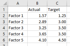
I’ll illustrate a simple combination chart with this simple data. The chart will use the first column for horizontal axis category labels, the second column for actual values plotted using lines with markers, and the third column using columns (vertical bars).
We start by selecting the data and inserting a column chart.
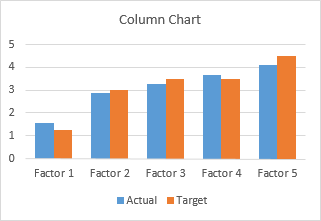
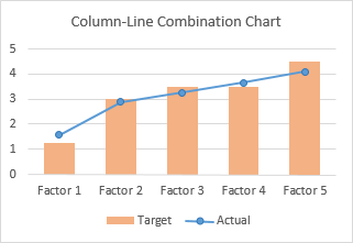
We finish by right clicking on the “Actual” data, choosing Change Series Chart Type from the pop-up menu, and selecting the new chart type we want. I’ve also used a lighter shade of orange for the columns, to make the markers stand out better.
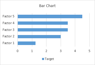
Let’s do the same for a bar chart. Select the data, insert a bar chart.
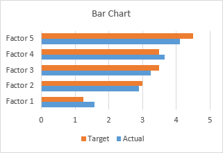
Okay, the category labels are along the vertical axis, but we’ll continue by changing the Actual data to a line chart series. That didn’t work out at all. The markers are not positioned vertically along the centers of the horizontal bars, nor horizontally where the data lies in the Actual column of the worksheet.
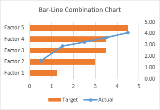
In the chart below I’ve shown all axis scales and axis titles to illustrate the problem. When we converted the Actual series to a line type, Excel assigned it to the secondary axis, and we have no ability to reassign it to the primary axis. The primary axes used for the bar chart are not aligned with the secondary axes used for the line chart: the X axis for the bars is vertical and the X axis for the line is horizontal; the Y axis for the bars is horizontal and the Y axis for the line is vertical.
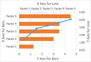
We can’t use a line chart at all. If we want to line up the markers horizontally with their proper position along the lengths of the bars, we need to use the Actual data as the X values of an XY series. We will need to generate some additional data for the Y values of the XY series.
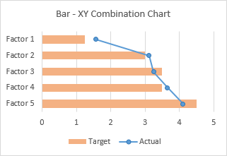
Bar-XY Combination Chart
We will not try to make a Bar-Line combination chart, because the Line chart type does not position the markers where we want them. We will make a Bar-XY chart type, using an XY chart type (a/k/a Scatter chart type) to position markers.
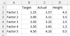
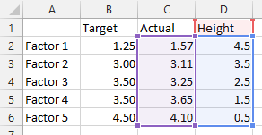
Here is the new data needed for our Bar-XY combination chart. The factor labels and Target values will be used by the Bar chart series, and the Actual values and Heights for the XY series. Don’t worry about the Height values: I’ll show how they are derived in a moment. The nice thing is that we can use dummy values now and type in the proper values later and the chart will update.
Select the first two columns of the data and insert a bar chart.
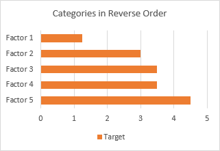
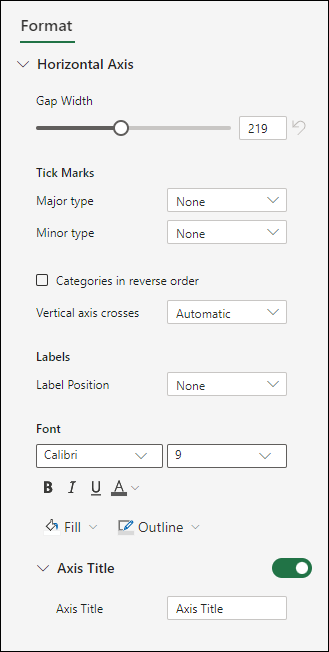
Since we probably want the categories listed in the same order as in the worksheet, let’s select the vertical axis (which in a bar chart is the X axis) and press Ctrl+1, the shortcut that opens the Format dialog or task pane for the selected object in Excel. Check the box for Categories in Reverse Order and also select Horizontal Axis Crosses at Maximum Category to move it next to Factor 5.
I’ve also recolored the bars orange, because blue markers show up better against light orange than orange markers against light blue.
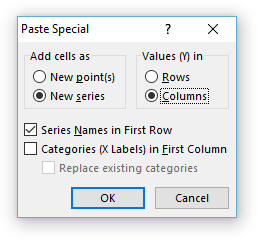
Now copy the last two columns (Actual and Height), select the chart, and on the Home tab of the ribbon, click the Paste dropdown arrow, choose the options in this dialog (add cells as new series, values in columns, series names in first row, categories in first column), and click OK.
The data is added as another set of bars, which I’ve colored blue, but we’ll change that in a second.
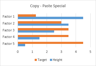
Right-click on the added series, select Change Series Chart Type from the pop-up menu, and select XY with markers and lines.
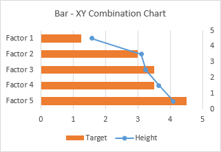
We see that the horizontal positions of the markers is just what we want to show.
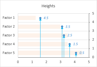
Now we can see where the values in the Heights column comes from. The right hand vertical axis is used for the Y values of the XY series. Looking at the positions of the horizontal bars and the markers in their correct positions, we can see that the Factor 1 bar is centered on Y=4.5, the Factor 2 bar is centered on 3.5, etc. If you hadn’t guessed this at the beginning, type these values into your data range, and let the chart update.
A few minor changes and we’ll be done. First, change the name of the XY series from Heights to Actual. The easiest way is to click on the series, then look at the highlighted ranges in the chart. The X values (C2:C6) are highlighted purple, the Y values (D2:D6) are highlighted blue, and the series name (cell D1) is highlighted red (highlight colors in Excel 2010 and earlier are different, but the concept is the same). Click on the red border of cell D2, and drag the highlighting rectangle to cover cell C2 to change the series name.
Click on the red border of cell D2, and drag the highlighting rectangle to cover cell C2 to change the series name.
Then, use a lighter shade of orange for the bars, so the blue markers stand out. Finally, hide the right-hand vertical axis: format it so it has no labels and no line color.
And there’s our completed Bar-XY Combination Chart.
More Combination Chart Articles on the Peltier Tech Blog
- Clustered Column and Line Combination Chart
- Precision Positioning of XY Data Points
- Add a Horizontal Line to an Excel Chart
- Horizontal Line Behind Columns in an Excel Chart
- Salary Chart: Plot Markers on Floating Bars
- Fill Under or Between Series in an Excel XY Chart
- Fill Under a Plotted Line: The Standard Normal Curve
- Excel Chart With Colored Quadrant Background
Charts help you visualize your data in a way that creates maximum impact on your audience. Learn to create a chart and add a trendline. You can start your document from a recommended chart or choose one from our collection of pre-built chart templates.

Create a chart
-
Select data for the chart.
-
Select Insert > Recommended Charts.
-
Select a chart on the Recommended Charts tab, to preview the chart.
Note: You can select the data you want in the chart and press ALT + F1 to create a chart immediately, but it might not be the best chart for the data. If you don’t see a chart you like, select the All Charts tab to see all chart types.
-
Select a chart.
-
Select OK.
Add a trendline
-
Select a chart.
-
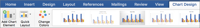
Select Design > Add Chart Element.
-
Select Trendline and then select the type of trendline you want, such as Linear, Exponential, Linear Forecast, or Moving Average.
Note: Some of the content in this topic may not be applicable to some languages.
Charts display data in a graphical format that can help you and your audience visualize relationships between data. When you create a chart, you can select from many chart types (for example, a stacked column chart or a 3-D exploded pie chart). After you create a chart, you can customize it by applying chart quick layouts or styles.
Charts contain several elements, such as a title, axis labels, a legend, and gridlines. You can hide or display these elements, and you can also change their location and formatting.
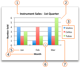
 Chart title
 Plot area
 Legend
 Axis titles
 Axis labels
 Tick marks
 Gridlines
You can create a chart in Excel, Word, and PowerPoint. However, the chart data is entered and saved in an Excel worksheet. If you insert a chart in Word or PowerPoint, a new sheet is opened in Excel. When you save a Word document or PowerPoint presentation that contains a chart, the chart’s underlying Excel data is automatically saved within the Word document or PowerPoint presentation.
Note: The Excel Workbook Gallery replaces the former Chart Wizard. By default, the Excel Workbook Gallery opens when you open Excel. From the gallery, you can browse templates and create a new workbook based on one of them. If you don’t see the Excel Workbook Gallery, on the File menu, click New from Template.
-
On the View menu, click Print Layout.
-
Click the Insert tab, and then click the arrow next to Chart.

-
Click a chart type, and then double-click the chart you want to add.
When you insert a chart into Word or PowerPoint, an Excel worksheet opens that contains a table of sample data.
-
In Excel, replace the sample data with the data that you want to plot in the chart. If you already have your data in another table, you can copy the data from that table and then paste it over the sample data. See the following table for guidelines for how to arrange the data to fit your chart type.
For this chart type
Arrange the data
Area, bar, column, doughnut, line, radar, or surface chart
In columns or rows, as in the following examples:
Series 1
Series 2
Category A
10
12
Category B
11
14
Category C
9
15
or
Category A
Category B
Series 1
10
11
Series 2
12
14
Bubble chart
In columns, putting x values in the first column and corresponding y values and bubble size values in adjacent columns, as in the following examples:
X-Values
Y-Value 1
Size 1
0.7
2.7
4
1.8
3.2
5
2.6
0.08
6
Pie chart
In one column or row of data and one column or row of data labels, as in the following examples:
Sales
1st Qtr
25
2nd Qtr
30
3rd Qtr
45
or
1st Qtr
2nd Qtr
3rd Qtr
Sales
25
30
45
Stock chart
In columns or rows in the following order, using names or dates as labels, as in the following examples:
Open
High
Low
Close
1/5/02
44
55
11
25
1/6/02
25
57
12
38
or
1/5/02
1/6/02
Open
44
25
High
55
57
Low
11
12
Close
25
38
X Y (scatter) chart
In columns, putting x values in the first column and corresponding y values in adjacent columns, as in the following examples:
X-Values
Y-Value 1
0.7
2.7
1.8
3.2
2.6
0.08
or
X-Values
0.7
1.8
2.6
Y-Value 1
2.7
3.2
0.08
-
To change the number of rows and columns included in the chart, rest the pointer on the lower-right corner of the selected data, and then drag to select additional data. In the following example, the table is expanded to include additional categories and data series.
-
To see the results of your changes, switch back to Word or PowerPoint.
Note: When you close the Word document or the PowerPoint presentation that contains the chart, the chart’s Excel data table closes automatically.
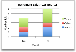
After you create a chart, you might want to change the way that table rows and columns are plotted in the chart. For example, your first version of a chart might plot the rows of data from the table on the chart’s vertical (value) axis, and the columns of data on the horizontal (category) axis. In the following example, the chart emphasizes sales by instrument.

However, if you want the chart to emphasize the sales by month, you can reverse the way the chart is plotted.
-
On the View menu, click Print Layout.
-
Click the chart.
-
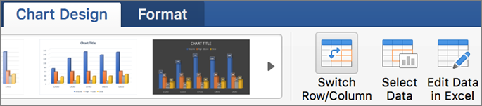
Click the Chart Design tab, and then click Switch Row/Column.
If Switch Row/Column is not available
Switch Row/Column is available only when the chart’s Excel data table is open and only for certain chart types. You can also edit the data by clicking the chart, and then editing the worksheet in Excel.
-
On the View menu, click Print Layout.
-
Click the chart.
-
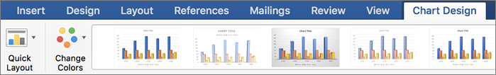
Click the Chart Design tab, and then click Quick Layout.
-
Click the layout you want.
To immediately undo a quick layout that you applied, press
+ Z .
 + Z .
+ Z .Chart styles are a set of complementary colors and effects that you can apply to your chart. When you select a chart style, your changes affect the whole chart.
-
On the View menu, click Print Layout.
-
Click the chart.
-
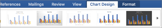
Click the Chart Design tab, and then click the style you want.
To see more styles, point to a style, and then click
.To immediately undo a style that you applied, press
+ Z .
 .
.-
On the View menu, click Print Layout.
-
Click the chart, and then click the Chart Design tab.
-
Click Add Chart Element.
-
Click Chart Title to choose title format options, and then return to the chart to type a title in the Chart Title box.
See also
Update the data in an existing chart
Chart types
Create a chart
You can create a chart for your data in Excel for the web. Depending on the data you have, you can create a column, line, pie, bar, area, scatter, or radar chart.
-
Click anywhere in the data for which you want to create a chart.
To plot specific data into a chart, you can also select the data.
-
Select Insert > Charts > and the chart type you want.
-
On the menu that opens, select the option you want. Hover over a chart to learn more about it.
Tip: Your choice isn’t applied until you pick an option from a Charts command menu. Consider reviewing several chart types: as you point to menu items, summaries appear next to them to help you decide.
-
To edit the chart (titles, legends, data labels), select the Chart tab and then select Format.
-
In the Chart pane, adjust the setting as needed. You can customize settings for the chart’s title, legend, axis titles, series titles, and more.


Available chart types
It’s a good idea to review your data and decide what type of chart would work best. The available types are listed below.
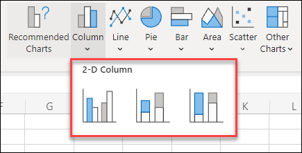
Data that’s arranged in columns or rows on a worksheet can be plotted in a column chart. A column chart typically displays categories along the horizontal axis and values along the vertical axis, like shown in this chart:

Types of column charts
-
Clustered column A clustered column chart shows values in 2-D columns. Use this chart when you have categories that represent:
-
Ranges of values (for example, item counts).
-
Specific scale arrangements (for example, a Likert scale with entries, like strongly agree, agree, neutral, disagree, strongly disagree).
-
Names that are not in any specific order (for example, item names, geographic names, or the names of people).
-
-
Stacked column A stacked column chart shows values in 2-D stacked columns. Use this chart when you have multiple data series and you want to emphasize the total.
-
100% stacked column A 100% stacked column chart shows values in 2-D columns that are stacked to represent 100%. Use this chart when you have two or more data series and you want to emphasize the contributions to the whole, especially if the total is the same for each category.
Data that is arranged in columns or rows on a worksheet can be plotted in a line chart. In a line chart, category data is distributed evenly along the horizontal axis, and all value data is distributed evenly along the vertical axis. Line charts can show continuous data over time on an evenly scaled axis, and are therefore ideal for showing trends in data at equal intervals, like months, quarters, or fiscal years.

Types of line charts
-
Line and line with markers Shown with or without markers to indicate individual data values, line charts can show trends over time or evenly spaced categories, especially when you have many data points and the order in which they are presented is important. If there are many categories or the values are approximate, use a line chart without markers.
-
Stacked line and stacked line with markers Shown with or without markers to indicate individual data values, stacked line charts can show the trend of the contribution of each value over time or evenly spaced categories.
-
100% stacked line and 100% stacked line with markers Shown with or without markers to indicate individual data values, 100% stacked line charts can show the trend of the percentage each value contributes over time or evenly spaced categories. If there are many categories or the values are approximate, use a 100% stacked line chart without markers.
Notes:
-
Line charts work best when you have multiple data series in your chart—if you only have one data series, consider using a scatter chart instead.
-
Stacked line charts add the data, which might not be the result you want. It might not be easy to see that the lines are stacked, so consider using a different line chart type or a stacked area chart instead.
-
Data that is arranged in one column or row on a worksheet can be plotted in a pie chart. Pie charts show the size of items in one data series, proportional to the sum of the items. The data points in a pie chart are shown as a percentage of the whole pie.

Consider using a pie chart when:
-
You have only one data series.
-
None of the values in your data are negative.
-
Almost none of the values in your data are zero values.
-
You have no more than seven categories, all of which represent parts of the whole pie.
Data that is arranged in columns or rows only on a worksheet can be plotted in a doughnut chart. Like a pie chart, a doughnut chart shows the relationship of parts to a whole, but it can contain more than one data series.

Tip: Doughnut charts are not easy to read. You may want to use a stacked column or stacked bar chart instead.
Data that is arranged in columns or rows on a worksheet can be plotted in a bar chart. Bar charts illustrate comparisons among individual items. In a bar chart, the categories are typically organized along the vertical axis, and the values along the horizontal axis.

Consider using a bar chart when:
-
The axis labels are long.
-
The values that are shown are durations.
Types of bar charts
-
Clustered A clustered bar chart shows bars in 2-D format.
-
Stacked bar Stacked bar charts show the relationship of individual items to the whole in 2-D bars
-
100% stacked A 100% stacked bar shows 2-D bars that compare the percentage that each value contributes to a total across categories.
Data that is arranged in columns or rows on a worksheet can be plotted in an area chart. Area charts can be used to plot change over time and draw attention to the total value across a trend. By showing the sum of the plotted values, an area chart also shows the relationship of parts to a whole.

Types of area charts
-
Area Shown in 2-D format, area charts show the trend of values over time or other category data. As a rule, consider using a line chart instead of a non-stacked area chart, because data from one series can be hidden behind data from another series.
-
Stacked area Stacked area charts show the trend of the contribution of each value over time or other category data in 2-D format.
-
100% stacked 100% stacked area charts show the trend of the percentage that each value contributes over time or other category data.
Data that is arranged in columns and rows on a worksheet can be plotted in an scatter chart. Place the x values in one row or column, and then enter the corresponding y values in the adjacent rows or columns.
A scatter chart has two value axes: a horizontal (x) and a vertical (y) value axis. It combines x and y values into single data points and shows them in irregular intervals, or clusters. Scatter charts are typically used for showing and comparing numeric values, like scientific, statistical, and engineering data.

Consider using a scatter chart when:
-
You want to change the scale of the horizontal axis.
-
You want to make that axis a logarithmic scale.
-
Values for horizontal axis are not evenly spaced.
-
There are many data points on the horizontal axis.
-
You want to adjust the independent axis scales of a scatter chart to reveal more information about data that includes pairs or grouped sets of values.
-
You want to show similarities between large sets of data instead of differences between data points.
-
You want to compare many data points without regard to time — the more data that you include in a scatter chart, the better the comparisons you can make.
Types of scatter charts
-
Scatter This chart shows data points without connecting lines to compare pairs of values.
-
Scatter with smooth lines and markers and scatter with smooth lines This chart shows a smooth curve that connects the data points. Smooth lines can be shown with or without markers. Use a smooth line without markers if there are many data points.
-
Scatter with straight lines and markers and scatter with straight lines This chart shows straight connecting lines between data points. Straight lines can be shown with or without markers.
Data that is arranged in columns or rows on a worksheet can be plotted in a radar chart. Radar charts compare the aggregate values of several data series.

Type of radar charts
-
Radar and radar with markers With or without markers for individual data points, radar charts show changes in values relative to a center point.
-
Filled radar In a filled radar chart, the area covered by a data series is filled with a color.
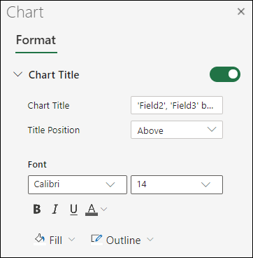
Add or edit a chart title
You can add or edit a chart title, customize its look, and include it on the chart.
-
Click anywhere in the chart to show the Chart tab on the ribbon.
-
Click Format to open the chart formatting options.
-
In the Chart pane, expand the Chart Title section.
-
Add or edit the Chart Title to meet your needs.
-
Use the switch to hide the title if you don’t want your chart to show a title.
Add axis titles to improve chart readability
Adding titles to the horizontal and vertical axes in charts that have axes can make them easier to read. You can’t add axis titles to charts that don’t have axes, such as pie and doughnut charts.
Much like chart titles, axis titles help the people who view the chart understand what the data is about.

-
Click anywhere in the chart to show the Chart tab on the ribbon.
-
Click Format to open the chart formatting options.
-
In the Chart pane, expand the Horizontal Axis or Vertical Axis section.
-
Add or edit the Horizontal Axis or Vertical Axis options to meet your needs.
-
Expand the Axis Title.
-
Change the Axis Title and modify the formatting.
-
Use the switch to show or hide the title.

Change the axis labels
Axis labels are shown below the horizontal axis and next to the vertical axis. Your chart uses text in the source data for these axis labels.

To change the text of the category labels on the horizontal or vertical axis:
-
Click the cell which has the label text you want to change.
-
Type the text you want and press Enter.
The axis labels in the chart are automatically updated with the new text.
Tip: Axis labels are different from axis titles you can add to describe what is shown on the axes. Axis titles aren’t automatically shown in a chart.
Remove the axis labels
To remove labels on the horizontal or vertical axis:
-
Click anywhere in the chart to show the Chart tab on the ribbon.
-
Click Format to open the chart formatting options.
-
In the Chart pane, expand the Horizontal Axis or Vertical Axis section.
-
From the dropdown box for Label Position, select None to prevent the labels from showing on the chart.

Need more help?
You can always ask an expert in the Excel Tech Community or get support in the Answers community.
One helpful tip in improving dashboard presentation is by creating combination charts. Excel allows us to combine different chart types in one chart. This article assists all levels of Excel users on how to create a bar and line chart.
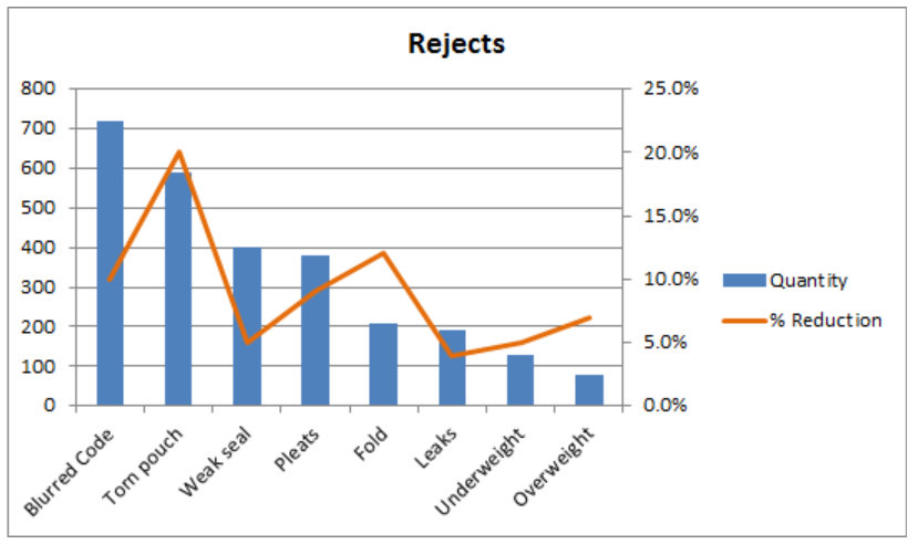 Figure 1. Final result: Bar and Line Graph
Bar Chart with Line
There are two main steps in creating a bar and line graph in Excel. First, we insert two bar graphs. Next, we change the chart type of one graph into a line graph.
Insert bar graphs
- Select the cells we want to graph
 Figure 2. Selecting the cells to graph
- Click Insert tab > Column button > Clustered Column
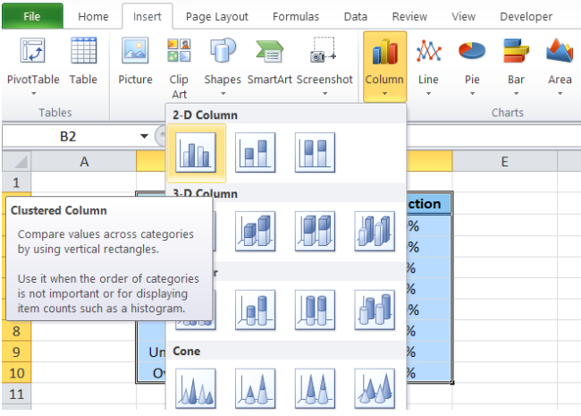 Figure 3. Clustered Column in Insert Tab
Two column charts or vertical bar charts will be created, one each for Quantity and %Reduction.
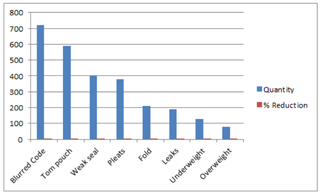 Figure 4. Vertical Bar Graph
Change bar graph to line graph
We want to present %Reduction as a line graph.
- We right-click on the series “% Reduction” and select Change Series Chart Type
 Figure 5. Change Series Chart Type in Menu Options
- The Change Chart Type dialog box will appear. Select Line > Line with Markers
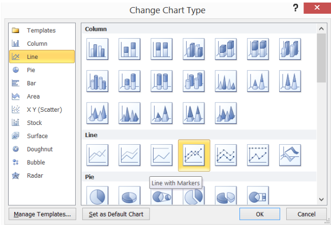 Figure 6. Line with Markers Chart Type
The %Reduction bar graph is now presented as a line graph. However, since the values are less than one, the line graph values are too close to the horizontal axis to be visually significant.
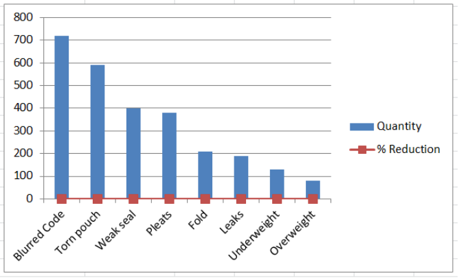 Figure 7. Bar Chart with Line
Display line graph scale on secondary axis
The work-around is to plot the line graph on a secondary axis.
- Right-click the line graph and select Format Data Series.
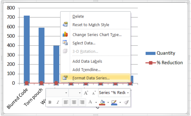 Figure 8. Format Data Series Option
- The Format Data Series dialog box will pop-up. Tick Secondary Axis in Series Options.
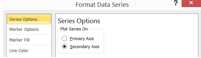 Figure 9. Secondary Axis in Series Options
We now have a combination bar and line graph.
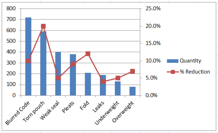 Figure 10. Bar and Line Graph with Secondary Axis
Next let us clean up our bar and line graph by doing the following:
- In Format Data Series, choose Marker Options > Marker Type > None
- Marker Color > Solid Line > Orange
- Delete the gridlines
- Add a chart title in Layout tab > Chart Title > Above Chart, then type “Rejects”
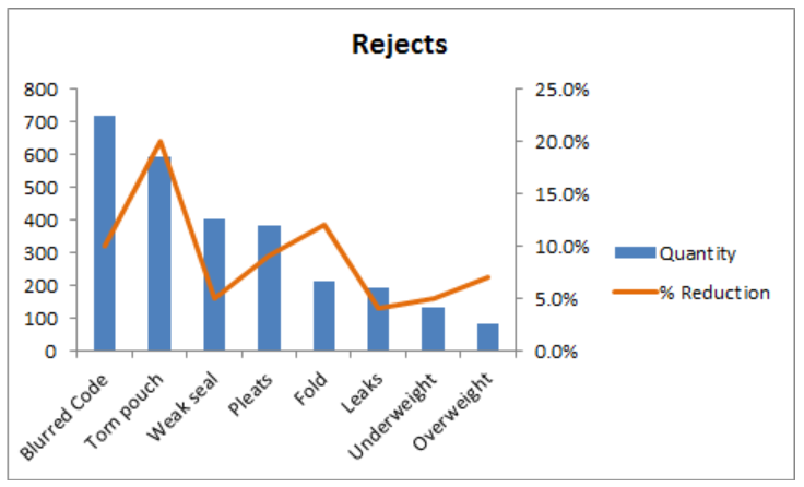 Figure 11. Output: Bar Chart with Line
Instant Connection to an Excel Expert
Most of the time, the problem you will need to solve will be more complex than a simple application of a formula or function. If you want to save hours of research and frustration, try our live Excelchat service! Our Excel Experts are available 24/7 to answer any Excel question you may have. We guarantee a connection within 30 seconds and a customized solution within 20 minutes.
Excel provides fairly extensive capabilities for creating graphs, what Excel calls charts. You can access Excel’s charting capabilities by selecting Insert > Charts. We will describe how to create bar and line charts here. Elsewhere on the website we describe how to create scatter charts. Other types of charts are created in a similar manner. Once a chart is created three new ribbons are accessible, namely Design, Layout and Format. These are used to refine the chart created.
Bar charts
To create a bar chart execute the following steps:
- Enter the data that you are charting into a worksheet.
- Highlight the data range and select Insert > Charts|Column. A list of bar chart types is displayed. As usual, you can place the mouse pointer over the picture of any chart type to get a brief description of that chart type. E.g. the first type is a 2-dimensional side-by-side bar chart while the second choice is a 2-dimensional stacked bar chart.
- Use the Design, Layout and Format ribbons to refine the chart. At any time you can click on the chart to get access to these ribbons.
We now demonstrate how to create a bar chart via the following example.
Example 1 – Create a bar chart for the data in Figure 1.
The first step is to enter the data into the worksheet. We next highlight the range A4:D10, i.e. the data (excluding the totals) including the row and column headings, and select Insert > Charts|Column.

Figure 1 – Bar Chart in Excel
The resulting chart is shown in Figure 1, although initially, the chart does not contain a chart title or axes titles. To add a chart title click on the chart, select Layout > Labels|Chart Title and then choose Above Chart and enter the title Marketing Campaign Results. You can add the title of the horizontal axis in a similar manner by selecting Layout > Labels|Axis Titles > Primary Horizontal Axis Title > Title Below Axis and entering the word City. Finally, you can add the title of the vertical axis by selecting Layout > Labels|Axis Titles > Primary Vertical Axis Title > Rotated Title.
To get the results displayed in Figure 1 we also needed to move the chart within the worksheet by left-clicking on the chart and dragging it to the desired location. We can then resize the chart, making it a little smaller (or bigger), by clicking on one of the corners of the chart and dragging the corner to change the dimensions. To ensure that the aspect ratio (i.e. the ratio of the length to the width) doesn’t change it is important to hold the Shift key down while dragging the corner.
If instead of a chart of sales by city, you want a chart of sales by brand, you can click on the chart and select Design > Data|Switch Row/Column. You can also change the type of chart by clicking on the chart, selecting Design > Type|Change Chart Type and then choosing the chart type that you want (e.g. a stacked bar chart instead of a side-by-side bar chart).
Line charts
The process for creating a line chart is similar to that of a bar chart. The main difference is that you need to select Insert > Charts|Line.
Example 2 – Create a line chart for the average income of a sample of people in their thirties by age based on the data in Figure 2.
")
Figure 2 – Line Chart (initial view)
To create the chart we highlight the range B3:B13 and select Insert > Charts|Line. The result is as displayed in Figure 2. We next describe a series of modifications that we want to make to the chart.
The legend labeled Income is not particularly useful and so we eliminate it by clicking on the chart and selecting Layout > Labels|Legend> None. We next change the chart title by simply highlighting the title (Income) and changing it to a more informative title such as Average Income by Age. We also insert the horizontal and vertical axes titles as we did for the bar chart in Example 1.
Note that the horizontal axis defaults to the time series 1 to 10 (since there are 10 data items). To change this to 31 to 40, we click on the chart and select Design > Select Data to display the dialog box shown in Figure 3.

Figure 3 – Edit axes labels dialog box
Now click on the Edit button for the Horizontal (Category) Axis Labels (on the right side of the dialog box). We are prompted for the axis label data range and enter A4:A13 (or simply highlight this range on the worksheet) and then press the OK button. We next press the OK button on the dialog box shown in Figure 3 to accept the change.
Since no data element corresponds to income below 20,000 it might be better to have the vertical axis start with 20,000 instead of 0. We accomplish this by clicking on the vertical axis labels (0 to 40000) and select Layout > Current Selection|Format Selection Selection (alternatively, right-click on the vertical axis labels and choose the Format Axis… option). This opens the Format Axis dialog box. Select Axis Options and then change the radio button for Minimum from Auto to Fixed and enter 20000.
We also decide to change the formatting of the labels to use comma separators for thousands. This is accomplished by selecting the Number tab (which is also on the Format Axis dialog box) and choosing the Number category and then clicking the Use 1000 Separator (,) checkbox and entering 0 for the Decimal Places.
The result of all these modifications is shown in Figure 4.
")
Figure 4 – Line Chart (revised view)
Observation: You can also create charts with more than one line. Click here for more details.
Scatter charts
A scatter chart is simply a chart of a series of pairs of data elements, where the first data element corresponds to the x-axis and the second to the y-axis.
Example 3: Create a scatter chart of the (x, y) pairs shown in range A3:C9 of Figure 5. Here the pairs represent the revenues (y values) and operating costs (x values) in millions of dollars for each of the six divisions of a retail business.
Highlight the range B4:C9 and select Insert > Charts|Scatter and then modify the titles as we have done in previous examples to produce the chart shown in 5. Note that if the data rows were scrambled, we would get the same chart.

Figure 5 – Scatter Chart
If you want to add labels to each point in the chart with the appropriate district name, click on the chart. This brings up the three icons shown on the top right of the chart in Figure 5. Click on the + icon and then click to the right of the Data Labels chart element option.
On the menu that appears, select the More Options … choice. This brings up a menu as shown on the right side of Figure 6. Uncheck the Y Value option and check the Value from Cell option. In the dialog box that appears, enter the range A4:A9 (containing the district names) and press the OK button. The chart will now contain the district name labels as shown on the left side of Figure 6.

Figure 6 – Scatter Chart with labels
Step charts
Excel doesn’t provide a step chart capability, but we can create one by using the scatter chart capability shown above.
Example 4: Create a step chart for the data in Figure 7.
Figure 7 – Step chart data
The key is to re-enter the data found in A3:B9 of Figure 7 by duplicating the entries as shown in range J3:K14 of Figure 8. You can then highlight range J3:K14 (or J4:K14) and select Insert > Charts|Scatter, using the Scatter with Straight Lines and Markers option. After the usual modifications to the titles, you obtain the step chart shown in Figure 8.
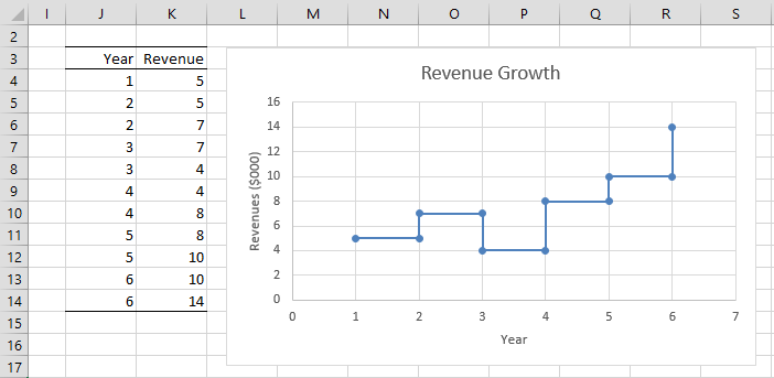
Figure 8 – Step Chart
Examples Workbook
Click here to download the Excel workbook with the examples described on this webpage.
References
Microsoft (2021) Create a chart from start to finish
https://support.microsoft.com/en-us/office/create-a-chart-from-start-to-finish-0baf399e-dd61-4e18-8a73-b3fd5d5680c2
Peltier, J. (2018) Step charts in Excel
https://peltiertech.com/step-charts-in-excel/
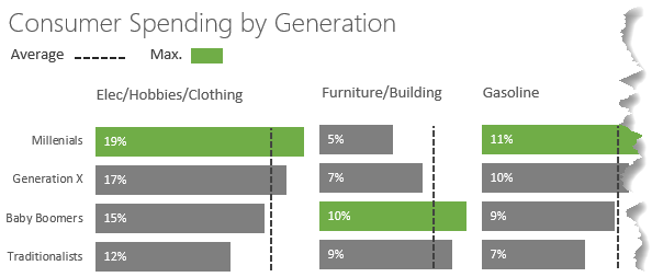
In this post I’m going to show you a way to create an Excel bar chart with a vertical line. The inspiration was taken from this Tableau chart by Emily Tesoriero:
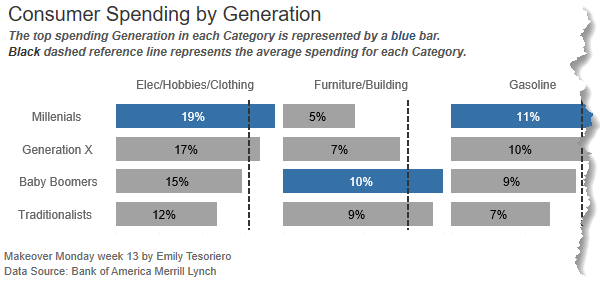
Unfortunately, adding a vertical line to a bar chart isn’t a simple feat in Excel, but I’ll step you through a workaround that’s relatively painless.
Download Workbook
Enter your email address below to download the sample workbook.
By submitting your email address you agree that we can email you our Excel newsletter.
Watch the Video
Step by Step Written Instructions
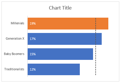
My data is split into separate tables for each spend category and I have 3 value columns; the actual spend by generation (column B), the maximum and the average:
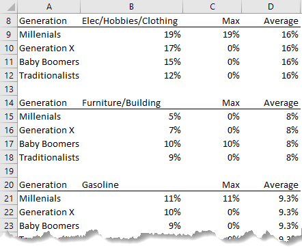
Step 1: Insert a Bar Chart
Taking the first category; Elec/Hobbies/Clothing, select cells A8:C12 > Insert tab > Bar Chart. It should look like this:
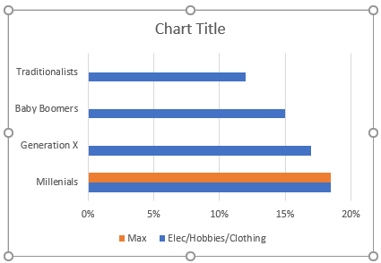
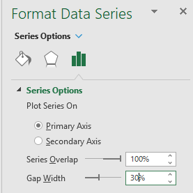
Step 2: Overlap Series and Set Gap Width
Single left click one of the series (bars) in the chart to select them > CTRL+1 to open the Format Chart Area (or right-click). Set the series overlap to 100% and the gap width to 30%:
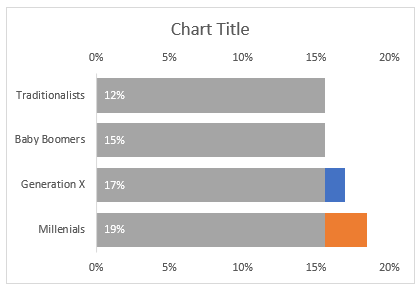
Step 3: Add Data Labels
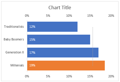
Select the blue bars (single left-click) > click on the + icon > Data Labels > Inside Base:

Step 4: Add the Vertical Line
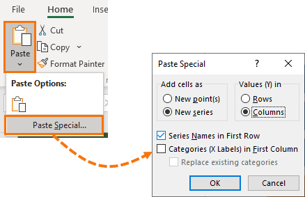
Select cells D8:D12 containing the Average header and values then CTRL+C to copy. Left click the outer edge of the chart to select it > Home tab > Paste drop down > Special:
It should look like this:
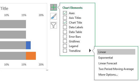
Step 5: Add a Trendline
Select the grey bars (left click once) > click the + > Trendline > Linear:
Note: if the two horizontal axes don’t end at the same maximum value, edit them to suit. It’s important that the scales are the same, otherwise the average line won’t be in the correct position.
Step 6: Switch Axis and Hide the Average Series’ Bars
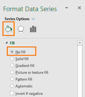
Left click the grey bars > CTRL+1 to open the Format Series dialog box > on the Series Options tab > Secondary Axis:
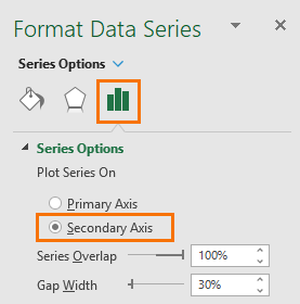
On the Paint tab > set the fill colour to ‘No Fill’:
You should be left with a pale grey dotted trendline and an extra axis on the top:
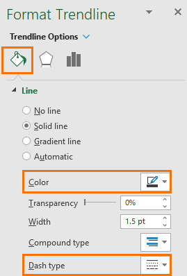
Step 7: Format the Trendline
Left click the trendline > CTRL+1 to open the format pane. In the paint bucket tab set the colour to a dark grey and change the dash type to suit your preference:
Step 8: Extend the Trendline
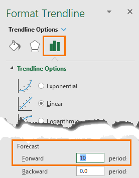
We want the trendline to start and finish in line with the top and bottom bars. To do this, go to the Options tab and set the ‘Forecast’ Forward 10:
Step 9: Formatting
Let’s do some tidying up:
- Select the bottom horizontal axis > press DELETE.
- Repeat for the top horizontal axis.
- Left click to select a gridline in the chart > press DELETE.
- Left click to select the legend > press DELETE.
- Left click to select the labels > format font white.
- Left click on the vertical axis > CTRL+1 to open the Format Axis pane > check the box ‘Categories in reverse order’:
It should now look like this:
Step 10: Chart Title
Left click the chart title > click in the formula bar > type = then left click on cell B8 containing the spend category. This will link the chart title to the text in cell C8.
Step 11: Rinse and Repeat
Repeat the above steps for the remaining spend categories. Tip: copy the chart and edit the source data (right-click > Select Data to open series dialog box where you can change the cell references).
Step 12: Hide Vertical Axes on Subsequent Charts
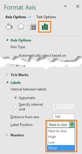
Left click the vertical axis > CTRL+1 to open format pane > Labels > Label Position > None:
Align them close together so they can share the vertical axis of the first chart.
Step 13: Create a Legend
I don’t like the built-in legend for Trendlines, so I created my own legend using Shapes available on the Insert tab. Here is my finished result: