
Note: These steps apply to Office 2013 and newer versions. Looking for Office 2010 steps?
Add a trendline

-
Select a chart.
-
Select the + to the top right of the chart.
-
Select Trendline.
Note: Excel displays the Trendline option only if you select a chart that has more than one data series without selecting a data series.
-
In the Add Trendline dialog box, select any data series options you want, and click OK.
Format a trendline
-
Click anywhere in the chart.
-
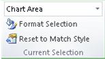
On the Format tab, in the Current Selection group, select the trendline option in the dropdown list.
-
Click Format Selection.
-
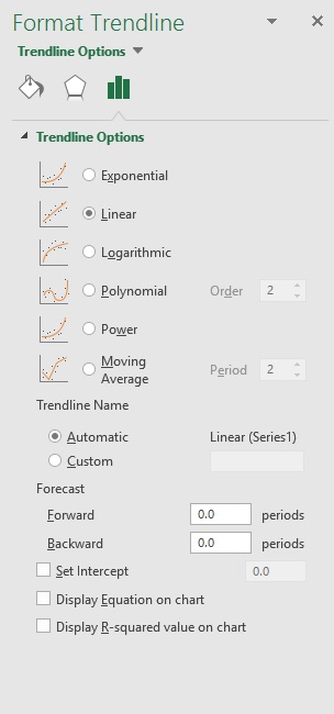
In the Format Trendline pane, select a Trendline Option to choose the trendline you want for your chart. Formatting a trendline is a statistical way to measure data:

-
Set a value in the Forward and Backward fields to project your data into the future.
Add a moving average line
You can format your trendline to a moving average line.
-
Click anywhere in the chart.
-
On the Format tab, in the Current Selection group, select the trendline option in the dropdown list.
-
Click Format Selection.
-
In the Format Trendline pane, under Trendline Options, select Moving Average. Specify the points if necessary.
Note: The number of points in a moving average trendline equals the total number of points in the series less the number that you specify for the period.
Add a trend or moving average line to a chart in Office 2010
-
On an unstacked, 2-D, area, bar, column, line, stock, xy (scatter), or bubble chart, click the data series to which you want to add a trendline or moving average, or do the following to select the data series from a list of chart elements:
-
Click anywhere in the chart.
This displays the Chart Tools, adding the Design, Layout, and Format tabs.
-
On the Format tab, in the Current Selection group, click the arrow next to the Chart Elements box, and then click the chart element that you want.
-
-
Note: If you select a chart that has more than one data series without selecting a data series, Excel displays the Add Trendline dialog box. In the list box, click the data series that you want, and then click OK.
-
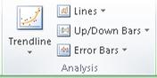
On the Layout tab, in the Analysis group, click Trendline.
-
Do one of the following:
-
Click a predefined trendline option that you want to use.
Note: This applies a trendline without enabling you to select specific options.
-
Click More Trendline Options, and then in the Trendline Options category, under Trend/Regression Type, click the type of trendline that you want to use.
Use this type
To create
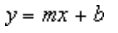
Linear
A linear trendline by using the following equation to calculate the least squares fit for a line:
where m is the slope and b is the intercept.
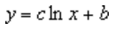
Logarithmic
A logarithmic trendline by using the following equation to calculate the least squares fit through points:
where c and b are constants, and ln is the natural logarithm function.
Polynomial
A polynomial or curvilinear trendline by using the following equation to calculate the least squares fit through points:
where b and
are constants.Power
A power trendline by using the following equation to calculate the least squares fit through points:
where c and b are constants.
Note: This option is not available when your data includes negative or zero values.
Exponential
An exponential trendline by using the following equation to calculate the least squares fit through points:
where c and b are constants, and e is the base of the natural logarithm.
Note: This option is not available when your data includes negative or zero values.
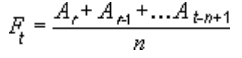
Moving average
A moving average trendline by using the following equation:
Note: The number of points in a moving average trendline equals the total number of points in the series less the number that you specify for the period.
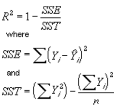
R-squared value
A trendline that displays an R-squared value on a chart by using the following equation:
This trendline option is available on the Options tab of the Add Trendline or Format Trendline dialog box.
Note: The R-squared value that you can display with a trendline is not an adjusted R-squared value. For logarithmic, power, and exponential trendlines, Excel uses a transformed regression model.
-
If you select Polynomial, type the highest power for the independent variable in the Order box.
-
If you select Moving Average, type the number of periods that you want to use to calculate the moving average in the Period box.
-
If you add a moving average to an xy (scatter) chart, the moving average is based on the order of the x values plotted in the chart. To get the result that you want, you might have to sort the x values before you add a moving average.
-
If you add a trendline to a line, column, area, or bar chart, the trendline is calculated based on the assumption that the x values are 1, 2, 3, 4, 5, 6, etc.. This assumption is made whether the x-values are numeric or text. To base a trendline on numeric x values, you should use an xy (scatter) chart.
-
Excel automatically assigns a name to the trendline, but you can change it. In the Format Trendline dialog box, in the Trendline Options category, under Trendline Name, click Custom, and then type a name in the Custom box.
-
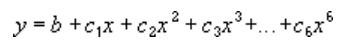
 are constants.

Tips:
-
You can also create a moving average, which smoothes out fluctuations in data and shows the pattern or trend more clearly.
-
If you change a chart or data series so that it can no longer support the associated trendline — for example, by changing the chart type to a 3-D chart or by changing the view of a PivotChart report or associated PivotTable report — the trendline no longer appears on the chart.
-
For line data without a chart, you can use AutoFill or one of the statistical functions, such as GROWTH() or TREND(), to create data for best-fit linear or exponential lines.
-
On an unstacked, 2-D, area, bar, column, line, stock, xy (scatter), or bubble chart, click the trendline that you want to change, or do the following to select it from a list of chart elements.
-
Click anywhere in the chart.
This displays the Chart Tools, adding the Design, Layout, and Format tabs.
-
On the Format tab, in the Current Selection group, click the arrow next to the Chart Elements box, and then click the chart element that you want.
-
-
On the Layout tab, in the Analysis group, click Trendline, and then click More Trendline Options.
-
To change the color, style, or shadow options of the trendline, click the Line Color, Line Style, or Shadow category, and then select the options that you want.
-
On an unstacked, 2-D, area, bar, column, line, stock, xy (scatter), or bubble chart, click the trendline that you want to change, or do the following to select it from a list of chart elements.
-
Click anywhere in the chart.
This displays the Chart Tools, adding the Design, Layout, and Format tabs.
-
On the Format tab, in the Current Selection group, click the arrow next to the Chart Elements box, and then click the chart element that you want.
-
-
On the Layout tab, in the Analysis group, click Trendline, and then click More Trendline Options.
-
To specify the number of periods that you want to include in a forecast, under Forecast, click a number in the Forward periods or Backward periods box.
-
On an unstacked, 2-D, area, bar, column, line, stock, xy (scatter), or bubble chart, click the trendline that you want to change, or do the following to select it from a list of chart elements.
-
Click anywhere in the chart.
This displays the Chart Tools, adding the Design, Layout, and Format tabs.
-
On the Format tab, in the Current Selection group, click the arrow next to the Chart Elements box, and then click the chart element that you want.
-
-
On the Layout tab, in the Analysis group, click Trendline, and then click More Trendline Options.
-
Select the Set Intercept = check box, and then in the Set Intercept = box, type the value to specify the point on the vertical (value) axis where the trendline crosses the axis.
Note: You can do this only when you use an exponential, linear, or polynomial trendline.
-
On an unstacked, 2-D, area, bar, column, line, stock, xy (scatter), or bubble chart, click the trendline that you want to change, or do the following to select it from a list of chart elements.
-
Click anywhere in the chart.
This displays the Chart Tools, adding the Design, Layout, and Format tabs.
-
On the Format tab, in the Current Selection group, click the arrow next to the Chart Elements box, and then click the chart element that you want.
-
-
On the Layout tab, in the Analysis group, click Trendline, and then click More Trendline Options.
-
To display the trendline equation on the chart, select the Display Equation on chart check box.
Note: You cannot display trendline equations for a moving average.
Tip: The trendline equation is rounded to make it more readable. However, you can change the number of digits for a selected trendline label in the Decimal places box on the Number tab of the Format Trendline Label dialog box. (Format tab, Current Selection group, Format Selection button).
-
On an unstacked, 2-D, area, bar, column, line, stock, xy (scatter), or bubble chart, click the trendline for which you want to display the R-squared value, or do the following to select the trendline from a list of chart elements:
-
Click anywhere in the chart.
This displays the Chart Tools, adding the Design, Layout, and Format tabs.
-
On the Format tab, in the Current Selection group, click the arrow next to the Chart Elements box, and then click the chart element that you want.
-
-
On the Layout tab, in the Analysis group, click Trendline, and then click More Trendline Options.
-
On the Trendline Options tab, select Display R-squared value on chart.
Note: You cannot display an R-squared value for a moving average.
-
On an unstacked, 2-D, area, bar, column, line, stock, xy (scatter), or bubble chart, click the trendline that you want to remove, or do the following to select the trendline from a list of chart elements:
-
Click anywhere in the chart.
This displays the Chart Tools, adding the Design, Layout, and Format tabs.
-
On the Format tab, in the Current Selection group, click the arrow next to the Chart Elements box, and then click the chart element that you want.
-
-
Do one of the following:
-
On the Layout tab, in the Analysis group, click Trendline, and then click None.
-
Press DELETE.
-
Tip: You can also remove a trendline immediately after you add it to the chart by clicking Undo  on the Quick Access Toolbar, or by pressing CTRL+Z.
Home > Data Recovery > 3 Ways to Add an Average Line to Your Charts in Excel (Part I)
Chart in Excel are always used to analyze some important information. Therefore, in this article we will demonstrate how to add horizontal average line to vertical chart in Excel.
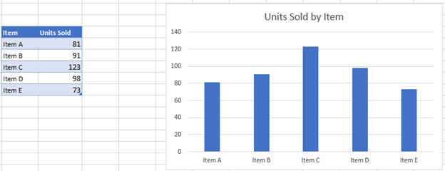
In an Excel worksheet, you will always add a chart according to the data in certain cells. And sometimes, you will need to know the average level of certain index. For example, in this image, you can see that there is a bar chart for the sales volume of those sales representatives.
However, the average level is hard to see from this chart. Thus, you need to add an average line into this chart. And the following are the two ways to add.
Add Horizontal Average Line to Vertical Chart
The following are the steps to add a horizontal average line.
- In the original worksheet, add a column of average sales volume.


And you can use the Average function to calculate the number.
- Select the whole area including the average column.
- Click the “Insert” tab in the ribbon.
- And then click the “Column”.

- Now in the drop down menu, click the clustered column to create a bar chart. Thus, you have created a new chart.

- Right click any of the red bars in the column.
- In the new menu, choose the “Change Series Chart Type”.

- And then in the “Change Chart Type”, choose the line chart.

- Next click “OK”. Therefore, you have finished all the setting, and you can see that in the bar chart, there is an average line.


Add Horizontal Line through Inserting Line Feature
This is the other method to add an average line.
- In the original worksheet, add a row of average sales volume.

- Select the whole area.
- Repeat the step3-step5 in the previous part to create a bar chart.

- Click the chart to position the cursor on the chart. If you skip this step, the line will not in the chart.
- Click the “Insert” tab in the ribbon.
- And then click the “Shapes”.
- In the drop-down menu, choose the “Line”.

- Then hold the key “Shift” on the keyboard.
- In this step, you should be more careful. Put your cursor on the top of the bar “Average”.

- Then use your mouse to drag and draw a line in the chart. Because now you are holding the “Shift”, you don’t need to worry about the line will not be horizontal.


Thus, the average line will be created. And if you want to change the color or the type to make it clearer, you can also set in the ribbon.
The above are the two ways to add horizontal line into a vertical chart. In addition, in the next article, we will introduce about adding a vertical line into the horizontal bar chart.
Author Introduction:
Anna Ma is a data recovery expert in DataNumen, Inc., which is the world leader in data recovery technologies, including word recovery and outlook repair software products. For more information visit www.datanumen.com
Return to Charts Home
This graph will demonstrate how to add an average line to a graph in Excel.
Add Average Line to Graph in Excel
Starting with your Data
We’ll start with the below bar graph. The goal of this tutorial is to add an average line to help show how each bar compares to the average.
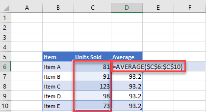
Adding Average
In the next column, create an average formula by typing in =AVERAGE(Range), in this case =AVERAGE($C$6:$C:$10). The average should be the same number for each X Axis. (Note: use $s to lock the cell references so they don’t change when the formula is copied down).
Adding Average Dataset to Graph
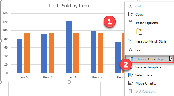
- Right click graph
- Click Select data
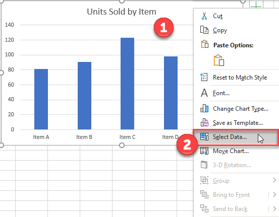
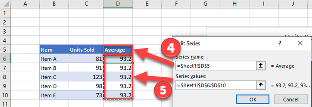
3. Click Add Series
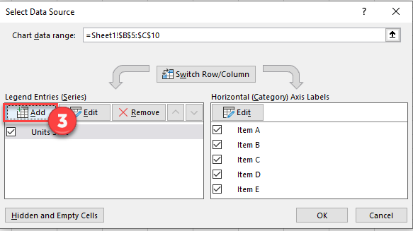
4. Select Header under Series Name
5. Select Range of Values for Series Values and click OK.
Change Average to Line Graph
- Right click on graph
- Select Change Chart Graph
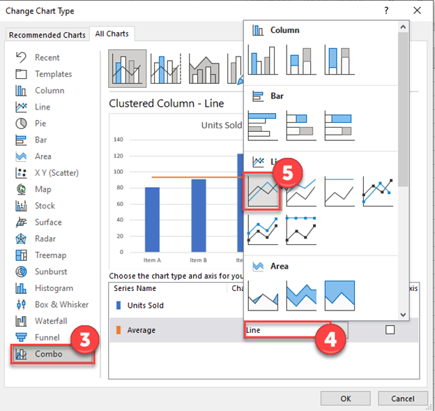
3. Select Combo
4. Click Graph next to Average
5. Select Line
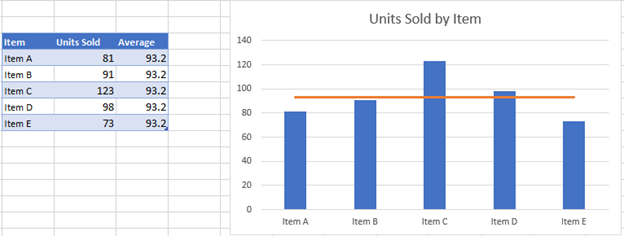
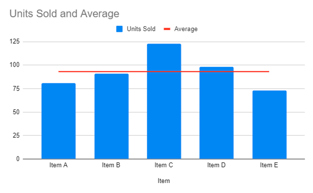
Final Graph with Average Line
As you can see, the final product is a bar graph of the items with an average line to show comparisons between the items.
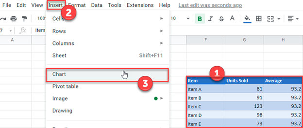
Add Average Line to Graph in Google Sheets
- Select Data that was put together in Excel
- Click Insert
- Click Chart
Final Graph with Average Line
It’s very easy to chart moving averages and standard deviations in Excel 2016, using the Trendline feature.
Excel charts and trendlines of this kind are covered in great depth in our Essential Skills Books and E-books. If you’re not familiar with Excel charts or want to improve your knowledge it could be of great value to you.
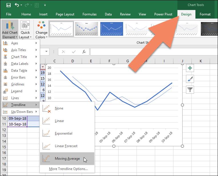
Adding a moving average to a chart
To add a two-period moving average trendline to the chart, click it and then click:
Chart Tools > Design > Chart Layouts > Add Chart Element > Trendline > Moving Average.
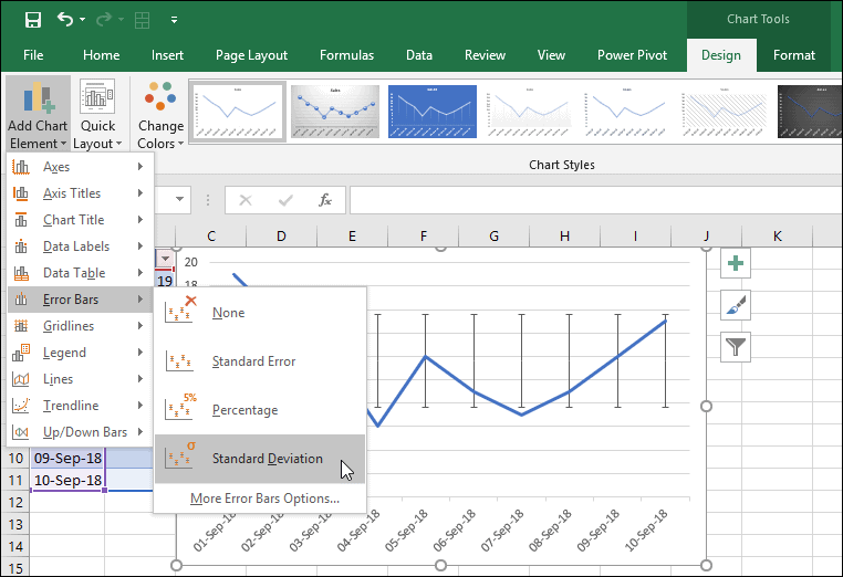
Adding standard deviation error bars to a chart
For Standard Deviation, it’s likely that you’ll want to use ‘error bars’ instead of trendlines. Error bars work in almost exactly the same way as trendlines. To add standard deviation error bars, click: Chart Tools > Design > Chart Layouts > Add Chart Element > Error Bars > Error Bars with Standard Deviation.
Calculating average and standard deviation separately
If these options aren’t what you’re looking for, you may want to calculate the average and standard deviation figures within your data by using the AVERAGE and STDEV functions. You can then create charts based upon the results of your calculations.
If Excel formulas and functions aren’t familiar to you, you could find our free Basic Skills E-book extremely useful. Basic Skills will teach you the basics of Excel formulas as well as many other basic Excel skills.
Advanced functions are covered in our Expert Skills Books and E-books.
Share this article
Recent Articles
Leave a Reply
In Microsoft Excel, you can add an average line to a chart to show the average value for the data in your chart. In this Excel, tutorial you will learn how to create a chart with an average line.
First, prepare some data tables.

Preparing an average line for a graph
Click on the average column. Use Excel average function for calculations. Type in =AVERAGE(all cells in the total column ex. $B$2:$B$24) and click enter.

In my example formula is =AVERAGE([Sales]) or =AVERAGE($B$2:$B$24). On best-excel-tutorial.com, you can learn more about Define Name.
Select all the data, and create the chart by clicking on insert tab. I recommend Column Chart or Line Chart.

Right-click on the average column. From the list, choose the Change Series Chart Type option.

Inserting average chart
Choose a Line Chart.

Adding an average line in chart
The average line chart is ready.

This is it. Average line on the chart could be useful to compare data with an average value. You can choose another type of line, and write the title of chart.