
- Posted on August 5, 2020August 7, 2020

The relationship between images and words has a long tradition that began with the ancient manuscripts, but since the beginning of the 20th century, with the artistic avant-garde, the textual component recovers a high weight as it becomes an object of analysis and (dis)construction. Braque and Picasso, promoters of Cubism, incorporated words into their paintings using newspaper. Likewise, Boccioni and Marinetti’s futurism violently altered the size of the typography within the same word, an aesthetic similar to Russian constructivism, which marked the path for graphic design. Dada poetry was a massive revolution. It’s writing was constructed by selecting words at random from different books that later directly influenced the automatic thinking that the surrealists carried out to represent the world of dreams and the unconscious.
Today, the boundaries between art, advertising, design or communication are becoming increasingly blurred. From the ashes of the avant-gardes came many artists who use words as their great weapon to convey messages, in some cases, interesting ones, which expose the undoubted power of words. Below are some of the artists who have captivated attention with their work in a variety of ways.
Joseph Kosuth
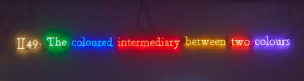
Kosuth is one of the pioneers of conceptual art that emerged in the 60s and 70s. His work is based on the dematerialization of art; in other words, the artist rejects the notion of the work of art as a contemplative object. Kosuth followed in Duchamp’s ready-made footsteps and became interested in the objectivity of closed concepts; that is that they are imposed on immediate reality, and words are the perfect medium since definitions are usually concrete and concise. In this way, in his works, the artist eliminates everything with a subjective character, and that depends on the spectator’s multi-interpretations to reduce it to a single idea.
His work, “The Colour of Wittgenstein,” is based only on RED’s word, whose relationship to its meaning is literal. In the case of “One and Three Chairs,” in which he contrasts a chair with his photograph and its definition, which also does not admit of variations. The importance of Kosuth’s artistic work lies in the combination of the words and the installation to reflect on the effects of language on the subjects’ subjectivity.
Matt Siber
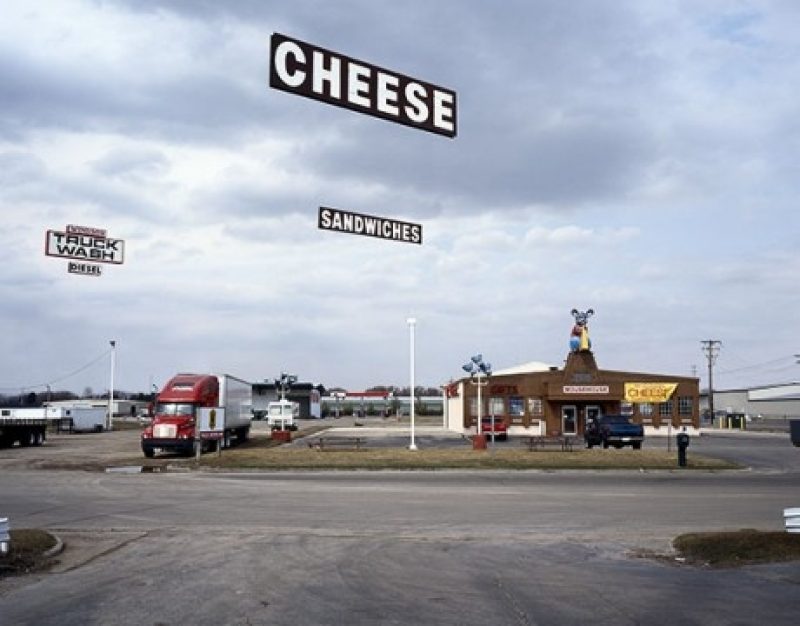
Matt Siber’s work is characterized by the intervention on urban photographs where the focus is on traffic signs, advertising posters on the roads, or the most influential capitalist consumerism brands. Using Photoshop, he eliminates the support structures of these objects so that the logos are left floating. Using this action, the artist removes all visual distractions to only pay attention to the text or the logo. Siber’sOn the other hand, the “Untitled Project” is based on the deliberate absence of text. Both works are intended to explore the power of human words concerning public language and point out the many non-traditional ways in which written language is used to communicate.
Jason Innocent
Innocent is an emerging artist who demonstrates his social commitment in his work. He transmits a powerful message to his viewers in which he denounces different current social problems such as racism, inequalities and gender stereotypes through satire. In his first works, he juxtaposes drawing and writing of a childish nature that denotes spontaneity. Many of his words may be upside down, crossed out, or joined together in a Scrabble-like manner. However, he began to gain recognition on the art scene for his graffiti and stencils in lower Manhattan with a mixture of drawings, phrases, words, poetry, and lines such as his intervention in public space anti-Trump posters during his election campaign.
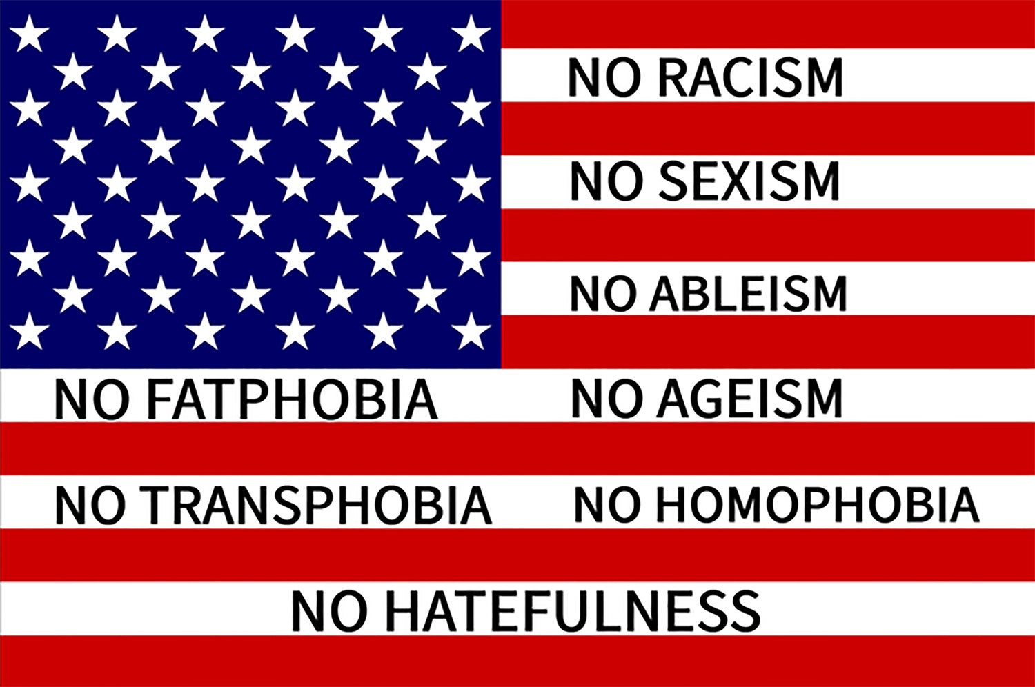
Jason Innocent also combines using graphic language. “American Flag” is a work in which he disarms and re-signifies the concept of the American flag and questions what it represents for citizens by creating a banner with the compelling words NO RACISM, NO SEXISM, NO ABLEISM, NO FATPHOBIA, NO AGEISM, NO TRANSPHOBIA, NO HOMOPHOBIA, AND NO HATEFULNESS. Following a similar line, the artist has recently created minimalist images with the words HOLY SHIT, RADIO RADIO, and Burning the midnight oil in which Innocent appeals to the literalness of their definitions. In the case of Holy Shit, he emphasizes its meaning with the use of capital letters, and in RADIO RADIO, he uses the resource of repetition.
Mar Arza
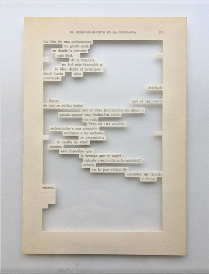
Mar Arza is a sculptor of words. Through non-writing, she manipulates the original stories in search of an artistic lyricism. Under the influence of Dadaist poetry, she chooses words at random from books’ pages and then meticulously dissects texts and phrases or emphasizes concepts that take on a sculptural form without frames or crystals. Her works destroy the hegemonic account of the idea of linearity and challenge the limits of the structure and easel painting concept. Arza adopts a disruptive attitude towards the idea of reading both books and contemporary art. In this way, the artist integrates a debate about words and their tangible dimension and explores new conceptual, verbal, and plastic meanings.
Honda Koichi
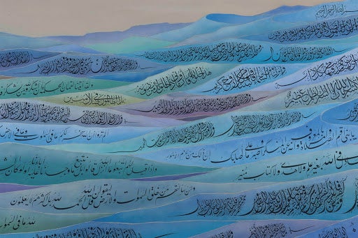
Koichi is a master of Arabic calligraphy despite being Japanese. He belongs to a small community of Japanese who practice Islam’s religion, which originated during World War II. Koichi is an interesting example of interculturality and the construction of cultural stereotypes. His work forces us to reflect on the notion of culture and identity and ask ourselves: why do we find it so shocking to see a Japanese Muslim, a Japanese master of Arabic calligraphy? Also, Koichi incorporates the Arabic characters as a graphic element, paying attention to their delineation and form. His well-known blue pyramid work is built with verses from the Koran and at the top; you can read Allah’s name, the Muslim God, surrounded by a white aura.
Barbara Kruger
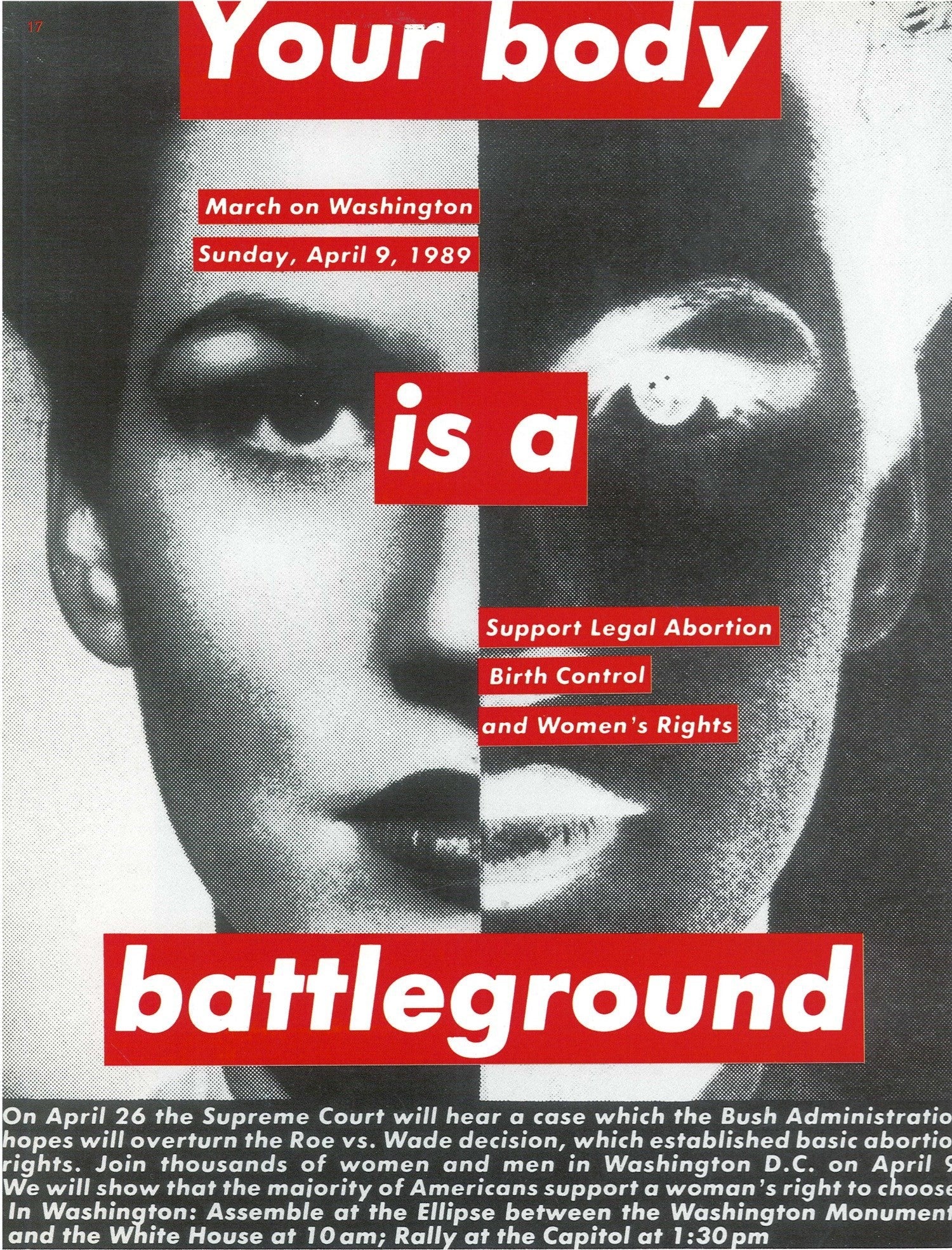
Barbara Kruger is a pop artist working out of New York and Los Angeles. Her career began in the late 60s, doing mixed media work that often included sewn yarn, beads, and other common craft materials, turning them into sexually suggestive pieces. This was at the height of the discussion around the lines between art and craft. By 1976, she took a sabbatical from her practice. It wasn’t until she discovered the philosophical works of Walter Benjamin and Roland Barthes that she became reinvigorated, picking up collage as her new focus. She gradually expanded into other fields, making everything from installations to t-shirts.
She is most well known for her pieces featuring found black-and-white photography overlaid with text, typically in Futura and Helvetica. Using the motifs of magazine and billboard advertisements, Kruger is a master at subverting context. One of her most well-known statements, “I shop therefore I am,” highlights her frequent confrontation with consumerism and the self’s examination in late capitalism. Similar works include text like, “You are not yourself,” and “Where does she think she is?” These provocative phrases are most famously set in white text on red strips, charging the images with conflicting messages and darkly humorous references.
Jenny Holzer
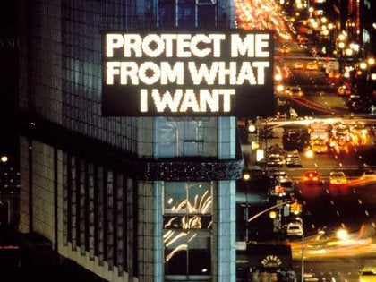
Jenny Holzer’s career is defined by text and finding new ways to display it to the public. The first phase of her work was a series called Truisms, a two-year project beginning in 1977. She clipped moving quotes from the Whitley Independent Study Program and reproduced them in italicized black text on broadsheet paper. The effect is an extensive list of quotations that dazzle the eye until approached and read carefully. Phrases as disparate as “CAPITALISM IS AS ARTIFICIAL AS PLASTIC” and “EVERYTHING THAT IS INTERESTING IS NEW” live in succession, dozens lined up one after the other. These broadsheets were wheat-pasted in public areas around Manhattan, including businesses and open fences. Over the project’s course, she printed the quotes on leaflets, t-shirts, and other materials.
As Holzer’s profile increased, she began pursuing new avenues to project language into the world. She has expected declassified government documents on a New York Library building, displayed quotations on electronic airport signs, and installed stone benches engraved with quotes from the Hollywood Ten victims at a public park. This small selection highlights the full range of her oeuvre, which continues five decades.
Ed Ruscha
Ed Ruscha’s career is defined by the ethic of pursuing high art through commercial forms. This proclivity propelled Ruscha into the forefront of the emerging pop art movement in 1969, when he participated in the seminal show “New Painting of Common Objects.” His biography shows why he had the unique ability to merge these fields. After receiving an art education from Emerson Woelffer and Robert Irwin at the Chouinard Art Institute, Ruscha found employment as a layout designer at the Carson-Roberts Advertising Agency. Over the 60s, Ruscha had rigorous training in the art of print publication and used this to change the landscape of 20th-century art along with fellow travelers like Andy Warhol and Roy Lichtenstein.
Ruscha’s work explores typography and manipulating letter shapes, using typefaces like found objects, sometimes choosing words not for meaning but visual interest. His paintings often feature text in the world, famously gas station signs. In these, he is like a landscape artist who captures typeface in the wild. While also experimenting in photography and filmmaking, his lasting legacy is his work with text and his position as a luminary of pop art.
Christopher Wool
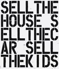
Christopher Wool is a contemporary artist who works in the text through a post-conceptual lens — a movement that seeks to place all aesthetic choices into the service of ideas. He lives and works in New York but spends much of the year in the storied artist and writer getaway of Marfa, Texas. His atypical art education helped shape is atypical approach. While he enrolled at the New York Studio School in the late 70s, he left shortly after, with most of his formal training from his role as a studio assistant for sculptor Joel Shapiro. Instead, he soaked up the thriving art and music scene in the city. Wool began working with text in the 80s, finding his signature look of stenciled black letters placed in a grid pattern over a white background.
Wool often repeats words, drops vowels, and rearranges or eliminates spaces. The outcome is striking, often creating a challenge for viewers to grasp what is written quickly. This lingering effect of his work forces viewers to stand and struggle through each letter, muttering the sounds under their breath, reengaging with the very act of putting notes together to create a meaningful word. The outcomes are often humorous and forceful. The confrontational messages antagonize the slow work of reading.
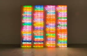
Bruce Nauman
Bruce Nauman is an artist who has worked in every conceivable physical medium. His career has frequently, though not exclusively, played with text, often written in neon light. He began his education pursuing mathematics before studying art at the University of California, Davis, from 1965 to 66. While his art started with painting, he was seeking cinema, performance, and sculpture before long. That opening up of his pursuits led to the wide variation he experimented with over his career.
His resplendent neon works are halting studies in the use of text in art, using multiple bright colors and bizarre layouts, these pieces send viewers turning their heads, stepping back, and stepping forward. In some parts, phrases careen into each other and break at angles in the collision. In others, words spiral out from or into the center. Nauman’s playful approach brings optimism to the existential themes of psychology, sexuality, and the pursuit of art.

SWAGGER Staff
Collaborative content by SWAGGER’s in-house editorial team.
Related Topics
- Jason Innocent
Subscribe
Get the latest Swagger Scoop right in your inbox.
Suggest me visual artists that use words please.
Specifically where the words are the primary visual component, e.g. the works of Mel Bochner, Christopher Wool, Jenny Holzer, Richard Prince’s «joke» paintings, etc.
In contrast to the work of people like Edward Ruscha, Wayne White, or Barbara Kruger, where words are juxtaposed with other images, or a very stylized ‘font’ is used (excluding graffiti artists for this same reason).
Relevant readings, etc. also appreciated.
Thanks!
As both a painter and poet personally engaged in transnational linguistic and pictorial exchange,1
Larry Rivers made artwork that consistently combined words and images. Parts of the Face: French Vocabulary Lesson 1961 (Tate T00522; fig.1) provides a salient example of this strategy, which can be situated in proximity to the larger interest in language so prevalent among the artists and writers of the 1950s and 1960s, but which offers a novel and multifaceted treatment of the relation between what can be seen (image) and what can be said (word).
Fig.1 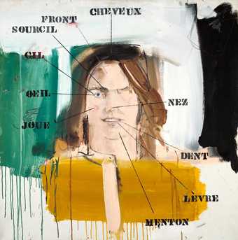
Larry Rivers
Parts of the Face: French Vocabulary Lesson 1961
Tate T00522
© The estate of Larry Rivers
Photo © Tate
How we understand the relationship between words and images, especially regarding their order of priority, shapes how we conceive of human knowledge and experience. On the one hand, to privilege words over images is to suggest that language, as a deep linguistic and conceptual structure, makes intelligible experience possible, such that we are able to recognise a sensible object as an image in the first place. On the other hand, to privilege images over words is to suggest that we must first encounter the world in its sensuous immediacy and singularity before our experience can be cognised and codified through language.
As we will see, Parts of the Face doubly destabilises this opposition. Firstly, in refusing to accord primacy to either word or image, the work opens a self-referential or ‘tautological’ interplay of text and figure where any question of priority between them would be strictly undecidable. Secondly, this dynamic unity of word and image is itself exceeded by the expressive aspects of the painting, which create an affective force irreducible to any discursive-figural circuit of meaning. Furthermore, the work’s destabilising effects playfully undermine the didactic pedagogical regime of the standardised vocabulary lesson, the rigid trace of which persists in the authoritative severity of the painting’s black lines of designation. In so doing, Parts of the Face calls into question a certain institutionalised form of instruction while envisioning more creative possibilities for how to learn and experience.
Artistic tautology: A conceptual sketch
The concept of artistic tautology provides an interpretive window into Parts of the Face.2
Tautological artworks can be broadly characterised according to two traits. Firstly, they are self-referential; and secondly, they centrally concern the relationship between word and image, or between text and figure, which is to say, the relationship between language and visual form. Combining these two traits, we can go one step further: in a tautological artwork, the self-reference essential to the work is relayed by means of the relation established in the work between word and image.
Fig.2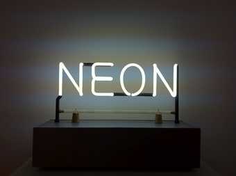
Joseph Kosuth
Neon 1965
© Joseph Kosuth
A tautological work is thus fundamentally double, an object comprised of both verbal and visual aspects; and key to approaching any particular piece of tautological art is to understand the specific word-image relation that constitutes that work’s field of self-reference. Typically, this relation takes the form of identity, where word and image are coextensive, as can be seen in Joseph Kosuth’s Neon 1965 (fig.2). However, the relation between the verbal and the visible in self-referential artworks can also take more divergent forms, as with the incommensurability installed between text and figure in René Magritte’s Ceci n’est pas une pipe series (fig.3) or the irresolvable tension between the meaning and visual content of colour words in Jasper Johns’s False Start 1959 (fig.4). If the term ‘tautological’ is to be reserved for the former kind of self-referential work that tends toward an identity relation between word and image, then the latter kind of self-referential work that disrupts this identity relation might be termed ‘anti-tautological’.3
Fig.3 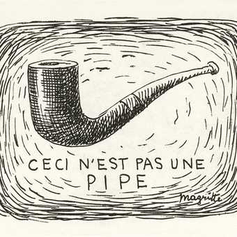
René Magritte
Ceci n’est pas une pipe 1926
Reproduced in Michel Foucault, Ceci n’est pas une pipe, Montpellier 1973, p.16
Fig.4 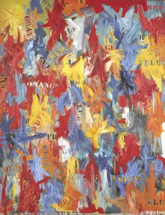
Jasper Johns
False Start 1959
Collection of Kenneth and Anne Griffin
The tautological dimension of Parts of the Face
To what extent, then, is Rivers’s Parts of the Face a tautological painting? Does it achieve or undo this essential identity between text and figure, label and feature? At first glance, the answer seems to be obvious: the labels, so many stencilled words naming in French various parts of the face, are accurately applied, faithfully indicating through superimposed lines of designation the particular facial part to which they correspond. Fidelity of reference would thus seem to unite word and image, each denoting in its manner the same thing. This view has been articulated recently, for example, by the art historian Leslie Ross, who writes in Language in the Visual Arts that Rivers’s ‘labeled pieces function like “bilingual rebuses”; in most cases they seem to use words and images to reinforce rather than to contradict one another. In this sense, these words pose a contrast to the deliberate “mislabeling” of objects and colors by artists such as Magritte and Johns.’4
Curator Russell Bowman offers a similar take on Parts of the Face in particular: ‘In the manner of a medical text or a drawing manual – and in exact converse to Magritte’s “this is not a pipe” – [the words] accurately describe the body parts they label.’5
Indeed, when it comes to the relationship between word and image in visual art more generally, literary theorist George L. Dillon has pointed out that ‘[l]abelling would seem to be among the least problematic of relations: the label word, though inside the frame, is the name (or other index) of the part to which the term points by means of a pointer or the part where the label is located.’6
If, in keeping with artistic tautology, the one-to-one correspondence between label and feature in Parts of the Face thus bespeaks the identity of word and image, it tells us less about their order of priority. That is, if word and image are one another’s double, it remains to be determined which is the duplicate and which the original. Does the label simply repeat what the figure already shows, a kind of verbal redundancy useful only in its heuristic capacity as a teaching tool? This would seem to be the implication of Bowman’s comment that the painting proceeds in a conventional diagrammatic manner, like an illustration in an anatomy book, in which case the image would precede the word that describes it. After all, the lines of reference by which the labels designate the corresponding parts of the face are superimposed upon the figure, suggesting the primacy of the image beneath. On the other hand, if the figure merely serves to illustrate, then its function as visual image would be subordinate to the words whose meanings it conveys, for such semantic conveyance is the principle objective of any vocabulary lesson. In this case, the word would be primary and the image its pictorial representation. Such a view would seem to follow from Ross’s reference to Rivers’s labelled paintings as ‘bilingual rebuses’, since a rebus is precisely an image that represents words.
This dual reading coheres with the two kinds of source material used for Parts of the Face, as explained in the first section of this In Focus.7
On the one hand, Rivers drew inspiration from his language class, where the image performs a purely instrumental function in the service of teaching vocabulary terms. On the other hand, he also used a drawing manual where, conversely, writing serves the sole purpose of explaining how to make visual form. However, despite the opposing ways in which they privilege either words or images, both the vocabulary lesson and the drawing manual operate according to a didactic pedagogical model. Whether images transmitting knowledge of words or words preparing knowledge of images, in either event, a form of knowledge is produced through the imposition, reception and iteration of an authoritative meaning – a meaning the truth of which comes to appear as self-evident as a tautology. In both cases, then, a static and infantilising pedagogy happens to result when either word or image becomes subordinated to the other as its fixed instrument of realisation. One learns how to reproduce convention rather than create something new. It is this reductive and repetitive kind of tautological pedagogy that Parts of the Face effectively destabilises and goes beyond.
To see what makes the problem of primacy essential to the word-image relation in Parts of the Face, two visual observations must be added. The first favours the perspective of imagistic priority: the optical economy of the canvas is not, after all, akin to a conventional diagram. As Dillon remarks apropos of Parts of the Body: French Vocabulary Lesson III 1964 (private collection), but in a manner perfectly applicable to the painting that concerns us, Rivers disrupts the ‘carefully framed and directed textbook gaze’ by subverting ‘the standard format of a vocabulary diagram’ in which ‘the object or objects shown are all firmly outlined objects drawn in canonical recognition view’, i.e. from a vantage point situated 30–45 degrees above the object and 30–45 degrees to the side.8
Unlike a standard line drawing that has a rigid boundary but ‘appropriately scant realistic surface detail’, the figure of the face is represented more fully, partially detailed, yet without definite outline; and rather than occupying a position beneath and angled away from the viewer, the figure meets our gaze head on, ‘looking directly at us (with her one eye)’.9
In other words, the figured model – who is, of course, Rivers’s wife, Clarice – confronts us in her semi-concrete singularity: rather than a generic outline occasioning our learning or recollection of words (which would themselves be general in their scope of application), she is the unique exemplar that affords those labels their meaning. No longer or not yet general (because appearing in a foreign language), each word becomes particularised, tied to the image of Clarice’s feature that provides that word with its founding instantiation. It is as though the painter, locked in requited gaze with his wife while learning French, associates each French word with that part of her face, such that it is her face, specifically, that calls forth or recalls the words he would learn. In short, the painting presents a love story about recognition and remembering how to learn for the first time, with painterly priority given to the singularity of the image. The artist thereby subverts the clinical and objectivising perspective proper to didactic pedagogy; rather than conceive instruction as a matter of memorising standardised schemata, what emerges instead is a vision of learning that would give pride of place to the active imagination.
On the other hand, our second observation swings in favour of according primacy to word over image. Looking again at the painting, the parts of the face that are distinctly visible, ‘legible’ to our eye – for instance, the textured curl of her eyebrow, the reflective gleam at the edge of her eye’s iris, the red flush of her cheek – are precisely those features that are labelled. By contrast, the regions of the face without labels appear indistinct and generally inchoate, especially the left side of the face, running from muddied forehead and eyebrow, through absented eyelid and eye, to unrouged and unsculpted cheek. If priority in the painting were to be given to the image, then surely the facial features that remain unlabelled would nevertheless be discernible, since their visibility as well-formed objects of our perceptual awareness would not depend on words that would merely represent them verbally. However, the only features given detail and form – that is, the only features to speak of – are those pointed to by a label. Thus, it would seem that the word rather than the image is primary: in keeping with the broader linguistic turn in twentieth-century philosophy, art and social science, it is language that fundamentally shapes our reality, which is to say, that conditions what can be thought and experienced, making possible the intelligibility of a meaningful and shareable world. The verbal is not a redundant repetition of the visual, but that which renders visible, allowing the image to feature as an object of recognition to begin with. In other words, our experience of the world is constituted discursively, conceptually mediated from the ground up.
There would thus seem to be a kind of reversibility in the relation between figure and text, an undecidability in their order of priority that accounts for the playful dynamism of the word-image doublet. The tautological field of self-reference proper to Parts of the Face is animated by this oscillation between perspectives: on the one hand, the public primacy of the word, which, through its labelling function, allows the image to show forth as a visible object of our perception; on the other hand, the private primacy of the image as the singular ground or founding instance that would anchor the learned meaning of the word.
However, in tension with this dynamic tautological unity, Parts of the Face also expresses a play of forces of a different order, made visible through what escapes or contests the recognitive synthesis of label and feature. In the ill-defined regions of the canvas, where the crudity of paint in its excessive and careless application is nonetheless carefully maintained and displayed, one sees the active absence of a well-formed image. If the tautological dimension of the painting captures signification in the game of reciprocal reference between the verbal and visual parts of the face, the asignifying impastos and overflowing colour fields would seem to produce an affective charge quite alien to that of the cerebral black lines of designation. Would not the latter suggest a certain violence, an imperial imposition of the signifier carving up and demarcating the territories of the face, beneath which the expressive paint would either flee or, defacing a labelless feature, resist directly? It is this resistance, no doubt, of paint in its pure materiality – wet streaks of colour or thickening mass, before it can yet be taken to signify or represent as image – that imbues the painting with its feeling. In this way, Rivers both realises a dynamic relation of identity between word and image, and presents (and exceeds) the expressive limits of this artistic tautology.
Tautology and anti-tautology in twentieth-century art
We have said that a tautological artwork is a self-referential work, the self-reference of which is achieved by establishing a relation of identity between word and image in the work. One of the most literal examples of tautological art is provided by Kosuth’s neon art (see the aforementioned Neon 1965; fig.2). Here, the tautology seems evident straightaway, insofar as Neon itself is neon twice over: it is composed of both the word ‘Neon’ and the substance, neon. In other words, there obtains a self-referential identity of title, form and content: a work entitled Neon takes as its visual form the word ‘Neon’, using as content the material named by that word. The identity of word and visible object thus secures the truth of the self-reference, for, like artistic tautology generally, the work is a visual rendering of a verbal description stating a self-evident property of the work (here, its material constitution). Indeed, the unity of the verbal and the visible is so immediate, the coextension of word and image so complete, that the word would seem to have replaced the image altogether, appropriating the entire visual field of the work. Thus, for example, the curator Nancy Spector has written that by using ‘language itself as his medium’, Kosuth produced ‘a rigorously conceptual art devoid of all morphological presence; intellectual provocation replaced perception as words displaced images and objects’.10
In Neon, then, the tautological unity of text and figure would appear to be purchased at the expense of the figure. Not only is language given primacy, but visual form loses all autonomy, and the visible per se is reduced to a material substratum that can only confirm the truth of the verbal sign. The lesson of the work – or, to speak with Kosuth, its ‘art proposition’11
– would thus seem to be that not only is sensory experience fundamentally mediated by concepts (as Parts of the Face already suggests with respect to recognition), but the concept itself is the sole object of experience, at least in the case of art. Instead of the identity of word and image, it would therefore be more precise to speak here of the identity of word qua meaningful sign and word qua visible object, which is to say, the identity of what the word says (its sense, ‘Neon’) and what the word shows (its sensible materiality, neon tubing). Adding to its traditional function of saying, language acquires the ability to make visible, and the force of Kosuth’s work is to allow the word to exercise this double power simultaneously. Indeed, in this way, pronouncing and confirming itself at the same moment, what language makes visible is the truth of what it says; and it is precisely art that enables language to perform this double function. Artistic tautology thus makes it possible for language to show truth in its self-evidence.
While Neon secures the truth of its artistic tautology by subordinating image to word, by contrast, the reverse effect is achieved in an earlier work of anti-tautological painting: namely Johns’s False Start 1959 (fig.3), which definitively sunders any identity between the visual form and meaning of language. The work is composed of vibrantly expressive bursts of colour and variously dispersed colour words. Most of the words (although not all, suggesting a chance distribution) are stencilled in different colours than the words themselves designate (e.g., the word ‘Red’ appearing in orange letters) and mislabel (if the words are to be taken as labels) the colour bursts where they are placed. Startlingly, the unity of signification is shattered. In the first case, the typically intuitive linguistic connection between the signifier (the visible sequence of letters that constitutes the word) and the signified (the concept that the word represents) has been short-circuited, the visual content of the word (its colour) undermining its semantic content (its meaning). In the second case, even if the sign were to retain its coherence, it has lost all fidelity of reference: scattered haphazardly in the visual field and unmoored from any designative function, words become little more than the visible outlines of physical form, so many discarded shells of abandoned meaning.
Between the signification and imaging of words, False Start thus maintains a self-referential disunity. The words become, as the curator Harry Cooper has put it, ‘anti-calligrams’, a calligram being that traditional form of text (word, poem) whose letters or lines are arranged visually so as to compose a picture of its subject matter: ‘In False Start, each of the color names rendered in color is a kind of calligram, a fusion of word and image … but these fusions declare the divorce rather than the marriage of word and image … They are anti-calligrams.’12
As with artistic tautology, self-reference in anti-tautological art remains immediately self-evident; but now, as implied by the painting’s title, it becomes self-falsifying rather than self-validating. If Kosuth will later establish the identity of word qua meaningful sign and word qua visual form, Johns here achieves their alterity; and if the identity in Neon will come at the expense of image, the alterity in False Start comes at the expense of meaning. Arranged in an apparently random order, positioned at all angles with varying degrees of legibility, sometimes superimposed upon and sometimes semi-occluded beneath exploded paint, the words lose their value as verbal signs and slip into silence as simple visual objects. An inverse relationship thus seems to obtain between the cacophony of colour and the sounding of words, the latter as muted as they are meaningless or arbitrary.
If a calligram is a self-referential synthetic unity of word and image, then the anti-calligram will be the figure proper to anti-tautological art. As the philosopher Michel Foucault demonstrates, no one has realised the artistic anti-calligram more thoroughly than René Magritte, beginning with the first work in his Ceci n’est pas une pipe series, an ink drawing from 1926 (fig.4). Foucault interprets the drawing, in which the crosshatched figure of a pipe hovers above the handwritten phrase ‘Ceci n’est pas une pipe’ (‘This is not a pipe’), as the result of a secret operation by which Magritte constructs and then undoes a calligram of a pipe.13
The suggestion may be unexpected, since at first glance the image above and text below appear to be related representationally as picture and legend, whatever the negativity of their reference. To better understand Foucault’s view, we must examine the visual logic of the calligram.
Exploiting the dual nature of letters as both signs (elements of verbal meaning) and lines (elements of visual form), a calligram aims to capture what it represents twice over. The same words that, in their verbal aspect, speak about the object (bespeak its meaning), directly depict the object when taken in their visual aspect: the text in its exteriority displays as figure, while the figure in its interiority reads as text.14
Like in Neon, the calligram thus imbues language with a double power, for words show (make visible, in their capacity as lines) precisely what they name (make intelligible, in their capacity as signs). There is one significant difference, however: language in a calligram cannot exercise this double power simultaneously, precisely because the visual form does not sacrifice its autonomy in relation to the verbal sign. In a calligram, in order for language to display as image, the letter must remain seen in its mute materiality without being read as a sign. As Foucault described it: ‘The text must say nothing to this gazing subject who is a viewer, not a reader. As soon as he begins to read, in fact, shape dissipates … [T]he calligram never speaks and represents at the same moment’.15
There is thus an irreducible heterogeneity and even mutual exclusion between text and image in the calligram, despite the fact that both are composed of letters, share the same topic and superficially seem to reinforce one another.
It is this implicit incommensurability between the visual and verbal that Magritte makes explicit in Ceci n’est pas une pipe. While the hand-drawn nature of the written phrase (‘images of words the painter has set apart from the pipe’) and the handwritten style of the drawn pipe (a ‘figure in the shape of writing’) hint at an erstwhile coupling of text and figure, now that suggested unity is split open: ‘the separation of the two elements, the absence of letters in the drawing, the negation expressed in the text’ testify to their mutual estrangement.16
However, in unravelling the secretly composed calligram, Magritte has not merely created its antithesis: instead, he has faithfully externalised the structural incompossibility of word and image intrinsic to the calligram itself; for, trading on the ambivalence of letters as plastic symbols, the calligram (even when successful) is but a trick to mask the radical difference between sense and sensibility. Thus, rather than present an anti-calligram in the manner later realised by Johns, Magritte shows how every calligram is already anti-tautological in essence, ruined in advance by the fundamental non-identity of word and image. If artistic tautology in False Start is self-falsifying, in Ceci n’est pas une pipe it is absurd. Furthermore, to the extent that true self-reference remains possible in a tautological work after Magritte, it will result from a relation of force or capture between verbal sign and visual form that reduces one to the other, as in the domination of image by word in Neon.17
Finally, then, we can appreciate the unique contribution of Rivers’s Parts of the Face to the exploration of word-image relations in twentieth-century art. Between the opposite extremes of Kosuth, who sacrificed image to show the self-validating truth of language, and Johns, who sacrificed meaning to free image from the word that would falsify it, Rivers offered a middle way. On the one hand, Parts of the Face achieves a dynamic unity of text and figure, animated by a reversible relation of priority between the features depicted and the labels that name them; meaning thus remains possible, without becoming exclusively verbal, through the discursive recognition of sensible form. On the other hand, despite this unity and from the beginning, the double capture of the tautological circuit is thwarted by an expressive escape: vertically dripping colour and disfiguring impasto mutely convey through bare, painterly materiality the affective force that exceeds the recognitive closure of the vocabulary lesson, challenging the latter’s optical-symbolic regime. In this regard, like Johns and Magritte, Rivers’s painting breaks open the unity of artistic tautology. However, whereas False Start enacts the self-falsification proper to the anti-calligram, Parts of the Face visually realises the feeling that is irreducible and exterior to the play of true and false. And whereas Magritte’s Ceci n’est pas une pipe can only intimate the secret construction of a calligram it then leaves visibly unravelled, Parts of the Face at once shows the synthetic unity of word and image and induces the self-decomposition of the representational figure into expressive abstraction.
Parts of the Face thus enacts but also creatively destabilises artistic tautology. Moreover, in the same expressive movement, the work calls into question didactic pedagogy and subverts its purportedly authoritative determinations of sense. Not only is such a pedagogy reductive, precluding an imaginative mode of learning by imposing a particular form of knowledge and prescribing its internalisation through repetition; furthermore, by taking this knowledge to be self-evidently true, the didactic obscures the conditions of production of knowledge, which is to say, covers over the relation between knowledge and power. This is what is demonstrated in the final section of this In Focus, showing that for all its art theoretical complexity, Rivers’s work is not solely art interrogating itself as art, but bears profoundly on the relations between ideology, history and visual culture.18
From Wikipedia, the free encyclopedia
Not to be confused with the Microsoft product, WordArt, or the graphic design method also called text art, ASCII art.
Word art or text art[1] is a form of art that includes text, forming words or phrases, as its main component; it is a combination of language and visual imagery.[2]
Overview[edit]
There are two main types of word art:[2]
- One uses words or phrases because of their ideological meaning, their status as an icon, or their use in well-known advertising slogans; in this type, the content is of paramount importance, and is seen in some of the work of Barbara Kruger, On Kawara and Jenny Holzer’s projection artwork called «For the City» (2005) in Manhattan.
- In the other kind of word art, as exemplified by the word paintings of Christopher Wool, text forms the actual artistic component of the work.[2]
The style has been used since the 1950s by artists classified as postmodern, partly as a reaction to abstract art of the time. Word art has been used in painting, sculpture, lithography, screen-printing and projection mapping, and applied to T-shirts and other practical items.[2] Artists often use words from sources such as advertising, political slogans and graphic design, and use them for various effects from serious to comical.[3]
Artists[edit]
Other artists whose work is known for using text include Jasper Johns, Robert Indiana, Shepard Fairey,[2] Mel Bochner, Kay Rosen, Lawrence Weiner, Ed Ruscha and the collective Guerrilla Girls, whose work conveys political messages in the tradition of protest art.[4] Australian artists include Abdul Abdullah, Kate Just, Anastasia Klose, Sue Kneebone,[3] and Vernon Ah Kee.[5]
Hong Kong artist Tsang Kin-Wah’s work, which includes video installations, incorporates word art to express emotions and ideas, for example in Untitled-Hong Kong (2003-2004), which mixes bad language with pretty floral patterns based on William Morris designs.[6]
Exhibitions[edit]
A 2018 exhibition held simultaneously at Subliminal Projects (which was co-founded by Fairey) in Los Angeles and Faction Art Projects in New York featured the word art of Holzer, Ruscha, Guerrilla Girls and Betty Tompkins as well as younger artists like Ramsey Dau and Scott Albrecht.[1]
Also in 2018, an exhibition called Word in the Hugo Mitchell Gallery in Adelaide, South Australia, featured the work of Just, Abdullah, Klose, Kneebone, Alice Lang, Richard Lewer, Sera Waters, and many others.[3]
See also[edit]
- Kinetic typography – animations involving moving text
References[edit]
- ^ a b Benson, Louise (11 September 2018). «Celebrating the Provocative Power of Text Art». Elephant. Retrieved 19 May 2021.
- ^ a b c d e «Word Art: Text-based Painting, Prints, Sculpture». Art Encyclopedia. Visual-Arts-Cork.com. Retrieved 19 May 2021.
- ^ a b c Sigglekow, Zara (30 August 2018). «Artists use text in Word». Art Guide Australia. Retrieved 19 May 2021.
- ^ Cohen, Alina (5 January 2019). «13 Artists Who Highlight the Power of Words». Artsy. Retrieved 19 May 2021.
- ^ «Ah Kee , Vernon — Austracism». National Gallery of Australia. Retrieved 19 May 2021.
- ^ «Tsang Kin-wah And The Organic Necessity Of Art». Culture Trip. 11 July 2019. Retrieved 19 May 2021.