
Art is always best when you embrace it at a cross-section. Text artists bring together art and wordplay in order to create a better overall picture.
For most people, text art can be incredibly compelling.
It can be visually beautiful and linguistically compelling at the same time.
This allows artists to give their art an even more interesting meaning that can be used to get the most out of work. It makes it possible for them to share a completely unique message.
Word artists are known for bringing together different art and art styles with words.
It is an exciting style of art that allows for some additional artistic expression.
Every day, people are making some truly great things with it!
What is Art with Text Called?
Word Art is the most common name for this type of art.
However, many different kinds of art incorporate words or text, and not all of them comfortably hold the title ‘word art.’
Word art took off in the 1950s as part of the movement of postmodernism.
It has been seen as a reaction to abstract expressionism, incorporating hybrid models of expression that allow art to move on from abstraction without simply going back to impression or realism.
Contemporary artists are often influenced by graphic design.
Its influence on word art is heavy.
The two fields blend into one another and reveal the power of words as art.
Why do Artists use Text with Work?
The use of words within art has been seen as a postmodern invention.
Instead of simply transporting the viewer into a scene, the use of text breaks the mind into conflicting modes of observation.
On the one side, one sees the representation within the artwork itself.
On the other, text can come into conflict or change the meaning of what is being seen.
It can also convey a direct message onto the work of art.
Marcel Duchamp was one of the originators of postmodern art with his upturned urinal which became a piece of art in part due to his title “Fountain.”
Pop artists such as Andy Warhol and Roy Lichtenstein also paved the way for everyday items to become the subject of serious art, especially the use of repetition to change the meaning of artworks.
The movement away from figurative art provided a new starting point not just from abstract art, but word art as well.
There are many more reasons why artists might use text with their works, but these are best explored by looking at the individual artists’ works themselves.
Famous Artists that Use Words in their Art
Guerrilla Girls
This modern collection of word artists is known for bringing together a variety of powerful statements.
These text artists use words as a powerful tool to share their beliefs in public spaces.
Their focuses on political improvement and feminism make it easy for them to focus on power. It leads to bold designs and truly amazing artistic choices that catchy the eyes of anyone passing by.
You will love seeing what these artists have to say almost as much as you love their bizarre masks.
Don’t be afraid to look these bold designs in the eye and think about how we can improve our planet.
Ray Johnson
If there is one artist that took the style of word artists to the next level, it was Ray Johnson.
This artist was renowned for using words and letters from all different languages in his work.
His unique pieces, which focused heavily on a collage effect, bring something completely unique to the table. Every single piece of his has a sort of disheveled look, often filled with words or phrases.
However, this seems to be part of the charm of his work as a whole.
Not all word artists are this comfortable with raw-looking work, but it was undoubtedly part of his genius.
His pieces are captivating to look at and seem to tell a story.
Ed Ruscha
Some word artists are known because of their effortlessly modern style.
Ed Ruscha is undoubtedly one of these artists.
Using a variety of different artistic mediums, Ruscha works to show off his messages and convey them with great intent.
Many of his works of art look beautiful and flashy.
Others are more unique or downplayed in nature.
At the end of the day, Ruscha does an excellent job of bringing together words and art to create something truly amazing.
This artist is perfect for snapping an amazing photo for your profile or for considering the greater meanings of the words.
Carl Andre
Some artists are known for their art and others are known for their ability to design it.
Carl Andre’s work was largely popularized because of his distinct style.
This artist did an excellent job of arranging words and letters in such a way that you can’t help but stare at them.
His works range from basic shapes to shapes with true intent.
They are quite a spectacle to behold and likely played a large influence in popular trends today.
Seeing the way that he effortlessly arranges words is excellent for getting inspired.
It is easy to see why people love looking at his engaging works that somehow always preserve a clean look.
As far as text artists go, he really defined the style.
Tracey Emin
Every once in a while text artists can make creations that feel like they were taken straight out of a school notebook.
Tracey Emin’s art perfectly captures this exact feeling and uses it to make something absolutely beautiful.
As far as word artists go, she does a great job of bringing together a balance of youthful energy.
The young artist’s works of art dance between being entirely focused on love and passion and then veering into more of a vibrant and bold energy.
At times, her work can be offensive to some and thrilling to others.
Each piece is unique, but they are all very much alive.
Juan Uribe
When it comes to text artists, some artists really leverage the power of words.
In so many ways, Juan Uribe does an amazing job of conveying powerful ideas through short sentences.
You don’t need that much context to truly feel the sting of some of these artistically presented words.
Many of them speak to us as a people, as well as us in the face of modern rule.
It is easy to see just how powerful even a few words can be when you look at these works of art.
Juan Uribe has gained much renown for his work in recent times, and it is impossible to deny that his work is compelling.
Lawrence Weiner
If you are looking for the kind of word artists who really leverage words in different scenes, this is a great example.
Lawrence Weiner is responsible for a variety of brilliant and well-done pieces of text art.
Everything that Weiner does evokes a pretty specific emotion.
Depending on the piece you might find yourself having realizations and coming to terms with certain feelings.
In new ways, this visual artist stands out in the world of text artists.
His work is not only compelling, but each piece is incredibly unique as well.
Tom Phillips
Some word artists rely more heavily on art in addition to their words.
Tom Phillips uses art to carefully cradle his words to emphasize their overall meaning.
He is known for using various forms of art to carefully surround his words with something appealing.
This makes it easy to force his words to stand out, which improves their overall impact of them.
Many people find that this artist does an excellent job of making you look directly at the words above all else.
You might find that you view the art side of things after, but you will always be drawn to the words first.
Max Rippon / RIPO
Regardless of what you would call this artist, his work speaks for itself.
Max Rippon is known for making amazing street style art that is compelling to look at and packs a punch.
In some instances, he will incorporate words to add life to images.
In other instances, he will actively use words as a central point within the work.
Whether you are looking for more captivating text artists or you just love graffiti, RIPO might be right for you.
You won’t believe all of the different variations of artistic talent that have gone into his work.
Jason Rhoades
There are some text artists that aim to really push the issue with their art.
Jason Rhoades wastes absolutely no time when it comes to making art that cuts to the core.
You will be amazed to see just how bold and fascinating this artist’s work is.
The style that he uses to convey his messages can vary greatly from one work to the next.
Some are incredibly modern while others look more traditional.
At the end of the day, Jason Rhoades does a great job of bringing together eye-catching words meant to make a statement.
You might be surprised by what he has to say, but you have to admit he makes his point.
Tiziana La Melia
This is one amazing artist who loves to show off the power of words in her art.
She uses stunning visuals of different varieties to accompany her words.
Unlike some word artists, she focuses a lot on the visual aspect of her art.
If anything, the words are often added in as an almost afterthought.
While she, of course, does this with great intent, the words are often downplayed in a way.
This makes it that much more remarkable when you read them and see how impactful they can be.
She uses a cross-section of the arts to make something truly magical.
Mel Bochner
Some word artists use words in a simple and understated way, but not Mel Bochner.
This artist is known for his bold and text-heavy works of art.
They are great for bringing together a wide range of words and concepts.
Most of them are completely covered in words, making them ideal for all kinds of projects.
You can enjoy taking a moment to pause, read, and truly process these works of art.
They are built around presenting certain sentiments in the best possible way.
Anastasia Klose
Plenty of word artists also practice other types of art.
Anastasia Klose is an artist who makes a lot of different amazing styles of art, but it doesn’t mean that she’s any less committed to more traditional styles too.
Her art can vary drastically from one piece to the next, using traditional materials such as oil paint or charcoal one day and non-traditional the next.
She is known for making sometimes playful and educational works of art that make it possible for her to share important messages.
Her work can shift from refined to unrefined from piece to piece.
At the end of the day, she is an incredibly talented word artist who does an excellent job of bringing her visions to life.
You will love the time and energy that goes into her pieces of art.
They are truly something to marvel at.
Wayne White
This is one controversial member of the text artists’ community, not because of the artist himself.
Instead, the controversy is largely built around the art that he creates.
This artist does a great job of making art that will absolutely catch everyone’s eye, but not always in the best light.
For those who are easily offended, artwork by Wayne White should be avoided at all costs.
He is known to say extreme things and includes quite a bit of profanity depending on the art piece.
While most grown adults don’t consider this to be a problem, it does cause some people to take pause with this artist.
However, whether you like what he has to say or not, there is no denying his talent.
Wayne White does an excellent job of making beautiful creations that certainly pack a punch.
If the point of art is to make people talk, White does truly great work.
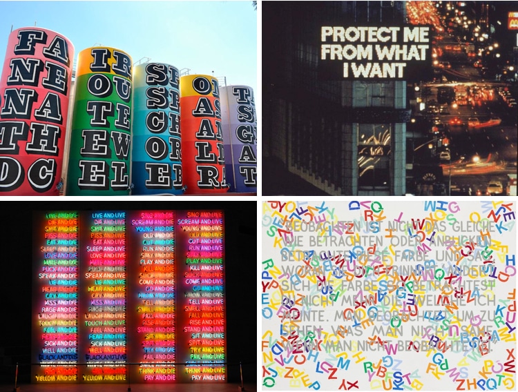
Jenny Holzer
An American artist of some renown, Jenny Holzer rose to fame in the early to late 1980s with her projection work, a new technology at the time.
She would use LEDs to broadcast messages in places like Times Square in New York City.
The themes of her work include the difficulties of modern life, religion, and gender.
She often used direct language combined with shocking phrasing to force her viewers to confront the day’s political issues.
She would often engrave poetic feminist statements and statements of individuality into stone benches made of serious mediums such as marble or spotted granite.
Typically, these are all caps, serif lettering in the form of a formal proclamation.
For example, one reads, “RAISE BOYS AND GIRLS THE SAME WAY.”
These public benches transform a public space into a site of artistic activism for Holzer.
Much of her work focuses on the ability to get a direct message out there.
Sean Landers
Some critics have described Sean Lander’s work as “cringeworthy, but in a challenging way.”
His 1990s ink-on-paper works reveal private, heartfelt confessions from the artist’s life.
For example, his misspelling of ‘threw’ as ‘through’ in one piece makes one feel the authenticity of his confession all the more, even while it lowers his credibility.
The art world can be a strange place. His work at times can be lewd and full of oversharing, such as mentioning his masturbation rituals in a 1993 work.
But these words do seem to serve a higher purpose – to reveal his authentic self, however still curated, directly to the observer.
Today, his recent work continues on the subject matter of aging and his potential for a lasting legacy.
It remains as confessional and open as ever.
Adam Pendleton
Adam Pendleton uses language as his primary means of artistic expression.
He is inspired by the dadaists and surrealists of the inter-war period to express his own concerns as a black American.
However, conceptual artists like Pendleton don’t always allow their work to be understood at first glance.
His work is contemporary, using silkscreens, ink, and spraypaints to throw up countless letters and messages on canvases.
A single word might be used repeatedly to make a point, or placed amongst many others in a state of flux.
Most of it is indecipherable, but the knowledge that a message is trying to convey meaning in the chaos is poignant.
His work is not always illegible, however, he has been known to use phrases from writers such as Gertrude Stein, who experimented extensively with repeated and repetitive language.
Also, the musician Sun Ra.
He often overlays a collage of strange backdrops to heighten the sense of layered meaning in his work.
He lets his thoughts be seen more clearly in some rare pieces, such as a 2015 piece in which the phrase “Black Lives Matters” appears clearly and boldly.
Christopher Wool
Christopher Wool is best known for his stark word paintings of black, stenciled letters on white canvas with strange juxtapositions of common words and sayings.
These famous works were produced in the late 1980s and are among his first works.
Since then, his style has evolved to include a strong sense of the liminal and erasure.
In some works, he combines painting techniques with gestures of erasure to create depth.
The canvas gains a new sense by layering sayings and their removal, often leaving ghostly impressions of previous phrases.
His paintings can often be seen as inviting you to guess at what is missing, defined by the erasures, and what is held back as they are by what remains.
Steve Powers
Stever Powers, also known as ESPO, has been using text in his works since his days as a graffiti artist.
Even his full-time studio artworks since 2000 still harken back his to graffiti roots.
His work tends towards vintage sign painting, celebrating a different time.
He uses clever wordplay to convey powerful messages in his work.
Working in Philadelphia in collaboration with Philadelphia Mural Arts, his large-scale project A Love Letter for You can be seen across 50 rooftops in the city, representing a large body of work.
His works tend to have uplifting messages meant to be both thought-provoking and optimistic.
Ben Eine
Another graffiti artist turned respected word artist, Ben Eine came to international acclaim when British Prime Minister David Cameron gifted then-President Barack Obama one of Eine’s paintings.
His precise creations look like real vintage sign work done to an extreme for the contemporary eye.
They are bold and usually colorful, sometimes with a clear message and other times without.
His popularity is of little surprise due to his statement pieces’ beauty and impact.
In addition, his typographic style is clearly influenced by both his street art and modern graphic design.
Hamish Fulton
An earlier artist of the period, London-born Hamish Fulton walked through the highly varied landscapes in countries such as Norway, Mexico, and Tibet in 1969 for inspiration.
He uses plain typography splayed over photographic images of the landscapes he walked to evoke a romantic, pastoral sense of place.
His solitary journeys are reflected in the landscapes through the use of his observations and emotions present in the text.
The central role of the landscapes interplays with the subtle textual elements to elevate the places into the realm of the personal while still capturing their natural quality.
His work has been displayed widely, included in major museum collections such as Tate Britain and MoMA.
Conclusion
Great art comes in all shapes and sizes.
Sometimes it is images, it is symbols, or it’s words.
At the end of the day, it is a matter of creating something great.
These artists all set out to say something.
Not just with words, but in general.
The reality is that they put in the time, though, and effort to make it work.
These amazing word artists are not just successful because of what they have to say.
Modern artists are successful because they know how to bring their visions to fruition and they do it very well.
Language is a powerful tool. And no one understands that better than artists who thoughtfully utilize text to make a statement and draw out emotion. By using text as the central communication vehicle in their artistic expression, these artists push forth letters, numbers, and words as their primary means to get out their message.
Of course, text and art have been intertwined for centuries—think of medieval illuminated manuscripts, with their elaborate illustrations. But things really took off in the 20th century. When Surrealist artist Magritte famously wrote “Ceci n’est pas une pipe.” (“This pipe isn’t a pipe.”) across his painting, he moved text to a central role in understanding the work. Cubists, such as Georges Braque, were also known for incorporating text into their artwork, often highlighting its graphic quality.
From the 1960s onward, a group of artists increasingly focused on text in their art. From projections to canvases, sculptures to public murals, the versatility—and power—of the written word forces the viewer to reflect. Clever word play, political activism, subversion of advertising, and appropriation of form are just some common characteristics of powerful text art. Scroll down to learn a little more about the masters who pioneered this art movement.
We look at 8 text artists who use words, letters, and numbers to give meaning to their art.
Barbara Kruger
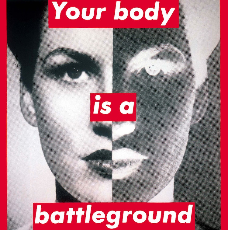
Untitled (Your body is a Battleground), 1989. The Broad, Los Angeles, California.

Untitled (I shop therefore I am), 1987. Modern Art Museum of Fort Worth, Fort Worth, Texas.
American conceptual artist Barbara Kruger’s work uses catchy phrases laid over images to challenge ideas of power, identity, and sexuality. Playing off sensational news headlines or advertising slogans, her work forces the viewer to explore their understanding of how these traditional media outlets skew our perceptions. “I work with pictures and words because they have the ability to determine who we are and who we aren’t.”
Jenny Holzer
New York City, 1985.
Siena, Italy, 2009.
Emerging in the 1980s, Jenny Holzer is known for her projections, which took advantage of what was new technology at the time. Her 1982 work in New York’s Times Square used LED to broadcast her messages to a wide audience. Recurring themes in her work are tribulations of modern life, as well as issues of religion and gender. Using direct language, and often juxtaposing shocking phrases, she forces the public to confront societal issues.
Ed Ruscha
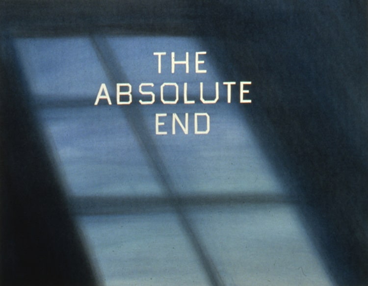
The Absolute End, 1982. de Young Museum, San Francisco, California.
Active since the 1960s, Ed Ruscha is often categorized as a pop artist. Based in Los Angeles, his work pulls through the ironies of life on the West Coast, often placing text over bright, vibrant color patterns or dramatic, cinematic backgrounds. Ruscha is also known for experimenting with unusual media, having used everything from chocolate syrup to blood in his artwork.
Christopher Wool
Apocalypse Now, 1988.
Based in New York and Marfa, Texas, Christopher Wool is best known for his series of black text rolled onto white canvases, which he produced in the 1980s. In fact, his work Apocalypse Now, sold at Christie’s for over $26 million in 2013. The bold letters, executed as stencils, were inspired by the graffiti Wool was seeing in New York City.
Bruce Nauman

The True Artist Helps the World by Revealing Mystic Truths. 1967. Philadelphia Museum of Art.
Multi-media artist Bruce Nauman works with video installation, performance, sculpture, and photography, but his most text-heavy works are his neon light sculptures. Focusing on semantics, his work often centers on how slight changes in words can have a fundamental effect on meaning. “Perception itself—the viewer’s encounter with his or her body and mind in relation to the art object—can be interpreted as the subject matter of Nauman’s work,” writes Nancy Spector, chief curator of the Guggenheim in New York.
Mel Bochner

If the Color Changes (#?), 1999.
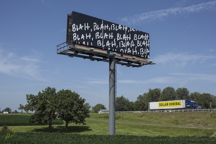
Blah, Blah, Blah, 2014. I-70 Sign Show, Hatton, Missouri.
Conceptual artist Mel Bochner has been active since the 1960s, starting practices that are now taken for granted, such as using gallery walls as a canvas for his work. A highly versatile artist, Bochner works with painting, installation art, and photography. His thesaurus paintings show overlapping synonyms executed in rainbow colors, while other pieces often take a single word, repeated for effect.
Steve Powers
Former graffiti artist Steve Powers, also known as ESPO, dedicated himself to full-time studio art in 2000, but his origins still shine through in his work. Showing influence from vintage sign painting, he uses clever wordplay both in public murals and his studio. His project A Love Letter for You saw him paint over 50 rooftop murals in Philadelphia in collaboration with Philadelphia Mural Arts. Often whimsical and thought-provoking, with an uplifting message, Powers plays off Philadelphia’s history of painted advertising.
Ben Eine
Berlin, Germany.
Capetown, South Africa.
Also moving from illegal graffiti writer to respected artist, Ben Eine was launched to international fame in 2010 after British Prime Minister David Cameron presented President Barack Obama with one of his paintings. He regularly works in both indoor and outdoor spaces, with his words often broken up along a grid system.
Related Articles:
Art History: What is Contemporary Art?
12 Contemporary Artists Tell Us What it Takes to Make a Great Piece of Art
Art History: Exploring the Avant-Garde Art of Surrealism
Incredible Bronze Hand Sculptures by Bruce Nauman
Art
Alina Cohen
Most of us are so used to reading that we forget each letter is a shape and each word its own composition. There’s a significant aesthetic dimension to the writing we read daily—in emails and books, on packaging and signs—and so it makes sense that visual artists have co-opted graphic design and typography strategies for their own philosophical ends.
Using language, artists transform a basic communication tool—the alphabet—into unique provocations. Language is also particularly malleable, cost-free, and renewable. “There’s a million different ways artists can use it,” said Jewish Museum curator Kelly Taxter. “Often, it’s artists who work with issues of politics or social justice.” Just as artists are still finding new ways to manipulate paint, canvas, and space, they’re constantly developing fruitful new reasons to turn words into art.
Jenny Holzer
Jenny Holzer
All Fall Text: Truisms, 1977-79 (in English and Spanish); Living, 1980-82 and Survival, 1983-85, 2012
Sprüth Magers
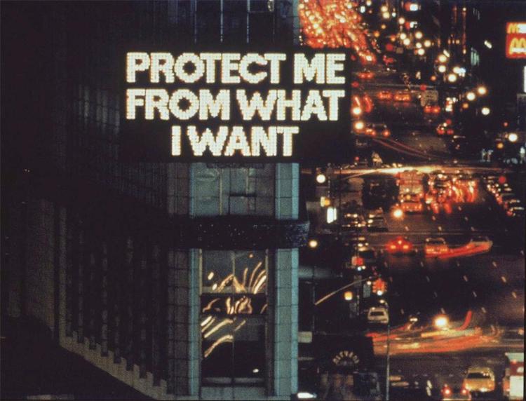
Jenny Holzer turns common public objects into subversive artworks bearing powerful words. She engraves poetic statements about power, feminism, and individual agency into benches made from streaked Carrara marble, spotted granite, and royal blue-tinged sodalite. Holzer renders her phrases in all-caps and serif lettering, turning them into monumental proclamations: “PROTECT ME FROM / WHAT I WANT,” “IT IS IN YOUR SELF-INTEREST / TO FIND A WAY TO BE VERY TENDER,” “RAISE BOYS AND GIRLS THE SAME WAY.” They become creative mandates in shared spaces and benevolent counterpoints to state directives.
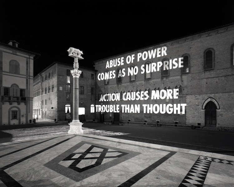
If Holzer’s benches transform public park fixtures into artistic media, her LED banners co-opt a structure associated with commerce and advertising. On screens that would typically promote sales, company names, or stock market updates, Holzer broadcasts punchy phrases such as “DON’T TALK DOWN TO ME” or “WITNESS,” along with longer, looping messages. The artist often repurposes her poetic phrases, or “Truisms,” building their power through repetition. (One of Holzer’s most famous messages, “ABUSE OF POWER COMES AS NO SURPRISE,” has been readopted as a protest mantra in the #MeToo era.)
“I like placing content wherever people look,” Holzer told fellow artist Kiki Smith in a conversation for Interview Magazine, “and that can be at the bottom of a cup or on a shirt or hat or on the surface of a river or all over a building.” Holzer turns the public realm into her exhibition space, gifting her thoughtful poetry to anyone who wants to sit or read a sign.
Mel Bochner
Many artists working with words offer profound written statements in their work. Mel Bochner’s most famous pieces, in contrast, simply read “BLAH / BLAH / BLAH.” The artist plasters the essentially meaningless phrase on billboards and jams it in block letters across brightly colored paintings. The artist seems most interested in highlighting the banalities of contemporary communication. A 2017 monoprint, for example, juxtaposes collaged phrases such as “OH WELL, THAT’S / THE WAY IT GOES,” “IT IS WHAT IT IS,” “WHAT CAN YOU DO?” and “SHIT HAPPENS.” Bochner elevates non-committal conversations and bromides to fine art. Reading them, the viewer can feel a little indicted. Who hasn’t leaned on some of those clichés when making small talk?
In another series, Bochner renders a group of synonyms—for words like “money,” “obscene,” “obvious,” or “amazing”—in rows. The viewer is forced to consider both the subtleties of language and the garishness of English: We have an awful lot of ways to discuss commerce and convey hyperbole. Bochner’s style amplifies this sense of ornamentation; exclamation points and bright oranges, yellows, and reds abound.
Ed Ruscha
Ed Ruscha
Mocha Standard Station, 1969
Hamilton-Selway Fine Art
Ed Ruscha’s iconic photography series “Twentysix Gasoline Stations” (1963) captured the signage and architecture of 26 gas stations between Los Angeles and Oklahoma City. Ruscha developed a new mythology about the American West as he emphasized the roadside signs that populated it. Though the pictures are, ostensibly, of buildings, nearly all of them contain words: “Conoco,” “Texaco,” “Stop/Save,” “Say Fina,” “Cafe,” “Mobil Service,” “Navajo Rugs,” “Beer & Liquors.” In fact, such phrases become inextricable from the landscape itself.
The series laid the groundwork for Ruscha’s career: Over the past five decades, he’s continued to link language and the environment. A painting from 1989 juxtaposes the phrase “Safe and Effective Medication” with a picture of dark clouds. In more recent work, the titular expressions “Pay Nothing Until April” (2003), “Wall Rockets” (2000), and “History Kids” (2009) overlie painted, craggy mountains. Viewers consider the association—or lack thereof—between the different elements as they wonder what any of those obscure phrases actually mean. Typography itself becomes as integral to a work’s mood as color or composition—Ruscha’s angular, thin, white lettering in all-caps is simultaneously delicate and declarative, mechanical and strange. It’s Ruscha’s own font, which he calls Boy Scout Utility Modern.
Sean Landers
According to writer Mark Prince, Sean Landers’s art has “always been embarrassing.” Landers conflates painting and drawing to indulge a diaristic impulse, using his art to share cringeworthy confessionals. On a 1990 ink-on-paper work titled Ouch, he made public such private musings as “I wonder what it is about Hellen that through [sic] me for a loop? Shouldn’t I be used to heartache by now?” and “I really do fear that this may be the stupidest body of work that I’ve ever embarked on.” In the sprawling [sic] (1993), Landers gets more graphic, wondering if he is “deluded enough to think that my jerking off in my studio was something higher than what it is.”
Newer paintings, from 2017, resemble doodles on canvas.Flicker Dimming Protocols features the artist’s first name in cursive; sketches of a dog, skeleton jester, and robot; and scribbled, melodramatic text: “youth passes so fast” and “Ageing is the penultimate / content of art / death is the ultimate.” In other works, he paints tree trunks that have been gouged with words, like “I Made Art → Lots of Art → Most of it Good → Some of it Very Good → And I Hope Everlasting.”
Adam Pendleton
Adam Pendleton
If the function of dada, 2017
Galerie Laurent Strouk
Adam Pendleton’s raw material is language, but the artist often doesn’t care if his words make clear sense. His broad project “Black Dada,” which he began in 2008, co-opts the dreamlike, nonsensical aesthetics of European inter-war artists like Kurt Schwitters, Max Ernst, and Salvador Dalí, repurposing them for Pendleton’s own concerns as a black American. In his 2017 painting If the function of dada, for example, Pendleton silkscreens, inks, and spray-paints so many black letters against his white canvas that the viewer struggles to decipher any messaging. It’s a perfect strategy to convey contemporary dissonance and chaos.
Not all of Pendleton’s work with text, however, is illegible. He’s appropriated phrases from writer Gertrude Stein, artist Ad Reinhardt, and musician Sun Ra, and frequently overlaid varying backdrops (photographs of bricks or an African mask) with the word “INDEPENDANCE.” For the 2015 Venice Biennale, he created large-scale wall works for the Belgian pavilion that replicated the words “Black Lives Matter” in a loose, graffiti-like scrawl.
Kay Rosen
Kay Rosen
Something Happened, 2017
Krakow Witkin Gallery
Using stencils of generic fonts, Kay Rosen paints words and phrases on gallery and museum walls, and also projects them onto façades. “ADD AND END,” she tells us in a bright mix of primary colors (Happy Ever After, 1994/2016). “JUMBO MUMBO,” she says, in blue-and-black lettering (Big Talk, 1985/2017). The titles infuse the works with additional humor. “The linguist in me wanted meaning to be carried by the structure of the words, not type style; the inner painter insisted that color convey meaning; the sculptor in me obsessed about the construction of letterforms through materials and process,” she wrote in Art in America in 2014. “Visual consistency gives text authority—which is the fundamental lesson I learned at my publishing day job.”
Rosen’s work is often about concrete poetry and wordplay. In fact, some of her canvases read as rebuses. Head Over Heels (2016), for example, features the words “fall over” toppling sideways—you might also read the text as “fal lover,” turning the title into a double entendre about both form and romance.
Jason Rhoades
In the late Jason Rhoades’s installations, neon words hang from the ceiling-like linguistic confetti suspended in space. His work literally lights up the gallery space with riotous, evocative slang. In My Madinah. In pursuit of my ermitage… (2004), for example, all 240 phrases refer to female genitalia. Visitors walk under a tangle of language that includes “Cock Alley,” “Cooze,” “Fuzz Box,” “Private Property,” “Ginger,” and “Fluttering Love.” Underneath lie overlapping towels, suggesting a Muslim place of worship. With his title, Rhoades indicated that the terms—and the female body itself—added up to a pseudo-religion for him. (Objectifying? Probably. But 2004 was…a different time.) In another work, Fuzzy Puddle/Turkey Beard (2003), the titular phrases appear in orange neon against a black sign. The latter hangs upside down. Lingerie lace loops over the bright, cursive wording—just in case the viewer couldn’t already guess what particular anatomy the phrases refer to.
Erica Baum
Erica Baum, excerpts from Dog Ear, 2016. Courtesy of Ugly Duckling Presse, Brooklyn, NY.
Erica Baum doesn’t choose the words that she includes in her “Dog Ear” series, per se. In close-cropped photographs, the artist captures a dog-eared book’s page and the one hiding behind it. The viewer sees two separate triangular sections of text, one laid atop another in a square format. Neither the photographs nor their titles disclose the source material. In Enfold (2013), the dog-eared page simply reads “A,” while the page behind offers a kind of fragmented nonsense poem: “a wave would be hear / to enfold the note / spraying its foa / music. I gre / my thing / struck / in.” Viewers must choose to read the words and guess at the larger story. Alternately, they can opt not to read at all, and simply look at each work as a group of black forms against light pages. The letters become secondary to the concept: Baum’s work captures the physical evidence of reading—folded pages signify that readers have temporarily abandoned their books as they return to real life.
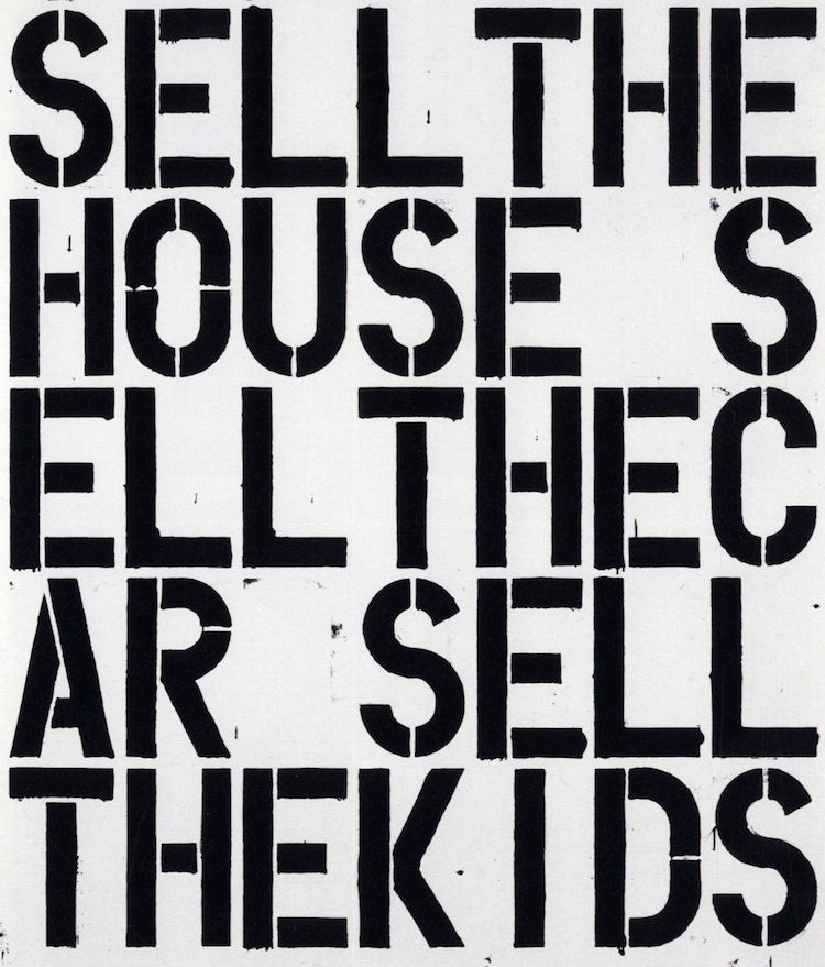
Christopher Wool
Christopher Wool
PARANOIAC from the Black Book, 1989
Winston Wächter Fine Art
According to legend, Christopher Wool developed the idea for his word paintings in 1987, after seeing graffiti scrawled in black lettering across a delivery truck. His subsequent canvases embrace their gritty conceptual origins. Across stark white backgrounds, he uses stencils to create blocky black letters, detached at their joints, erratically spelling out “Sell the House, Sell the Car, Sell the Kids” (a line from the film Apocalypse Now) or “TR/BL” (“trouble” with the vowels removed). Broken up into lines and curves, the letters become both heavy compositional elements and potential vehicles for additional meaning.
Yet given the limited palette and lack of any other context, the words stop short of real significance—“leached…of personality,” as Peter Schjeldahl wrote in a 2013 review of Wool’s Guggenheim retrospective. For the New York Times, Roberta Smith concluded: “These paintings conflate the act of seeing, reading and even speaking as you tease and sound out the meanings of their run-on or awkwardly broken words.” Time Out situated the work in a particularly historical context, asserting that Wool’s language “seemed to encapsulate a collective mood of foreboding and unease brought on by the Reagan administration and the various disasters—the AIDS crisis, the 1987 stock market crash, the savings and loan scandal—it left in its wake.”
Guerilla Girls
The anonymous collective Guerilla Girls fits into a rich tradition of protest artists who employ words for explicitly political ends. In particular, the group uses language to reconsider gender discrimination and violence. “What do these men have in common?” one of their 1995 posters asks. Below the bold black wording, photographs of O.J. Simpson and minimalist artist Carl Andre appear. The answer to their provocation? The state accused both men of murdering women (Simpson: his ex-wife Nicole Brown Simpson; Andre: his wife Ana Mendieta). Both enjoyed acquittals and avoided jail time. The Guerilla Girls discuss the prevalence of domestic violence beneath the pictures. They also include a tagline at the bottom: “A public service message from Guerilla Girls conscience of the art world.”
Another famous work, Do Women Have to Be Naked to Get Into the Met Museum? (1989), critiques the lack of art by female practitioners in major institutions. Across the Guerilla Girls’s oeuvre, wry ideology becomes an art form. Their messaging—and its situation within the institutions it critiques—supersedes all other aesthetic concerns.
EJ Hauser
EJ Hauser, blue mountainbed, 2018. Courtesy of Derek Eller Gallery.
EJ Hauser, the second garden secret, 2018. Courtesy of Derek Eller Gallery.
From 2008 to 2012, EJ Hauser used newsprint as a backdrop for her drawings. Up-to-the-minute writings about the world became literal foundations for the artist’s gestural marks. Hauser explicitly linked abstraction with earthly concerns, arguing against claims that non-figurative work is divorced from reality. In halted attempt at terrorism, white swishes of oil paint overlay text about a civilian-thwarted attack. In laker, a shower of vaguely patriotic red, white, and blue brushstrokes obscure the faces of two basketball players. The sports section, ostensibly, is just as good a background as the international pages.
For a 2013 painting, forget-me-not three, Hauser painted her own text to undergird ambiguous black shapes. Beneath lines, circles, and a pair of cartoonish legs, the viewer can just make out the titular phrase, “forget me not.” Written in off-white against a pale background, the words already look endangered, as though their disappearance and erasure is imminent.
In a body of work now on view at Derek Eller in New York, Hauser uses text as scaffolding for her images: Look closely at her marks and you’ll find the backbones and curves of various letters, jumbled together to eliminate the boundary between word and picture.
Barbara Kruger
Barbara Kruger co-opts the format of magazine advertisements in her prints, photographs, and silkscreens. They overlay black-and-white pictures (often of women) with white text inside red banners (“Your body is a battleground,” most famously). Commerce and feminism mingle uncomfortably: Kruger’s art often calls attention to the way that corporations, mass media, and the government attempt to control women. All the works feature a Futura typeface, turning the artist’s oeuvre into its own subversive brand.
It’s no surprise that Kruger began her career as a graphic designer. In the 1960s, she worked for Condé Nast’s women’s magazine Mademoiselle. Yet as an artist, she’s been able to significantly expand her palette. Her large-scale installations have grown to cover the walls, floors, and sometimes even ceilings of rooms at museums and galleries, immersing viewers in her loud, bold language.
Lawrence Weiner
Art historians consider Lawrence Weiner one of the forerunners of Conceptual art. The artist is best known for rendering text directly on walls, letter by letter, often in his own invented sans serif font, Margaret Seaworthy Gothic. Flat against the wall, the phrases lack the objecthood that’s often an artwork’s prerequisite.
Despite lacking accompanying imagery, Weiner’s word art frequently evokes distinct settings and things. Stones skipped across the bay of Naples (2009) or Stacks of Severed Trees Laid Beside a Fissure in the Earth (2007), for example, suggest artworks and arrangements never made, just considered. As viewers read the piece, they complete Weiner’s projects themselves—conjuring a mental images of what he has merely described.
Alternately, other Weiner pieces focus on a sense of space. Raised High Above (2018) or The Right Thing in The Wrong Place (2016), for example, evoke more ambiguous objects and agency—who did the raising, or put something where it wasn’t supposed to be? “He has experimented with how language can perform as a public artwork, as a sculpture,” Taxter said. According to her, his work asks “Who owns what phrases?” New York’s new, as-yet-unfinished multidisciplinary arts center The Shed recently commissioned Weiner to make work for the entry pavilion. His two lines of text read “IN FRONT OF ITSELF”—one facing the building, and one facing away from it.
AC

Text: Ralf Borlinghaus | Section: Articles by Artists
Strong Words
In themselves, words are symbols that regain their meaning through the reader. Here, the words are ascribed a specific meaning at the outset.
In the category Strong Words, the individual concept (for example Success and Freedom) provides the point of departure from which we seek a formative, pictorial interpretation. It attains resolution when, out of the abstract letters, a concrete image arises that interprets the meaning of the word in some possible manner.
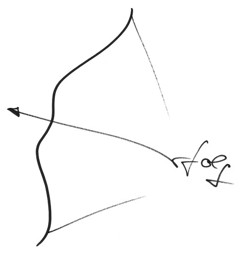
Example 1: Success (Erfolg)
The series of letters creates an arch, on which an arrow is strung, ready to be shot off. The arch and the arrow are both formed by the letter E, the vanes through the letters r-f-o-l-g. The word image that arises depicts success as the result of action with a purpose.
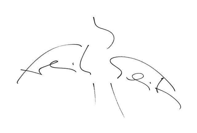
Example 2: Freedom (Freiheit)
Freedom is interpreted as a bird rising into the air in flight. The wings and torso are formed by the series of letters f-r-e-i-h and h-e-i-t. Body and tail feathers are marked by three additional strokes. The flying bird is universally understood to stand symbolically for freedom.
City Symbols
Cities are like people. They have a face and a character. Many have a relatively generic face, while others are quite individual.
In these city symbols, the name is graphically associated with one or more particularities of the city in question. This comes about through the modification of certain letters and/or graphic augmentation. Anyone familiar with the town recognises it at once; the stranger becomes curious.
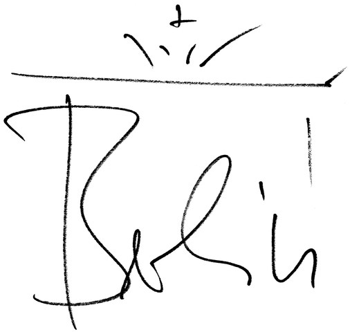
Example 3: Berlin
Berlin appears with its landmark, the Brandenburg Gate. Through the lettering B-e-r-l-i-n, the columns of the monument are represented; the right column, the architrave and quadriga are indicated by graphic augmentation.
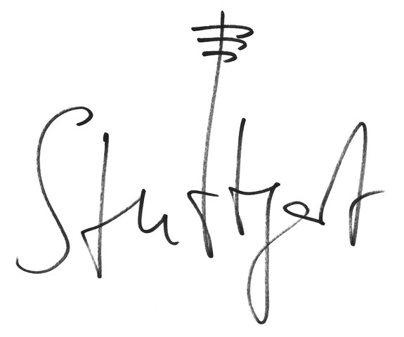
Example 4: Stuttgart
In the case of Stuttgart, three subtle strokes through the extended letter t suffice to remind the viewer of the television tower as the city’s landmark.
Portraits
Every person has his or her own unique handwriting. Many leave behind their signature in time and history for all to see.
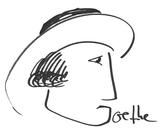
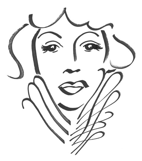
The portraits of outstanding personalities in political and economic life, art and religion permeate all boundaries between the various spheres of life. Either an individual letter becomes the graphic focal point around which the portrait comes about (Goethe), or all of the letters of the name are its formative elements (Marlene). At times the personality might be sketched by a single characteristic gesture or situation. Within this category, Word Art steps across the line which separates it from caricature or cartoon.
Example 5: Goethe
The letter G provides the framework for Goethe’s profile, based on Tischbein’s famous painting Goethe in der Campagna.
Example 6: Marlene
With Marlene Dietrich, all the letters are integrated into the portrait: while the face is fashioned from the letter a, the letters m, r-l-e-n-e form the collar. The hair falling down the sides is added by two wavy lines.
Political Art
The human being is a political animal. So is Word Art.
From the beginning, the written word was at the same time political. One need think only of the Codex Hammurabi as one of the earliest sources of writing in history. Politics is likewise inherent to Word Art. Through the combination of word and image, strong aesthetic statements can arise.
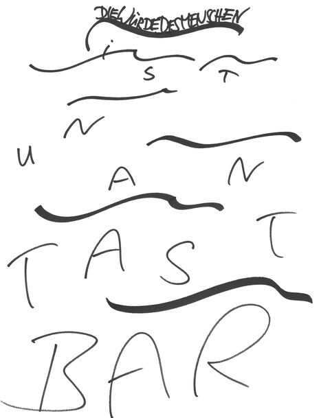
Example 7:
The Dignity of Man is Inalienable (Die Würde des Menschen ist unantastbar). The letters comprising Article 1 of the Basic Law of the Federal Republic of Germany in this graphic representation show, uppermost and in the distance, a group of tightly packed refugees on a life raft, indicated by a wavy line. In the water, there drift about individual refugee-letters between waves that grow larger and more threatening as they approach the viewer.
(Ver-)Dichtung (Poetically condensed)
What pleases our culinary taste applies likewise to poetry: the eye eats, or in this case, reads, together with us.
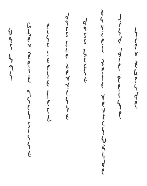
Example 8: Time and Tide (Zeit & Reim)
Like a sheet of water, the text trickles down before the eye and tranquilises the beholder: whatever one may think about time / one thing is sure / that it trickles away / that not too much time be wasted / here the rhymes are ended. (“was man über Zeit auch sinnt / eins steht fest / dass sie zerrinnt / dass nicht zuviel Zeit verschwände / sind die Reime hier zu Ende.”)
What is Word Art?
Prologue
In the beginning was the Word. Here it becomes Art.
The thought condenses to the word.
The digital word easily mutates into twittering.
Handwriting binds the word back to the person.
To write words by hand, we term the Art of Writing.
To give the word meaning through writing is Word Art.
Word Art as Hieroglyph
Before the human being described (wrote) the world, he drew or painted it, after which he abstracted the image to letters and finally to the printed word – a process which repeats itself in every human being right to the present day. From that point on, painting and writing go separate ways. And where image and text meet, the image either serves to illustrate the text or the text to describe the image.
Word Art, as I understand it, re-unites drawing and writing, inasmuch as it – now contrary to its original trend – creates the image out of letters and words. The result once more becomes the hieroglyph, the Word Image (for example Dolphin)
Example 9: Dolphin (Delphin)
Word Art as Composition
Written words turn into sentences and these ultimately to text. Written text finds its equivalent in music in the musical score. They have in common that they codify their content and require expert decoding that they may cause to resound again for those unacquainted with writing or music. We call this reciting, reading aloud, playing or singing. Those with the knowledge are able to understand or hear text or sheet music silently in their mind, without recourse to outer sounds. To illustrate musical notes in colour adds nothing of significance, so that text and music are generally written in black.
Overall in human culture, the technique of reading and writing is today more widespread than that of composition, despite the fact that the former is both more abstract and freer. In his score, the composer sets the musician exact guidelines and carefully notes how he would like to have his music played: beat, key and tempo, piano or forte, crescendo or decrescendo, not to speak of instrumentalisation. This kind of concrete interpretation in music we generally find only in the director’s notes of a playwright for performing his play.
Mostly text is far less definite, as compared to musical notation. The many different possibilities we have in writing text are rather illustrative. The meaning ascribed to it by the author does not become apparent by the layout of the text itself but rather from the context in which the writer places it. For example, the word “love” in itself, as it is written here, can mean a number of things: joy, passion, mourning, jealousy, loss, care… These meanings are interpreted by the reader in accordance with his mood immediate situation. Should the author wish to have the word understood in a particular way, he must surround it with additional words, so that the reader understands the word in this specific sense.
Love, expressed as a musical chord, guides the contextual associations of the hearer in the intended direction, so that he or she can react solely with either sympathy or dislike, should the passion in the music not accord with the feeling of sadness he is experiencing in the moment. In this lies the close association of Word Art with music. Word Art gives to the single word (for example: Love) through its connotation a concrete interpretation that the viewer is immediately able to associate with it, or respectively, a sound whose mood he can immediately sense. Tone and colour of the concept originate in the head, so that for Word Art, simple black and white may suffice.
Example 10: Love (Liebe)
Word Art as Protestantism
The visual arts were originally practised as craft and as divine service, the identity of the artist shrouded behind the work. During the Renaissance and the changeover from the Middle Ages to modern times, art emancipated itself from religion and rapidly became worldly. The emerging Middle Class, wishing to celebrate itself, in the absence of photography, commissioned the painter for portraits representing and documenting their status. It was not only through conquest, trade and science that modern Mankind made the world his own; also the artist, in the course of the following epochs, painted his way through and into our present time the culmination of our view of the world – passing through the Baroque, through Classicism, Romanticism, Realism, Impressionism, Expressionism, Cubism, Futurism, Surrealism, Postmodernism …
The relentless disempowerment of Church and Priesthood left a gap into which art positioned itself. Adoration of the Saint transformed itself into the cult around the Artist. Works of art are collected like holy relics and change hands at astronomical prices. Cathedrals and monstrances have transformed into museums and galleries, in which visitors devotedly wander in search of edification, only to be left mystified. For, like the decadence of the pre-Reformation Papacy, its promise of salvation is repeated in the current behavior of the art market. The Avant Garde long ago left behind the parish and has turned its back on it. It has become – though incomprehensible and crude, a mere hocus pocus celebrating its own individualism, demanding from the needy in search of art an obtuse faith rather than mature aesthetic participation. They speak to the illiterate in the same content that gives the educated something to think about for the rest of their lives.
In the face of this, Word Art is the protestant. It causes a thought to resound pictorially. It does not turn its back on the public but meets it as an equal. The reading viewer finds him or herself addressed aesthetically through a word or a sentence and reacts autonomously, with independent judgement and personal thoughts and feelings, with acceptance or rejection.
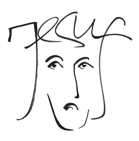
Example 11: Jesus
Word Art as Minimalism
Anything that can be written can become the object of Word Art. The entire spectrum of human reality, from cheerful to serious, superficial to profound, philosophical to political etc. can be portrayed through it. In doing so, Word Art is ever wakeful for that magic moment of intuition, in which the head, the heart and the stomach meet and can assist the concept, through writing and drawing, to find aesthetic expression. The actual process is reduced to a few strokes, so that only in the oscillation between thinking and perception on the part of both the producer and the recipient, the entire picture becomes manifest.
Example 12: Sex
www.wortkunst-grafik.de
Introduction by the Editor
Ralf Borlinghaus, the originator of Word Art, claims it is an art form in which word and art, Logos and aesthetics, knowledge and perception, enter into a symbiotic relationship with one another. Word Art demands that it be thoughtfully perceived or perceived thinkingly. How, in that case, does Word Art find its appropriate place in w/k?
In the domains Articles by Artists, Interviews, Articles about Artists and Art Theory this online journal focuses on the connection between Science and the visual arts whereby, in regard to the individuals involved, it differentiates between three forms: the border crosser between science and art, the science-related artist and the collaboration between at least one artist and one scientist. The editorial board, however, also permits presentations of borderline projects of other kinds.
Such a borderline project is Word Art: Borlinghaus’ aim is primarily to re-establish the innate connection between the written and the pictorial and to interpret this anew. In the context of that which w/k generally publishes as the connection between Science and the visual arts, one may here speak of a connection between literature and visual arts.
The works of Word Art shown in the following passage are all Graphics. They stem from Ralf Borlinghaus and may be viewed on www.wortkunst-grafik.de. As the pictures have been scanned, the usual note in w/k, “Foto: XY”, is absent.
The artist Ralf Borlinghaus sees himself as a spiritual scientist and artist – which might be viewed a playing field for a cross-border commuter. In the following w/k contribution, he introduces us to Project Word Art.
With currently about 230 graphics, Word Art has been around since 2013. They are presented on the website www.wortkunst-grafik.de in five categories.
Post-edit by the w/k editorial team: reflecting on the article
According to the claim of its author Ralf Borlinghaus, word art is an art form in which word and art, logos and aesthetics, knowledge and perception are symbiotically connected: Word art should and wants to be considered in reflectively. How can this project be positioned within w/k?
In the sections artist contributions, artist contributions, and interviews, the online journal focuses on connections between science and the visual arts, distinguishing three forms in relation to individuals: the border crosser, the science-related artist, and the cooperation between at least one scientist and at least one artist. At the margins of both areas the editors also allow presentations of other types of interface projects. Such an interface project is word art: Borlinghaus’s main concern is to link up with the original connection between the written and the pictorial and to reinterpret it. In relation to the connections between science and the visual arts, which are dealt with primarily in w/k, one can speak here of a connection between literature and the visual arts. The word artist Ralf Borlinghaus sees himself as a humanities scholar and artist – this can be understood as a special variety of the border crosser.
The word art works shown in the article are graphic works. They are all mady by Ralf Borlinghaus and are accessible on the artist’s website.
Image above text: Ralf Borlinghaus: Wortkunst (Word Art) (2013). Felt-tip pen on upright A3 Canson Paper.
How to cite this article
w/k-Redaktion (2019): Word Art: A New Art Form. w/k–Between Science & Art Journal. https://doi.org/10.55597/e3980
Download as PDF
From Wikipedia, the free encyclopedia
Not to be confused with the Microsoft product, WordArt, or the graphic design method also called text art, ASCII art.
Word art or text art[1] is a form of art that includes text, forming words or phrases, as its main component; it is a combination of language and visual imagery.[2]
Overview[edit]
There are two main types of word art:[2]
- One uses words or phrases because of their ideological meaning, their status as an icon, or their use in well-known advertising slogans; in this type, the content is of paramount importance, and is seen in some of the work of Barbara Kruger, On Kawara and Jenny Holzer’s projection artwork called «For the City» (2005) in Manhattan.
- In the other kind of word art, as exemplified by the word paintings of Christopher Wool, text forms the actual artistic component of the work.[2]
The style has been used since the 1950s by artists classified as postmodern, partly as a reaction to abstract art of the time. Word art has been used in painting, sculpture, lithography, screen-printing and projection mapping, and applied to T-shirts and other practical items.[2] Artists often use words from sources such as advertising, political slogans and graphic design, and use them for various effects from serious to comical.[3]
Artists[edit]
Other artists whose work is known for using text include Jasper Johns, Robert Indiana, Shepard Fairey,[2] Mel Bochner, Kay Rosen, Lawrence Weiner, Ed Ruscha and the collective Guerrilla Girls, whose work conveys political messages in the tradition of protest art.[4] Australian artists include Abdul Abdullah, Kate Just, Anastasia Klose, Sue Kneebone,[3] and Vernon Ah Kee.[5]
Hong Kong artist Tsang Kin-Wah’s work, which includes video installations, incorporates word art to express emotions and ideas, for example in Untitled-Hong Kong (2003-2004), which mixes bad language with pretty floral patterns based on William Morris designs.[6]
Exhibitions[edit]
A 2018 exhibition held simultaneously at Subliminal Projects (which was co-founded by Fairey) in Los Angeles and Faction Art Projects in New York featured the word art of Holzer, Ruscha, Guerrilla Girls and Betty Tompkins as well as younger artists like Ramsey Dau and Scott Albrecht.[1]
Also in 2018, an exhibition called Word in the Hugo Mitchell Gallery in Adelaide, South Australia, featured the work of Just, Abdullah, Klose, Kneebone, Alice Lang, Richard Lewer, Sera Waters, and many others.[3]
See also[edit]
- Kinetic typography – animations involving moving text
References[edit]
- ^ a b Benson, Louise (11 September 2018). «Celebrating the Provocative Power of Text Art». Elephant. Retrieved 19 May 2021.
- ^ a b c d e «Word Art: Text-based Painting, Prints, Sculpture». Art Encyclopedia. Visual-Arts-Cork.com. Retrieved 19 May 2021.
- ^ a b c Sigglekow, Zara (30 August 2018). «Artists use text in Word». Art Guide Australia. Retrieved 19 May 2021.
- ^ Cohen, Alina (5 January 2019). «13 Artists Who Highlight the Power of Words». Artsy. Retrieved 19 May 2021.
- ^ «Ah Kee , Vernon — Austracism». National Gallery of Australia. Retrieved 19 May 2021.
- ^ «Tsang Kin-wah And The Organic Necessity Of Art». Culture Trip. 11 July 2019. Retrieved 19 May 2021.