
IMPORTANT: Ideas in Excel is now Analyze Data
To better represent how Ideas makes data analysis simpler, faster and more intuitive, the feature has been renamed to Analyze Data. The experience and functionality is the same and still aligns to the same privacy and licensing regulations. If you’re on Semi-Annual Enterprise Channel, you may still see «Ideas» until Excel has been updated.

Analyze Data in Excel empowers you to understand your data through natural language queries that allow you to ask questions about your data without having to write complicated formulas. In addition, Analyze Data provides high-level visual summaries, trends, and patterns.
Have a question? We can answer it!
Simply select a cell in a data range > select the Analyze Data button on the Home tab. Analyze Data in Excel will analyze your data, and return interesting visuals about it in a task pane.
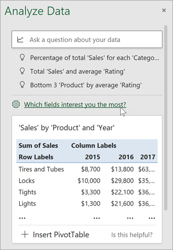
If you’re interested in more specific information, you can enter a question in the query box at the top of the pane, and press Enter. Analyze Data will provide answers with visuals such as tables, charts or PivotTables that can then be inserted into the workbook.
If you are interested in exploring your data, or just want to know what is possible, Analyze Data also provides personalized suggested questions which you can access by selecting on the query box.
Try Suggested Questions
Just ask your question
Select the text box at the top of the Analyze Data pane, and you’ll see a list of suggestions based on your data.

You can also enter a specific question about your data.

Notes:
-
Analyze Data is available to Microsoft 365 subscribers in English, French, Spanish, German, Simplified Chinese, and Japanese. If you are a Microsoft 365 subscriber, make sure you have the latest version of Office. To learn more about the different update channels for Office, see: Overview of update channels for Microsoft 365 apps.
-
The Natural Language Queries functionality in Analyze Data is being made available to customers on a gradual basis. It may not be available in all countries or regions at this time.
Get specific with Analyze Data
If you do not have a question in mind, in addition to Natural Language, Analyze Data analyzes and provides high-level visual summaries, trends, and patterns.
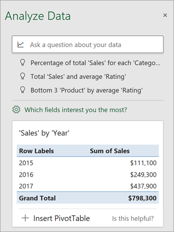
You can save time and get a more focused analysis by selecting only the fields you want to see. When you choose fields and how to summarize them, Analyze Data excludes other available data — speeding up the process and presenting fewer, more targeted suggestions. For example, you might only want to see the sum of sales by year. Or you could ask Analyze Data to display average sales by year.
Select Which fields interest you the most?
Select the fields and how to summarize their data.
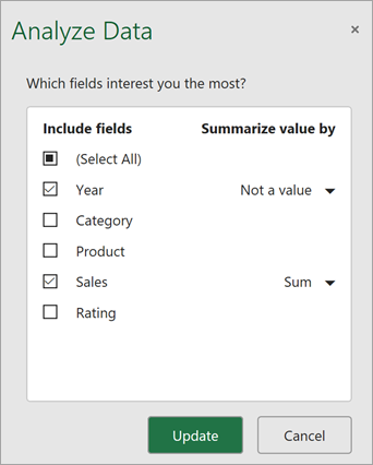
Analyze Data offers fewer, more targeted suggestions.
Note: The Not a value option in the field list refers to fields that are not normally summed or averaged. For example, you wouldn’t sum the years displayed, but you might sum the values of the years displayed. If used with another field that is summed or averaged, Not a value works like a row label, but if used by itself, Not a value counts unique values of the selected field.
Analyze Data works best with clean, tabular data.
Here are some tips for getting the most out of Analyze Data:
-
Analyze Data works best with data that’s formatted as an Excel table. To create an Excel table, click anywhere in your data and then press Ctrl+T.
-
Make sure you have good headers for the columns. Headers should be a single row of unique, non-blank labels for each column. Avoid double rows of headers, merged cells, etc.
-
If you have complicated, or nested data, you can use Power Query to convert tables with cross-tabs, or multiple rows of headers.
Didn’t get Analyze Data? It’s probably us, not you.
Here are some reasons why Analyze Data may not work on your data:
-
Analyze Data doesn’t currently support analyzing datasets over 1.5 million cells. There is currently no workaround for this. In the meantime, you can filter your data, then copy it to another location to run Analyze Data on it.
-
String dates like «2017-01-01» will be analyzed as if they are text strings. As a workaround, create a new column that uses the DATE or DATEVALUE functions, and format it as a date.
-
Analyze Data won’t work when Excel is in compatibility mode (i.e. when the file is in .xls format). In the meantime, save your file as an .xlsx, .xlsm, or .xlsb file.
-
Merged cells can also be hard to understand. If you’re trying to center data, like a report header, then as a workaround, remove all merged cells, then format the cells using Center Across Selection. Press Ctrl+1, then go to Alignment > Horizontal > Center Across Selection.
Analyze Data works best with clean, tabular data.
Here are some tips for getting the most out of Analyze Data:
-
Analyze Data works best with data that’s formatted as an Excel table. To create an Excel table, click anywhere in your data and then press
 +T.
+T. -
Make sure you have good headers for the columns. Headers should be a single row of unique, non-blank labels for each column. Avoid double rows of headers, merged cells, etc.
 +T.
+T.Didn’t get Analyze Data? It’s probably us, not you.
Here are some reasons why Analyze Data may not work on your data:
-
Analyze Data doesn’t currently support analyzing datasets over 1.5 million cells. There is currently no workaround for this. In the meantime, you can filter your data, then copy it to another location to run Analyze Data on it.
-
String dates like «2017-01-01» will be analyzed as if they are text strings. As a workaround, create a new column that uses the DATE or DATEVALUE functions, and format it as a date.
-
Analyze Data can’t analyze data when Excel is in compatibility mode (i.e. when the file is in .xls format). In the meantime, save your file as an .xlsx, .xlsm, or xslb file.
-
Merged cells can also be hard to understand. If you’re trying to center data, like a report header, then as a workaround, remove all merged cells, then format the cells using Center Across Selection. Press Ctrl+1, then go to Alignment > Horizontal > Center Across Selection.
Analyze Data works best with clean, tabular data.
Here are some tips for getting the most out of Analyze Data:
-
Analyze Data works best with data that’s formatted as an Excel table. To create an Excel table, click anywhere in your data and then click Home > Tables > Format as Table.
-
Make sure you have good headers for the columns. Headers should be a single row of unique, non-blank labels for each column. Avoid double rows of headers, merged cells, etc.
Didn’t get Analyze Data? It’s probably us, not you.
Here are some reasons why Analyze Data may not work on your data:
-
Analyze Data doesn’t currently support analyzing datasets over 1.5 million cells. There is currently no workaround for this. In the meantime, you can filter your data, then copy it to another location to run Analyze Data on it.
-
String dates like «2017-01-01» will be analyzed as if they are text strings. As a workaround, create a new column that uses the DATE or DATEVALUE functions, and format it as a date.
We’re always improving Analyze Data
Even if you don’t have any of the above conditions, we may not find a recommendation. That’s because we are looking for a specific set of insight classes, and the service doesn’t always find something. We are continually working to expand the analysis types that the service supports.
Here is the current list that is available:
-
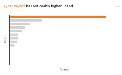
Rank: Ranks and highlights the item that is significantly larger than the rest of the items.
-
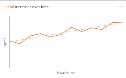
Trend: Highlights when there is a steady trend pattern over a time series of data.
-
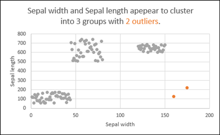
Outlier: Highlights outliers in time series.
-
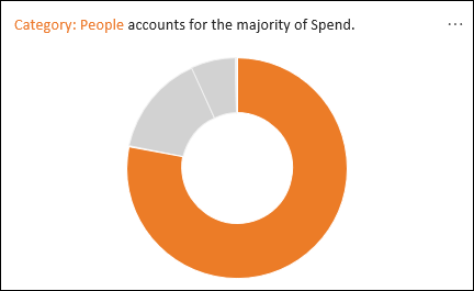
Majority: Finds cases where a majority of a total value can be attributed to a single factor.
If you don’t get any results, please send us feedback by going to File > Feedback.
Because Analyze Data analyzes your data with artificial intelligence services, you might be concerned about your data security. You can read the Microsoft privacy statement for more details.
Need more help?
You can always ask an expert in the Excel Tech Community or get support in the Answers community.
Excel Tool for Data Analysis (Table of Contents)
- Data Analysis Tool in Excel
- Unleash Data Analysis Tool Pack in Excel
- How to Use the Data Analysis Tool in Excel?
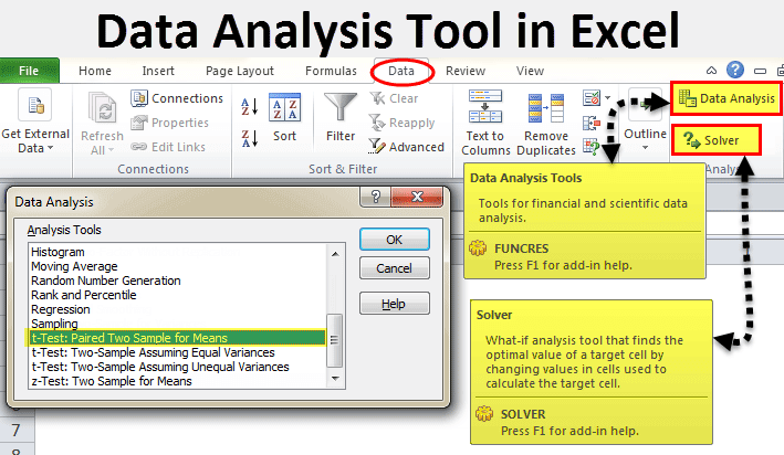
In excel, we have few inbuilt tools which are used for Data Analysis. But these become active only when you select any of them. To enable the Data Analysis tool in Excel, go to the File menu’s Options tab. Once we get the Excel Options window from Add-Ins, select any of the analysis pack, let’s say Analysis Toolpak and click on Go. This will take us to the window from where we can select one or multiple Data analysis tool packs, which can be seen in the Data menu tab.
If you observe excel on your laptop or computer, you may not see the data analysis option by default. You need to unleash it. Usually, a data analysis tool pack is available under the Data tab.
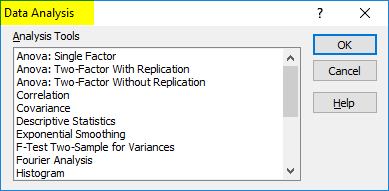
Under the Data Analysis option, we can see many analysis options.
Unleash Data Analysis Tool Pack in Excel
If your excel is not showing this pack, follow the below steps to unleash this option.
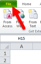
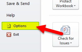
Step 1: Go to FILE.
Step 2: Under File, select Options.
Step 3: After selecting Options, select Add-Ins.
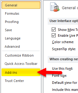
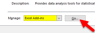
Step 4: Once you click on Add-Ins, at the bottom, you will see Manage drop-down list. Select Excel Add-ins and click on Go.
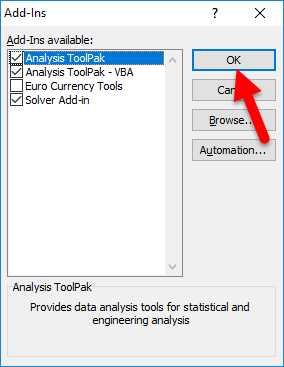
Step 5: Once you click on Go, you will see a new dialogue box. You will see all the available Analysis Tool Pack. I have selected 3 of them and then click on Ok.
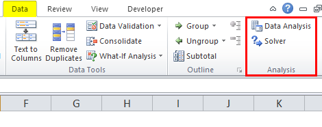
Step 6: Now, you will see these options under the Data ribbon.

How to Use the Data Analysis Tool in Excel?
Let’s understand the working of a data analysis tool with some examples.
You can download this Data Analysis Tool Excel Template here – Data Analysis Tool Excel Template
T-test Analysis – Example #1
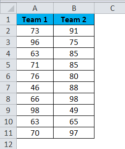
A t-test is returning the probability of the tests. Look at the below data of two teams scoring pattern in the tournament.
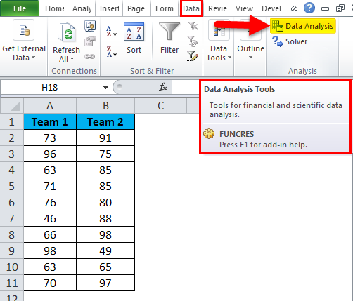
Step 1: Select the Data Analysis option under the DATA tab.
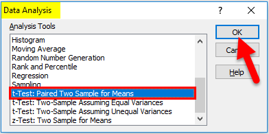
Step 2: Once you click on Data Analysis, you will see a new dialogue box. Scroll down and find the T-test. Under T-test, you will three kinds of T-test; select the first one, i.e. t-Test: Paired Two Sample for Means.
Step 3: After selecting the first t-Test, you will see the below options.
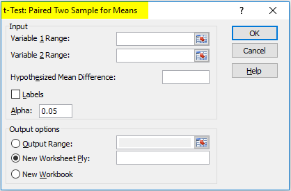
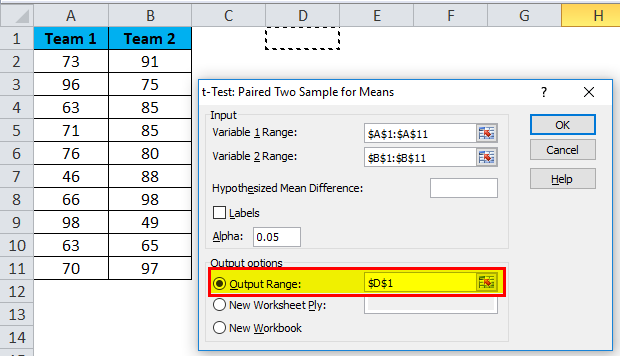
Step 4: Under Variable 1 Range, select team 1 score and under Variable 2 Range, select team 2 score.
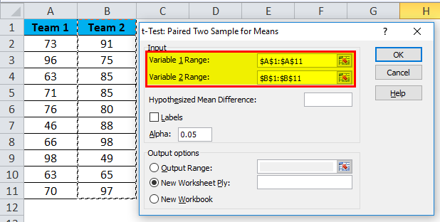
Step 5: Output Range selects the cell where you want to display the results.
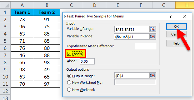
Step 6: Click on Labels because we have selected the ranges, including headings. Click on Ok to finish the test.
Step 7: From the D1 cell, it will start showing the test result.
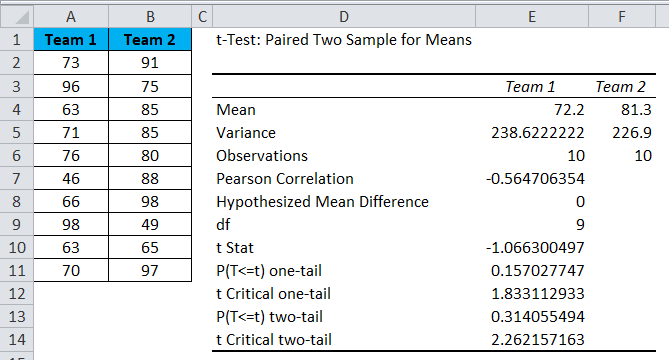
The result will show the mean value of two teams, Variance Value, how many observations are conducted or how many values taken into consideration, Pearson Correlation etc.…
If you P (T<=t) two-tail, it is 0.314, which is higher than the standard expected P-value of 0.05. This means data is not significant.
We can also do the T-test by using the built-in function T.TEST.
SOLVER Option – Example#2
A solver is nothing but solving the problem. SOLVER works like a goal seek in excel.
Look at the below image. I have data of product units, unit price, total cost, and the total profit.
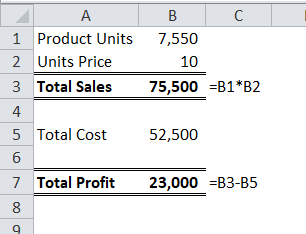
Units sold quantity is 7550 at a selling price of 10 per unit. The total cost is 52500, and the total profit is 23000.
As a proprietor, I want to earn a profit of 30000 by increasing the unit price. As of now, I don’t know how much units price I have to increase. SOLVER will help me to solve this problem.
Step 1: Open SOLVER under the DATA tab.
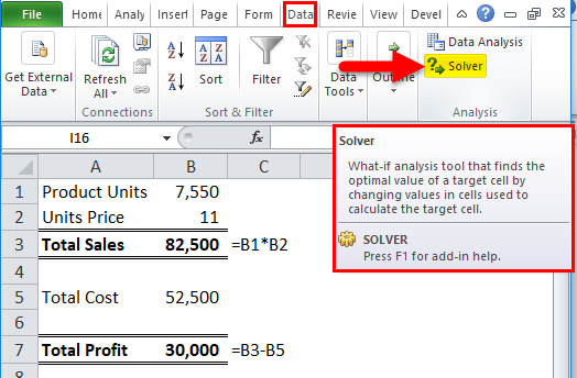
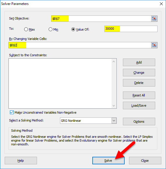
Step 2: Set the objective cell as B7 and the value of 30000 and by changing the cell to B2. Since I don’t have any other special criteria to test, I am clicking on the SOLVE button.
Step 3: The Result will be as below:
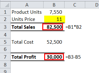
Ok, excel SOLVER solved the problem for me. To make a profit of 30000 I need to sell the products at 11 per unit instead of 10 per unit.
In this way, we can do the analyze the data.
Things to Remember
- We have many other analysis tests like Regression, F-test, ANOVA, Correlation, Descriptive techniques.
- We can add Excel Add-in as a data analysis tool pack.
- Analysis tool pack is available under VBA too.
Recommended Articles
This has been a guide to Data Analysis Tool in Excel. Here we discuss how to use the Excel Data Analysis Tool along with excel examples and a downloadable excel template. You may also look at these useful articles in excel –
- Pareto Analysis in Excel
- What-If Analysis in Excel
- Excel Regression Analysis
- Excel Quick Analysis
Asked by: Claud Swift
Score: 4.5/5
(72 votes)
Q. Where is the data analysis button in Excel?
- Click the File tab, click Options, and then click the Add-Ins category.
- In the Manage box, select Excel Add-ins and then click Go.
- In the Add-Ins available box, select the Analysis ToolPak check box, and then click OK.
Where is analyze Data in Excel?
Simply select a cell in a data range > select the Analyze Data button on the Home tab. Analyze Data in Excel will analyze your data, and return interesting visuals about it in a task pane.
Where is data analysis Excel 2021?
Go to the Data tab > Analysis group > Data analysis.
How do you Analyse text Data in Excel?
Perform Complex Data Analysis with the Analysis Toolpak
- In Excel, click Options in the File tab.
- Go to Add-ins, then select Analysis ToolPak and click Go.
- In the pop-up window, check the Analysis ToolPak option and click OK.
- Under the Data tab in the toolbar of your Excel sheet, you’ll now see a Data Analysis option.
How do you analyze unstructured data in Excel?
The Keys to parsing in unstructured data:
- To first Assign each row a «Record ID», that helps with how to treat each row.
- Get rid of the blank rows.
- Use the “Generate Rows” tool to put each Description and Value on a single row, when there are multiple Descriptions and Values on a single row.
31 related questions found
What is analyze in Excel?
With Analyze in Excel, you can bring Power BI datasets into Excel, and then view and interact with them using PivotTables, charts, slicers, and other Excel features. To use Analyze in Excel you must first download the feature from Power BI, install it, and then select one or more datasets to use in Excel.
How do I analyze data?
To improve your data analysis skills and simplify your decisions, execute these five steps in your data analysis process:
- Step 1: Define Your Questions. …
- Step 2: Set Clear Measurement Priorities. …
- Step 3: Collect Data. …
- Step 4: Analyze Data. …
- Step 5: Interpret Results.
Which tool is used for data analysis?
Top 10 Data Analytics tools
- R Programming. R is the leading analytics tool in the industry and widely used for statistics and data modeling. …
- Tableau Public: …
- SAS: …
- Apache Spark. …
- Excel. …
- RapidMiner:
- KNIME. …
- QlikView.
How do I do regression analysis in Excel?
To run the regression, arrange your data in columns as seen below. Click on the “Data” menu, and then choose the “Data Analysis” tab. You will now see a window listing the various statistical tests that Excel can perform. Scroll down to find the regression option and click “OK”.
Is Excel a data analysis tool?
In excel, we have few inbuilt tools which are used for Data Analysis. To enable the Data Analysis tool in Excel, go to the File menu’s Options tab. … Once we get the Excel Options window from Add-Ins, select any of the analysis pack, let’s say Analysis Toolpak and click on Go.
Which is best tool for data analysis?
Top 10 Data Analytics Tools You Need To Know In 2021
- R and Python.
- Microsoft Excel.
- Tableau.
- RapidMiner.
- KNIME.
- Power BI.
- Apache Spark.
- QlikView.
What are the tools of analysis?
Data Collection & Analysis Tools Related Topics
- Box & Whisker Plot.
- Check Sheet.
- Control Chart.
- Design of Experiments (DOE)
- Histogram.
- Scatter Diagram.
- Stratification.
- Survey.
How do you do regression analysis?
Run regression analysis
- On the Data tab, in the Analysis group, click the Data Analysis button.
- Select Regression and click OK.
- In the Regression dialog box, configure the following settings: Select the Input Y Range, which is your dependent variable. …
- Click OK and observe the regression analysis output created by Excel.
How do I add an analysis tab in Excel?
Load the Analysis ToolPak in Excel
- Click the File tab, click Options, and then click the Add-Ins category. …
- In the Manage box, select Excel Add-ins and then click Go. …
- In the Add-Ins box, check the Analysis ToolPak check box, and then click OK.
What is analysis techniques?
Analytical technique is a method that is used to determine a chemical or physical property of a chemical substance, chemical element, or mixture. There are a wide variety of techniques used for analysis, from simple weighing to advanced techniques using highly specialized instrumentation.
What is data tool?
Data Collection and Analysis Tools. Data collection and analysis tools are defined as a series of charts, maps, and diagrams designed to collect, interpret, and present data for a wide range of applications and industries. …
What is analysis software?
Computer Assisted Qualitative Data Analysis Software (CAQDAS), is computer software designed to facilitate the analysis of qualitative data, whether from groups, interviews or other qualitative textual sources.
What are the 5 basic methods of statistical analysis?
It all comes down to using the right methods for statistical analysis, which is how we process and collect samples of data to uncover patterns and trends. For this analysis, there are five to choose from: mean, standard deviation, regression, hypothesis testing, and sample size determination.
What is data analysis example?
A simple example of Data analysis is whenever we take any decision in our day-to-day life is by thinking about what happened last time or what will happen by choosing that particular decision. This is nothing but analyzing our past or future and making decisions based on it.
What are the three rules of data analysis?
Three Rules for Data Analysis: Plot the Data, Plot the Data, Plot the Data.
How do I enable analyze in Excel?
Load and activate the Analysis ToolPak
- Click the File tab, click Options, and then click the Add-Ins category.
- In the Manage box, select Excel Add-ins and then click Go. …
- In the Add-Ins box, check the Analysis ToolPak check box, and then click OK.
What is what if analysis in Excel example?
What-If Analysis is the process of changing the values in cells to see how those changes will affect the outcome of formulas on the worksheet. Three kinds of What-If Analysis tools come with Excel: Scenarios, Goal Seek, and Data Tables. … The Solver add-in is similar to Goal Seek, but it can accommodate more variables.
What is pivoting in Excel?
A pivot table in Excel is an extraction or resumé of your original table with source data. A pivot table can provide quick answers to questions about your table that can otherwise only be answered by complicated formulas.
Where is data analysis Excel 2016?
These instructions apply to Excel 2010, Excel 2013 and Excel 2016. Click the File tab, click Options, and then click the Add-Ins category. In the Manage box, select Excel Add-ins and then click Go. In the Add-Ins available box, select the Analysis ToolPak check box, and then click OK.
Содержание
- Включение блока инструментов
- Активация
- Запуск функций группы «Анализ данных»
- Вопросы и ответы

Программа Excel – это не просто табличный редактор, но ещё и мощный инструмент для различных математических и статистических вычислений. В приложении имеется огромное число функций, предназначенных для этих задач. Правда, не все эти возможности по умолчанию активированы. Именно к таким скрытым функциям относится набор инструментов «Анализ данных». Давайте выясним, как его можно включить.
Включение блока инструментов
Чтобы воспользоваться возможностями, которые предоставляет функция «Анализ данных», нужно активировать группу инструментов «Пакет анализа», выполнив определенные действия в настройках Microsoft Excel. Алгоритм этих действий практически одинаков для версий программы 2010, 2013 и 2016 года, и имеет лишь незначительные отличия у версии 2007 года.
Активация
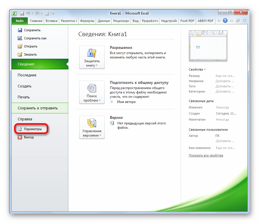
- Перейдите во вкладку «Файл». Если вы используете версию Microsoft Excel 2007, то вместо кнопки «Файл» нажмите значок Microsoft Office в верхнем левом углу окна.
- Кликаем по одному из пунктов, представленных в левой части открывшегося окна – «Параметры».
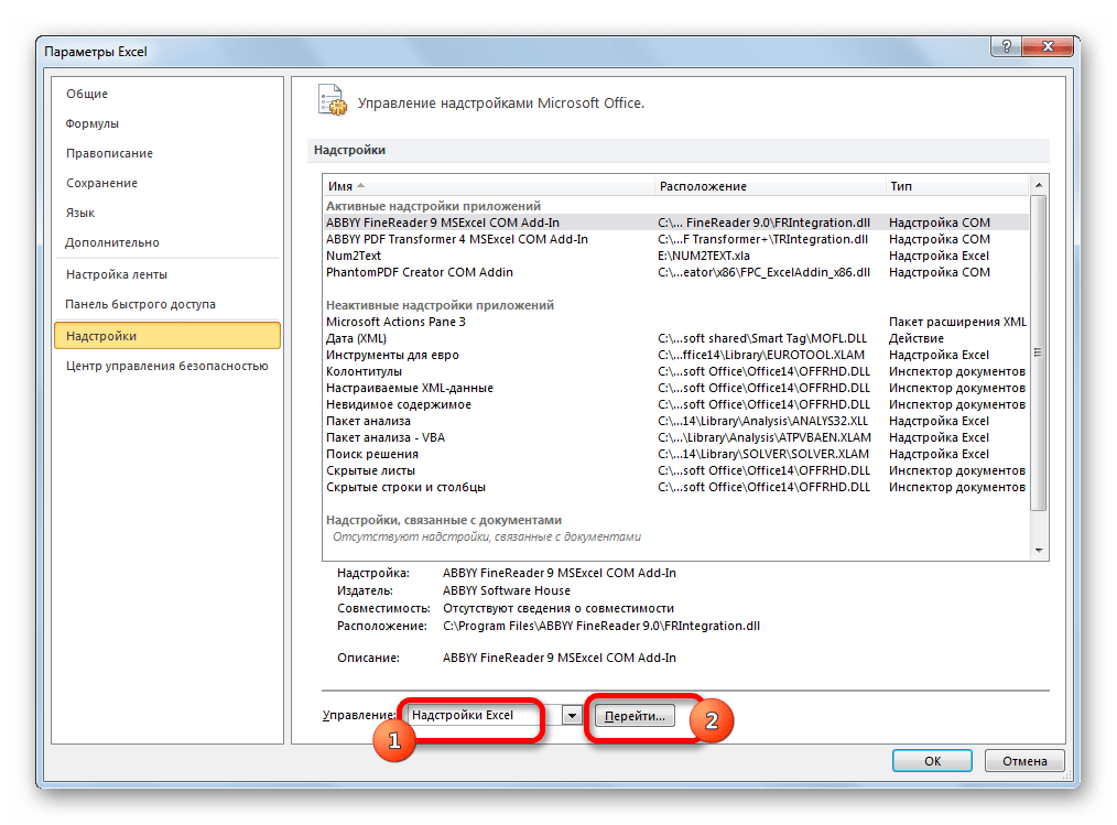
- В открывшемся окне параметров Эксель переходим в подраздел «Надстройки» (предпоследний в списке в левой части экрана).
- В этом подразделе нас будет интересовать нижняя часть окна. Там представлен параметр «Управление». Если в выпадающей форме, относящейся к нему, стоит значение отличное от «Надстройки Excel», то нужно изменить его на указанное. Если же установлен именно этот пункт, то просто кликаем на кнопку «Перейти…» справа от него.
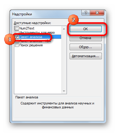
- Открывается небольшое окно доступных надстроек. Среди них нужно выбрать пункт «Пакет анализа» и поставить около него галочку. После этого, нажать на кнопку «OK», расположенную в самом верху правой части окошка.


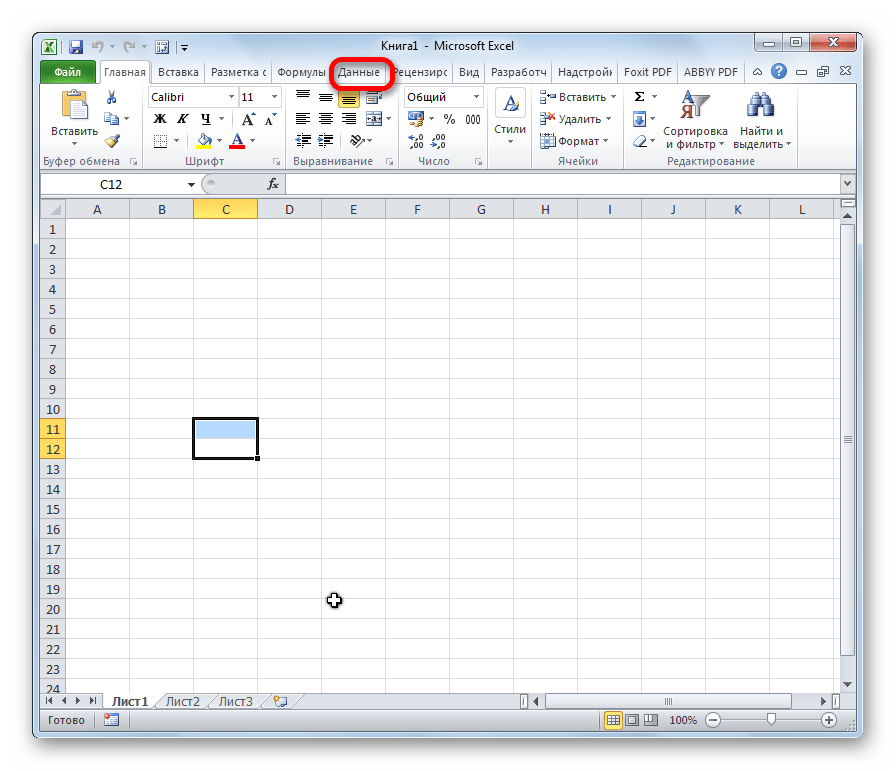
После выполнения этих действий указанная функция будет активирована, а её инструментарий доступен на ленте Excel.
Запуск функций группы «Анализ данных»
Теперь мы можем запустить любой из инструментов группы «Анализ данных».
- Переходим во вкладку «Данные».
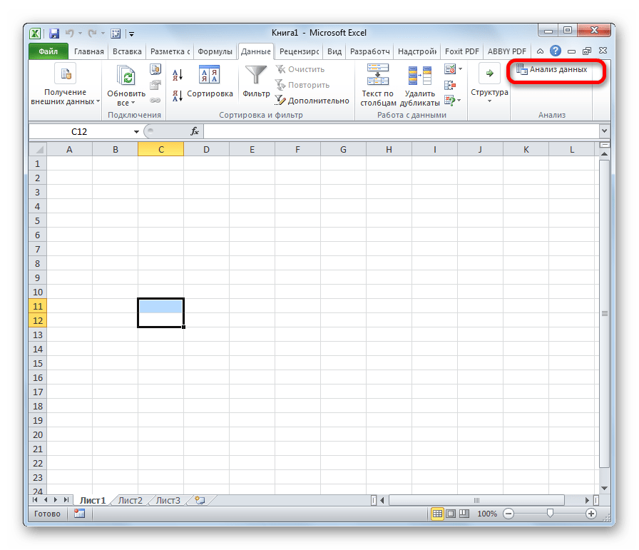
- В открывшейся вкладке на самом правом краю ленты располагается блок инструментов «Анализ». Кликаем по кнопке «Анализ данных», которая размещена в нём.
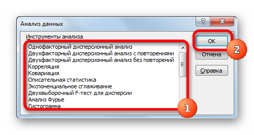
- После этого запускается окошко с большим перечнем различных инструментов, которые предлагает функция «Анализ данных». Среди них можно выделить следующие возможности:
- Корреляция;
- Гистограмма;
- Регрессия;
- Выборка;
- Экспоненциальное сглаживание;
- Генератор случайных чисел;
- Описательная статистика;
- Анализ Фурье;
- Различные виды дисперсионного анализа и др.
Выбираем ту функцию, которой хотим воспользоваться и жмем на кнопку «OK».
Работа в каждой функции имеет свой собственный алгоритм действий. Использование некоторых инструментов группы «Анализ данных» описаны в отдельных уроках.
Урок: Корреляционный анализ в Excel

Урок: Регрессионный анализ в Excel
Урок: Как сделать гистограмму в Excel
Как видим, хотя блок инструментов «Пакет анализа» и не активирован по умолчанию, процесс его включения довольно прост. В то же время, без знания четкого алгоритма действий вряд ли у пользователя получится быстро активировать эту очень полезную статистическую функцию.
Еще статьи по данной теме:
Помогла ли Вам статья?
Excel Quick Analysis Tool allows you to quickly analyze data.
It gives you quick access to some of the commonly used data analysis functionalities in Excel so that you don’t have to go into the ribbon and find the correct option (hence saving some clicks and a little bit of time).
In this tutorial, I will tell you everything you need to know about the Quick Analysis Tool in Excel. I’d also cover different use cases where you can use this tool to be more productive and save time.
Where is the Quick Analysis Tool in Excel?
Excel Quick Analysis tool was introduced in Excel 2013, so you won’t find it in versions before Excel 2013.
If you’re searching for the Quick Analysis Tool in the ribbon in Excel, you won’t find it.
It appears automatically whenever you select a range of cells an icon in the bottom right part of the selection.

You can also use the keyboard shortcut Control + Q to show the Quick Analysis Tool icon, in case it doesn’t show up.
By default, this tool is enabled in all the Excel versions (in and after Excel 2013). In case you still can’t access the Quick Analysis Tool, you can follow the steps here to enable it.
What Can You Do with Quick Analysis Tool in Excel?
Quick Analysis Tool tries to give you some commonly used functionalities in Excel.
Note that the data analysis options you see in the Quick Analysis Tool are not unique and you can also find these in the ribbon in different tabs in Excel. The point of showing this tool is to enable you to access these faster.
Let’s now look at all the options you have available in the Quick Analysis Toolbar:
Conditional Formatting
The first option you get in the Quick Analysis Toolbar is Conditional Formatting. Within this, you will see five commonly used Conditional Formatting options.

Note that these options would change based on the data you have selected. For example, if you have numeric data, you will see options such as Data Bars, Icon set, Greater than, Top 10%, etc.
If you have text data, then the options would be to highlight duplicate or unique values or highlight cells that contain specific text or matches a specific string.
And similarly, in case you have dates data, the options would accordingly change.
Keyboard Shortcut - Control + Q + F
Charts
Based on the data in your selected range, you will be shown some commonly used chart types in Excel.

In case you don’t find the chart type you’re looking for, you can click on the More Charts option, which will open the ‘Insert Chart’ dialog box, where you get all the charting options.
Keyboard Shortcut - Control + Q + C
Totals (Calculations)
This could be quite useful if you quickly want to get calculations such as sum, count, average, running total, etc.

Again, the options you see here would be dependent on the data in the range you have selected. If you only have text data in the selected range, then this would only show you the option to get the Count.
Keyboard Shortcut - Control + Q + O
Insert Table/Pivot Table
If you have tabular data that you quickly want to convert into an Excel Table, it can be done using the Quick Analysis Tool (option in the Table’s header).

You also get an option to quickly insert a new Pivot Table in a new sheet using the selected data as the source.
Keyboard Shortcut - Control + Q + T
Sparklines
And lastly, you have the sparkline option where you can quickly insert these in-cell charts that can do wonders in making your data more comprehensible.

You can use it to quickly insert the Line, Column, or Win/Loss sparklines.
Keyboard Shortcut - Control + Q + S
Using Quick Analysis Toolbar in Excel – Some Practical Examples
Now let’s look at some practical examples where using the Quick Analysis Toolbar can save you some time.
Get the SUM or COUNT of Multiple Rows/Columns in One Go
Below I have a dataset where I have the sales of different product lines (printers, scanners, laptops, and projectors) for seven different states in the US.

I want to get the sum of each row and each column. This will tell me what was the total sale value of each product line as well as the total sale value for each state.
Below are the steps to do this using Quick Analysis Tool:
- Select the entire dataset
- Click the Quick Analysis icon that shows up at the bottom right of the selection. If you don’t see it, use the keyboard shortcut Control + Q

- Go to the Totals group
- Click on the ‘Sum’ option (the one in blue color)

The above steps would instantly add a new row that will show you the sum of total sales of each product.

Similarly, if you want to get the sum by states, you can repeat the same steps, and in step 4, instead of the first Sum option (the one in blue color), select the second Sum option (the one in the yellow color).

This will add a new column that will show the sum of all values for each state.

Note that when you use this option, Excel creates and enters the formula for these in the cells. If you click on any of these cells filled by the Quick Analysis tool and check the formula bar, you will see the formula it has used.
In this example, I have shown you how to get the sum of values in rows or columns, and you can follow the same process to get the count of values in rows or columns. Just change the selection in Step 4 (and select the Count options instead)
Also read: How to Sum Only Positive or Negative Numbers in Excel (Easy Formula)
Calculate Percentage Total For Multiple Rows/Columns
Just like we added the sum and count values for rows/columns, you can also add the % Total values.
Below I have the same dataset and I want to get the percentage total value for each product as well as each state.
This will tell me what percentage of total sales is because of the Printers or Scanners. Similarly, having the percentage total value in the column would tell me what percentage of sales is contributed by which state.
Below are the steps to do this:
- Select the dataset
- Click the Quick Analysis icon
- Click on the Totals option
- Click on the % Total option

The above steps would insert a new row that will show the percentage total of all the products.

Similarly, if you want to get the percentage total of all the states, you can repeat the same steps, and in step 4, choose the second % Total option (the one in the yellow color). This will insert a new column that will show the percentage-wise sales by each state.

Also read: Calculate Percentage Change in Excel (% Increase/Decrease Formula)
Highlighting All the Cell With Value Greater Than a Specified Value
If you’re working with numeric data and want to quickly highlight all the cells with a value greater than a specific value, you can do that with a few clicks using the Quick Analysis Tool.
Below I have a dataset where I have the sales figures for different states, and I want to highlight all the cells where the value is more than 100000.

Here are the steps to do this:
- Select the range that has the sales value
- Click the Quick Analysis icon that shows up at the bottom right of the selection. If you don’t see it, use the keyboard shortcut Control + Q
- Make sure you are in the Formatting group
- Click on the ‘Greater Than’ option

- In the ‘Greater Than’ dialog box, enter 100000 in the field

- Specify the formatting (or you can use the default Light Red Fill with Dark Red Text)

- Click OK
The above steps would instantly highlight all the cells that have a value greater than 100,000.

Note that the above steps have used the Conditional Formatting option to highlight the cells. If you want to modify the conditional formatting rule, you can do that by clicking on the Conditional Formatting option (in the Home tab) and then clicking on ‘Manage Rules’
Add a Running Total in Column or Row
Below I have month-wise sales data and I want to add a running total column for the sales values.

Having a running total column is useful when you want to track how the sales are progressing. For example, I can quickly scan through this column and figure out when the total sales value crossed 30,00 or 50,000.
Below are the steps to add a running total column using the Quick Analysis tool:
- Select the entire dataset
- Click on the Quick Analysis icon at the bottom right of the selection (keyboard shortcut Control + Q)
- Go to the Totals group
- Get more options by clicking on the small arrow icon at the right (where all the options end). Clicking on this would show you more available options

- Click on the ‘Running Total’ option

The above steps would instantly add a new column that will show the running totals.

Note that for this to work, the adjacent column (where the running total values get filled) needs to be blank. In case it’s not blank, you will see a prompt that will ask you to overwrite the data or cancel the operation
In case you see the hash symbols instead of the values in the running total column, expand the column width to make sure it’s wide enough to accommodate the numbers.
Just like I showed you how to add a running total column, you can also add the row that shows the running total. For this, you need to select the blue-colored Running Total option (there are two running total options – the blue one for rows and the yellow one for columns)
Add a New Column to Get Sum of Rows
Another useful use of the Quick Analysis tool can be to add a row or column that gives the sum of the values in that row/column.
Below I have the sales data for different product lines and different states in the US.
It would be useful to have an additional row and an additional column that shows the sum of all the values. This would help me know what’s the total sales for each product line and total sales for each state.
Below are the steps to do add a row that shows the sum of all values in each column:
- Select the dataset
- Click on the Quick Analysis icon at the bottom right of the selection (keyboard shortcut Control + Q)
- Go to the Totals group
- Click on the Sum option

The above steps would instantly add a new row with the title ‘Sum’ that will give you the sum of all the columns that have product-wise sales data.

Similarly, if you want to add a column that shows the sum of all values in the row, repeat the same steps, but after step 3, click on the small arrow icon at the right to get more options, and then click on the Sum option (the one in Yellow color)
Note that in case you see hash symbols instead of the values, the column width needs to be increased to make the values visible.
Also read: How to Multiply a Column by a Number in Excel (2 Easy Ways)
Highlight Dates That Occur Last Month or Last Week
Quick Analysis tool has some useful options when working with dates.
One that I find particularly useful is the option to highlight dates that occur in the last week or the last month (where Excel picks up the current date value from your system’s setting).
Below I have a dataset where I have the dates in column A and the task list in column B, and I want to know what dates occurred in the past month or the past week.

Here are the steps to highlight all dates in the previous month:
- Select the dataset
- Click on the Quick Analysis icon at the bottom right of the selection
- In the Formatting group, click on the ‘Last Month’ option

The above steps would instantly highlight all the dates that occur in the previous month.

Note that the dates being highlighted are using the current date of my system at the time of taking this screenshot
A few things you should know when using the Quick Analysis tool to highlight cells using Conditional Formatting:
- When you use any of the options in the Formatting group, it uses conditional formatting to create a rule for the selected cells. This rule remains in place unless you remove it by clicking on the ‘Clear Format’ option (it’s also there in the Formatting group)
- When you click on more than one option, more than one rule is applied to the selected cells. For example, if I first click on the option to highlight cells with dates occurring in the last week and then click on the option to highlight cells with dates occurring in the last month, both the rules would be in place.
Also read: How to Highlight Weekend Dates in Excel?
Highlight All Cells That Contain a Specific Text
So far, we have seen examples of using the Quick Analysis tool with numeric data and dates.
But you can also use this with text data.
Below I have a dataset where I have the product id in column A and the price in column B.

I want to quickly highlight all the cells where the product id contains the text ‘KL’.
Below are the steps to do this using Quick Analysis options:
- Select the data in column A, that has the text data. Note that you shouldn’t select the entire dataset (i.e., columns A and B), as it wouldn’t show you the text-related right options in the Quick Analysis tool.
- Click on the Quick Analysis icon
- In the Formatting group, click on the ‘Text Contains’ option

- In the ‘Text That Contains’ dialog box, enter KL

- Select the formatting in which you want the cells to be highlighted. In this case, I will go with the default ‘Light Red Fill with Dark Red text’

- Click OK
The above steps would instantly highlight all the cells in column A that contain the text ‘KL’

Also read: How to Count Cells that Contain Text Strings
Highlight Cells with Duplicate Text
Identifying duplicates in a dataset is a common task for many Excel users. While there are multiple ways to highlight duplicates in Excel, the Quick Analysis tool makes it really quick.
Below I have a dataset where I have employee names in column A and the training dates assigned to them.

Here are the steps to quickly highlight all the cells with duplicate names:
- Select the names in column A (don’t select the entire dataset, only column A that has the text data)
- Click on the Quick Analysis icon
- In the Formatting group, click on the ‘Duplicate Values’ option

That’s it! Done.
It will highlight all the cells that have the names that have been repeated.

For this to work, the text in the cells needs to be exactly the same. So make sure there are no leading or trailing space characters in the cells. If there are extra space characters in one cell with a name, and not there in the other one, Excel would consider these as different.
Also read: How to Filter Cells that have Duplicate Text Strings (Words) in it
Highlight Cells with Unique Text
Just like we highlighted cells with duplicate text, you can also highlight cells that have unique values.
Let’s take the same example (dataset below), where I have the employee names in column A and their training date in column B, and I want to identify names that only occur once.
Below are the steps to do this using the Quick Analysis tool:
- Select the names in column A (excluding the header)
- Click on the Quick Analysis icon
- In the Formatting group, click on the ‘Unique Values’ option

The above steps would instantly highlight all the names that only appear once in the list.

Remove Conditional Formatting from the Selected Range of Cells
Conditional Formatting is an amazing tool that I use quite often, and a lot of times, I need to remove the Conditional Formatting rules that have already been applied.
Sometimes I just don’t need these, or I need to start from a blank slate that requires removing all the previously applied rules.
Quick Analysis tool makes it really easy to remove conditional formatting by giving you access to that option with a single click.
Below are the steps to remove Condition Formatting using the Quick Analysis tool:
- Select the data from which you want to remove the Condition Formatting rules
- Click on the Quick Analysis icon
- Click on Clear Format

Note that the above steps would only remove the Conditional Formatting, and not the regular formatting such as borders or cell colors or font size/type, etc.
Also read: How to Remove Cell Formatting in Excel (from All, Blank, Specific Cells)
Quickly Insert a Cluster/Stacked chart, Pie Chart, or Scatter Chart
Apart from all the other ways to insert charts in Excel, you can also use the Quick Analysis tool to insert a chart.
While you only get some limited options in the Quick Analysis tool, it could be faster if you want to insert common chart types such as a line chart or a clustered column chart.
And in case you want more charting options, there is a More Charts option available as well.
Below I have a dataset where I have the month names in column A and the sales values in column B, and I want to create a line chart using it.

Here are the steps to do this:
- Select the entire dataset
- Click on the Quick Analysis icon
- Go to the Chart options
- Click on the ‘Line Charts’ option

The above steps would insert a line chart using the selected dataset.

Note that when you hover over the charting options in the Quick Analysis tool, it will show you a preview of how each chart would look like using the selected data.
Also read: How to Make a PIE Chart in Excel
Quick Analysis Tool Not Showing Up in Excel – How to Fix?
In case you’re using the latest Excel version (Excel 2013, 2016, 2019 or Excel with Microsoft 365), And you do not see the Quick Analysis Tool when you select a range of cells, most likely it’s disabled.
And this has an easy fix – you enable it.
Below are the steps to enable the Quick Analysis Tool in Excel:
- Click the File tab in the ribbon
- Click on Options
- In the Excel Options dialog box, make sure General is selected in the left pane
- Enable the option – ‘Show Quick Analysis options on selection’
- Click OK
Note that even if the Quick Analysis tool is disabled in your workbook, it would still show up when you use the keyboard shortcut Control + Q (hold the Control key and press the Q key)
Can I add More Options to the Quick Analysis Tool?
At the time of writing this article, unfortunately, you cannot add more options to the Quick Analysis Tool.
However, just like many features or functionality in Excel, there is a good possibility that they might allow users to add custom options to the Quick Analysis Tool.
Even if it doesn’t allow users to add custom options, I am confident that based on user feedback, the team at Microsoft Excel would add more useful options.
As an alternative, you can consider using the Quick Access Toolbar which allows you to add custom options and even macros that can be accessed with a click or a keyboard shortcut.
Can I Disable the Quick Analysis Tool?
If you don’t want the Quick Analysis Tool icon to show up whenever you select any range of cells, you can disable it.
The steps are exactly the same as I covered above in the ‘Quick Analysis Tool Not Showing Up in Excel – How to Fix?‘ section:
- Click the File tab in the ribbon
- Click on Options
- In the Excel Options dialog box, uncheck the option – ‘Show Quick Analysis options on selection’

- Click OK
Even when it’s disabled, you can still access it using the keyboard shortcut Control + Q
In this article, I showed you how to use the Quick Analysis tool to get access to some useful options. I also covered some practical examples and how these can be used in your day-to-day work.
Overall, it’s quite useful and can help you become more productive when working with Excel.
And although at the time of writing this article, there are limited options in the tool and it does not allow adding custom options to it, I have seen continuous improvements being made to the tool and it may allow this functionality in the future.
Other Excel tutorials you may also like:
- Excel Quick Access Toolbar – 5 Options You Should Consider Adding
- Apply Conditional Formatting Based on Another Column in Excel
- Search and Highlight Data Using Conditional Formatting