
Note: These steps apply to Office 2013 and newer versions. Looking for Office 2010 steps?
Add a trendline

-
Select a chart.
-
Select the + to the top right of the chart.
-
Select Trendline.
Note: Excel displays the Trendline option only if you select a chart that has more than one data series without selecting a data series.
-
In the Add Trendline dialog box, select any data series options you want, and click OK.
Format a trendline
-
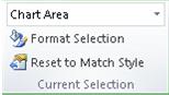
Click anywhere in the chart.
-
On the Format tab, in the Current Selection group, select the trendline option in the dropdown list.
-
Click Format Selection.
-
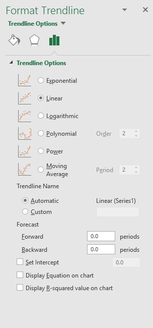
In the Format Trendline pane, select a Trendline Option to choose the trendline you want for your chart. Formatting a trendline is a statistical way to measure data:

-
Set a value in the Forward and Backward fields to project your data into the future.
Add a moving average line
You can format your trendline to a moving average line.
-
Click anywhere in the chart.
-
On the Format tab, in the Current Selection group, select the trendline option in the dropdown list.
-
Click Format Selection.
-
In the Format Trendline pane, under Trendline Options, select Moving Average. Specify the points if necessary.
Note: The number of points in a moving average trendline equals the total number of points in the series less the number that you specify for the period.
Add a trend or moving average line to a chart in Office 2010
-
On an unstacked, 2-D, area, bar, column, line, stock, xy (scatter), or bubble chart, click the data series to which you want to add a trendline or moving average, or do the following to select the data series from a list of chart elements:
-
Click anywhere in the chart.
This displays the Chart Tools, adding the Design, Layout, and Format tabs.
-
On the Format tab, in the Current Selection group, click the arrow next to the Chart Elements box, and then click the chart element that you want.
-
-
Note: If you select a chart that has more than one data series without selecting a data series, Excel displays the Add Trendline dialog box. In the list box, click the data series that you want, and then click OK.
-
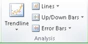
On the Layout tab, in the Analysis group, click Trendline.
-
Do one of the following:
-
Click a predefined trendline option that you want to use.
Note: This applies a trendline without enabling you to select specific options.
-
Click More Trendline Options, and then in the Trendline Options category, under Trend/Regression Type, click the type of trendline that you want to use.
Use this type
To create
Linear
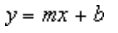
A linear trendline by using the following equation to calculate the least squares fit for a line:
where m is the slope and b is the intercept.
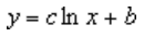
Logarithmic
A logarithmic trendline by using the following equation to calculate the least squares fit through points:
where c and b are constants, and ln is the natural logarithm function.
Polynomial
A polynomial or curvilinear trendline by using the following equation to calculate the least squares fit through points:
where b and
are constants.Power
A power trendline by using the following equation to calculate the least squares fit through points:
where c and b are constants.
Note: This option is not available when your data includes negative or zero values.
Exponential
An exponential trendline by using the following equation to calculate the least squares fit through points:
where c and b are constants, and e is the base of the natural logarithm.
Note: This option is not available when your data includes negative or zero values.
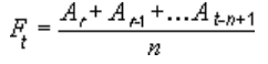
Moving average
A moving average trendline by using the following equation:
Note: The number of points in a moving average trendline equals the total number of points in the series less the number that you specify for the period.
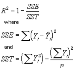
R-squared value
A trendline that displays an R-squared value on a chart by using the following equation:
This trendline option is available on the Options tab of the Add Trendline or Format Trendline dialog box.
Note: The R-squared value that you can display with a trendline is not an adjusted R-squared value. For logarithmic, power, and exponential trendlines, Excel uses a transformed regression model.
-
If you select Polynomial, type the highest power for the independent variable in the Order box.
-
If you select Moving Average, type the number of periods that you want to use to calculate the moving average in the Period box.
-
If you add a moving average to an xy (scatter) chart, the moving average is based on the order of the x values plotted in the chart. To get the result that you want, you might have to sort the x values before you add a moving average.
-
If you add a trendline to a line, column, area, or bar chart, the trendline is calculated based on the assumption that the x values are 1, 2, 3, 4, 5, 6, etc.. This assumption is made whether the x-values are numeric or text. To base a trendline on numeric x values, you should use an xy (scatter) chart.
-
Excel automatically assigns a name to the trendline, but you can change it. In the Format Trendline dialog box, in the Trendline Options category, under Trendline Name, click Custom, and then type a name in the Custom box.
-
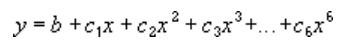
 are constants.

Tips:
-
You can also create a moving average, which smoothes out fluctuations in data and shows the pattern or trend more clearly.
-
If you change a chart or data series so that it can no longer support the associated trendline — for example, by changing the chart type to a 3-D chart or by changing the view of a PivotChart report or associated PivotTable report — the trendline no longer appears on the chart.
-
For line data without a chart, you can use AutoFill or one of the statistical functions, such as GROWTH() or TREND(), to create data for best-fit linear or exponential lines.
-
On an unstacked, 2-D, area, bar, column, line, stock, xy (scatter), or bubble chart, click the trendline that you want to change, or do the following to select it from a list of chart elements.
-
Click anywhere in the chart.
This displays the Chart Tools, adding the Design, Layout, and Format tabs.
-
On the Format tab, in the Current Selection group, click the arrow next to the Chart Elements box, and then click the chart element that you want.
-
-
On the Layout tab, in the Analysis group, click Trendline, and then click More Trendline Options.
-
To change the color, style, or shadow options of the trendline, click the Line Color, Line Style, or Shadow category, and then select the options that you want.
-
On an unstacked, 2-D, area, bar, column, line, stock, xy (scatter), or bubble chart, click the trendline that you want to change, or do the following to select it from a list of chart elements.
-
Click anywhere in the chart.
This displays the Chart Tools, adding the Design, Layout, and Format tabs.
-
On the Format tab, in the Current Selection group, click the arrow next to the Chart Elements box, and then click the chart element that you want.
-
-
On the Layout tab, in the Analysis group, click Trendline, and then click More Trendline Options.
-
To specify the number of periods that you want to include in a forecast, under Forecast, click a number in the Forward periods or Backward periods box.
-
On an unstacked, 2-D, area, bar, column, line, stock, xy (scatter), or bubble chart, click the trendline that you want to change, or do the following to select it from a list of chart elements.
-
Click anywhere in the chart.
This displays the Chart Tools, adding the Design, Layout, and Format tabs.
-
On the Format tab, in the Current Selection group, click the arrow next to the Chart Elements box, and then click the chart element that you want.
-
-
On the Layout tab, in the Analysis group, click Trendline, and then click More Trendline Options.
-
Select the Set Intercept = check box, and then in the Set Intercept = box, type the value to specify the point on the vertical (value) axis where the trendline crosses the axis.
Note: You can do this only when you use an exponential, linear, or polynomial trendline.
-
On an unstacked, 2-D, area, bar, column, line, stock, xy (scatter), or bubble chart, click the trendline that you want to change, or do the following to select it from a list of chart elements.
-
Click anywhere in the chart.
This displays the Chart Tools, adding the Design, Layout, and Format tabs.
-
On the Format tab, in the Current Selection group, click the arrow next to the Chart Elements box, and then click the chart element that you want.
-
-
On the Layout tab, in the Analysis group, click Trendline, and then click More Trendline Options.
-
To display the trendline equation on the chart, select the Display Equation on chart check box.
Note: You cannot display trendline equations for a moving average.
Tip: The trendline equation is rounded to make it more readable. However, you can change the number of digits for a selected trendline label in the Decimal places box on the Number tab of the Format Trendline Label dialog box. (Format tab, Current Selection group, Format Selection button).
-
On an unstacked, 2-D, area, bar, column, line, stock, xy (scatter), or bubble chart, click the trendline for which you want to display the R-squared value, or do the following to select the trendline from a list of chart elements:
-
Click anywhere in the chart.
This displays the Chart Tools, adding the Design, Layout, and Format tabs.
-
On the Format tab, in the Current Selection group, click the arrow next to the Chart Elements box, and then click the chart element that you want.
-
-
On the Layout tab, in the Analysis group, click Trendline, and then click More Trendline Options.
-
On the Trendline Options tab, select Display R-squared value on chart.
Note: You cannot display an R-squared value for a moving average.
-
On an unstacked, 2-D, area, bar, column, line, stock, xy (scatter), or bubble chart, click the trendline that you want to remove, or do the following to select the trendline from a list of chart elements:
-
Click anywhere in the chart.
This displays the Chart Tools, adding the Design, Layout, and Format tabs.
-
On the Format tab, in the Current Selection group, click the arrow next to the Chart Elements box, and then click the chart element that you want.
-
-
Do one of the following:
-
On the Layout tab, in the Analysis group, click Trendline, and then click None.
-
Press DELETE.
-
Tip: You can also remove a trendline immediately after you add it to the chart by clicking Undo  on the Quick Access Toolbar, or by pressing CTRL+Z.
Trendline is applied for illustrating price change trends. The element of technical analysis is a geometrical representation of the mean values of the analyzed indicator.
Here’s how to add a trendline to a chart in Excel.
Adding a trendline to a chart
For example, let’s take average oil prices since 2000 from open sources. Type the analysis data in the spreadsheet:

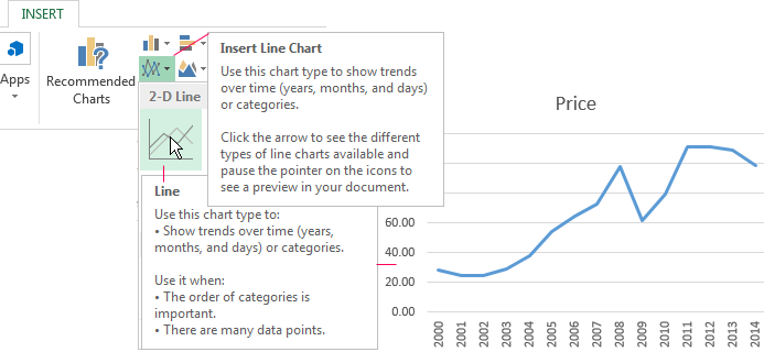
- Create a chart based on the spreadsheet. Select the range A1:P2 and click on the «Insert»-«Charts»-«Insert Line Chart»-«Line». Choose a simple graph out of the offered chart types. The horizontal direction represents year, and the vertical one shows price.
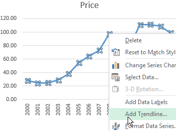
- Right-click the chart itself. Click «Add Trendline».
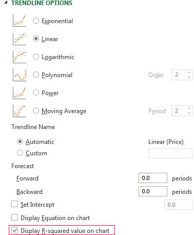
- The window for setting line parameters opens. Select the line type and enter R-squared value (the approximation accuracy value) in the chart.
- A skew line appears on the chart.
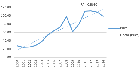
Trendline in Excel is an approximating function chart. It is used for making predictions based on statistical data. To this end, we need to extend the line and determine its values.
If R2 = 1, the approximation error is zero. In our example, the choice of the linear approximation has given a low accuracy and poor result. The prediction will be inaccurate.
Note: that a trendline can not be added to the following types of charts and graphs:
- radar;
- circular;
- surface;
- doughnut;
- stereogram;
- stacked.
Equation of trendline in Excel
In the example above the linear approximation has been chosen only for illustrating the algorithm. The R-squared value demonstrates that the choice has not been successful.
It is necessary to choose the type of representation that will best illustrates the trend of changes in the data entered by the user. Let’s examine the options.
Linear approximation
Its geometric representation is a straight line. Hence, linear approximation is used to illustrate the indicator which increases or decreases at a constant rate.
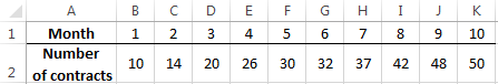
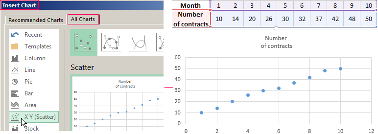
Let’s consider the conditional number of contracts concluded by a manager for 10 months:
Based on the Excel spreadsheet data make a scatter chart (it will help illustrate a linear type):
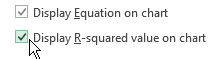
Highlight the chart, select «Add Trendline». In the settings, select the linear type. Add the R-squared value and the equation of a trendline (simply tick the box at the bottom of the «Options» window).
We get the result:
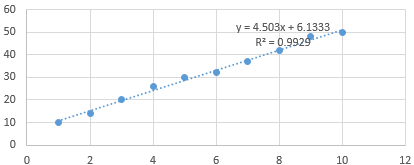
Note that in the linear approximation type data points are located very close to the line. This type uses the following equation:
y = 4,503x + 6,1333
- where 4,503 – slope indicator;
- 6,1333 — offset;
- y — sequence of values,
- x — period number.
The straight line on the graph shows a steady increase in the quality of the manager’s job. The R-squared value is equal to 0.9929, indicating a good agreement between the calculated straight line and the source data. Forecasts must be accurate.
To predict the number of concluded contracts, for example, in period 11, it is necessary to put number 11 instead of x in the equation. After calculating, we find out that in period 11 the manager will conclude 55-56 contracts.
The exponential trendline
This type is useful if the input values change with increasing speed. Exponential approximation is not applied if there are zero or negative characteristics.
Let’s create an exponential trendline in Excel. Take for example the conditional values of electric power supply in X region:
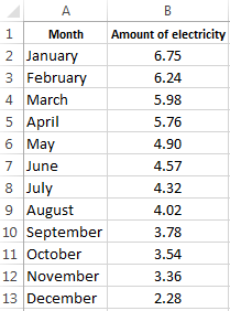
Make the chart «Line with Markers». Add the exponential line.
The equation is as follows:
y = 7,6403е^-0,084x
where:
- 7.6403 and -0.084 – constants;
- e – base of natural logarithm.
The indicator of R-squared value is 0.938, which means that the curve corresponds to the data, the error is minimal, and the forecasts will be accurate.
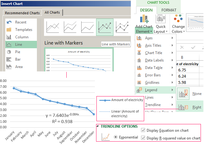
Logarithmic trendline and sales forecast
It is used for the following indicator changes: first, rapid growth or decrease, then — relative stability. The optimized curve adapts well to this value «behavior». The logarithmic trend is suitable for forecasting sales of a new product that has just entered the market.
The initial task of the manufacturer is to expand the customer base. When the goods have their buyer, it will be necessary to hold and serve him.
Make a chart and add a logarithmic trend line for a conditional product sales forecast:
R2 is close in value to 1 (0.9558), indicating the minimum error of approximation. Let’s forecast sales volume for further periods. To do this, put period number instead of x in the equation.
For example:

To calculate forecast figures we use the formula: =304.52*LN(A18)+101.57, where A18 is period number.
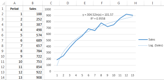
Polynomial trendline in Excel
This curve features alternate increase and decrease. The degree (by the number of minimum and maximum values) is determined for polynomials. For example, one extreme (minimum and maximum) is the second degree, two extremes make the third degree, three extremes – the fourth one.
A polynomial trend in Excel is used for the analysis of a large data set of unstable value. Let’s look at the example of the first set of values (oil prices).
Table of oil price dynamics by years:
| Year | 2000 | 2001 | 2002 | 2003 | 2004 | 2005 | 2006 | 2007 | 2008 | 2009 | 2010 | 2011 | 2012 | 2013 | 2014 | 2015 |
| Price per barrel | 28.30 | 24.40 | 25.00 | 28.90 | 38.30 | 54.40 | 65.40 | 72.70 | 97.70 | 61.90 | 79.60 | 111.00 | 111.40 | 108.80 | 98.90 | 52.40 |
Download examples of graphs with a trendline
To get this R-squared value (0.9252), we had to put the sixth degree.
However, this trend allows for making more or less accurate predictions.
With Excel Charts, it is very easy to create Trendlines for your data. Trendlines show which direction the trend of your data is going, and gives you the trajectory as well.
In this tutorial, you will cover all of these sub-topics in details:
- How to add trendline in Excel
- Different types of trendline
- Format the Trendline
- Use trendline to forecast future data
- Add multiple trendline to same chart
- How to remove trendline in Excel
How to add Trendline in Excel
*** Watch our video and step by step guide below on Trend Chart in Excel with a free downloadable workbook to practice ***

In this example, you will learn how to insert a trendline in Excel using a Line Chart.
STEP 1:Highlight your table of data, including the column headings:

Go to Insert > Recommended Charts (Excel 2013 & 2016)

Go to Insert > Line > 2-D Line (Excel 2010)

STEP 2: Select All Charts > Line > OK (Excel 2013 & 2016)

STEP 3: Right-click on the line of your Line Chart and Select Add Trendline.

STEP 4: Ensure Linear is selected and close the Format Trendline Window

Now you have your Trendline in your chart, and you can predict where the trajectory is going in the succeeding periods:

Different types of Trendline
There are different types of trendlines available to be added to the Excel Charts:
Format the Trendline
Now that you know how to add trendline in Excel, let’s move forward to understand how to format them. You can change the color, transparency, width, dash type, compound type, cap type, and more for your trendline.
In the example below, you want to change the color of the trendline to blue, increase the width to 2.5, and change the dash type.
STEP 1: Right-click on the Trendline.

STEP 2: Select the Format Trendline option.

Or, you can skip STEP 1 & 2 and simply double click on the trendline to open the Format Trendline pane.
STEP 3: From the Format Trendline pane, click the Fill & Line category.

STEP 4: Select color – BLUE

STEP 5: Change the width to 2.5

STEP 6: Change the dash type

Your formatted trendline is ready!

Use Trendline to Forecast Future Data
In Excel, you can extend your data and project the data trend into the future or past using the features of Trendline.
In this example, you want to forecast sales for the next 6 periods. Follow the steps below to understand how to forecast data trends.
STEP 1:Double click on the trendline to open the Format Trendline pane.
STEP 2: Select the Trendline Options tab.

STEP 3: Under forecast, type “6” in the forward box.

Your project data trend for the next 6 periods is created.

You can use trendline to extrapolate the trend of the data into the past. Simply type the period in the backward box instead of the forward box.
Add multiple trendline to same chart
Until now, you have learned how to add trendline in Excel. But you can add multiple trendlines to the same chart. Let’s see how it can be done.
Say, you want to add both linear and moving average trendline to the existing data. Add the first linear trendline as discussed above and then follow the steps below to add another trendline.
STEP 1: Click on the Chart Elements (“+” icon) on the top-right corner of the chart.

STEP 2: Click on the arrow next to Trendline

STEP 3: Select Two Period Moving Average from the list

STEP 4: Select the series SALES.

Excel will show both the trendlines on the same chart.

How to remove trendline in Excel
Removing the trendline in Excel Chart is extremely easy and a quick process. Let’s see how it is done.
STEP 1: Click on the Excel Chart.

STEP 2: Click on the Chart Elements (“+” icon) on the top-right corner of the chart.

STEP 3: From the dropdown, uncheck Trendline.

Or, you could simply right click on the trendline and click on delete.

Conclusion
In this tutorial, you have covered how to add trendline in Excel, the different types of trendlines, formatting the trendline, extending the trendline into future or past periods, adding multiple trendlines to the same chart, and finally how to remove them.
You can learn more about Excel Charts by going through these blogs!
Make sure to download our FREE PDF on the 333 Excel keyboard Shortcuts here:

You can learn more about how to use Excel by viewing our FREE Excel webinar training on Formulas, Pivot Tables, and Macros & VBA!
About The Author
Bryan
Bryan is a best-selling book author of the 101 Excel Series paperback books.
How to Add a Trendline in Excel – Full Tutorial (2023)
On a graph, it can be hard to find the actual direction of a data series if there is no line on the graph to show the pattern of the data series.
But there’s a tool to help us out with that: the trendline📈
You can even use the trendline to get the expression of the data points, so you can do forecasts.
Grab the sample workbook here and let’s dive into adding a trendline to this dataset🤿

How to add a trendline in Excel
To start the lesson, we will first convert our dataset to a chart.
I am creating a scatter plot for the example data set.

You can add trend lines to any of the below chart types👍
- Column chart
- Line chart
- Bar chart
- Area chart
- Stock chart
- Bubble chart
- XY scatter charts
But, we can’t add a trendline to every chart type. The below chart types are not supporting the trendline👎
- Pie chart
- Surface chart
- Radar chart
- Stacked chart
- Sunburst chart
- Doughnut chart
Let’s add a trendline to the above chart.
- Select the chart.
Click on the chart to select the chart.

- Click the plus (+) button in the top right corner of the chart to expand the chart elements.

- Select trendline from chart elements.

Our chart is quickly updated with a linear trendline.

- Double-click on the trendline to open the format trendline pane.

- Select one of the 6 trendline options.
-
- Exponential trendline
- The exponential trendline is a curved line and this trendline is helpful when data values increase or decrease at a constant rate.
- An exponential curve cannot be generated if the data set has negative values and zeros.
- Linear trendline
- A linear trend line is suitable when data points increase or decrease at a steady rate.
- Logarithmic trendline
- The following equation is used to compute the least squares fit of the data points.
- Exponential trendline

-
-
- A logarithmic trendline can have both negative and positive values.
- Polynomial trendline
- The following equation is the polynomial equation to calculate the least squares fit of the data points.
-

-
- Power trend line
- The power trendline is a curved line.
- It cannot be used in any of the data values that are negative or zero.
- Moving average trendline
- The moving average trendline clearly shows a trend in the data set by smoothing away variations in the data.
- We can change the number of periods to find the average values for the trendline.
- Power trend line
The name of the selected trendline option is displayed in the format trendline pane🔎

Linear trendline
Let’s apply a linear trendline to our data set.
Select “Linear” from the trendline options.

The equation below is used to determine the least squares fit for a line in a linear trendline:

Our linear trendline is ready.

Polynomial trendline
Let’s use the polynomial trendline for our data values.
Select “Polynomial” from the trendline options.

In the order box, we can enter a whole number between 2 and 6.

The number of bends (hills and valleys) in the curve can be used to estimate the polynomial’s order⛰️⛰️⛰️
Typically, there is only one hill or valley on an Order 2 polynomial trendline.
Order 3 contains one or two hills or valleys.
Order 4 typically has three or more.
Our chart with the polynomial trendline is ready.

Pro Tip!
You can add multiple trendlines on the same chart😍
How to add a trendline to each data series in the same chart?
Select one data series at a time and follow the steps of the above example.
How to add different types of trendlines for the same data series?
Repeat the steps of the above example and choose a different trendline each time.
Let’s add different trendlines to our example.

The red line is the linear trend line and the black line is the polynomial trend line.
Show trendline equation
Select the checkbox of “Display equation on chart” to add trendline equations on the chart.


If this option is selected, Excel displays the R-squared value on the chart.


Go to the Fill & Line section of the format trendline pane to change the line color of the trendline.

What is a trendline?
A trendline can be a line or curve to show the direction of data values.
It helps to visualize the pattern of a data series more effectively and easily.
It helps to forecast future trends more accurately and very quickly.
The trendline is very useful to get a quick insight into our data👌
For example, an increasing slope of a trendline indicates a positive correlation between the two variables. If the slope decreases, it indicates there is a negative correlation between the two variables.
Trendline reliability is depending on the R-squared value of the data set.
It assesses how well the linear regression line fits the data.
R squared value is ranging between 0% and 100%.
If the R squared value is 100%, the line fits the data values 100%.
It means that the independent variable completely explains the dependent variable.
When the R-squared value is closer to 100% the trendline is more reliable.
A low R-Squared value indicates that the trendline is not reliable.
That’s it – Now what?
You now understand how simple it is to insert a trendline in an Excel chart.
Did you tag along in the sample workbook?
Well done💪🏼
So, you’re looking to add a trendline to a chart.
But what data does your chart display?
It better be something useful.
The best functions for getting useful numbers in Excel are: IF, SUMIF, and VLOOKUP.
If you’re not already an expert on those topics, you should sign up for my 30-minute free online course and learn them all, step-by-step.
Kasper Langmann2023-02-23T15:20:24+00:00
Page load link
This example teaches you how to add a trendline to a chart in Excel.
1. Select the chart.
2. Click the + button on the right side of the chart, click the arrow next to Trendline and then click More Options.

The Format Trendline pane appears.
3. Choose a Trend/Regression type. Click Linear.
4. Specify the number of periods to include in the forecast. Type 3 in the Forward box.
5. Check «Display Equation on chart» and «Display R-squared value on chart».

Result:

Explanation: Excel uses the method of least squares to find a line that best fits the points. The R-squared value equals 0.9295, which is a good fit. The closer to 1, the better the line fits the data. The trendline predicts 120 sold Wonka bars in period 13. You can verify this by using the equation. y = 7.7515 * 13 + 18.267 = 119.0365.
6. Instead of using this equation, you can use the FORECAST.LINEAR function in Excel. This function predicts the same future values.

7. The FORECAST.ETS function in Excel predicts a future value using Exponential Triple Smoothing, which takes into account seasonality.

Tip: visit our page about forecasting to learn more about these functions.