
Word for Microsoft 365 Word 2021 Word 2019 Word 2016 Word 2013 Word 2010 Word Starter 2010 More…Less
You can make a chart in Word. If you have lots of data to chart, create your chart in Excel, and then copy from Excel to another Office program. This is also the best way if your data changes regularly and you want your chart to always reflect the latest numbers. In that case, when you copy the chart, keep it linked to the original Excel file.
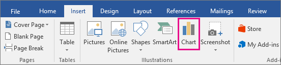
To create a simple chart from scratch in Word, click Insert > Chart, and pick the chart you want.
-
Click Insert > Chart.

-
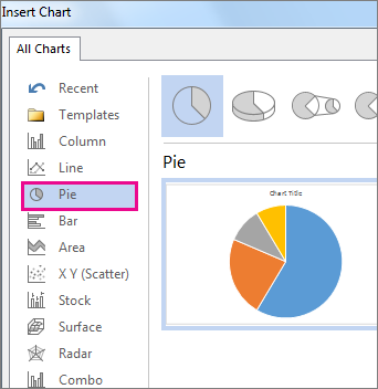
Click the chart type and then double-click the chart you want.
-
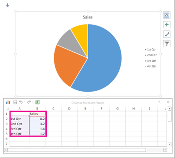
In the spreadsheet that appears, replace the default data with your own information.
-
When you’ve finished, close the spreadsheet.
-
If you want, use the Layout Options button
to arrange the chart and text in your document.
 to arrange the chart and text in your document.
You can make a chart in Word or Excel. If you have lots of data to chart, create your chart in Excel, and then copy from Excel to another Office program. This is also the best way if your data changes regularly and you want your chart to always reflect the latest numbers. In that case, when you copy the chart, keep it linked to the original Excel file.
To create a simple chart from scratch in Word, click Insert > Chart and pick the chart you want.
-
Click Insert > Chart.
-
Click the chart type and then double-click the chart you want.
-
In the spreadsheet that appears, replace the default data with your own information.
-
When you’ve finished, close the spreadsheet.
-
If you want, use the Layout Options button
to arrange the chart and text in your document.
Important:
Office 2010 is no longer supported. Upgrade to Microsoft 365 to work anywhere from any device and continue to receive support.
Upgrade now
In Microsoft Word 2010, you can insert many kinds of data charts and graphs, such as column charts, line graphs, pie charts, bar charts, area graphs, scatter graphs, stock charts, surface charts, doughnut charts, bubble graphs, and radar graphs.
Notes:
-
Don’t see the chart that you want in this article? For more information about the variety of graphs and charts you can use, see Available chart types.
-
Want to create an organization chart? For more information about how to create organization charts, see Create an organization chart.
-
If Microsoft Excel 2010 isn’t installed on your computer, you will not be able to take advantage of the advanced data charting capabilities in the Microsoft Office 2010. Instead, when you create a new data chart in Word 2010, Microsoft Graph opens.
How?
|
|
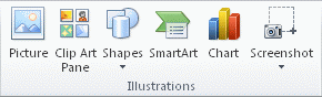
On the Insert tab, in the Illustrations group, click Chart.
|

|
|
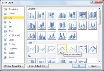
In the Insert Chart dialog box, click the arrows to scroll through the chart types. Select the type of chart that you want and then click OK.
When you rest the mouse pointer over any chart type, a ScreenTip displays its name. |

|
|
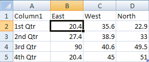
Edit the data in Excel 2010. When you are finished editing your data, you can close Excel.
Sample data in an Excel worksheet |

Tips
-
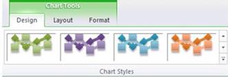
To get a good idea of what you can add to or change in your chart, under Chart Tools, click the Design, Layout, and Format tabs, and then explore the groups and options that are provided on each tab.
Note: If you don’t see the Chart Tools, make sure that you click anywhere inside the chart to activate it.
-
You can also access design, layout, and formatting features that are available for specific chart elements (such as chart axes or the legend) by right-clicking those chart elements.
More information
-
To learn about the available chart types, see Available chart types.
-
To edit data in your chart, see Change the data in an existing chart.
Top of Page
See also
Present data in a chart
Need more help?

You’ve done the hard work in the laboratory, taking precise measurements and recording them diligently. Now comes the time to write up your results.
But how should you do this? Is there not some kind of clear, simple and visually striking way to present your data in a Microsoft Word document? Friend, you’ve come to the right place.
In today’s blog post, we run through the basics of adding (and formatting) charts and tables in Microsoft Word.
Adding a Chart or Graph
Microsoft Word enables adding charts and graphs of many kinds in your document, from simple pie charts to 3D surface graphs. To do this, simply:
- Place the cursor where you want your chart to appear
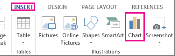
- Go to “Insert” on the main ribbon and select “Chart” from the “Illustrations” section

- In the new window, pick the type of chart you want in your document and click “OK”
- Your chart will now appear in the position selected and an Excel spreadsheet window will open (called “Chart in Microsoft Word”)
- Edit the values and labels in the Excel window to reflect the data required for your chart

- To change the chart title, simply double click and type (you can also add a caption by right clicking on the chart and selecting “Insert Caption…)

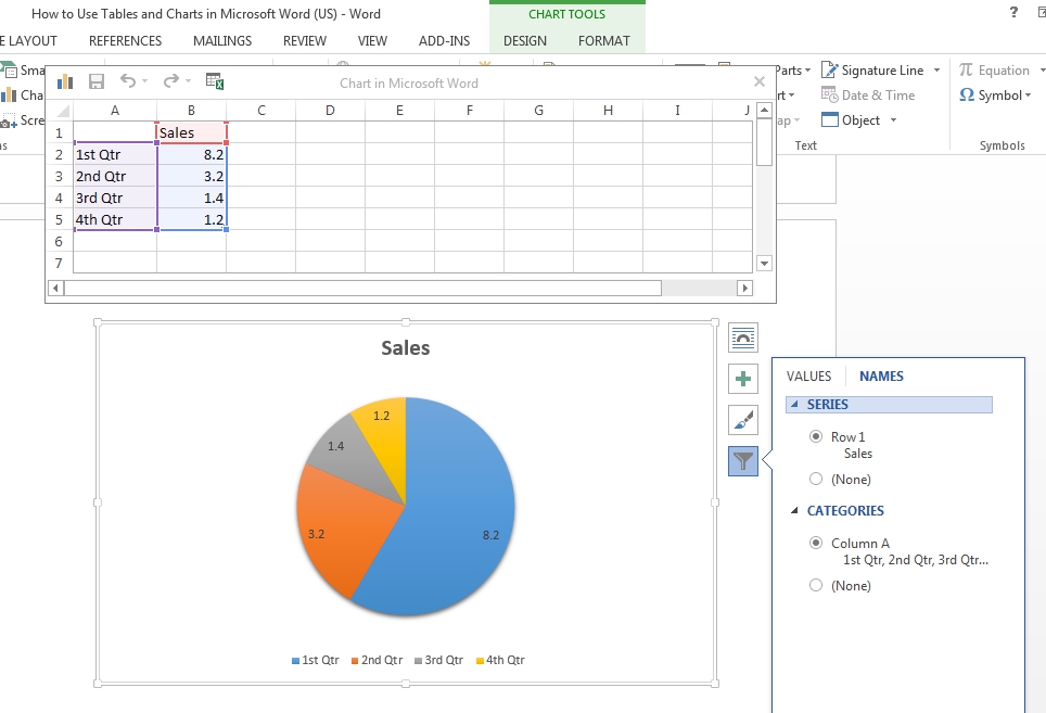
You can customize your chart further via the buttons that appear when you click on the chart (options include layout, chart elements, chart style, colors and the data you wish to be visible).
Linking Excel and Word
Alternatively, if you already have an Excel spreadsheet containing a chart, you can copy and paste this to a Microsoft Word document using the “Paste Special…” option on the “Home” tab (to select this, click the small arrow at the bottom of the normal “Paste” button).
Find this useful?
Subscribe to our newsletter and get writing tips from our editors straight to your inbox.
To do this, open the Excel spreadsheet in question and copy the relevant chart. Next, select “Paste Special.” You can then add the chart to your Word document by selecting “Paste link” and “Microsoft Excel Chart Object”.
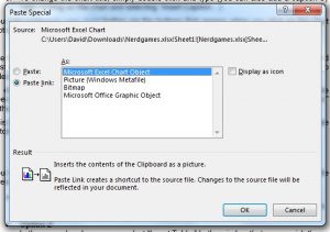
This links the chart in the Word document to the one in the original spreadsheet. It will then update automatically if the values in the spreadsheet are changed.
Adding a Table
You have various options for adding tables to a Microsoft Word document, so we’ll stick to the three simplest here.
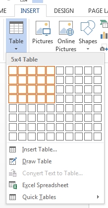
- Option 1
Go to “Insert” and select “Table.” This opens a dropdown menu with a grid. You can then pick the number of columns and rows required.

- Option 2
In the same dropdown menu, select “Insert Table.” In the window that opens, pick the number of columns and rows required. - Option 3
Draw your own! In the “Table” menu on the “Insert” tab, select “Draw Table.” This lets you draw and edit tables by hand
If you click on an existing table, you can edit its design and layout via the “Table Tools” tab that appears on the ribbon.
-
1
Open a Microsoft Word document. To do so, you can double-click an existing Word document, or you can open Microsoft Word and select your document from the Recent section.
- If you’re opening a new document, simply open the Microsoft Word program and click Blank document instead.
-
2
Click in the document where you want to insert your graph. Doing so will place the blinking cursor where you clicked; this is where your graph will appear when you add it.
- For example, clicking below a paragraph of text will set that location as the place to insert your graph.
Advertisement
-
3
Click the Insert tab. It’s at the top of the Word page, to the right of the Home tab.
-
4
Click Chart. You’ll see this option below and to the right of the Insert tab. Its icon resembles several different-colored bars.
-
5
Click a chart format. These are listed on the left side of the Chart pop-up window.
- A few common chart formats are Line, Column, and Pie.
- You can customize your chart’s format by clicking an appearance option at the top of your format’s window.
-
6
Click OK. Doing so will insert your chart into your document.
- You’ll also see a small Excel window with cells appear—this is where you’ll input your data.


Advertisement
-
1
Click a cell in the Excel window. Doing so will select it, which will allow you to add a point of data to that cell.
- The values in the «A» column dictate the X-axis data of your graph.
- The values in the «1» row each pertain to a different line or bar (e.g., «B1» is a line or bar, «C1» is a different line or bar, and so on).
- Numerical values outside of the «A» column or the «1» row represent different points of data on the Y-axis.
- Anything written in an Excel cell can be re-written to reflect your data.
-
2
Type in a number or name.
-
3
Press ↵ Enter or ⏎ Return. Doing so will enter your data into the cell, allowing you to move on to another cell.
-
4
Repeat this process for every point of data you need. As you enter data, your graph will change to display it.
-
5
Click X in the top right corner of the Excel window. Doing so will close the window and save your graph changes.
- You can re-open the Excel window at any time by clicking on your graph.


Advertisement
Add New Question
-
Question
How do I label the axes in a line graph?

The «Chart Tools» menu. Click on the tab entitled «Layout» in the Chart Tools menu. Click on «Axis Titles» from within the «Labels» group. Click on «Primary Horizontal Axis Title» or «Secondary Horizontal Axis Title» to add a horizontal axis text box to your chart.
-
Question
How do I make a table around existing text in my document?
You need to click «Insert» and then click «Smartapp.» Then click on «Relationships» on the left hand side and pick your table.
-
Question
How do I change the title if I update entries?
You can just click on your title and type in the updated title when you’re ready.
See more answers
Ask a Question
200 characters left
Include your email address to get a message when this question is answered.
Submit
Advertisement
-
On Word 2010 or earlier, the Excel window will pop up outside of Microsoft Word as an entirely new Excel document.
Thanks for submitting a tip for review!
Advertisement
-
Make sure you save your work!
Advertisement
About This Article
Article SummaryX
1. Click where you want to put the graph.
2. Click Insert.
3. Click Chart.
4. Select a format.
5. Click OK.
6. Click the Excel window.
7. Add graph data.
Did this summary help you?
Thanks to all authors for creating a page that has been read 646,939 times.
Is this article up to date?

Charts offer a concise and visually appealing way to present numeric information. This tutorial explains the basics of creating and customizing charts in Microsoft Word. We’ll cover five topics:
- How to insert a chart
- How to update existing data in a chart
- How to resize a chart
- How to reposition a chart
- How to change chart colors
These steps apply to all seventeen of Word’s prebuilt chart types:
| Column | Area | Surface | Histogram | Combo |
| Line | X Y (Scatter) | Radar | Box & Whisker | |
| Pie | Map | Treemap | Waterfall | |
| Bar | Stock | Sunburst | Funnel |
Important Note: Word provides many ways to customize charts—many more than can reasonably be covered in one tutorial. So, this tutorial presents the basic methods I believe will be most useful for the majority of users.
Before we begin…
What about Figures and Graphs?
In the writing world, charts and graphs fall under the umbrella term figures, which also includes photos, drawings, maps, and musical scores.
Graphs are generally considered a type of chart. Therefore, the term chart is used throughout this tutorial. However, all the steps shown here also apply to visuals typically considered to be graphs, such as line graphs.
This tutorial is also available as a YouTube video showing all the steps in real time.
Watch more than 150 other writing-related software tutorials on my YouTube channel.
The images below are from Word for Microsoft 365. The steps are the same in Word 2021, Word 2019, Word 2016, and Word 2013. However, your interface may look slightly different in those older versions of the software.
How to Insert a Chart
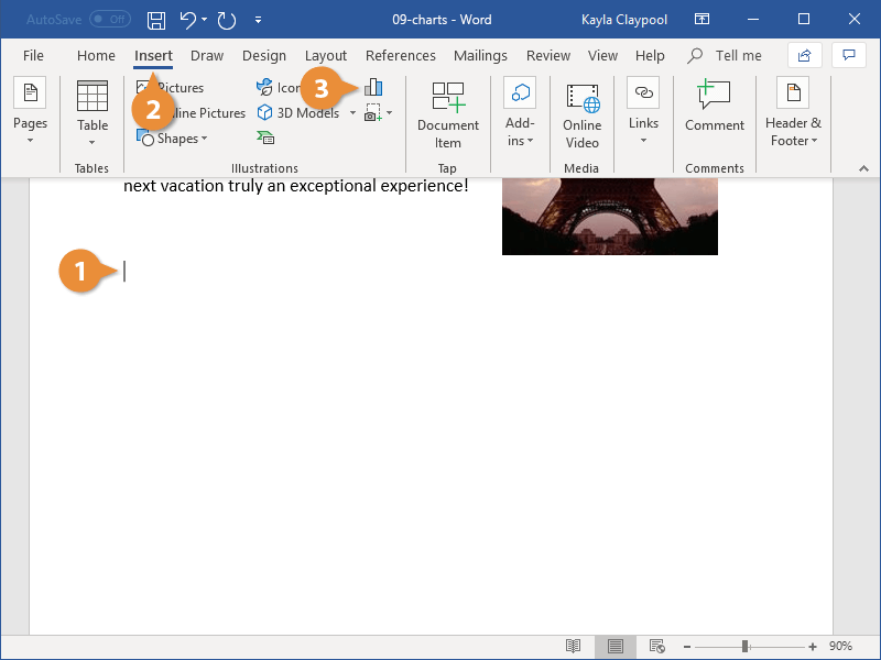
- Place your cursor where you want to insert the chart.
- Select the Insert tab in the ribbon.

- Select the Chart button in the Illustrations group.

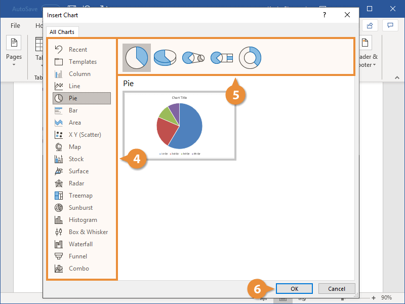
- Select a chart type from the left side of the Insert Chart dialog box.

Pro Tip: Hover your pointer over the example image in the center of the Insert Chart dialog box to see a larger example of the chosen chart type.
- Select a subtype of the selected chart.
The available subtypes will depend on the selected chart. Common charts such as pie charts and bar charts offer attractive 3-D options.

- Select the OK button to close the Insert Chart dialog box and insert the chart.

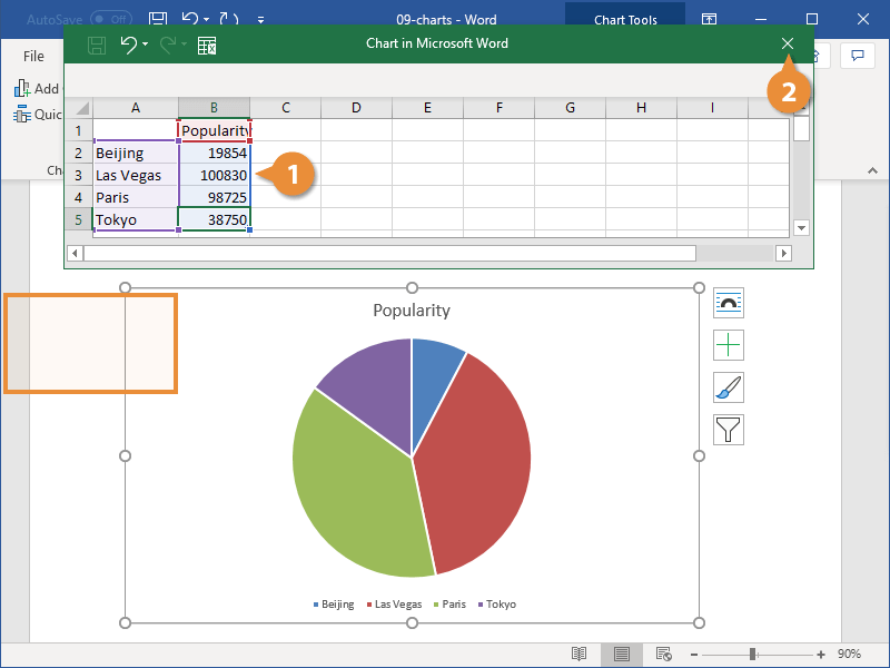
- Enter labels and numbers into the spreadsheet by typing over the example data. Add additional labels and numbers or delete the example data as necessary.

- Select the X to close the spreadsheet.

- (Optional Step) Select the Chart Elements button to the right of the chart if you want to add or remove the title, data labels, or the legend. (Click inside the border to select the chart if the right-side buttons are not visible.)

How to Update Existing Data in a Chart
- Right-click the chart.
- Select Edit Data from the shortcut menu.

Pro Tip: Select the arrow next to Edit Data and select Edit Data in Excel if you want to update your chart in Excel rather than Word’s spreadsheet.
- Edit your data in the spreadsheet (see figure 6).
- Select the X to close the spreadsheet and apply your changes (see figure 7).
How to Resize a Chart
Charts can be resized by dragging the border or by using exact dimensions (e.g., 3” x 4”).
Basic Method: Resize a Chart by Dragging the Border
- Click inside the border to reveal the resizing handles.

- Click and hold one of the handles as you drag the chart to the appropriate size.
-
- The corner handles provide movement in all directions.
- The side handles provide horizontal movement.
- The top and bottom handles provide vertical movement.
Advanced Method: Resize a Chart to Exact Dimensions
- Click inside the border to select the chart.
- Select the Layout Options button to the right of the chart.

- Select See more from the Layout Options menu.

- Select the Size tab in the Layout dialog box.

- (Optional Step) Select Lock aspect ratio if you want to maintain the current shape.

- Enter the dimensions in the Height and Width boxes. If you selected Lock aspect ratio, you only have to enter one of these numbers.

- Select the OK button to close the Layout dialog box and apply your new dimensions.

How to Reposition a Chart
You can customize your chart’s placement on the page by changing its alignment and text wrapping. Text wrapping determines how charts and other figures are positioned in relation to the surrounding text.
- Select the Home tab in the ribbon.

- Click inside the border to select the chart.
- Select the Align Left, Center, or Align Right button in the Paragraph group.

- (Optional Step) Select the Layout Options button to the right of the chart for text wrapping options.

Your position changes will be applied immediately.
How to Change Chart Colors
You can choose a prebuilt color palette for your whole chart or select custom colors for individual elements.
See the bonus section below for information about using RGB, HSL, and Hex color codes.
Basic Method: Choose a Prebuilt Color Palette
- Click inside the border to select the chart.
- Select the Chart Styles button to the right of the chart.

- Select the Color tab in the shortcut menu.

- Select a color palette.

Your new color palette will be applied immediately.
Advanced Method: Choose Custom Colors
- Select and then right-click the individual chart element you want to change.
- Select the Fill button in the shortcut menu.

- Select a color from the drop-down menu or choose More Fill Colors for additional options.

Your new color will be applied immediately.
Bonus Section: How to Use RGB, HSL, and Hex Color Codes in a Chart
Word lets you use RGB (Red, Green, Blue) and HSL (Hue, Saturation, Lightness) color codes in your charts. In addition, you can use Hex color codes if you are using an updated version of Word for Microsoft 365 (formerly Office 365).
- Select and then right-click the individual chart element you want to change.
- Select the Fill button in the shortcut menu (see figure 23).
- Select More Fill Colors from the drop-down menu.

- Select the Custom tab in the Colors dialog box.

- Select RGB or HSL from the Color model menu or enter a code in the Hex box.

- Enter your RGB or HSL code into the appropriate boxes. (Skip this step if you are using a Hex code.)

- Select the OK button to close the Colors dialog box and apply your color change.

Related Resources
Three Ways to Insert Tables in Microsoft Word
How to Save Tables and Figures as Images in Microsoft Word (PC & Mac)
How to Update Table and Figure Numbers in Microsoft Word
How to Change the Style of Table Titles and Figure Captions in Microsoft Word
How to Create and Update a List of Tables or Figures in Microsoft Word
How to Write Figure Captions for Graphs, Charts, Photos, Drawings, and Maps
How to Write Table Titles
How to Reference Tables and Figures in Text
Updated November 27, 2022

You can add charts to your documents to help present information graphically. Using them instead of, or in addition to, tables of data can make it easier for readers to understand.
Insert a Chart
- Click where you want to insert the chart.
- Click the Insert tab.
- Click the Chart button in the Illustrations group.

- Column and Bar charts work well to compare different sets of data against each other.
- Line and Area charts are great for showing trends over time.
- Pie charts show different categories as parts of a whole.
- Select a chart type.
- Select a chart style.
- Click OK.
The Insert Chart dialog box lets you choose from a variety of chart types. Some chart types will be better at displaying certain data than others.
The most common types of charts are Column, Line, and Pie.
Each chart type has a few styles to choose from, presenting the data differently.
A blank chart is inserted, along with a spreadsheet full of placeholder data.
Add Chart Data
When a chart is inserted, its spreadsheet will be full of placeholder data that you can replace with your own content.
- Enter your chart data.
- Click the spreadsheet window’s Close button when you’re done.
As you add rows and columns, the row headers, column headers, and data are highlighted by borders.
To add or remove sections of the data, click and drag any of the selection handles in the spreadsheet and what’s included in the chart will change.
To reopen the spreadsheet, select the chart, click the Design tab in the Chart Tools ribbon group, and click the Edit Databutton.
Change the Layout
You can quickly adjust a chart’s layout at any point after you’ve inserted it. Layouts will affect the position of chart elements like the title, legend, and data labels.
- With the chart selected, click the Design tab in the Chart Tools ribbon group.
- Click the Quick Layout button.
- Select a layout.
A gallery of available layouts appears, based on the chart’s type.
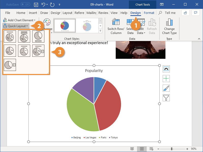
The layout is applied.
If you want to change the color or style, use the options in the Chart Styles group.
Modify Chart Elements
Another way to change the chart layout is to use the chart tool shortcuts to edit the active chart elements.
- With the chart selected, click the Chart Elements button.
- Click the check box next to the element you want to toggle on or off.
- Click the list arrow next to a chart element and select an option.
Different chart types contain different chart elements. Depending on the chart type, you may be able to adjust gridlines, titles, legends, and data or axis labels.
Each element can also be customized further. You can set the position of elements such as the title or legend, or toggle subsets of specific elements, such as horizontal or vertical gridlines.
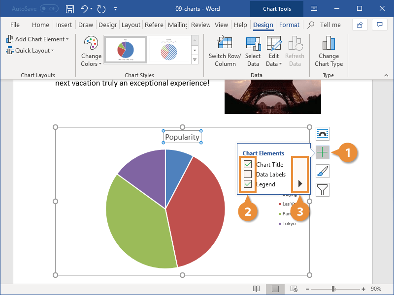
You can continue to set up chart elements in this way until the chart appears exactly how you want it.
You can also insert or modify chart elements by clicking the Design tab in the Chart Tools ribbon group, then clicking Add Chart Element.

FREE Quick Reference
Click to Download
Free to distribute with our compliments; we hope you will consider our paid training.