
Note: If you’re looking for information about adding or changing a chart legend, see Add a legend to a chart.
Add a data series to a chart on the same worksheet
-
On the worksheet that contains your chart data, in the cells directly next to or below your existing source data for the chart, enter the new data series you want to add.
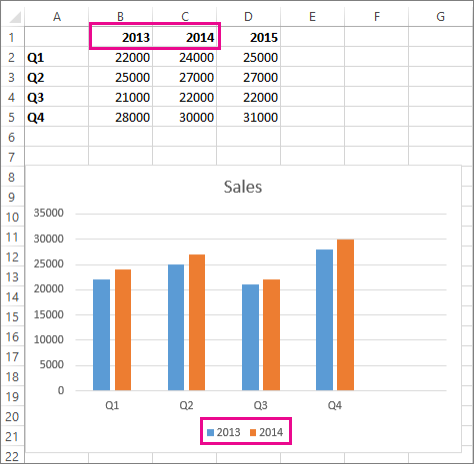
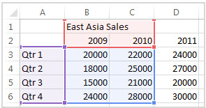
In this example, we have a chart that shows 2013 and 2014 quarterly sales data, and we’ve just added a new data series to the worksheet for 2015. Note that the chart does not yet display the 2015 data series.

-
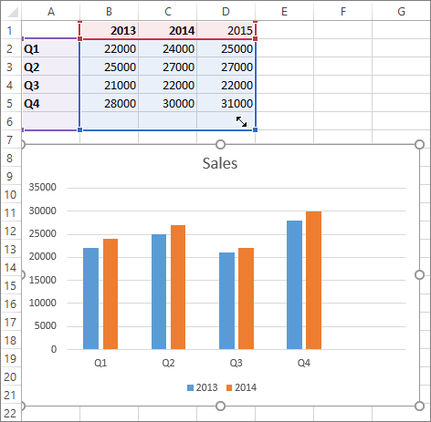
Click anywhere in the chart.
The currently displayed source data is selected on the worksheet, showing sizing handles.
You can see that the 2015 data series is not selected.
-
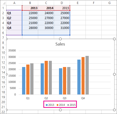
On the worksheet, drag the sizing handles to include the new data.
The chart is updated automatically and shows the new data series you added.

Add a data series to a chart on a separate chart sheet
If your chart is on a separate worksheet, dragging might not be the best way to add a new data series. In that case, you can enter the new data for the chart in the Select Data Source dialog box.
-
On the worksheet that contains your chart data, in the cells directly next to or below your existing source data for the chart, enter the new data series you want to add.
-
Click the worksheet that contains your chart.
-
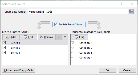
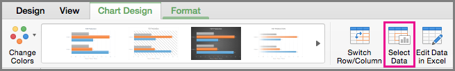
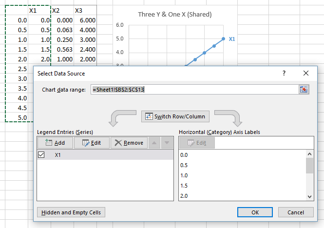
Right-click the chart, and then choose Select Data.
The Select Data Source dialog box appears on the worksheet that contains the source data for the chart.
-
Leaving the dialog box open, click in the worksheet, and then click and drag to select all the data you want to use for the chart, including the new data series.
The new data series appears under Legend Entries (Series) in the Select Data Source dialog box.
-
Click OK to close the dialog box and to return to the chart sheet.

See Also
Create a chart
Select data for a chart
Add a legend to a chart
Available chart types in Office
Get Microsoft chart templates
After creating a chart, you might add another data series to your worksheet that you want to include in the chart. If your chart is on the same worksheet as the data you used to create the chart (also known as the source data), you can quickly drag around any new data on the worksheet to add it to the chart.
-
On the worksheet, in the cells directly next to or below the source data of the chart, enter the new data series you want to add.
-
Click anywhere in the chart.
The source data is selected on the worksheet showing the sizing handles.
-
On the worksheet, drag the sizing handles to include the new data.
The chart is updated automatically and shows the new data series you added.
If your chart is on a separate chart sheet, dragging might not be the best way to add a new data series. In that case, you can enter the new data for the chart in the Select Data dialog box.
Add a data series to a chart on a chart sheet
-
On the worksheet, in the cells directly next to or below the source data of the chart, type the new data and labels you want to add.
-
Click the chart sheet (a separate sheet that only contains the chart you want to update).
-
On the Chart Design tab, click Select Data.
The Select Data Source dialog box appears on the worksheet that has the source data of the chart.
-
Leaving the dialog box open, click in the worksheet, and then select all data you want to use for the chart, including the new data series.
The new data series appears under Legend Entries (Series).
-
Click OK to close the dialog box and to return to the chart sheet.
Specific line and bar types are available in 2-D stacked bar and column charts, line charts, pie of pie and bar of pie charts, area charts, and stock charts.
Predefined line and bar types that you can add to a chart
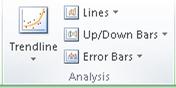
Depending on the chart type that you use, you can add one of the following lines or bars:
-
Series lines These lines connect the data series in 2-D stacked bar and column charts to emphasize the difference in measurement between each data series. Pie of pie and bar of pie charts display series lines by default to connect the main pie chart with the secondary pie or bar chart.
-
Drop lines Available in 2-D and 3-D area and line charts, these lines extend from data points to the horizontal (category) axis to help clarify where one data marker ends and the next data marker starts.
-
High-low lines Available in 2-D line charts and displayed by default in stock charts, high-low lines extend from the highest value to the lowest value in each category.
-
Up-down bars Useful in line charts with multiple data series, up-down bars indicate the difference between data points in the first data series and the last data series. By default, these bars are also added to stock charts, such as Open-High-Low-Close and Volume-Open-High-Low-Close.


Add predefined lines or bars to a chart
-
Click the 2-D stacked bar, column, line, pie of pie, bar of pie, area, or stock chart to which you want to add lines or bars.
This displays the Chart Tools, adding the Design, Layout, and Format tabs.
-
On the Layout tab, in the Analysis group, do one of the following:
-
Click Lines, and then click the line type that you want.
Note: Different line types are available for different chart types.
-
Click Up/Down Bars, and then click Up/Down Bars.
-
Tip: You can change the format of the series lines, drop lines, high-low lines, or up-down bars that you display in a chart by right-clicking the line or bar, and then clicking Format <line or bar type> .
Remove predefined lines or bars from a chart
-
Click the 2-D stacked bar, column, line, pie of pie, bar of pie, area, or stock chart that displays predefined lines or bars.
This displays the Chart Tools, adding the Design, Layout, and Format tabs.
-
On the Layout tab, in the Analysis group, click Lines or Up/Down Bars, and then click None to remove lines or bars from a chart.
Tip: You can also remove lines or bars immediately after you add them to the chart by clicking Undo on the Quick Access Toolbar or by pressing CTRL+Z.
You can add other lines to any data series in an area, bar, column, line, stock, xy (scatter), or bubble chart that is 2-D and not stacked.
Add other lines
-
This step applies to Word for Mac only: On the View menu, click Print Layout.
-
In the chart, select the data series that you want to add a line to, and then click the Chart Design tab.
For example, in a line chart, click one of the lines in the chart, and all the data marker of that data series become selected.
-
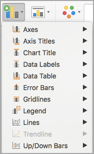
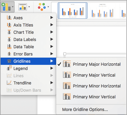
Click Add Chart Element, and then click Gridlines.
-
Choose the line option that you want or click More Gridline Options.
Depending on the chart type, some options may not be available.
Remove other lines
-
This step applies to Word for Mac only: On the View menu, click Print Layout.
-
Click the chart with the lines, and then click the Chart Design tab.
-
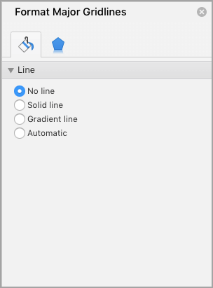
Click Add Chart Element, click Gridlines, and then click More Gridline Options.
-
Select No line.
You can also click the line and press DELETE .
Return to Charts Home
This tutorial will demonstrate how to add series to graphs in Excel & Google Sheets.
Adding Series to a Graph in Excel
Starting with your Data
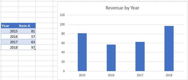
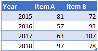
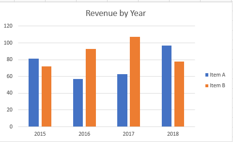
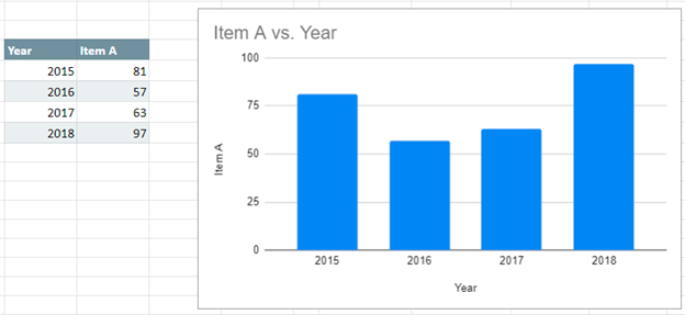
We’ll start with the below data that shows Item A Revenue by Year. In this tutorial, we’ll show how to add new series to an existing graph.
Adding Data
In this example, we’ll add another dataset to add to the graph.
- Right click Graph
- Click Select Data
3. Select Add under Legend Entries (Series)
4. Update Series Name with New Series Header
5. Update Series Values with New Series Values
Final Graph with Additional Series
Below you can see the final graph with the additional series.
Adding Series to a Graph in Google Sheets
Starting with your Data
Below, we’ll use the same data used above.
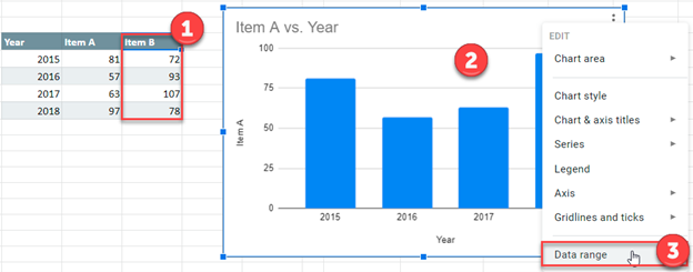
Add a Data Series
- Add the additional series to the table
- Right click on graph
- Select Data Range
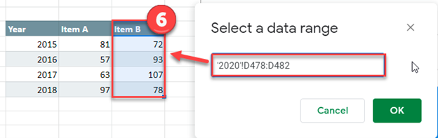
4. Select Add Series
5. Click box to Select a Data Range
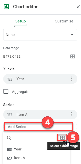
6. Highlight the new Series Dataset and click OK.
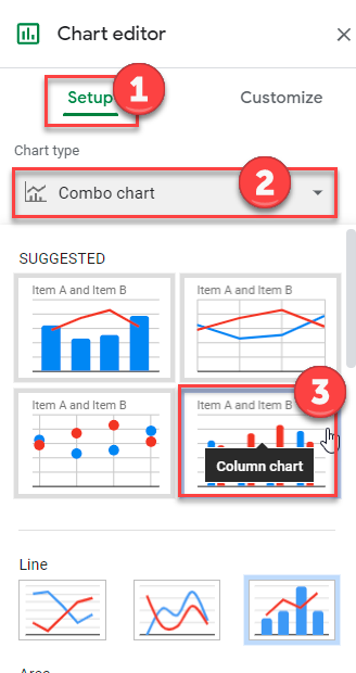
Format Graph
- Select Setup under Chart editor
- Click on box under Chart Type
- Change to Bar Graph
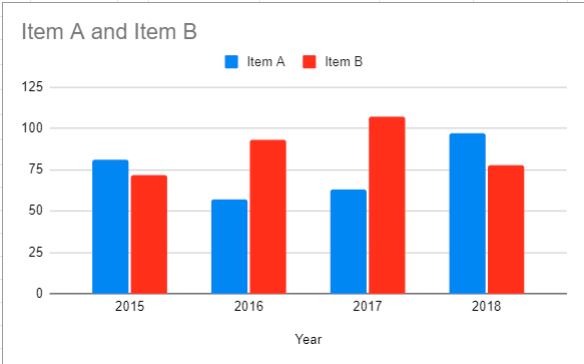
Final Graph with Additional Series
The below graph shows the additional data series.
In this tutorial, we will show how you can add an additional series to an existing chart without recreating the chart. This can save you a lot of time and also help you understand the outcome if any new data is added. Using a small trick, we can add a new series to a chart in Excel.
Adding a Series to a Chart in Excel
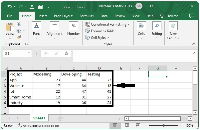
Let us suppose we have the following data available in an Excel sheet. To start with, we will convert this available data to a chart.
Step 1:
To create the chart, select the data → click Insert → select 2D Column Chart. The chart for the above data will look like the one shown below:
Step 2:
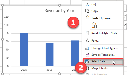
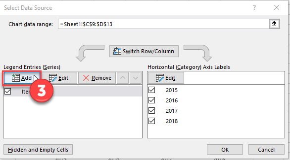
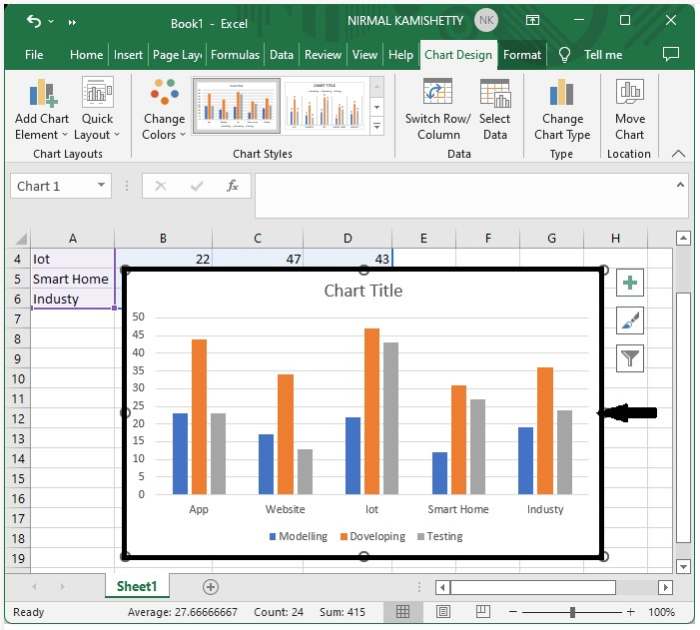
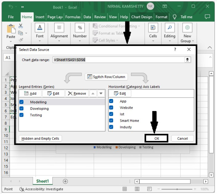
To add a new series, enter the new series in the table → right-click on the chart → Select Data Source. It will open a new pop-up window, as shown in the following image:
Step 3:
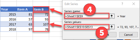
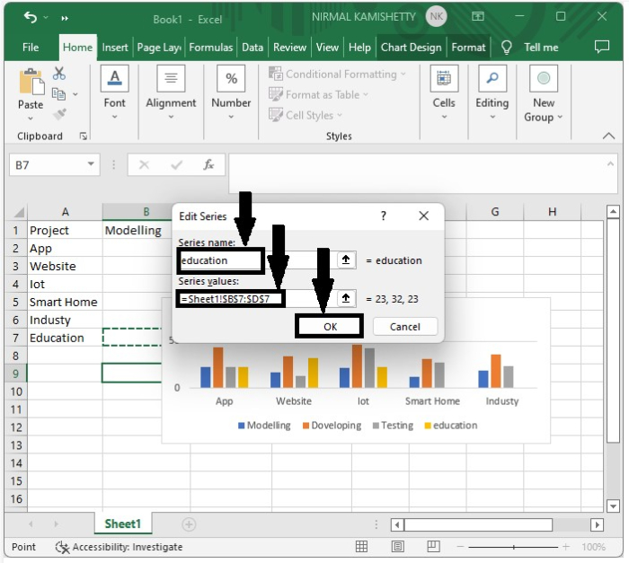
In the new pop-up window, click «OK». It will open another pop-up window on which you need to enter the Series Name as «Education» and the Series Value as Address of all the values of New Series. Click «OK» to close the pop-up window.
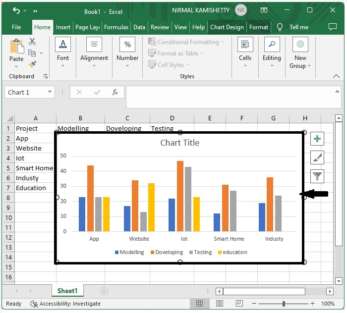
Again click the «OK» button to close the pop-up window. Now, you can observe the new series is added to the existing chart, as shown below:
Conclusion
In this tutorial, we used an example to demonstrate how you can add a new series to an already existing chart in Excel.
Tuesday, August 9, 2016
Peltier Technical Services, Inc., Copyright © 2023, All rights reserved.
A common question in online forums is “How can I show multiple series in one Excel chart?” It’s really not too hard to do, but for someone unfamiliar with charts in Excel, it isn’t totally obvious. I’m going to show a couple ways to handle this. I’ll show how to add series to XY scatter charts first, then how to add data to line and other chart types; the process is similar but the effects are different.
Displaying Multiple Series in an XY Scatter Chart
Single Block of Data
This is a trivial case, and probably not what people are asking about. But I’ll cover it just for completeness.
If I have a single block of data, I can select the block of data, or just a single cell within it, and Excel will build a chart using all of the data. The first column (if series are plotted by column) is used for X values, the rest of the columns become the Y values, and the first row is used for series names.

Select Series Data: If I somehow have a chart that uses only part of the data, I can right click on the chart and choose Select Data, or I can click Select Data on the ribbon, and the Select Data Source dialog pops up. I can then edit the Chart Data Range, either by manually editing the address, or by selecting a different range, to update the chart.
Highlighted Chart Data: But it’s even easier to do without the dialog. If I select the chart, I can see the chart’s data highlighted in the worksheet.
I can click on any of the handles on the corners of the highlighted ranges to stretch the amount of data used in the chart.

Easy peasy, right? I’ve written about this simple yet powerful technique for controlling chart data in Chart Source Data Highlighting, Chart Series Data Highlighting, and Highlighted Chart Source Data.
Note: The default Excel chart has a legend, and I’ve replaced it with color-coded data labels on the last point of each series in the chart. When new series are added, they would also be listed in the legend. In my sample charts above, I had to add the data label every time I added a new series. What a pain, you say? Not really. In Peltier Tech Charts for Excel, one of the most used features adds a label to the last point of a selected series, or the last point of every series in one or more selected charts. A relates feature matches the label color to the plotted series.
Multiple Blocks of Data
It’s not as easy to manipulate your chart’s data when the data resides in separate blocks of data, such as this:

You have to start by selecting one of the blocks of data and creating the chart.
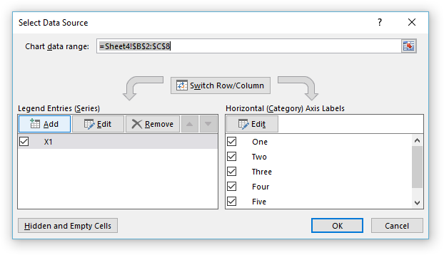
Select Series Data: Right click the chart and choose Select Data, or click on Select Data in the ribbon, to bring up the Select Data Source dialog. You can’t edit the Chart Data Range to include multiple blocks of data. However, you can add data by clicking the Add button above the list of series (which includes just the first series).
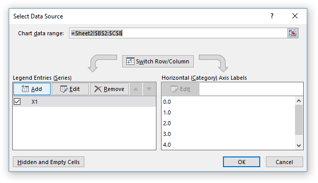
The Select Data Source dialog disappears, while a smaller Edit Series dialog pops up, with spaces for series name, X values, and Y values.
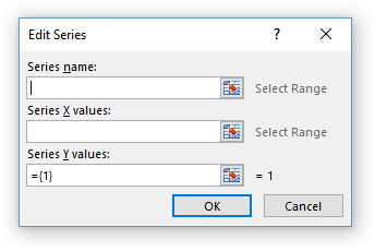
Select ranges for each of these…
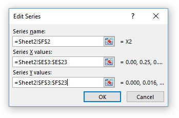
… then click OK and the new data appears as a new series in the list.
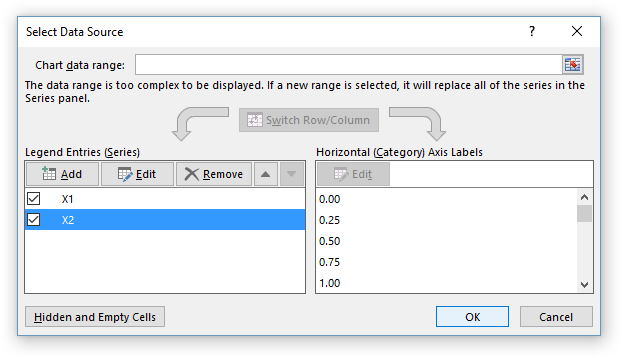
The chart now has two series. Note that in an XY Scatter chart, each series can have its own X values, independent of the other series in the chart.
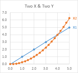
Repeat as needed to fully populate the chart.
Not too bad, but I’m not a huge fan of the Select Data Source dialog. It just seems like too much work. And like the expansion of data within a single range that I started this article with, there’s a faster and easier way to add data to a chart from different ranges.
Copy – Paste Special: Select and copy the data you want to add to the chart, then select the chart, and from the Home tab of the ribbon, click the Paste dropdown, and select Paste Special. You will be greeted with the Paste Special dialog.
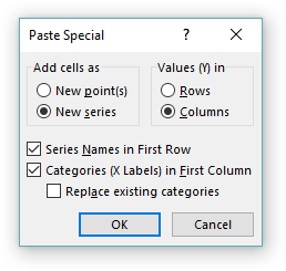
Make sure that the settings in the dialog are correct: Values (Y) in rows or columns, series names in first row, categories (X labels) in first column.
The Replace Existing Categories setting would replace existing X values with those being pasted, which makes little sense for an XY chart that already has X values defined. We’ll talk about this setting when we discuss Line charts. For XY Scatter charts, I never ever check this box.
Click OK and the chart has a new series.
Copy the next range, select the chart, Paste Special.
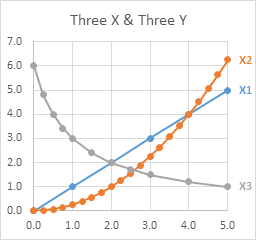
Again, in an XY Scatter chart, each series can have its own X values, plotted along the same X axis scale, independent of the other series in the chart.
This is pretty easy. It’s even easier to use Paste instead of Paste Special, but sometimes Excel guesses incorrectly on those row/column, first row, first column settings, and you’ll have to undo the Paste and do Paste Special.
Displaying Multiple Series in a Line (Column/Area/Bar) Chart
I’m using Line charts here, but the behavior of the X axis is the same in Column and Area charts, and in Bar charts, but you have to remember that the Bar chart’s X axis is the vertical axis, and it starts at the bottom and extends upwards.
Single Block of Data
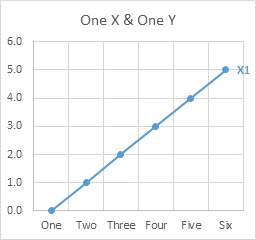
When your data is in a single block, a Line chart works just like the XY scatter chart. The first column (if the series data is plotted in columns) is used as X values, or more accurately, X labels; the rest of the columns are used as Y values. The first row is used for series names.

Multiple Blocks of Data
When there are multiple blocks of data, Line charts still work mostly the same as XY Scatter charts. Let’s look at this simple data.
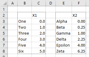
Start by creating a Line chart from the first block of data.
Select Series Data: Right click the chart and choose Select Data from the pop-up menu, or click Select Data on the ribbon.
As before, click Add, and the Edit Series dialog pops up. There are spaces for series name and Y values.
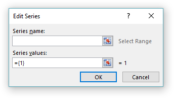
Fill in entries for series name and Y values, and the chart shows two series. The original X labels remain on the chart.
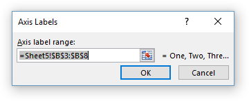
This dialog differs from the one seen when adding data to an XY Scatter chart, because there is no place for X values (or X labels). To change the X labels, click the Edit button above the list of X labels in the chart. The Axis Labels dialog appears.
The reason for this is that Line charts (plus Column, Area, and Bar charts) treat X values differently than XY Scatter charts. XY Scatter charts treat X values as numerical values, and each series can have its own independent X values. Line charts and their ilk treat X values as non-numeric labels, and all series in the chart use the same X labels.
Change the range in the Axis Labels dialog, and all series in the chart now use the new X labels.

The differences between Line and XY Scatter charts can be confusing. What is important is that the data can be formatted the same (markers or no markers, lines or no lines), while the X values are treated differently (numerical values in XY Scatter charts, non-numeric labels in Line charts).
Copy – Paste Special: As in XY Scatter charts, adding data to Line charts can be faster and easier with Copy and Paste Special than with the Select Data dialog.
Check the settings in the dialo: Values (Y) in rows or columns, series names in first row, categories (X labels) in first column. If Replace Existing Categories is unchecked, the original X labels will remain in the chart. Click OK to update the chart.

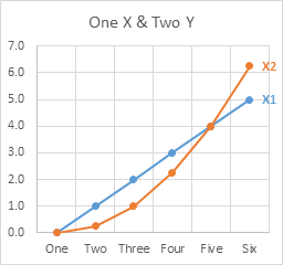
Although both series are plotted against the original X labels, if we examine the series formulas, we see that the original series formula contains the original X labels range ($B$3:$B$8), while the new series formula references the new range ($E$3:$E$8).
=SERIES(Sheet4!$C$2,Sheet4!$B$3:$B$8,Sheet4!$C$3:$C$8,1) =SERIES(Sheet4!$F$2,Sheet4!$E$3:$E$8,Sheet4!$F$3:$F$8,2)The X labels specified in the first series formula is what Excel uses for the chart. If we had selected only the new Y values, ignoring any new X values, and kept Categories in First Column unchecked, both series formulas would reference the same X label range.
Here is what happens when we check Replace Existing Categories.

When we click OK to update the chart, the new X labels appear along the axis. In addition, both series formulas include the new X label range.

This usually isn’t what I want, so I almost never check Replace Existing Categories for any chart type.
The behavior even becomes stranger when we use mismatched data ranges. The second range below has many more rows than the first.

Here is the chart if we paste special with Replace Existing Categories unchecked. Both series use the same X labels, so the axis has enough spaces for the longest series. Since the first labels are being used, these fill the first part of the axis, overlapping excessively, while the rest of the axis remains unlabeled. The first series is pushed to the left of the chart along with the axis labels, since it only uses a fraction of the X axis labels.
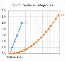
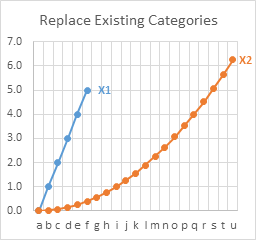
Here is the same chart if we paste special with Replace Existing Categories checked. Both series use the new X labels, which fill the entire length of the axis, and they don’t overlap excessively since I wisely used one-character labels. The first series is again pushed to the left of the chart, since it has many fewer points than the second series.
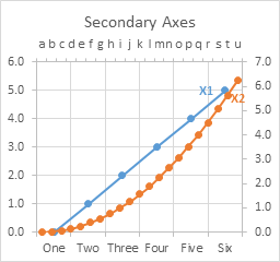
You can assign one series to the primary axis and the other to the secondary axis, and each axis will be long enough for its labels. Below, the first series is plotted on the primary axis (bottom and left edges of the chart), while the second series is plotted on the secondary axis (top and right edges).
It is easier to assign the new series to the secondary axis because I kept the Replace Existing Categories unchecked. This kept the new X label range in the series formula even though the series was initially plotted against the original labels. When I switched the series to the secondary axis, it used the new X labels from the series formula. If I had used Replace Existing Categories, the original categories would have been removed from the original series formula, and I would have had to restore them.
I oversimplified when I stated earlier that all series in a Line (Column, Area, Bar) chart use the same X labels. It’s more accurate to say that all primary axis series in a Line chart use the primary axis labels, while all secondary axis series use the secondary axis labels.
You can try to do a little rescaling of axes to make the chart look better. Here I set the same maximum and minimum values for primary and secondary Y axes. I also formatted the Axis Position to On Tick Marks for both primary and secondary X axes: “One” lines up with “a” and “Six” lines up with “u”, and fortunately there are the right number of categories that each category on the primary scale lines up with a category on the secondary scale (“Two” with “e”, “Three” with “i”, etc.). This alignment was a happy accident.
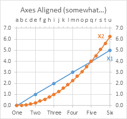
I hardly ever have a secondary X axis on a line chart, since there is usually no relationship between the two sets of labels, but our eye insists on seeing such a relationship. I’ve written about this confusion caused by Secondary Axes in Charts, even when applied in a well-meaning way.