
Excel for Microsoft 365 Excel 2021 Excel 2019 Excel 2016 Excel 2013 Excel 2010 More…Less
If someone’s entering data inaccurately, or you think a coworker may be confused about how to enter data, add a label. A simple name, such as «Phone,» lets others know what to put in a cell, and your labels can also provide more complex instructions.
You can add labels to forms and ActiveX controls.
Add a label (Form control)
-
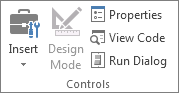
Click Developer, click Insert, and then click Label
 .
.
-
Click the worksheet location where you want the upper-left corner of the label to appear.
-
To specify the control properties, right-click the control, and then click Format Control.
 .
.
-
Click Developer and then click Insert, and under ActiveX Controls, click Label
.
-
Click the worksheet location where you want the upper-left corner of the label to appear.
-
Click Design Mode
. -
Click the worksheet location where you want the upper-left corner of the label to appear.
-
To specify the control properties, click Properties
.Tip: You can also right-click the label, and then click Properties.
The Properties dialog box appears. For detailed information about each property, select the property, and then press F1 to display a Visual Basic Help topic. You can also type the property name in the Visual Basic Help Search box. This table summarizes the properties.
Summary of label properties by functional category
 .
. .
. .
.|
If you want to specify |
Use this property |
|
General: |
|
|
Whether the control is loaded when the workbook is opened. (Ignored for ActiveX controls.) |
AutoLoad (Excel) |
|
Whether the control can receive the focus and respond to user-generated events. |
Enabled (Form) |
|
Whether the control can be edited. |
Locked (Form) |
|
The name of the control. |
Name (Form) |
|
The way the control is attached to the cells below it (free floating, move but do not size, or move and size). |
Placement (Excel) |
|
Whether the control can be printed. |
PrintObject (Excel) |
|
Whether the control is visible or hidden. |
Visible (Form) |
|
Text: |
|
|
Font attributes (bold, italic, size, strikethrough, underline, and weight). |
Bold, Italic, Size, StrikeThrough, Underline, Weight (Form) |
|
Descriptive text on the control that identifies or describes it. |
Caption (Form) |
|
How text is aligned in the control (left, center, or right). |
TextAlign (Form) |
|
Whether the contents of the control automatically wrap at the end of a line. |
WordWrap (Form) |
|
Size and position: |
|
|
Whether the size of the control automatically adjusts to display all contents. |
AutoSize (Form) |
|
The height or width in points. |
Height, Width (Form) |
|
The distance between the control and the left or top edge of the worksheet. |
Left, Top (Form) |
|
Formatting: |
|
|
The background color. |
BackColor (Form) |
|
The background style (transparent or opaque). |
BackStyle (Form) |
|
The color of the border. |
BorderColor (Form) |
|
The type of border (none or single-line). |
BorderStyle (Form) |
|
The foreground color. |
ForeColor (Form) |
|
Whether the control has a shadow. |
Shadow (Excel) |
|
The visual appearance of the border (flat, raised, sunken, etched, or bump). |
SpecialEffect (Form) |
|
Image: |
|
|
The bitmap to display in the control. |
Picture (Form) |
|
The location of the picture relative to its caption (left, top, right, and so on). |
PicturePosition (Form) |
|
Keyboard and mouse: |
|
|
The shortcut key for the control. |
Accelerator (Form) |
|
A custom mouse icon. |
MouseIcon (Form) |
|
The type of pointer that is displayed when the user positions the mouse over a particular object (for example, standard, arrow, or I-beam). |
MousePointer (Form) |
-
Click Developer and then click Insert, and under ActiveX Controls, click Text Box
.
-
Click the worksheet location where you want the upper-left corner of the text box to appear.
-
To edit the ActiveX control, click Design Mode
. -
To specify the control properties, click Properties
.Tip: You can also right-click the text box, and then click Properties.
The Properties dialog box appears. For detailed information about each property, select the property, and then press F1 to display a Visual Basic Help topic. You can also type the property name in the Visual Basic Help Search box. The following section summarizes the properties that are available.
Summary of text box properties by functional category
 .
.|
If you want to specify |
Use this property |
|
General: |
|
|
Whether the control is loaded when the workbook is opened. (Ignored for ActiveX controls.) |
AutoLoad (Excel) |
|
Whether the control can receive the focus and respond to user-generated events. |
Enabled (Form) |
|
Whether the control can be edited. |
Locked (Form) |
|
The name of the control. |
Name (Form) |
|
The way the control is attached to the cells below it (free floating, move but do not size, or move and size). |
Placement (Excel) |
|
Whether the control can be printed. |
PrintObject (Excel) |
|
Whether the control is visible or hidden. |
Visible (Form) |
|
Text: |
|
|
Whether a word or a character is the basic unit used to extend a selection. |
AutoWordSelect (Form) |
|
Font attributes (bold, italic, size, strikethrough, underline, and weight). |
Bold, Italic, Size, StrikeThrough, Underline, Weight (Form) |
|
Whether selected text remains highlighted when the control does not have the focus. |
HideSelection (Form) |
|
The default run time mode of the Input Method Editor (IME). |
IMEMode (Form) |
|
Whether the size of the control adjusts to display full or partial lines of text. |
IntegralHeight (Form) |
|
The maximum number of characters a user can enter. |
MaxLength (Form) |
|
Whether the control supports multiple lines of text. |
MultiLine (Form) |
|
Placeholder characters, such as an asterisk (*), to be displayed instead of actual characters. |
PasswordChar (Form) |
|
Whether the user can select a line of text by clicking to the left of the text. |
SelectionMargin (Form) |
|
The text in the control. |
Text (Form) |
|
How text is aligned in the control (left, center, or right). |
TextAlign (Form) |
|
Whether the contents of the control automatically wrap at the end of a line. |
WordWrap (Form) |
|
Data and binding: |
|
|
The range that is linked to the control’s value. |
LinkedCell (Excel) |
|
The content or state of the control. |
Value (Form) |
|
Size and position: |
|
|
Whether the size of the control automatically adjusts to display all the contents. |
AutoSize (Form) |
|
The height or width in points. |
Height, Width (Form) |
|
The distance between the control and the left or top edge of the worksheet. |
Left, Top (Form) |
|
Formatting: |
|
|
The background color. |
BackColor (Form) |
|
The background style (transparent or opaque). |
BackStyle (Form) |
|
The color of the border. |
BorderColor (Form) |
|
The type of border (none or a single-line). |
BorderStyle (Form) |
|
The foreground color. |
ForeColor (Form) |
|
Whether the control has a shadow. |
Shadow (Excel) |
|
The visual appearance of the border (flat, raised, sunken, etched, or bump). |
SpecialEffect (Form) |
|
Whether an automatic tab occurs when a user enters the maximum allowable characters into the control. |
AutoTab (Form) |
|
Keyboard and mouse: |
|
|
Whether drag-and-drop is enabled. |
DragBehavior (Form) |
|
The selection behavior when entering the control (select all or do not select). |
EnterFieldBehavior (Form) |
|
The effect of pressing ENTER (create a new line or move focus). |
EnterKeyBehavior (Form) |
|
A custom mouse icon. |
MouseIcon (Form) |
|
The type of pointer that is displayed when the user positions the mouse over a particular object (for example, standard, arrow, or I-beam). |
MousePointer (Form) |
|
Whether tabs are allowed in the edit region. |
TabKeyBehavior (Form) |
|
Specific to Text Box: |
|
|
Whether the control has vertical scroll bars, horizontal scroll bars, or both. |
ScrollBars (Form) |
-
Click File, click Options, and then click Customize Ribbon.
-
Under Main Tabs , select the Developer check box, and then click OK.
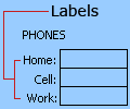
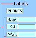
A label identifies the purpose of a cell or text box, displays brief instructions, or provides a title or caption. A label can also display a descriptive picture. Use a label for flexible placement of instructions, to emphasize text, and when merged cells or a specific cell location is not a practical solution.
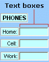
A text box is a rectangular box in which you can view, enter, or edit text or data in a cell. A text box can also be a static, and display data users can only read. Use a text box as an alternative to entering text in a cell, when you want to display an object that floats freely. You can also use a text box to display or view text that is independent of row and column boundaries, preserving the layout of a grid or table of data on the worksheet.
Label on a form control:
An ActiveX control label:
An ActiveX text box control:
Notes:
-
To create a text box with a set of placeholder characters that accepts a password, use the PasswordChar property. Make sure that you protect the linked cell or other location in which the text is stored. Use strong passwords that combine uppercase and lowercase letters, numbers, and symbols, such as Y6dh!et5, not House27. Passwords should be 8 or more characters;14 is better.
And don’t forget your password. If you do, we can’t help you retrieve it. Office doesn’t have a master key to unlock anything. Store passwords in a secure place away from the information they help protect.
-
To create a scrolling, multiple-line text box with horizontal and vertical scroll bars, set MultiLine to True, AutoSize and WordWrap to False, ScrollBars to 3, and LinkedCell to the cell address (such as D1) that you want to contain the text. To enter a new line, the user must press either CTRL+ENTER or SHIFT+ENTER, which generates a special character that is stored in the linked cell.
Need more help?
how to do it in Excel: adding data labels
Today’s post is a tactical one for folks creating visuals in Excel: how to embed labels for your data series in your graphs, instead of relying on default Excel legends.
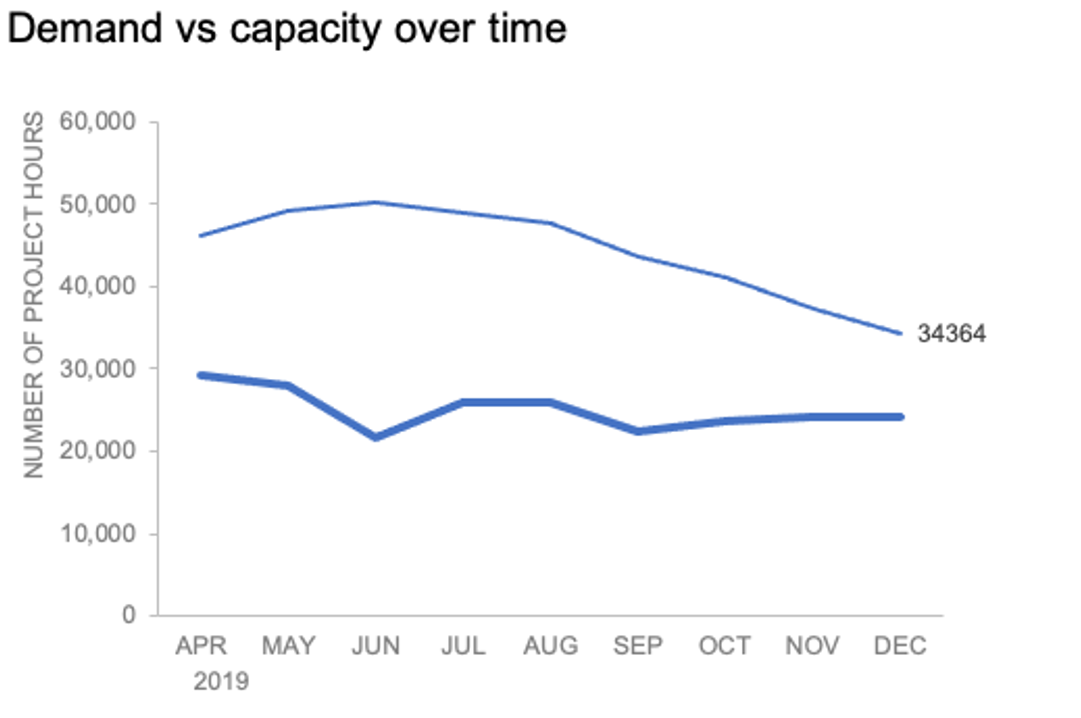
To illustrate, let’s look at an example from storytelling with data: Let’s Practice!. The graph below shows demand and capacity (in project hours) over time.

There are a few different techniques we could use to create labels that look like this.
Option 1: The “brute force” technique
The data labels for the two lines are not, technically, “data labels” at all. A text box was added to this graph, and then the numbers and category labels were simply typed in manually. This is what we affectionately refer to as “brute-forcing” your tool to make it look the way you want it to, regardless of its defaults. Remember: your audience only sees the end result of your work, even if the behind-the-scenes steps aren’t exactly elegant.

One benefit of this approach is that I have greater control over the formatting: size, position, and color of the labels. I can easily make them appear how I want them to appear by simply adjusting the formatting, which is much easier to do with a text box than with a genuine data label. The downside is that this method may not scale easily with many graphs, or those that will be frequently updated with new data—as the data changes, the text labels won’t move with them.
Option 2: Embedding labels directly
Let’s look now at an alternative approach: embedding the labels directly. You can download the corresponding Excel file to follow along with these steps:
Right-click on a point and choose Add Data Label. You can choose any point to add a label—I’m strategically choosing the endpoint because that’s where a label would best align with my design.

Excel defaults to labeling the numeric value, as shown below.
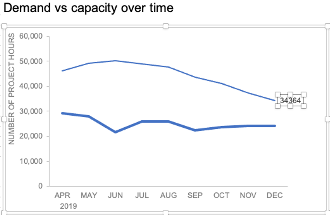
Now let’s adjust the formatting. Click the label (not the data point, but the label itself) twice, so that these white boxes appear around it:
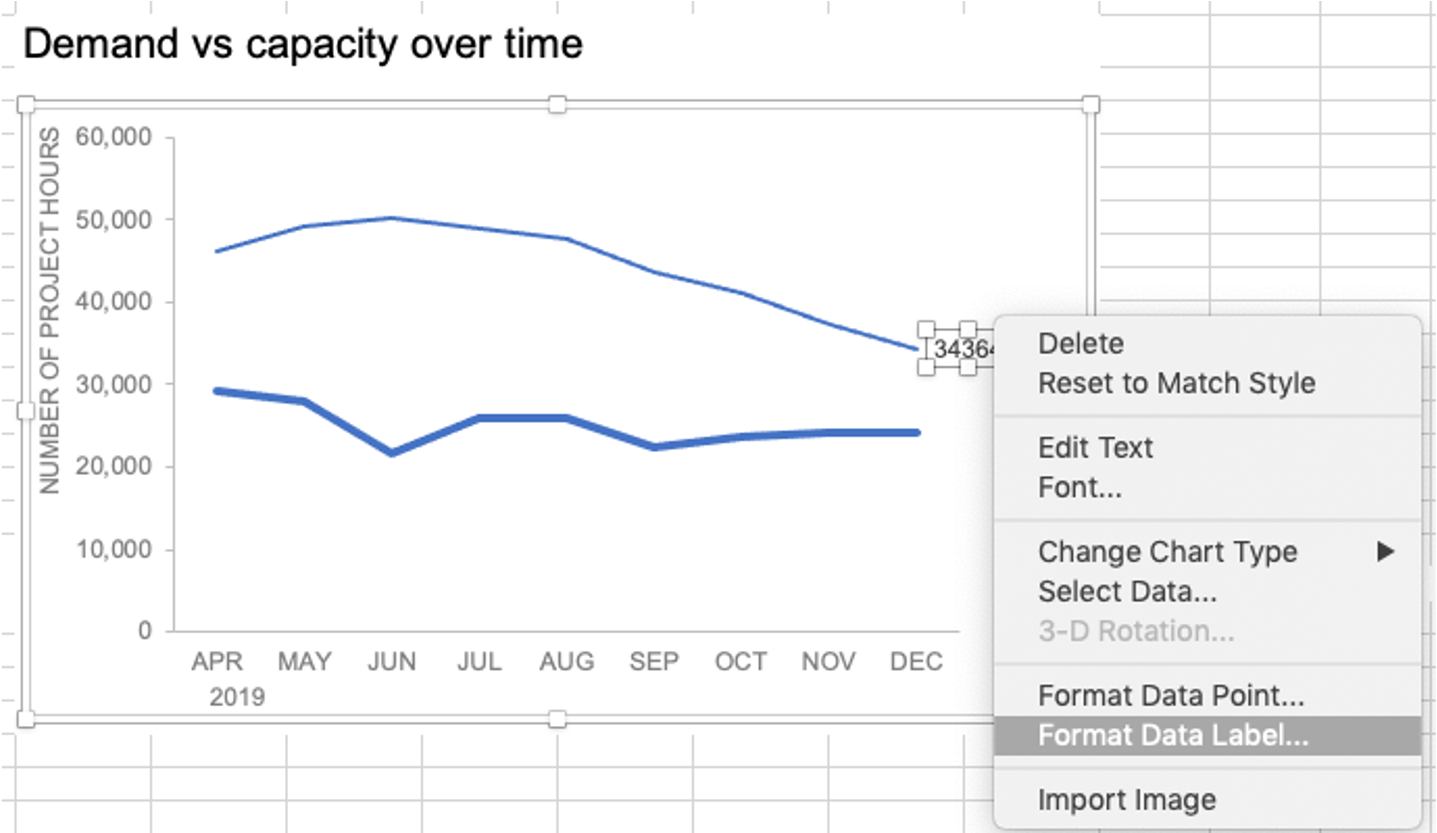
Right-click and choose Format Data Label:
In the Label Options menu that appears, you can choose to add or remove fields by checking (or unchecking) the corresponding box under Label Contains. To add the word “Demand”, I’ll check the Series Name box.

The label appeared in all-caps (“DEMAND”) because it’s referencing the underlying data—I could adjust the header in Column M to “Demand” if I didn’t want the entire word capitalized (this is a stylistic choice).

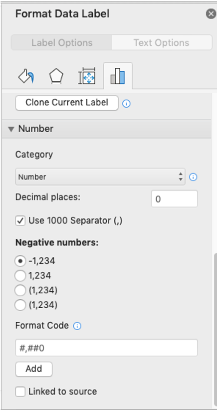
To adjust the number formatting, navigate back to the Format Data Label menu and scroll to the Number section at the bottom. I’ll choose Number in the Category drop-down and change Decimal places to 0 (side note: checking the Linked to source box is a good option if you want the labels to reformat when the formatting of the underlying source data changes).
My resulting visual looks like this:

From here, I can manually adjust the label alignment by highlighting the graph and making the Plot area smaller so that the label doesn’t overlap the line:
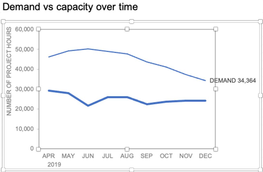
I’ll repeat the same steps to add the Capacity label:

The final thing I’ll do is clean up the formatting of those labels—move the numbers in front of the words, change the number format to be rounded to the thousands place, switch the colors of the labels to match the lines they refer to, and make the font for “24K Capacity” bold.

This post was inspired by a recent conversation during our bi-weekly office hour sessions. Do you ever need quick input on a graph or slide, or wish you could pick the SWD team’s brain on a project? Subscribe to premium membership for personalized support and get your questions answered. Our team has enjoyed getting to know many of you during these fun and interactive sessions!
Return to Charts Home
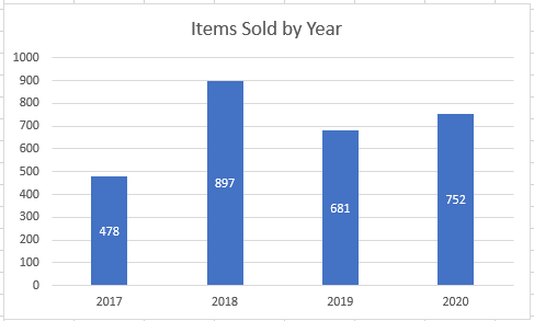
In this tutorial, we’ll add and move data labels to graphs in Excel and Google Sheets.
Adding and Moving Data Labels in Excel
Starting with the Data
In this example, we’ll start a table and a bar graph. We’ll show how to add label tables and position them where you would like on the graph.

Adding Data Labels
- Click on the graph
- Select + Sign in the top right of the graph
- Check Data Labels

Change Position of Data Labels
Click on the arrow next to Data Labels to change the position of where the labels are in relation to the bar chart

Final Graph with Data Labels
After moving the data labels to the Center in this example, the graph is able to give more information about each of the X Axis Series.
Adding and Moving Data Labels in Google Sheets
Starting with your Data
We’ll start with the same dataset that we went over in Excel to review how to add and move data labels to charts.
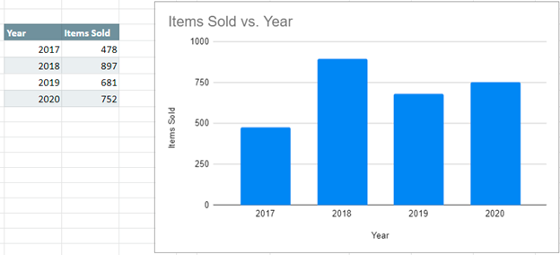
Add and Move Data Labels in Google Sheets
- Double Click Chart
- Select Customize under Chart Editor
- Select Series

4. Check Data Labels
5. Select which Position to move the data labels in comparison to the bars.

Final Graph with Google Sheets
After moving the dataset to the center, you can see the final graph has the data labels where we want.

Here’s a question from a reader:
I use Microsoft 365 Excel for data entry purposes. Once i have the data ready in the spreadsheet i would like to create different charts: pie, bars and so forth, all based on my dataset. It seems that by default no labels are posted in my Excel chart making it harder to understand the data aggregation. Any ideas how to add labels to my Excel chart?
Insert Excel data text labels and callouts
Having data labels on your charts makes it much easier and faster for your readers to understand the information you are conveying in a couple seconds. If you are having challenges adding data labels to your Excel charts, this guide is for you. I will take you through a step-step procedure that you can use to easily add data labels to your charts. The steps that I will share in this guide apply to Excel 2021 / 2019 / 2016.
- Step #1: After generating the chart in Excel, right-click anywhere within the chart and select Add labels. Note that you can also select the very handy option of Adding data Callouts.

- Step #2: When you select the “Add Labels” option, all the different portions of the chart will automatically take on the corresponding values in the table that you used to generate the chart. The values in your chat labels are dynamic and will automatically change when the source value in the table changes.
- Step #3: Format the data labels. Excel also gives you the option of formatting the data labels to suit your desired look if you don’t like the default. To make changes to the data labels, right-click within the chart and select the “Format Labels” option. Some of the formatting options you will have include; changing the label position, changing its alignment angle, and many more.

- Step #4: Drag to reposition: If you want to place one or multiple text labels in a specific position with the chart, you can easily hit your text label to move and position it accordingly.
- Step #5: Optional Step: Save your Excel chart as picture. After adding the labels and making all the changes you need; you can save your chart as a picture by right-clicking any point just outside the chart and select the “Save as Picture” option. By default, your chart will be saved in in your Pictures folder or on OneDrive as a graphic file such as png / bmp or jpg. You can access your saved pictures using Windows File Explorer.
In charts, axis labels are shown below the horizontal (also known as category) axis, next to the vertical (also known as value) axis, and, in a 3-D chart, next to the depth axis. The chart uses text from your source data for axis labels. To change the label, you can change the text in the source data.
Contents
- 1 How do you use category labels in Excel?
- 2 How do you add a category to a graph in Excel?
- 3 How do I add category labels to a pie chart in Excel?
- 4 How do I change the axis category in Excel?
- 5 What are data labels?
- 6 How do I add a label to a cell in Excel?
- 7 How do you category data in Excel?
- 8 How do I create a category in spreadsheet?
- 9 How do you categorize data in Excel?
- 10 What are data labels on a pie chart?
- 11 How do you label a graph?
- 12 How do you label Axis in Excel for Mac?
- 13 What are axis labels on a graph?
- 14 How do I label something in Excel?
- 15 What are labels and values in Excel?
- 16 How do you categorize data?
- 17 How do you classify text in Excel?
- 18 How do I select all data labels in Excel?
How do you use category labels in Excel?
From the Design tab, Data group, select Select Data. In the dialog box under Horizontal (Category) Axis Labels, click Edit. In the Axis label range enter the cell references for the x-axis or use the mouse to select the range, click OK. Click OK.
How do you add a category to a graph in Excel?
How to Create Multi-category Charts in Excel
- Select the entire data set.
- Go to Insert –> Column –> 2-D Column –> Clustered Column. You can also use the keyboard shortcut Alt + F1 to create a column chart from data.
How do I add category labels to a pie chart in Excel?
To add data labels to a pie chart:
- Select the plot area of the pie chart.
- Right-click the chart.
- Select Add Data Labels.
- Select Add Data Labels. In this example, the sales for each cookie is added to the slices of the pie chart.
How do I change the axis category in Excel?
In a chart, click the category axis that you want to change, or do the following to select the axis from a list of chart elements:
- Click anywhere in the chart.
- On the Format tab, in the Current Selection group, click the arrow next to the Chart Elements box, and then click Horizontal (Category) Axis.
What are data labels?
Data labels are text elements that describe individual data points. Displaying data labels. You may display data labels for all data points in the chart, for all data points in a particular series, or for individual data points. For information, see Displaying Data Labels. Data label text.
How do I add a label to a cell in Excel?
Add a label or text box to a worksheet
- Click Developer, click Insert, and then click Label .
- Click the worksheet location where you want the upper-left corner of the label to appear.
- To specify the control properties, right-click the control, and then click Format Control.
How do you category data in Excel?
- Highlight the rows and/or columns you want sorted.
- Navigate to ‘Data’ along the top and select ‘Sort.
- If sorting by column, select the column you want to order your sheet by.
- If sorting by row, click ‘Options’ and select ‘Sort left to right.
- Choose what you’d like sorted.
- Choose how you’d like to order your sheet.
How do I create a category in spreadsheet?
First, insert a column into your spreadsheet between your Items list and Estimated Cost. Then, label the column Category. To make categorizing expenses easy and quick, use data validation to create a drop-down menu of categories to choose from right in your budget sheet.
How do you categorize data in Excel?
Sorting levels
- Select a cell in the column you want to sort by.
- Click the Data tab, then select the Sort command.
- The Sort dialog box will appear.
- Click Add Level to add another column to sort by.
- Select the next column you want to sort by, then click OK.
- The worksheet will be sorted according to the selected order.
What are data labels on a pie chart?
Pie chart data labels can be used to display the values of the slices or to show the series names without using a legend.
How do you label a graph?
The proper form for a graph title is “y-axis variable vs. x-axis variable.” For example, if you were comparing the the amount of fertilizer to how much a plant grew, the amount of fertilizer would be the independent, or x-axis variable and the growth would be the dependent, or y-axis variable.
How do you label Axis in Excel for Mac?
Adding an Axis Title
- Click the chart.
- Click Toolbox. The Formatting Palette appears.
- From the Formatting Palette, click Chart Options.
- From the Titles pull-down menu, select the desired axis.
- From the Click here to add title text box, type the desired axis title.
- (Optional) To reposition your axis title,
What are axis labels on a graph?
Axis labels are words or numbers that mark the different portions of the axis. Value axis labels are computed based on the data displayed in the chart. Category axis labels are taken from the category headings entered in the chart’s data range. Axis titles are words or phrases that describe the entire axis.
How do I label something in Excel?
Click the chart, and then click the Chart Design tab. Click Add Chart Element and select Data Labels, and then select a location for the data label option. Note: The options will differ depending on your chart type. If you want to show your data label inside a text bubble shape, click Data Callout.
What are labels and values in Excel?
Entering data into a spreadsheet is just like typing in a word processing program, but you have to first click the cell in which you want the data to be placed before typing the data. All words describing the values (numbers) are called labels. The numbers, which can later be used in formulas, are called values.
How do you categorize data?
Categorizing Data
- Determine whether a value calculated from a group is a statistic or a parameter.
- Identify the difference between a census and a sample.
- Identify the population of a study.
- Determine whether a measurement is categorical or qualitative.
How do you classify text in Excel?
You will see that after opening the spreadsheet with your data in Excel, you will be able to analyze them in just a few clicks.
- Step 1: open the Text Classification interface.
- Step 2: select the data to analyze.
- Step 3: configure the analysis.
- Step 4: analyze the results.
How do I select all data labels in Excel?
Can you select all data labels at once, and change them all at once.
The Tab key will move among chart elements.
- Click on a chart column or bar.
- Click again so only 1 is selected.
- Press the Tab key. Each column or bar in the series is selected in turn, then it moves to selecting each data label in the series.