
Specific line and bar types are available in 2-D stacked bar and column charts, line charts, pie of pie and bar of pie charts, area charts, and stock charts.
Predefined line and bar types that you can add to a chart
Depending on the chart type that you use, you can add one of the following lines or bars:
-
Series lines These lines connect the data series in 2-D stacked bar and column charts to emphasize the difference in measurement between each data series. Pie of pie and bar of pie charts display series lines by default to connect the main pie chart with the secondary pie or bar chart.

-
Drop lines Available in 2-D and 3-D area and line charts, these lines extend from data points to the horizontal (category) axis to help clarify where one data marker ends and the next data marker starts.
-
High-low lines Available in 2-D line charts and displayed by default in stock charts, high-low lines extend from the highest value to the lowest value in each category.
-
Up-down bars Useful in line charts with multiple data series, up-down bars indicate the difference between data points in the first data series and the last data series. By default, these bars are also added to stock charts, such as Open-High-Low-Close and Volume-Open-High-Low-Close.


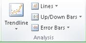
Add predefined lines or bars to a chart
-
Click the 2-D stacked bar, column, line, pie of pie, bar of pie, area, or stock chart to which you want to add lines or bars.
This displays the Chart Tools, adding the Design, Layout, and Format tabs.
-
On the Layout tab, in the Analysis group, do one of the following:
-
Click Lines, and then click the line type that you want.
Note: Different line types are available for different chart types.
-
Click Up/Down Bars, and then click Up/Down Bars.
-
Tip: You can change the format of the series lines, drop lines, high-low lines, or up-down bars that you display in a chart by right-clicking the line or bar, and then clicking Format <line or bar type> .
Remove predefined lines or bars from a chart
-
Click the 2-D stacked bar, column, line, pie of pie, bar of pie, area, or stock chart that displays predefined lines or bars.
This displays the Chart Tools, adding the Design, Layout, and Format tabs.
-
On the Layout tab, in the Analysis group, click Lines or Up/Down Bars, and then click None to remove lines or bars from a chart.
Tip: You can also remove lines or bars immediately after you add them to the chart by clicking Undo on the Quick Access Toolbar or by pressing CTRL+Z.
You can add other lines to any data series in an area, bar, column, line, stock, xy (scatter), or bubble chart that is 2-D and not stacked.
Add other lines
-
This step applies to Word for Mac only: On the View menu, click Print Layout.
-
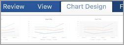
In the chart, select the data series that you want to add a line to, and then click the Chart Design tab.
For example, in a line chart, click one of the lines in the chart, and all the data marker of that data series become selected.
-
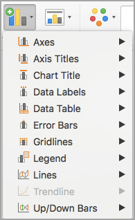
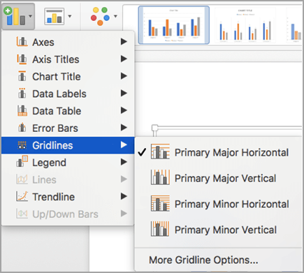
Click Add Chart Element, and then click Gridlines.
-
Choose the line option that you want or click More Gridline Options.
Depending on the chart type, some options may not be available.
Remove other lines
-
This step applies to Word for Mac only: On the View menu, click Print Layout.
-
Click the chart with the lines, and then click the Chart Design tab.
-
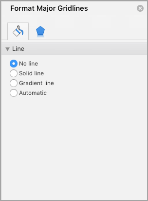
Click Add Chart Element, click Gridlines, and then click More Gridline Options.
-
Select No line.
You can also click the line and press DELETE .
Home / Excel Charts / Add a Horizontal Line in a Chart
While creating a chart in Excel, you can use a horizontal line as a target line or an average line. It can help you to compare achievement with the target. Just look at the below chart.
You like it, right? Say “Yes” in the comment section if you like it. OK so listen: Let’s say you have an average value which you want to maintain in your sales throughout the year. Or, a constant target which you want to show in a chart for all the months.
In this case, you can insert a straight horizontal line to present that value. Here’s the thing: This horizontal line can be a dynamic one that will change its value or a line with a fixed value. And in today’s post, I’m going to show you exactly how to do this.
I’m gonna share with you that how you can insert a fixed as well as a dynamic horizontal line in a chart.
An average line plays an important role whenever you have to study some trend lines and the impact of different factors on-trend. And before you create a chart with a horizontal line you need to prepare data for it.
Before I tell you about these steps let me show how I am setting up the data. Here I am using a dynamic chart to show you that how this will help you to make your presentation super cool. (download this dynamic data table from here) to follow along.

In the above data tables, I am getting data from the raw table to the dynamic table by using a VLOOKUP MATCH. Every time when I change the year in the dynamic table it will automatically change the sales values and the average will be calculated on those sale figures.
Below are the steps you need to follow to create a chart with a horizontal line.
- First of all, select the data table and insert a column chart.
- Go To Insert ➜ Charts ➜ Column Charts ➜ 2D Clustered Column Chart. or you can also use Alt + F1 to insert a chart.
- So now, you have a column chart in your worksheet like below.

- Next step is to change that average bars into a horizontal line.
- For this, select the average column bar and Go to → Design → Type → Change Chart Type.

- Once you click on change chart type option, you’ll get a dialog box for formatting.
- Change the chart type of average from “Column Chart” to “Line Chart With Marker”.

- Click OK.


Here is your ready-to-rock column chart with an average line and make sure to download this sample file from here.
One of my colleagues uses this same method to add a median line. You can also use this method to add an average line in a line chart. The steps are totally the same, you just have to insert a line chart instead of a column chart. And you will get something like this.
Add a Horizontal Target Line in Column Chart
This is one more method which I often use in my charts is adding a target line. There are several other ways to create a Target Vs. Achievement chart, but target line method is simple & effective. First of all, let me show you the data which I am using to create a target line in the chart.

I have used the above table to get the target and actual figures from the month-wise tables and make sure to download the sample file from here. Now let’s start with the steps.
- Select the dynamic table which I have mentioned above.
- Insert a column chart. Go To Insert → Charts → Column Charts → 2D Clustered Column Chart.
- You’ll get a chart like below.

- Now, you have to change the chart type of target bar from Column Chart to Line Chart With Markers. To change the chart type please use same steps which I have used in the previous method.
- After changing chart type your chart will look something like this.

- Now, we have to make some changes in this line chart.
- After that, make a double click on the line to open formatting option. Once you do that, you’ll get a formatting option dialog box.
- Make following changes in formatting.
- Go to → Fill & Line → Line.
- Change line style to “No Line”.

- Now, go to marker section and make following changes.
- Change marker type to Built-In, a horizontal bar, and size 25.
- Marker fill to solid fill.
- Use white color as the fill color.
- Make border style to a solid color.
- And, black color for borders.

- Once you make all the changes to the line you’ll get a chart like I have below.


Congratulations! your chart is ready.
Sample File
Download this sample file from here to follow along
More Charting Tutorials
Tuesday, September 11, 2018
Peltier Technical Services, Inc., Copyright © 2023, All rights reserved.
A common task is to add a horizontal line to an Excel chart. The horizontal line may reference some target value or limit, and adding the horizontal line makes it easy to see where values are above and below this reference value. Seems easy enough, but often the result is less than ideal. This tutorial shows how to add horizontal lines to several common types of Excel chart.
We won’t even talk about trying to draw lines using the items on the Shapes menu. Since they are drawn freehand (or free-mouse), they aren’t positioned accurately. Since they are independent of the chart’s data, they may not move when the data changes. And sometimes they just seem to move whenever they feel like it.
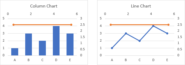
The examples below show how to make combination charts, where an XY-Scatter-type series is added as a horizontal line to another type of chart.
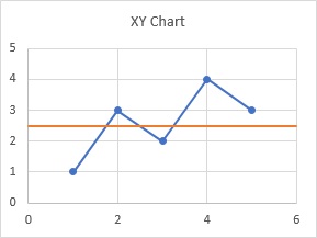
An XY Scatter chart is the easiest case. Here is a simple XY chart.
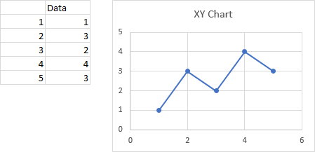
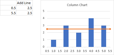
Let’s say we want a horizontal line at Y = 2.5. It should span the chart, starting at X = 0 and ending at X = 6.
This is easy, a line simply connects two points, right?
We set up a dummy range with our initial and final X and Y values (below, to the left of the top chart), copy the range, select the chart, and use Paste Special to add the data to the chart (see below for details on Paste Special).
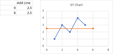
When the data is first added, the autoscaled X axis changes its maximum from 6 to 8, so the line doesn’t span the entire chart. We have to format the axis and type 6 into the box for Maximum. We probably also want to remove the markers from our horizontal line.
Paste Special
If you don’t use Paste Special often, it might be hard to find. If you copy a range and use the right click menu on a chart, the only option is a regular Paste, and Excel doesn’t always correctly guess how it should paste the data. So I always use Paste Special.
To find Paste Special, click on the down arrow on the Paste button on the Home tab of Excel’s ribbon. Paste Special is at the bottom of the pop-up menu.
You can also use the Excel 97-2003 menu-based shortcut, which is Alt + E + S (for Edit menu > Paste Special).
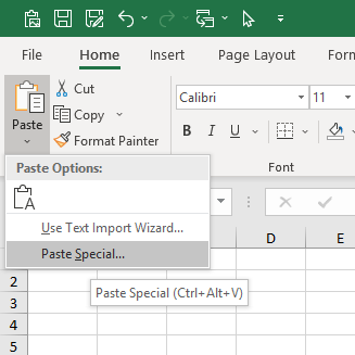
The tooltip below Paste Special in the menu indicates that you could also use Ctrl + Alt + V, but this shortcut doesn’t do anything for charts.
When the Paste Special dialog appears, make sure you select these options: Add Cells as a New Series, Y Values in Columns, Series Names in First Row, Categories (X Values) in First Column.
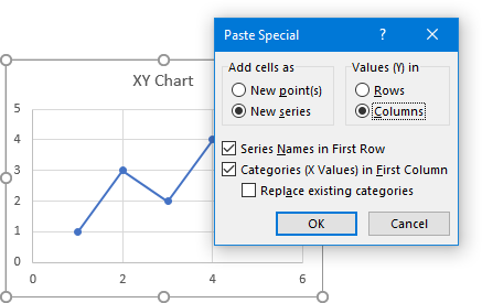
Click OK and the new series will appear in the chart.
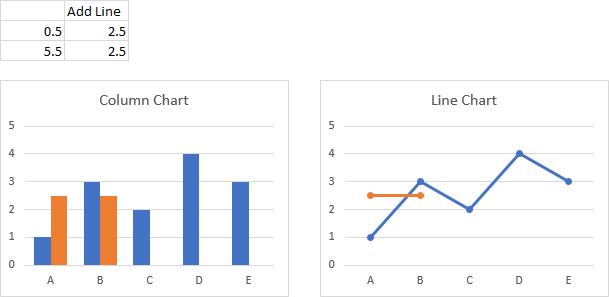
Add a Horizontal Line to a Column or Line Chart
When you add a horizontal line to a chart that is not an XY Scatter chart type, it gets a bit more complicated. Partly it’s complicated because we will be making a combination chart, with columns, lines, or areas for our data along with an XY Scatter type series for the horizontal line. Partly it’s complicated because the category (X) axis of most Excel charts is not a value axis.
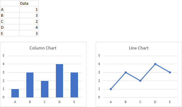
As with the XY Scatter chart in the first example, we need to figure out what to use for X and Y values for the line we’re going to add. The Y values are easy, but the X values require a little understanding of how Excel’s category axes work. Since the category axes of column and line charts work the same way, let’s do them together, starting with the following simple column and line charts.
Note in the charts above that the first and last category labels aren’t positioned at the corners of the plot area, but are moved inwards slightly. This is because column and line charts use a default setting of Between Tick Marks for the Axis Position property. We can change the Axis Position to On Tick Marks, below, and the first and last category labels line up with the ends of the category axis. The line chart looks okay, but we have cut off the outer halves of the first and last columns.
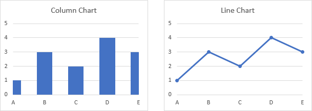
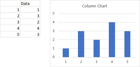
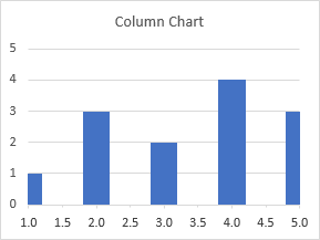
Let’s focus on a column chart (the line chart works identically), and use category labels of 1 through 5 instead of A through E. Excel doesn’t recognize these categories as numerical values, but we can think of them as labeling the categories with numbers.
Now let’s label the points between the categories. Not only do we have halfway points between the categories, we also have a half category label below the first category and another after the last category.
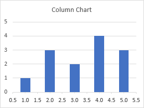
If the Axis Position property were set to On Tick Marks, our horizontal line starts at 1 (the first category number of 1) and ends at 5 (the last category number of 5). This would be wrong for a column chart, but might be acceptable for a line chart.
Here is our desired horizontal line, stretching from 0.5 to 5.5
So let’s use this data and the same approach that we used for the scatter chart, at the beginning of this tutorial.
Copy the range, and paste special as new series. We’ve added another set of columns or another line to the chart.
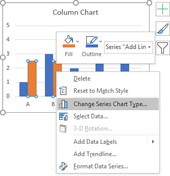
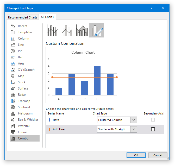
Right click on the added series, and choose Change Series Chart Type from the pop-up menu.
In the Change Chart Type dialog, select the XY Scatter With Straight Lines And Markers chart type. We’re using markers to temporarily mark the ends of the line, and we’ll remove the markers later; in general we will change directly to XY Scatter With Straight Lines.
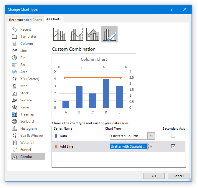
The new series don’t line up at all, though, because Excel decided we should plot the scatter series on the secondary axes. We could rescale the secondary axes, then hide them, but that makes a complicated situation even more complicated.
So we need to uncheck the Secondary Axis box next to the Scatter series in the Change Chart Type dialog.
And now everything lines up as expected: the markers on the horizontal lines are at the edges of the plot area.
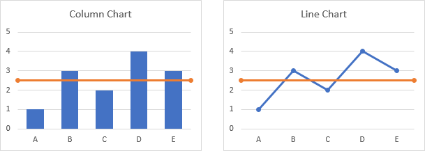
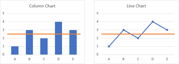
We should remove those markers now, and in the future select the chart type without markers.
“Lazy” Horizontal Line
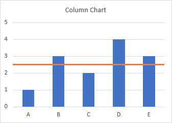
You may ask why not make a combination column-line chart, since column charts and line charts use the same axis type. And many charts with horizontal lines use exactly this approach. I call it the “lazy” approach, because it’s easier, but it provides a line that doesn’t extend beyond all the data to the sides of the chart.
Start with your chart data, and add a column of values for the horizontal line. You get a column chart with a second set of columns, or a line chart with a second line.

Change the chart type of the added series to a line chart without markers. Doesn’t look very good for the column chart (left) since the horizontal line ends at the centerlines of the first and last column. You could probably get away with it for the line chart, even though the horizontal line doesn’t extend to the sides of the chart.
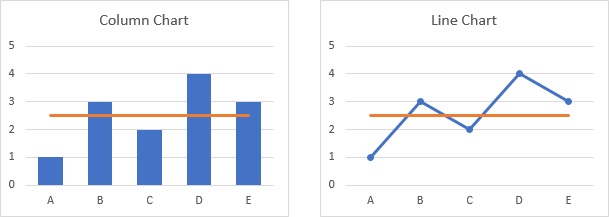
If we change the Axis Position so the vertical axis crosses On Tick Marks, the horizontal lines for both charts span the entire chart width. In the column chart, this comes at the expense of the outer halves of the first and last columns. The line chart looks okay, though.
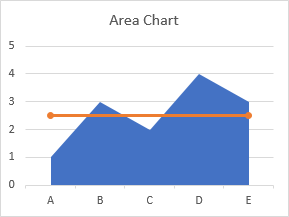
Add a Horizontal Line to an Area Chart
As with the previous examples, we need to figure out what to use for X and Y values for the line we’re going to add. The category axis of an area chart works the same as the category axis of a column or line chart, but the default settings are different. Let’s start with the following simple area chart.
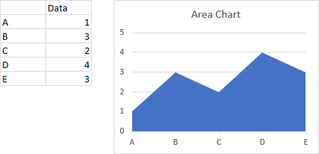
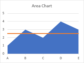
Notice that the first and last category labels are aligned with the corners of the plot area and the filled area series extends to the sides of the plot area. This is because the default setting of the Axis Position property is On Tick Marks. We can change it to Between Tick Marks, which makes the area chart look a bit strange.

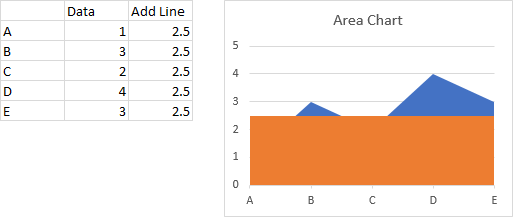
Below is the data for our horizontal line, which will start at 1 (the first category number of 1) and end at 5 (the last category number of 5), without the half-category cushion at either end. Copy the data, select the chart, and Paste Special to add the data as a new series.
Right click on the added series, and change its chart type to XY Scatter With Straight Lines And Markers (again, the markers are temporary). The resulting line extends to the edges of the plotted area, but Excel changed the Axis Position to Between Tick Marks.
Change the Axis Position setting back to On Tick Marks, and remove the markers from the line.
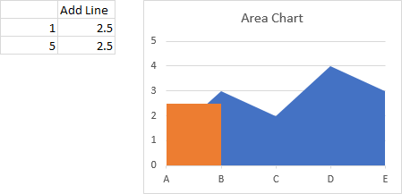
“Lazy” Horizontal Line
In the column chart, and perhaps for the line chart, the “lazy” approach did not give a suitable horizontal line, since the line did not extend to the edges of the plot area. Let’s see how it works for an area chart.
Make a chart with the actual data and the horizontal line data.
Right click on the second series, and change its chart type to a line. Excel changed the Axis Position property to Between Tick Marks, like it did when we changed the added series above to XY Scatter.

Change the Axis Position back to On Tick Marks, and the chart is finished.

For the area chart, the appearance of the lazy horizontal line is identical to the more complicated line that uses an XY Scatter series. Since it’s easier and just as good, it’s probably better to use the lazy approach.
Follow-Up
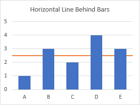
An alert reader noted in the comments that the line produced by this method is placed in front of the bars, and it might be better to place such reference lines behind the data. I have written a new post describing an approach that does just this: Horizontal Line Behind Columns in an Excel Chart.
Historical
I showed similar approaches in an old post, Add a Target Line.
More Combination Chart Articles on the Peltier Tech Blog
- Clustered Column and Line Combination Chart
- Precision Positioning of XY Data Points
- Horizontal Line Behind Columns in an Excel Chart
- Bar-Line (XY) Combination Chart in Excel
- Salary Chart: Plot Markers on Floating Bars
- Fill Under or Between Series in an Excel XY Chart
- Fill Under a Plotted Line: The Standard Normal Curve
- Excel Chart With Colored Quadrant Background
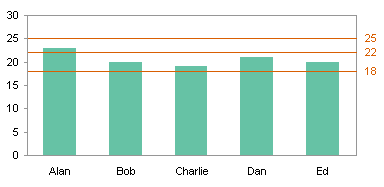
Excel allows us to simply structure our data.according to the content and purpose of the presentation. When we want to compare actual values versus a target value, we might need to add a line to a bar chart or draw a line on an existing Excel graph.
This step by step tutorial will assist all levels of Excel users in the following:
- How to add a horizontal line in an Excel bar graph?
- How to add a horizontal line in an Excel scatter plot?
- How to add a target line in Excel?
Suppose we have below data and we insert a column chart using the data in B2:C7.
- Select B2:C7
- Click Insert tab, Other Charts, then All Chart Types
- Select Column, then Clustered Column
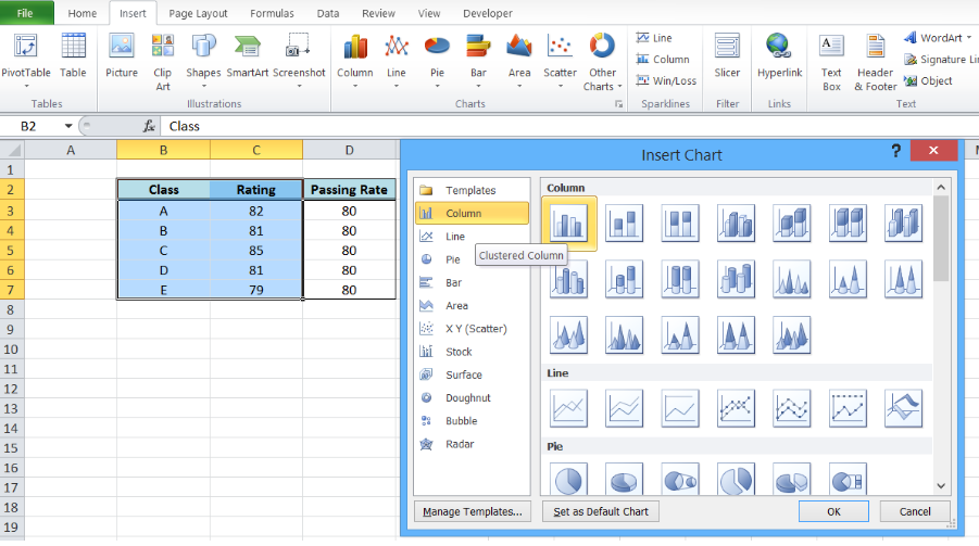 Figure 1. Insert a column chart
A column chart will be created, showing the rating per corresponding class.
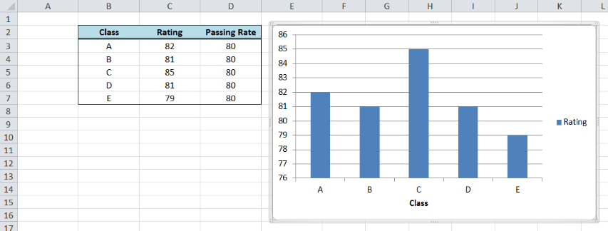 Figure 2. Column chart showing class ratings
How to add a horizontal line in an Excel bar graph?
We want to add a line that represents the target rating of 80 over the bar graph. In order to add a horizontal line in an Excel chart, we follow these steps:
- Right-click anywhere on the existing chart and click Select Data
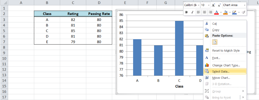 Figure 3. Clicking the Select Data option
- The Select Data Source dialog box will pop-up. Click Add under Legend Entries.
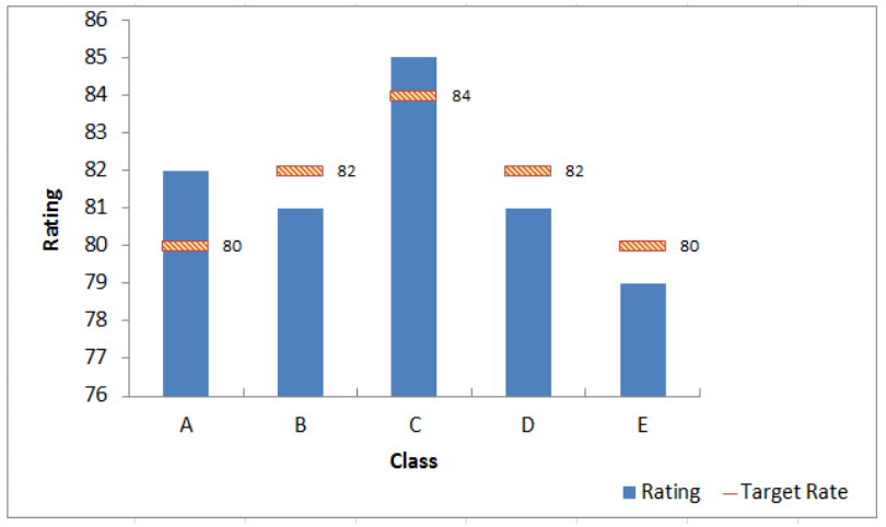 Figure 4. Adding a series data
The Edit Series dialog box will pop-up.
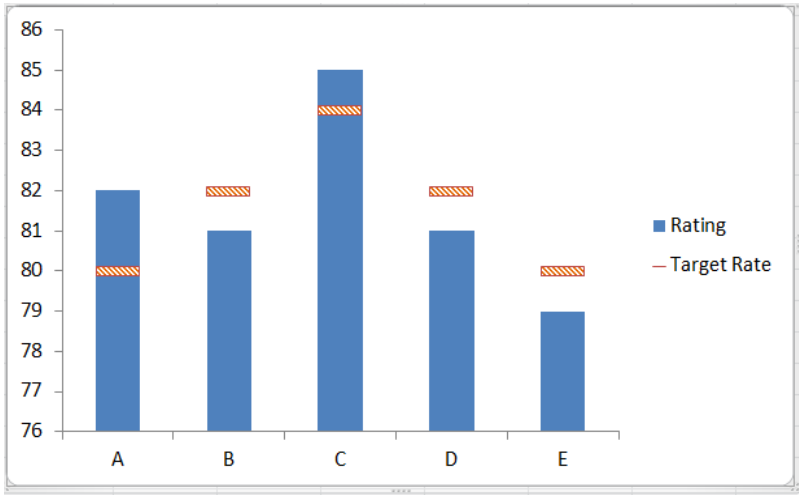 Figure 5. Edit Series preview pane
- In Series name, select cell D2 or “Passing Rate”.
- In Series values, select D3:D7 or input
=column!$D$3:$D$7. Click OK.
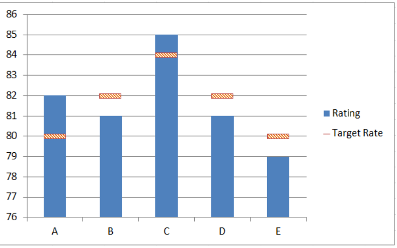 Figure 6. Adding the series name and values
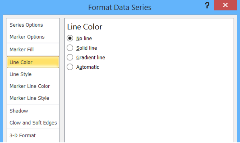 Figure 7. New Series “Passing Rate” added
- Click OK. A second column chart will be displayed beside the first chart.
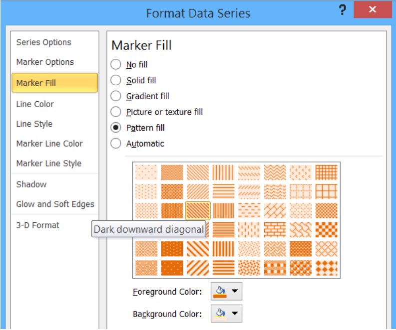 Figure 8. Combination column chart
- Click the second column chart “Passing Rate”, right-click and select “Change Series Chart Type”
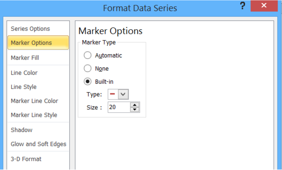 Figure 9. Clicking the Change Series Chart Type
- Select Line and press OK
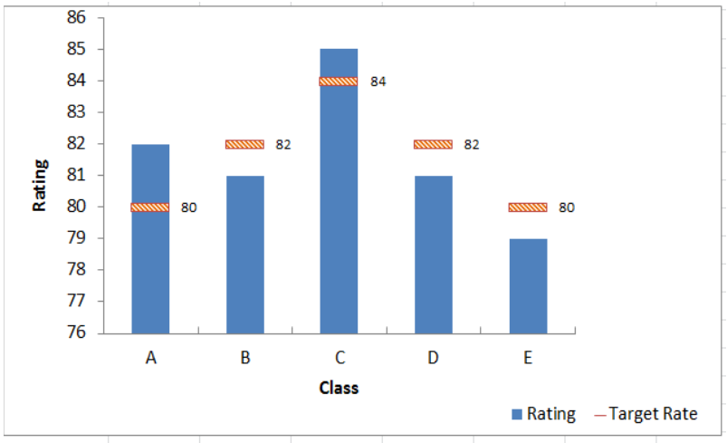 Figure 10. Selecting the Line chart type
The second column chart “Passing Rate” will be changed into a line chart.
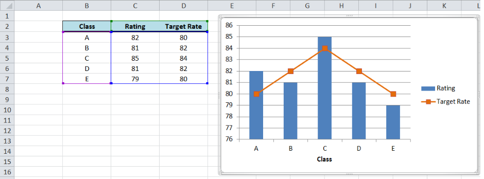 Figure 11. Output: Add a horizontal line to an Excel bar chart
Customize the line graph
Click on the line graph, right-click then select Format Data Series.
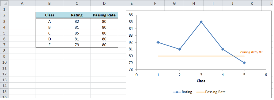 Figure 12. Selecting the Format Data Series
These are some of the ways we can customize the line graph in Excel:
- Change line color
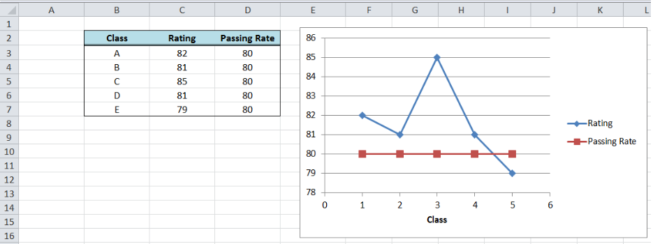 Figure 13. Changing the line color
- Add markers
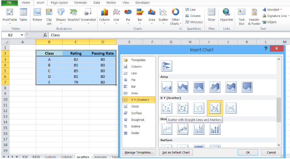 Figure 14. Adding a built-in marker
- Add data label
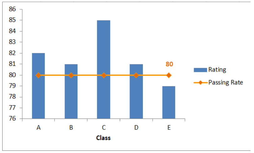 Figure 15. Final output: add a line to a bar chart
How to add a horizontal line in an Excel scatter plot?
We can follow the same procedure discussed above wherein we add a horizontal line to an Excel chart. However, this time let us try a quicker approach where we graph the two data points for Rating and Passing Rate at the same time using an XY Scatter plot.
- Select B2:D7
- Click Insert Chart, and select X Y (Scatter), then Scatter with Straight Lines and Markers.
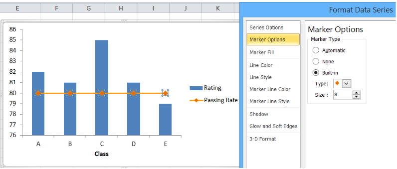 Figure 16. Creating an X Y Scatter Plot
We will be able to combine the two graphs in one chart, where Rating and Passing Rate are both presented in the form of data points connected by lines and markers.
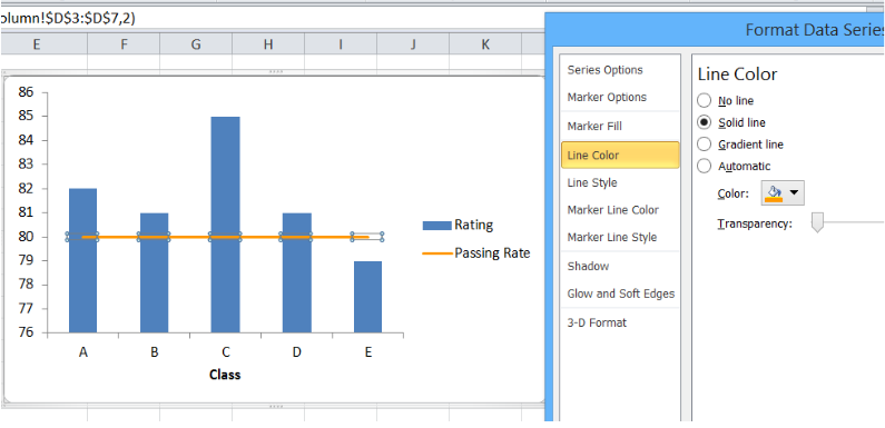 Figure 17. Combination X Y scatter plot
The value for passing rate is constant at 80 and it is presented as a horizontal line. This combination graph makes it easy to compare the rating per class to the passing rate of 80.
We can customize the line graph by changing the line color, removing the markers and adding a data label. We can do any customization we want when we right-click the line graph and select “Format Data Series”.
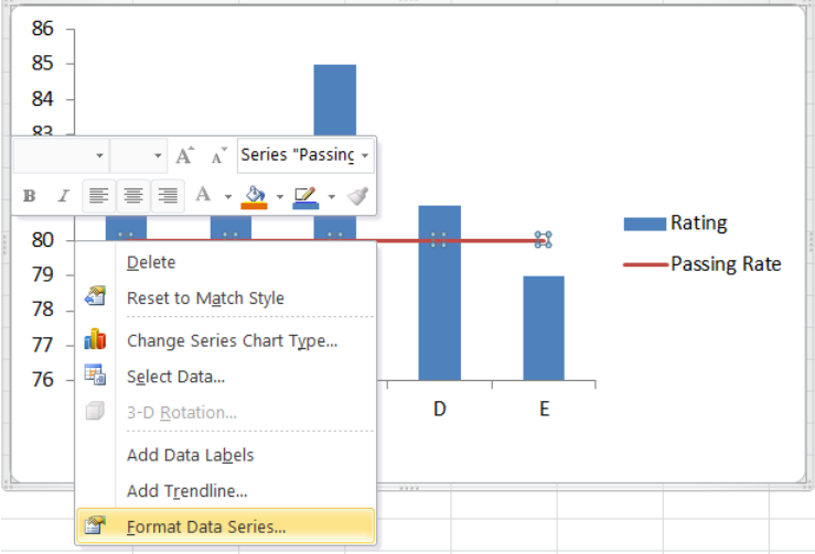 Figure 18. Final output: How to add a horizontal line in an Excel scatter plot
The resulting graph shows that the rating for classes A to D are well above the passing rate of 80.
How to add a target line in Excel?
Target values are not always equal for all data points. Suppose we have different targets for each class as shown below. We follow the same procedure as the above examples in adding a line to a bar chart. The combined line and bar graph will look like this:
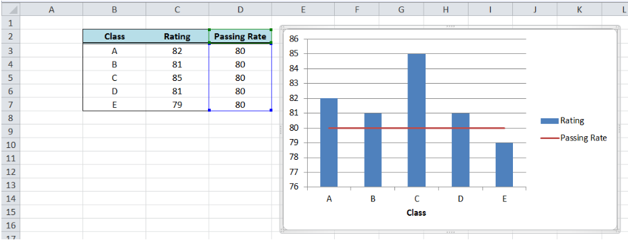 Figure 19. Output: Add line graph to a bar graph
When targets for each class are connected through lines as shown above, the comparison between the actual and target rating is not very clear. There is a more effective way to compare the data that will improve visualization and analysis, like the example below.
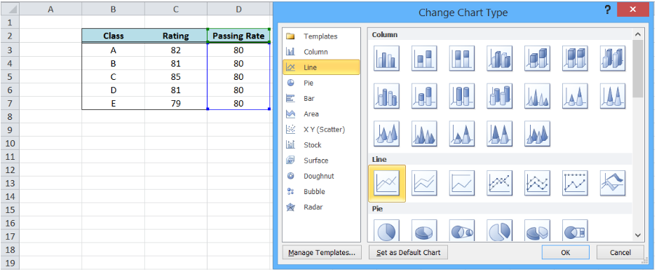 Figure 20. Bar graph with customized target graph
This graph can be done by customizing our target graph through these steps:
- Double click on the Target Rate graph to show the Format Data Series dialog box
- Input the following settings:
- In the Marker Options, select Built-in Marker Type and select the horizontal line or “dash” in the drop-down menu
- Select size 20
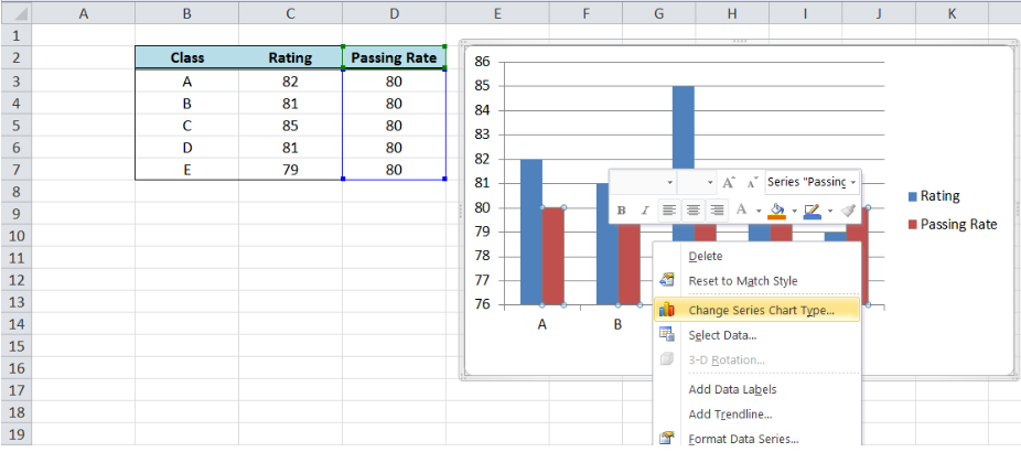 Figure 21. Selecting a built-in marker type and size
-
- Under Marker Fill, select Pattern Fill, “Dark Downward Diagonal”
- Select the Foreground Color Orange, Accent 6, Darker 25%
- Select the Background Color Orange, Accent 6, Lighter 80%
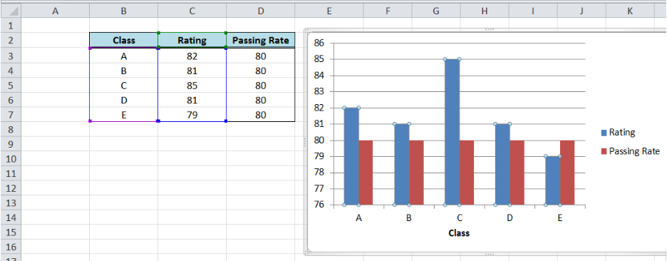 Figure 22. Customizing marker fill settings
-
- Line Color: No Line
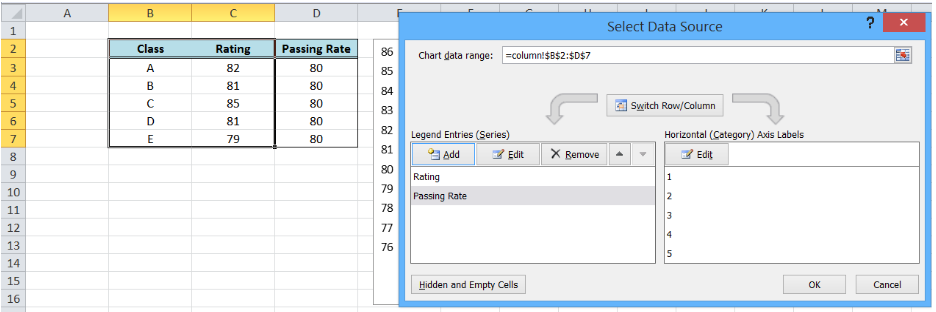 Figure 23. Removing line color for the target graph
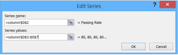 Figure 24. Output graph after initial formatting
- Delete the major gridlines
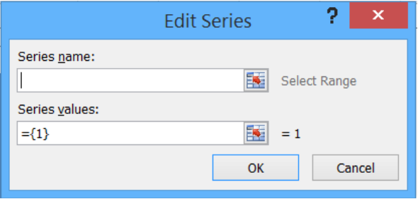 Figure 25. Output graph with deleted major gridlines
- Add data labels and axis titles, and move the legend to below the graph
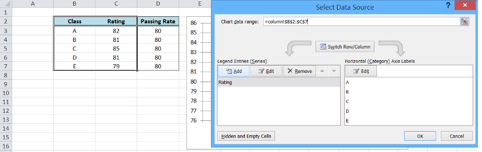 Figure 26. Output: How to add a target line in Excel
Most of the time, the problem you will need to solve will be more complex than a simple application of a formula or function. If you want to save hours of research and frustration, try our live Excelchat service! Our Excel Experts are available 24/7 to answer any Excel question you may have. We guarantee a connection within 30 seconds and a customized solution within 20 minutes.
Usually, horizontal lines are added to a chart to highlight a target, threshold, limits, base, average, or benchmark. These lines, for example, can help control if a process is behaving differently than usual. Excel allows you to add a vertical line to an existing chart in several different ways, e.g., by calculating line values for a scatter, line, or column chart, but using error bars is the easiest way to add a vertical line to a chart:


See how to add a vertical line to the scatter plot, a line or bar chart, or a horizontal line to a chart.
To add a horizontal line to a line or column chart, do the following:
I. Add new data for the horizontal line
1. Add the cells with the goal or limit (limits) to your data.
For example, cell C16 contains the goal that should be displayed as a horizontal line:

II. Add a new data series
2. Add a new data series to your chart by doing one of the following:
- Right-click on the chart plot area and choose Select Data… in the popup menu:

- On the Chart Design tab, in the Data group, choose Select Data:


In the Select Data Source dialog box, under Legend Entries (Series), click the Add button, then in the Edit Series dialog box, type:
- Optionally, in the Series name box, the name of this line (for this example, Goal),
- In the Series values box, the cell with the goal (for this example, $C$16):

By default, Excel adds the new data series to the first point on the x-axis. Note that a new data series can be invisible (see how to select invisible chart elements):

III. Change a data series type
Note: This step is necessary because Excel adds only Y Error bars to the first and last data points. To see the horizontal line, you need to add X Error bars.
3. Right-click on any data series and choose Change Series Chart Type… in the popup menu:

In the Change Chart Type dialog box, choose the Scatter type:

Don’t worry about the chart! Repeat step 2 to change the data series:
- In the Select Data Source dialog box, select the added data series, then under Legend Entries (Series), click the Edit button.
- In the Edit Series dialog box, in the Series X values box, add any cell from the horizontal (category) axis but the first or last one (see the note why).
For example, $B$8:


You will see the correct data for the same horizontal (category) axis:

IV. Add the horizontal line
4. On the chart, select the new data series (see how to select invisible chart elements), then do one of the following:
- Click on the Chart Elements button, select the Error Bars list, then choose More Options…:

- On the Chart Design tab, in the Chart Layouts group, click the Add Chart Element dropdown list:

In the Add Chart Element dropdown list, choose the Error Bars list, then click More Error Bars Options…:


See more about other options in Adding Error bars.
5. On the Format Error Bars pane for the Horizontal Error bar (see below how to select the Horizontal Error bar), on the Error Bar Options tab:
- In the Direction group, select Both,
- In the End Style group, select No Cap,
- In the Error Amount group, select the Custom option, then click the Specify Value button:

On the Custom Error Bars dialog box, type or select the appropriate value for negative and positive values. For this example:

You can then make any other adjustments to get the expected look.
Note: To select the Horizontal Error bar for some data series, do one of the following:
- Click the arrow next to Error Bar Options and choose the Series {data series name}: X Error Bars in the dropdown list:

- On the Chart Format tab, in the Current Selection group, click the arrow of the Chart Elements dropdown list, then select Series {data series name}: X Error Bars for the needed data series:


See also this tip in French:
Comment ajouter une ligne horizontale au graphique.