
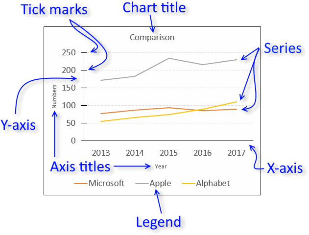
Data labels make a chart easier to understand because they show details about a data series or its individual data points. For example, in the pie chart below, without the data labels it would be difficult to tell that coffee was 38% of total sales. Depending on what you want to highlight on a chart, you can add labels to one series, all the series (the whole chart), or one data point.

Note: The following procedures apply to Office 2013 and newer versions. Looking for Office 2010 steps?
Add data labels to a chart
-
Click the data series or chart. To label one data point, after clicking the series, click that data point.
-
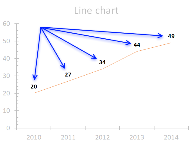
In the upper right corner, next to the chart, click Add Chart Element
 > Data Labels.
 -
To change the location, click the arrow, and choose an option.
-
If you want to show your data label inside a text bubble shape, click Data Callout.
 > Data Labels.

To make data labels easier to read, you can move them inside the data points or even outside of the chart. To move a data label, drag it to the location you want.
If you decide the labels make your chart look too cluttered, you can remove any or all of them by clicking the data labels and then pressing Delete.
Tip: If the text inside the data labels is too hard to read, resize the data labels by clicking them, and then dragging them to the size you want.
Change the look of the data labels
-
Right-click the data series or data label to display more data for, and then click Format Data Labels.
-
Click Label Options and under Label Contains, pick the options you want.

Use cell values as data labels
You can use cell values as data labels for your chart.
-
Right-click the data series or data label to display more data for, and then click Format Data Labels.
-
Click Label Options and under Label Contains, select the Values From Cells checkbox.
-
When the Data Label Range dialog box appears, go back to the spreadsheet and select the range for which you want the cell values to display as data labels. When you do that, the selected range will appear in the Data Label Range dialog box. Then click OK.
The cell values will now display as data labels in your chart.

Change the text displayed in the data labels
-
Click the data label with the text to change and then click it again, so that it’s the only data label selected.
-
Select the existing text and then type the replacement text.
-
Click anywhere outside the data label.
Tip: If you want to add a comment about your chart or have only one data label, you can use a textbox.
Remove data labels from a chart
-
Click the chart from which you want to remove data labels.
This displays the Chart Tools, adding the Design, and Format tabs.
-
Do one of the following:
-
On the Design tab, in the Chart Layouts group, click Add Chart Element, choose Data Labels, and then click None.
-
Click a data label one time to select all data labels in a data series or two times to select just one data label that you want to delete, and then press DELETE.
-
Right-click a data label, and then click Delete.
Note: This removes all data labels from a data series.
-
-
You can also remove data labels immediately after you add them by clicking Undo
on the Quick Access Toolbar, or by pressing CTRL+Z.
 on the Quick Access Toolbar, or by pressing CTRL+Z.
Add or remove data labels in a chart in Office 2010
-
On a chart, do one of the following:
-
To add a data label to all data points of all data series, click the chart area.
-
To add a data label to all data points of a data series, click one time to select the data series that you want to label.
-
To add a data label to a single data point in a data series, click the data series that contains the data point that you want to label, and then click the data point again.
This displays the Chart Tools, adding the Design, Layout, and Format tabs.
-
-
On the Layout tab, in the Labels group, click Data Labels, and then click the display option that you want.
Depending on the chart type that you used, different data label options will be available.

-
On a chart, do one of the following:
-
To display additional label entries for all data points of a series, click a data label one time to select all data labels of the data series.
-
To display additional label entries for a single data point, click the data label in the data point that you want to change, and then click the data label again.
This displays the Chart Tools, adding the Design, Layout, and Format tabs.
-
-
On the Format tab, in the Current Selection group, click Format Selection.
You can also right-click the selected label or labels on the chart, and then click Format Data Label or Format Data Labels.
-
Click Label Options if it’s not selected, and then under Label Contains, select the check box for the label entries that you want to add.
The label options that are available depend on the chart type of your chart. For example, in a pie chart, data labels can contain percentages and leader lines.
-
To change the separator between the data label entries, select the separator that you want to use or type a custom separator in the Separator box.
-
To adjust the label position to better present the additional text, select the option that you want under Label Position.
If you have entered custom label text but want to display the data label entries that are linked to worksheet values again, you can click Reset Label Text.
-
On a chart, click the data label in the data point that you want to change, and then click the data label again to select just that label.
-
Click inside the data label box to start edit mode.
-
Do one of the following:
-
To enter new text, drag to select the text that you want to change, and then type the text that you want.
-
To link a data label to text or values on the worksheet, drag to select the text that you want to change, and then do the following:
-
On the worksheet, click in the formula bar, and then type an equal sign (=).
-
Select the worksheet cell that contains the data or text that you want to display in your chart.
You can also type the reference to the worksheet cell in the formula bar. Include an equal sign, the sheet name, followed by an exclamation point; for example, =Sheet1!F2
-
Press ENTER.
Tip: You can use either method to enter percentages — manually if you know what they are, or by linking to percentages on the worksheet. Percentages are not calculated in the chart, but you can calculate percentages on the worksheet by using the equation amount / total = percentage. For example, if you calculate 10 / 100 = 0.1, and then format 0.1 as a percentage, the number will be correctly displayed as 10%. For more information about how to calculate percentages, see Calculate percentages.
-
-
The size of the data label box adjusts to the size of the text. You cannot resize the data label box, and the text may become truncated if it does not fit in the maximum size. To accommodate more text, you may want to use a text box instead. For more information, see Add a text box to a chart.
You can change the position of a single data label by dragging it. You can also place data labels in a standard position relative to their data markers. Depending on the chart type, you can choose from a variety of positioning options.
-
On a chart, do one of the following:
-
To reposition all data labels for a whole data series, click a data label one time to select the data series.
-
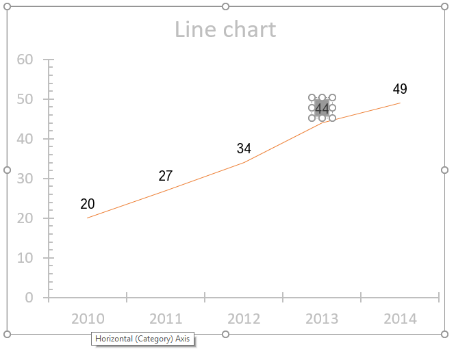
To reposition a specific data label, click that data label two times to select it.
This displays the Chart Tools, adding the Design, Layout, and Format tabs.
-
-
On the Layout tab, in the Labels group, click Data Labels, and then click the option that you want.
For additional data label options, click More Data Label Options, click Label Options if it’s not selected, and then select the options that you want.
-
Click the chart from which you want to remove data labels.
This displays the Chart Tools, adding the Design, Layout, and Format tabs.
-
Do one of the following:
-
On the Layout tab, in the Labels group, click Data Labels, and then click None.
-
Click a data label one time to select all data labels in a data series or two times to select just one data label that you want to delete, and then press DELETE.
-
Right-click a data label, and then click Delete.
Note: This removes all data labels from a data series.
-
-
You can also remove data labels immediately after you add them by clicking Undo
on the Quick Access Toolbar, or by pressing CTRL+Z.
Data labels make a chart easier to understand because they show details about a data series or its individual data points. For example, in the pie chart below, without the data labels it would be difficult to tell that coffee was 38% of total sales. Depending on what you want to highlight on a chart, you can add labels to one series, all the series (the whole chart), or one data point.
Add data labels
You can add data labels to show the data point values from the Excel sheet in the chart.
-
This step applies to Word for Mac only: On the View menu, click Print Layout.
-
Click the chart, and then click the Chart Design tab.
-
Click Add Chart Element and select Data Labels, and then select a location for the data label option.
Note: The options will differ depending on your chart type.
-
If you want to show your data label inside a text bubble shape, click Data Callout.
To make data labels easier to read, you can move them inside the data points or even outside of the chart. To move a data label, drag it to the location you want.
Note: If the text inside the data labels is too hard to read, resize the data labels by clicking them, and then dragging them to the size you want.
Click More Data Label Options to change the look of the data labels.
Change the look of your data labels
-
Right-click on any data label and select Format Data Labels.
-
Click Label Options and under Label Contains, pick the options you want.
Change the text displayed in the data labels
-
Click the data label with the text to change and then click it again, so that it’s the only data label selected.
-
Select the existing text and then type the replacement text.
-
Click anywhere outside the data label.
Tip: If you want to add a comment about your chart or have only one data label, you can use a textbox.
Remove data labels
If you decide the labels make your chart look too cluttered, you can remove any or all of them by clicking the data labels and then pressing Delete.
Note: This removes all data labels from a data series.
Use cell values as data labels
You can use cell values as data labels for your chart.
-
Right-click the data series or data label to display more data for, and then click Format Data Labels.
-
Click Label Options and under Label Contains, select the Values From Cells checkbox.
-
When the Data Label Range dialog box appears, go back to the spreadsheet and select the range for which you want the cell values to display as data labels. When you do that, the selected range will appear in the Data Label Range dialog box. Then click OK.
The cell values will now display as data labels in your chart.
how to do it in Excel: adding data labels
Today’s post is a tactical one for folks creating visuals in Excel: how to embed labels for your data series in your graphs, instead of relying on default Excel legends.
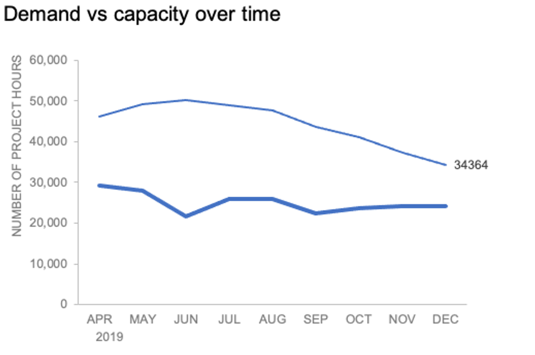
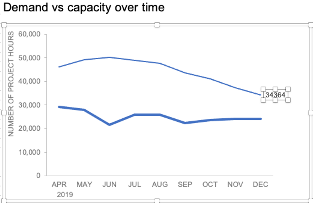
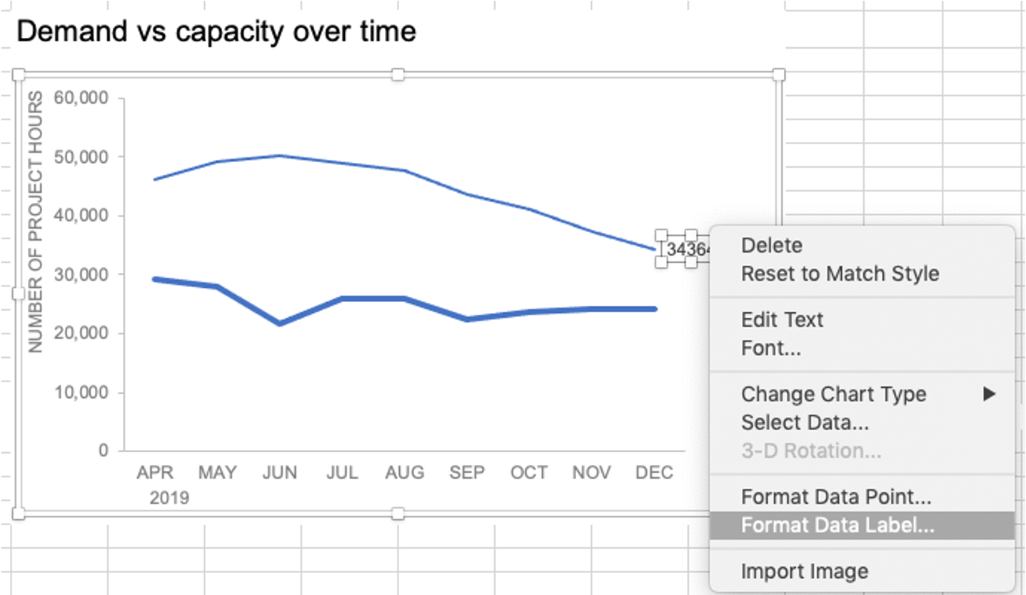
To illustrate, let’s look at an example from storytelling with data: Let’s Practice!. The graph below shows demand and capacity (in project hours) over time.

There are a few different techniques we could use to create labels that look like this.
Option 1: The “brute force” technique
The data labels for the two lines are not, technically, “data labels” at all. A text box was added to this graph, and then the numbers and category labels were simply typed in manually. This is what we affectionately refer to as “brute-forcing” your tool to make it look the way you want it to, regardless of its defaults. Remember: your audience only sees the end result of your work, even if the behind-the-scenes steps aren’t exactly elegant.

One benefit of this approach is that I have greater control over the formatting: size, position, and color of the labels. I can easily make them appear how I want them to appear by simply adjusting the formatting, which is much easier to do with a text box than with a genuine data label. The downside is that this method may not scale easily with many graphs, or those that will be frequently updated with new data—as the data changes, the text labels won’t move with them.
Option 2: Embedding labels directly
Let’s look now at an alternative approach: embedding the labels directly. You can download the corresponding Excel file to follow along with these steps:
Right-click on a point and choose Add Data Label. You can choose any point to add a label—I’m strategically choosing the endpoint because that’s where a label would best align with my design.

Excel defaults to labeling the numeric value, as shown below.
Now let’s adjust the formatting. Click the label (not the data point, but the label itself) twice, so that these white boxes appear around it:
Right-click and choose Format Data Label:
In the Label Options menu that appears, you can choose to add or remove fields by checking (or unchecking) the corresponding box under Label Contains. To add the word “Demand”, I’ll check the Series Name box.

The label appeared in all-caps (“DEMAND”) because it’s referencing the underlying data—I could adjust the header in Column M to “Demand” if I didn’t want the entire word capitalized (this is a stylistic choice).

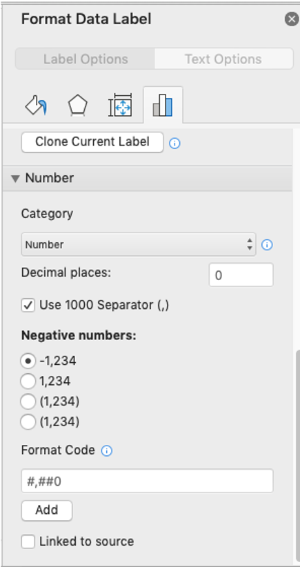
To adjust the number formatting, navigate back to the Format Data Label menu and scroll to the Number section at the bottom. I’ll choose Number in the Category drop-down and change Decimal places to 0 (side note: checking the Linked to source box is a good option if you want the labels to reformat when the formatting of the underlying source data changes).
My resulting visual looks like this:

From here, I can manually adjust the label alignment by highlighting the graph and making the Plot area smaller so that the label doesn’t overlap the line:
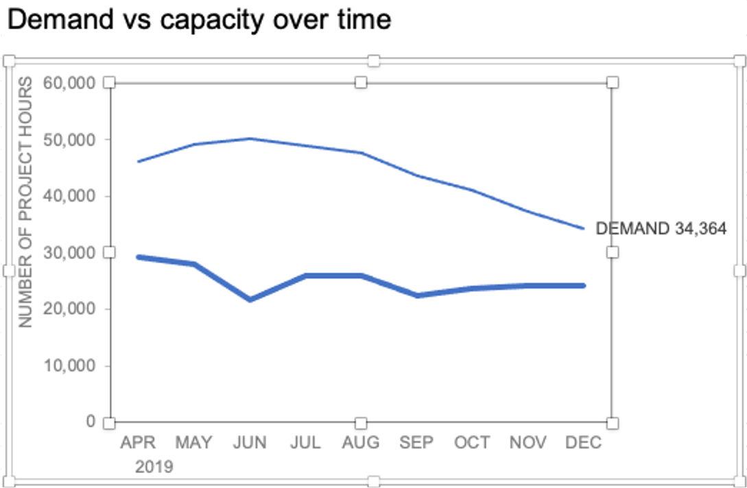
I’ll repeat the same steps to add the Capacity label:

The final thing I’ll do is clean up the formatting of those labels—move the numbers in front of the words, change the number format to be rounded to the thousands place, switch the colors of the labels to match the lines they refer to, and make the font for “24K Capacity” bold.

This post was inspired by a recent conversation during our bi-weekly office hour sessions. Do you ever need quick input on a graph or slide, or wish you could pick the SWD team’s brain on a project? Subscribe to premium membership for personalized support and get your questions answered. Our team has enjoyed getting to know many of you during these fun and interactive sessions!
Purpose — to add a data label to just ONE POINT on a chart in Excel
There are situations where you want to annotate a chart line or bar with just one data label, rather than having all the data points on the line or bars labelled.

Method — add one data label to a chart line
Steps shown in the video above:
- Click on the chart line to add the data point to.
- All the data points will be highlighted.
- Click again on the single point that you want to add a data label to.
- Right-click and select ‘Add data label‘
- This is the key step! Right-click again on the data point itself (not the label) and select ‘Format data label‘.
- You can now configure the label as required — select the content of the label (e.g. series name, category name, value, leader line), the position (right, left, above, below) in the Format Data Label pane/dialog box.
- To format the font, color and size of the label, now right-click on the label and select ‘Font‘.
Note: in step 5. above, if you right-click on the label rather than the data point, the option is to ‘Format data labelS‘ – i.e. plural. When you then start choosing options in the ‘Format Data Label‘ pane, labels will be added to all the data points.
Return to Charts Home
In this tutorial, we’ll add and move data labels to graphs in Excel and Google Sheets.
Adding and Moving Data Labels in Excel
Starting with the Data
In this example, we’ll start a table and a bar graph. We’ll show how to add label tables and position them where you would like on the graph.

Adding Data Labels
- Click on the graph
- Select + Sign in the top right of the graph
- Check Data Labels

Change Position of Data Labels
Click on the arrow next to Data Labels to change the position of where the labels are in relation to the bar chart

Final Graph with Data Labels
After moving the data labels to the Center in this example, the graph is able to give more information about each of the X Axis Series.
Adding and Moving Data Labels in Google Sheets
Starting with your Data
We’ll start with the same dataset that we went over in Excel to review how to add and move data labels to charts.
Add and Move Data Labels in Google Sheets
- Double Click Chart
- Select Customize under Chart Editor
- Select Series

4. Check Data Labels
5. Select which Position to move the data labels in comparison to the bars.

Final Graph with Google Sheets
After moving the dataset to the center, you can see the final graph has the data labels where we want.

Author: Oscar Cronquist Article last updated on October 09, 2018
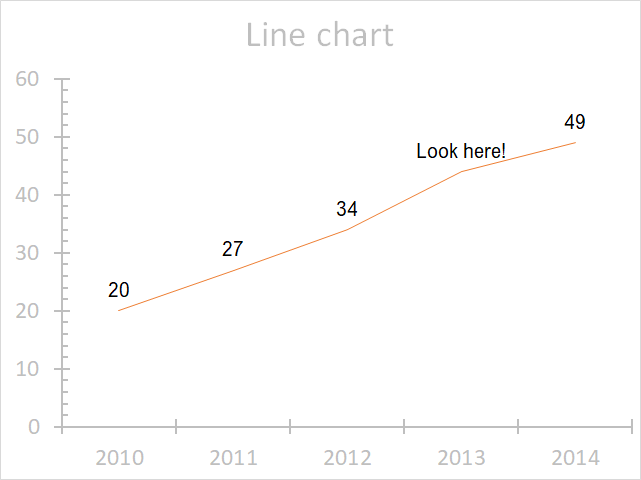
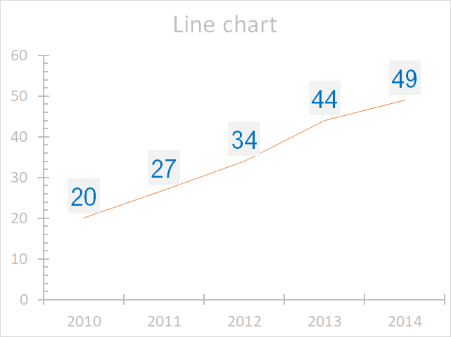
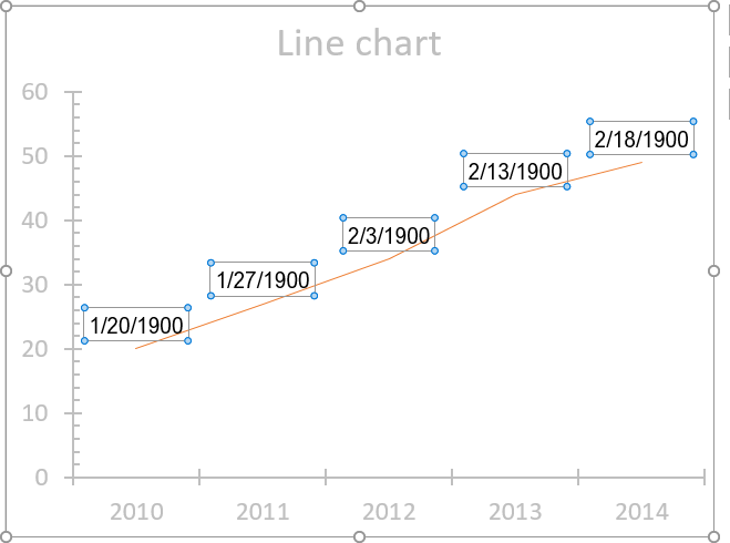
The image above demonstrates data labels in a line chart, each data point in the chart series has a visible data label.
Edit data labels
Excel allows you to edit the data label value manually, simply press with left mouse button on a data label until it is selected. Press with left mouse button on again to select the text, you can now type any value you want.
I changed the data label value to «Look here!».
You can link a group of data labels to a cell range so you don’t need to edit each data label, read this article: Custom chart data labels
Customize data labels
You can easily change the font, font size, and font color. Simply select the data labels.
Go to tab «Home» on the ribbon if you are not already there.
The font and font size drop-down lists allow you to pick a font and size for your data labels, the «fill color» button lets you choose a background color and the «Font color» button lets you change the font color of the data labels.
The image above shows a grey background color, blue font color, and a different font.
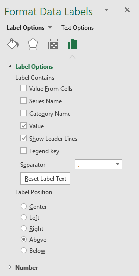
Label contains
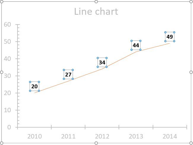
Double press with left mouse button on with left mouse button on a data label series to open the settings pane.
 Go to tab «Label Options» see image to the right.
The checkboxes let you select what values you want to use as data labels.
Value from cells — Lets you select a cell range that contains the values you want to use.
Series name — The name of the data series.
Category name — The same value as the x-axis value.
Value — The y-axis value (default).
Legend key — Color of the chart element (line, bar, column, etc..) of the data series.
Position
Double press with left mouse button on with left mouse button on a data label series to open the settings pane.
Go to tab «Label Options» see image to the right.
You have here the option to change the data label position relative to the data point.
Center — This places the data label right on the data point.
Left — The data label is on the left side of the data point.
Right — The data label is on the right side of the data point.
Above — The data label is above the data point. (Default value)
Below — The data label is below the data point.
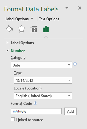
Number formatting
Double press with left mouse button on with left mouse button on a data label series to open the settings pane.
 Go to tab «Label Options» see image to the right.
This setting allows you to change the number formatting of the data labels.
The image below shows numbers formatted as dates.
Fill
Double press with left mouse button on with left mouse button on a data label series to open the settings pane.
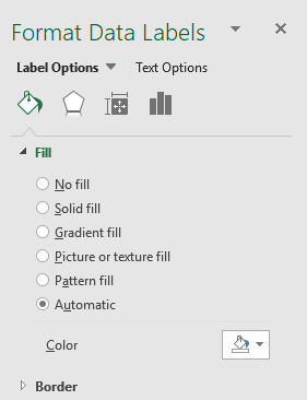 Go to tab «Fill & Line» and expand «Fill» settings, see image to the right.
These settings allow you to change the background to a solid fill, gradient fill, picture or texture fill, pattern fill, or Automatic.
Border
Double press with left mouse button on with left mouse button on a data label series to open the settings pane.
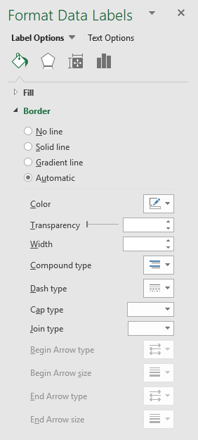 Go to tab «Fill & Line» and expand «Border» settings, see image to the right.
These settings let you add and customize a border around the data labels.
Effects
Double press with left mouse button on with left mouse button on a data label series to open the settings pane.
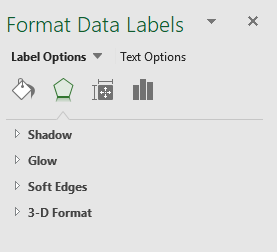 Go to tab «Effects», see image to the right.
These settings allow you to apply shadows, glow, soft edges and 3-D-Format to data labels.
Text direction
Double press with left mouse button on with left mouse button on a data label series to open the settings pane.
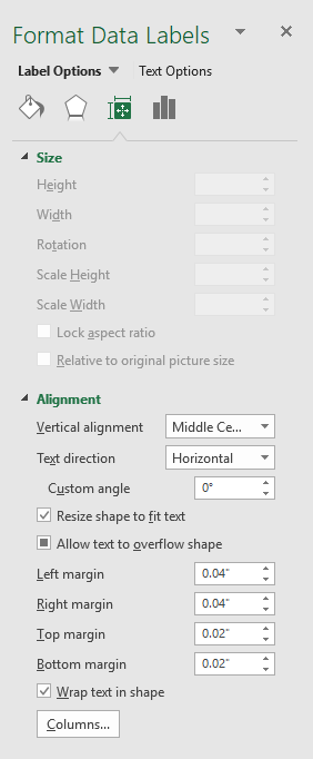 Go to tab «Size & properties», see image to the right.
These settings let you chosse vertical alignment and text direction.
Excel chart components
Charts in Microsoft Excel lets you visualize, analyze and explain data. Charting in Excel is very easy and you […]
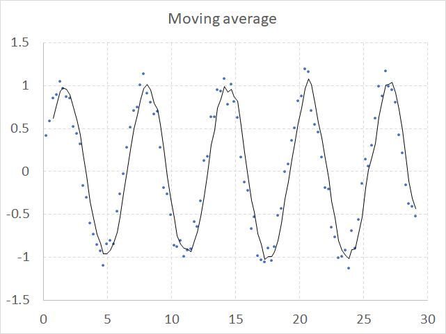
How to add a moving average to a chart
A moving average smooths out short-term variations to show a long-term trend or cycle. The chart above shows random values […]
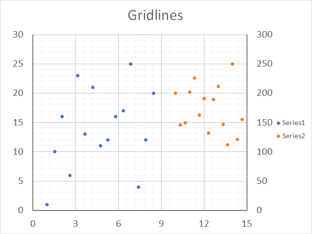
How to add chart gridlines
Chart gridlines are great for making the chart data more readable and detailed, Excel allows you to add major and […]
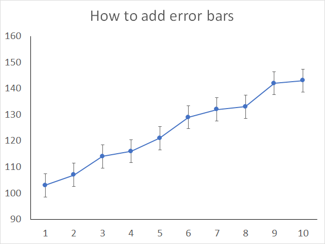
How to add Error Bars in a chart
Enable error bars when you want to show, for example, standard deviations in a chart, Excel lets you insert error […]
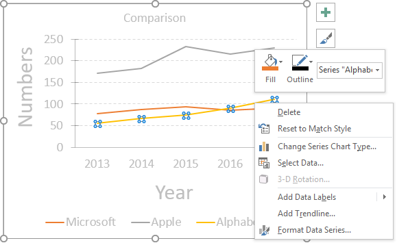
How to customize a chart data series
To change the looks of a data series simply double-press with left mouse button on with left mouse button on […]
How to customize chart axis
Most Excel charts consist of an x-axis and a y-axis, Excel allows you to easily change the looks of […]
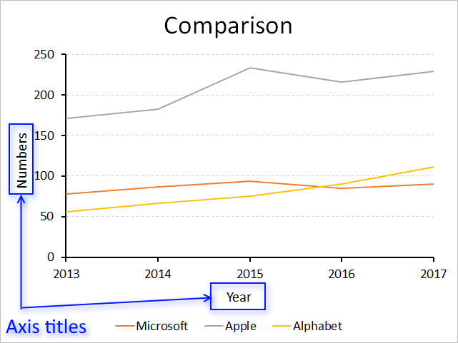
How to customize chart axis titles
The x-axis and y-axis titles are just as easy to format and customize as the other chart elements. How to […]
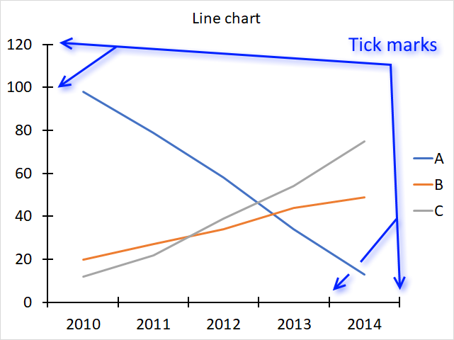
How to customize chart tick marks
The image above shows tick mars in a line chart, there are two types of tick marks, major and minor […]
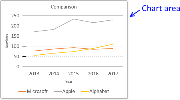
How to customize the chart area
The chart area contains all components. If you choose to format the chart area you can change things like border, […]
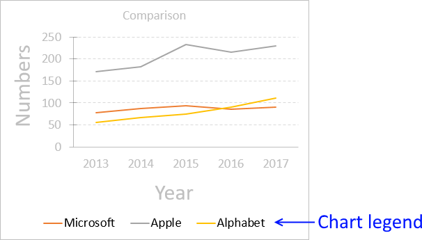
How to customize the chart legend
You can easily customize the font, font size, font color etc of the chart legend: Select legend. Go to tab […]
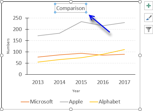
How to customize the chart title
I recommend that the chart title is short and easy to understand. How to add a chart title Follow these […]
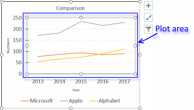
How to customize the plot area
The plot area refers to the location of the chart that displays the actual data represented by lines, bars, columns, […]
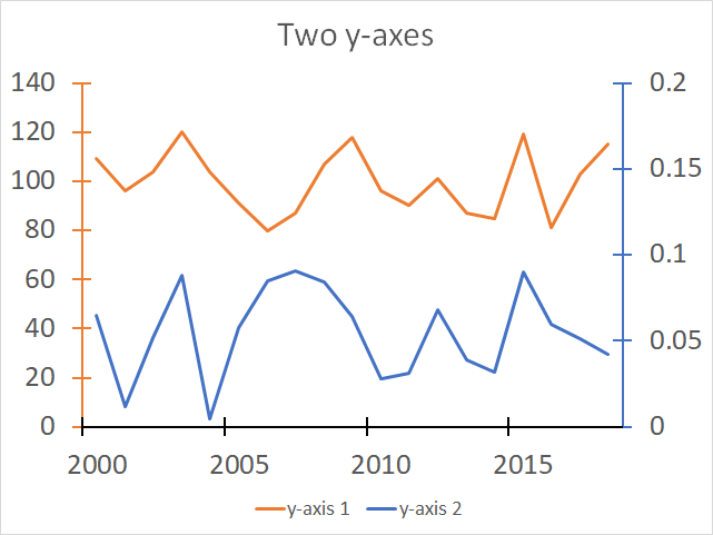
Two y-axes in one chart
The image above demonstrates a line chart containing two data series and two y-axes, one for each data series. I […]
Latest updated articles.
More than 300 Excel functions with detailed information including syntax, arguments, return values, and examples for most of the functions used in Excel formulas.
More than 1300 formulas organized in subcategories.
Excel Tables simplifies your work with data, adding or removing data, filtering, totals, sorting, enhance readability using cell formatting, cell references, formulas, and more.
Allows you to filter data based on selected value , a given text, or other criteria. It also lets you filter existing data or move filtered values to a new location.
Lets you control what a user can type into a cell. It allows you to specifiy conditions and show a custom message if entered data is not valid.
Lets the user work more efficiently by showing a list that the user can select a value from. This lets you control what is shown in the list and is faster than typing into a cell.
Lets you name one or more cells, this makes it easier to find cells using the Name box, read and understand formulas containing names instead of cell references.
The Excel Solver is a free add-in that uses objective cells, constraints based on formulas on a worksheet to perform what-if analysis and other decision problems like permutations and combinations.
An Excel feature that lets you visualize data in a graph.
Format cells or cell values based a condition or criteria, there a multiple built-in Conditional Formatting tools you can use or use a custom-made conditional formatting formula.
Lets you quickly summarize vast amounts of data in a very user-friendly way. This powerful Excel feature lets you then analyze, organize and categorize important data efficiently.
VBA stands for Visual Basic for Applications and is a computer programming language developed by Microsoft, it allows you to automate time-consuming tasks and create custom functions.
A program or subroutine built in VBA that anyone can create. Use the macro-recorder to quickly create your own VBA macros.
UDF stands for User Defined Functions and is custom built functions anyone can create.
A list of all published articles.
Data Labels make an Excel chart easier to understand because they show details about a data series or its individual data points.
Depending on what you want to highlight on a chart, you can add labels to one series, all the series (the whole chart), or one data point.
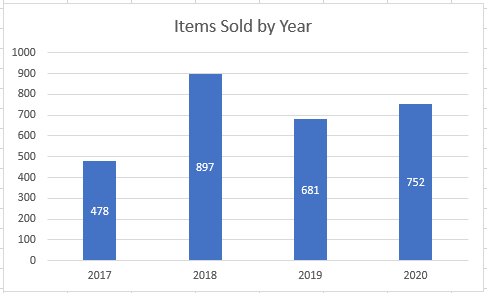
In our example below, I add a Data Label to a column chart and then I format the data label using CTRL+1.
I then select to custom format the numbers so it shows the values as thousands by adding a comma , after each zero and then showing the work k by adding “k”
Example Custom Number Format: [$$-1004]#,##0,”k”;-[$$-1004]#,##0,”k”

DOWNLOAD WORKBOOK
HELPFUL RESOURCE:

About The Author
John Michaloudis
John Michaloudis is the Founder & Chief Inspirational Officer of MyExcelOnline!
Here’s a question from a reader:
I use Microsoft 365 Excel for data entry purposes. Once i have the data ready in the spreadsheet i would like to create different charts: pie, bars and so forth, all based on my dataset. It seems that by default no labels are posted in my Excel chart making it harder to understand the data aggregation. Any ideas how to add labels to my Excel chart?
Insert Excel data text labels and callouts
Having data labels on your charts makes it much easier and faster for your readers to understand the information you are conveying in a couple seconds. If you are having challenges adding data labels to your Excel charts, this guide is for you. I will take you through a step-step procedure that you can use to easily add data labels to your charts. The steps that I will share in this guide apply to Excel 2021 / 2019 / 2016.
- Step #1: After generating the chart in Excel, right-click anywhere within the chart and select Add labels. Note that you can also select the very handy option of Adding data Callouts.

- Step #2: When you select the “Add Labels” option, all the different portions of the chart will automatically take on the corresponding values in the table that you used to generate the chart. The values in your chat labels are dynamic and will automatically change when the source value in the table changes.
- Step #3: Format the data labels. Excel also gives you the option of formatting the data labels to suit your desired look if you don’t like the default. To make changes to the data labels, right-click within the chart and select the “Format Labels” option. Some of the formatting options you will have include; changing the label position, changing its alignment angle, and many more.

- Step #4: Drag to reposition: If you want to place one or multiple text labels in a specific position with the chart, you can easily hit your text label to move and position it accordingly.
- Step #5: Optional Step: Save your Excel chart as picture. After adding the labels and making all the changes you need; you can save your chart as a picture by right-clicking any point just outside the chart and select the “Save as Picture” option. By default, your chart will be saved in in your Pictures folder or on OneDrive as a graphic file such as png / bmp or jpg. You can access your saved pictures using Windows File Explorer.
The data labels are the values of the data series of the chart providing the information as numbers or percent values being graphed. By default, data labels are not displayed when we insert a chart. We need to add labels to the chart to make it easy to understand by displaying the details of the data series.
 Figure 1. Data Labels
How to Add Data Labels
Adding data labels is dependent on MS Excel version. There is a difference between MS Excel versions on how to add labels.
In Excel 2010 And Earlier Versions
After inserting a chart in Excel 2010 and earlier versions we need to do the followings to add data labels to the chart;
- Click inside the chart area to display the Chart Tools.
 Figure 2. Chart Tools
- Click on Layout tab of the Chart Tools. In Labels group, click on Data Labels and select the position to add labels to the chart.
 Figure 3. Chart Data Labels
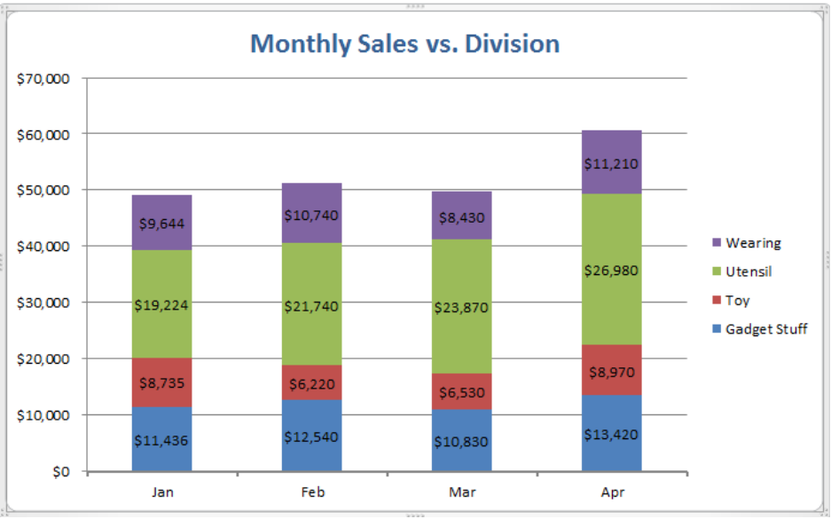 Figure 4. How to Add Data Labels
In Excel 2013 And Later Versions
In Excel 2013 and the later versions we need to do the followings;
- Click anywhere in the chart area to display the Chart Elements button
 Figure 5. Chart Elements Button
- Click the Chart Elements button > Select the Data Labels, then click the Arrow to choose the data labels position.
 Figure 6. How to Add Data Labels in Excel 2013
 Figure 7. Add Labels to Chart
Instant Connection to an Expert through our Excelchat Service
Most of the time, the problem you will need to solve will be more complex than a simple application of a formula or function. If you want to save hours of research and frustration, try our live Excelchat service! Our Excel Experts are available 24/7 to answer any Excel question you may have. We guarantee a connection within 30 seconds and a customized solution within 20 minutes.
Thursday, June 11, 2015
Peltier Technical Services, Inc., Copyright © 2023, All rights reserved.
Often you want to add custom data labels to your chart. The chart below uses labels from a column of data next to the plotted values.

When you first add data labels to a chart, Excel decides what to use for labels—usually the Y values for the plotted points, and in what position to place the points—above or right of markers, centered in bars or columns. Of course you can change these settings, but it isn’t obvious how to use custom text for your labels.
This chart is the starting point for our exercise. It plots simple data from columns B and C, and it displays only the default data labels, showing the Y values of each point.

There are a number of ways to apply custom data labels to your chart:
- Manually Type Desired Text for Each Label
- Manually Link Each Label to Cell with Desired Text
- Use the Chart Labeler Program
- Use Values from Cells (Excel 2013 and later)
- Write Your Own VBA Routines
Manually Type Desired Text for Each Label
The least sophisticated way to get your desired text into each label is to manually type it in.
Click once on a label to select the series of labels.

Click again on a label to select just that specific label.

Double click on the label to highlight the text of the label, or just click once to insert the cursor into the existing text.

Type the text you want to display in the label, and press the Enter key.
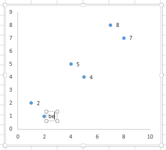
Repeat for all of your custom data labels. This could get tedious, and you run the risk of typing the wrong text for the wrong label (I initially typed “alpha” for the label above, and had to redo my screenshot).
One thing that makes this approach unsophisticated is that the typed labels are not dynamic. If th text in one of the cells changes, the corresponding label will not update.
Manually Link Each Label to Cell with Desired Text
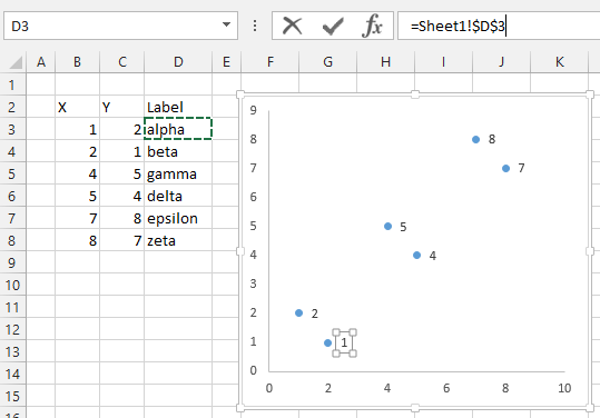
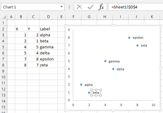
Select an individual label (two single clicks as shown above, so the label is selected but the cursor is not in the label text), type an equals sign in the formula bar, click on the cell containing the label you want, and press Enter. The formula bar shows the link (=Sheet1!$D$3).
Repeat for each of the labels. This could get tedious, but at least the labels are dynamic. If the text in one of the cells changes, the corresponding label updates to show the new text.
Use the Chart Labeler Program
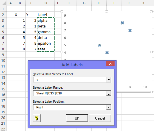
Brilliant Excel jockey and former MVP Rob Bovey has written a Chart Labeler add-in, which allows you to assign labels from a worksheet range to the points in a chart. It is free for anyone to use and can be downloaded from http://appspro.com. Rob colls it the XY Chart Labeler, but it actually works with any chart type that supports data labels.
When installed, the add-in adds a custom ribbon tab with a handful of useful commands. The tab is added at the end of the ribbon, but being pressed for space I moved it digitally to the beginning.
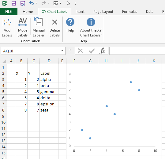
With a chart selected, click the Add Labels ribbon button (if a chart is not selected, a dialog pops up with a list of charts on the active worksheet). A dialog pops up so you can choose which series to label, select a worksheet range with the custom data labels, and pick a position for the labels.
If you select a single label, you can see that the label contains a link to the corresponding worksheet cell. This is like the previous method, but less tedious and much faster.
Use Values from Cells (Excel 2013 and later)
After years and years of listening to its users begging, Microsoft finally added an improved labeling option to Excel 2013.
First, add labels to your series, then press Ctrl+1 (numeral one) to open the Format Data Labels task pane. I’ve shown the task pane below floating next to the chart, but it’s usually docked off to the right edge of the Excel window.

Click on the new checkbox for Values From Cells, and a small dialog pops up that allows you to select a range containing your custom data labels.

Select your data label range.

Then uncheck the Y Value option. I also uncheck the Show Leader Lines option, which is another enhancement added in Excel 2013. Leader lines are hardly ever useful for the charts I make, but many users are happy with them.

While these data labels are not explicitly linked to worksheet cells as in the previous approaches, they still reflect any changes to the cells that contain the labels.
Write Your Own VBA Routines
I’ve put together a couple little routines that help with data point labeling. These are quick and dirty, because sometimes that’s all that you need. Also, writing your own code allows you to streamline your workflow according to your specific requirements.
Add Data Labels from Range Selected by User
This routine first makes sure a chart is selected, then it determines which series is to be labeled. It asks the user to select a range using an InputBox, and if the user doesn’t cancel it adds a label to the series point by point, linking the label to the appropriate cell.
Sub AddLabelsFromUserSelectedRange()
  Dim srs As Series, rng As Range, lbl As DataLabel
  Dim iLbl As Long, nLbls As Long

  If Not ActiveChart Is Nothing Then
    If ActiveChart.SeriesCollection.Count = 1 Then
      ' use only series in chart
      Set srs = ActiveChart.SeriesCollection(1)
    Else
      ' use series associated with selected object
      Select Case TypeName(Selection)
        Case "Series"
          Set srs = Selection
        Case "Point"
          Set srs = Selection.Parent
        Case "DataLabels"
          Set srs = Selection.Parent
        Case "DataLabel"
          Set srs = Selection.Parent.Parent
      End Select
    End If

    If Not srs Is Nothing Then
      ' ask user for range, avoid error if canceled
      On Error Resume Next
      Set rng = Application.InputBox( _
          "Select range containing data labels", _
          "Select Range with Labels", , , , , , 8)
      On Error GoTo 0

      If Not rng Is Nothing Then
        ' point by point, assign cell's address to label
        nLbls = srs.Points.Count
        If rng.Cells.Count < nLbls Then nLbls = rng.Cells.Count
        For iLbl = 1 To nLbls
          srs.Points(iLbl).HasDataLabel = True
          Set lbl = srs.Points(iLbl).DataLabel
          With lbl
            .Text = "=" & rng.Cells(iLbl).Address(External:=True)
            .Position = xlLabelPositionRight
          End With
        Next
      End If
    End If
  End If
End Sub
Add Data Labels from Row or Column Next to Y Values
This routine first makes sure a chart is selected, then it determines which series is to be labeled. It doesn’t bother the user, instead the routine parses the series formula to find the range containing the Y values, and if this is a valid range, it finds the next column or row, depending on the orientation of the Y values range. The code then adds a label to the series point by point, linking the label to the appropriate cell.
Sub AddLabelsFromRangeNextToYValues()
  Dim srs As Series, rng As Range, lbl As DataLabel
  Dim iLbl As Long, nLbls As Long
  Dim sFmla As String, sTemp As String, vFmla As Variant

  If Not ActiveChart Is Nothing Then
    If ActiveChart.SeriesCollection.Count = 1 Then
      ' use only series in chart
      Set srs = ActiveChart.SeriesCollection(1)
    Else
      ' use series associated with selected object
      Select Case TypeName(Selection)
        Case "Series"
          Set srs = Selection
        Case "Point"
          Set srs = Selection.Parent
        Case "DataLabels"
          Set srs = Selection.Parent
        Case "DataLabel"
          Set srs = Selection.Parent.Parent
      End Select
    End If

    If Not srs Is Nothing Then
      ' parse series formula to get range containing Y values
      sFmla = srs.Formula
      sTemp = Mid$(Left$(sFmla, Len(sFmla) - 1), InStr(sFmla, "(") + 1)
      vFmla = Split(sTemp, ",")
      sTemp = vFmla(LBound(vFmla) + 2)
      On Error Resume Next
      Set rng = Range(sTemp)

      If Not rng Is Nothing Then
        ' use next column or row as appropriate
        If rng.Columns.Count = 1 Then
          Set rng = rng.Offset(, 1)
        Else
          Set rng = rng.Offset(1)
        End If

        ' point by point, assign cell's address to label
        nLbls = srs.Points.Count
        If rng.Cells.Count < nLbls Then nLbls = rng.Cells.Count
        For iLbl = 1 To nLbls
          srs.Points(iLbl).HasDataLabel = True
          Set lbl = srs.Points(iLbl).DataLabel
          With lbl
            .Text = "=" & rng.Cells(iLbl).Address(External:=True)
            .Position = xlLabelPositionRight
          End With
        Next
      End If
    End If
  End If
End Sub